Photographing Kips Bay
There are so many elements that have to come together for a successful interiors photo shoot – great design, the right light, a detailed shot list, and more. And that’s just for one project with one interior designer. When I was asked to shoot the first-ever Kips Bay Showhouse to launch in Dallas, it was a marathon event with 27 designers, 3 days of intense shooting, and a lot of directors. And all in one huge French Provincial mansion. Here’s a look at how it went:
Size Matters
I was appointed as the official house photographer by the organizer of the home, the Kips Bay Boys & Girls Club. It’s an honor to be a part of this group’s iconic showhome program. For almost 50 years, Kips Bay has used a designer showhouse to raise money for after school and enrichment programs for kids in New York City. In the last few years, they expanded their showhomes to include Palm Beach, and this year moved into Dallas for their third location. Here in Dallas, the proceeds of the showhome also benefited local nonprofits Dwell with Dignity and the Crystal Charity Ball.
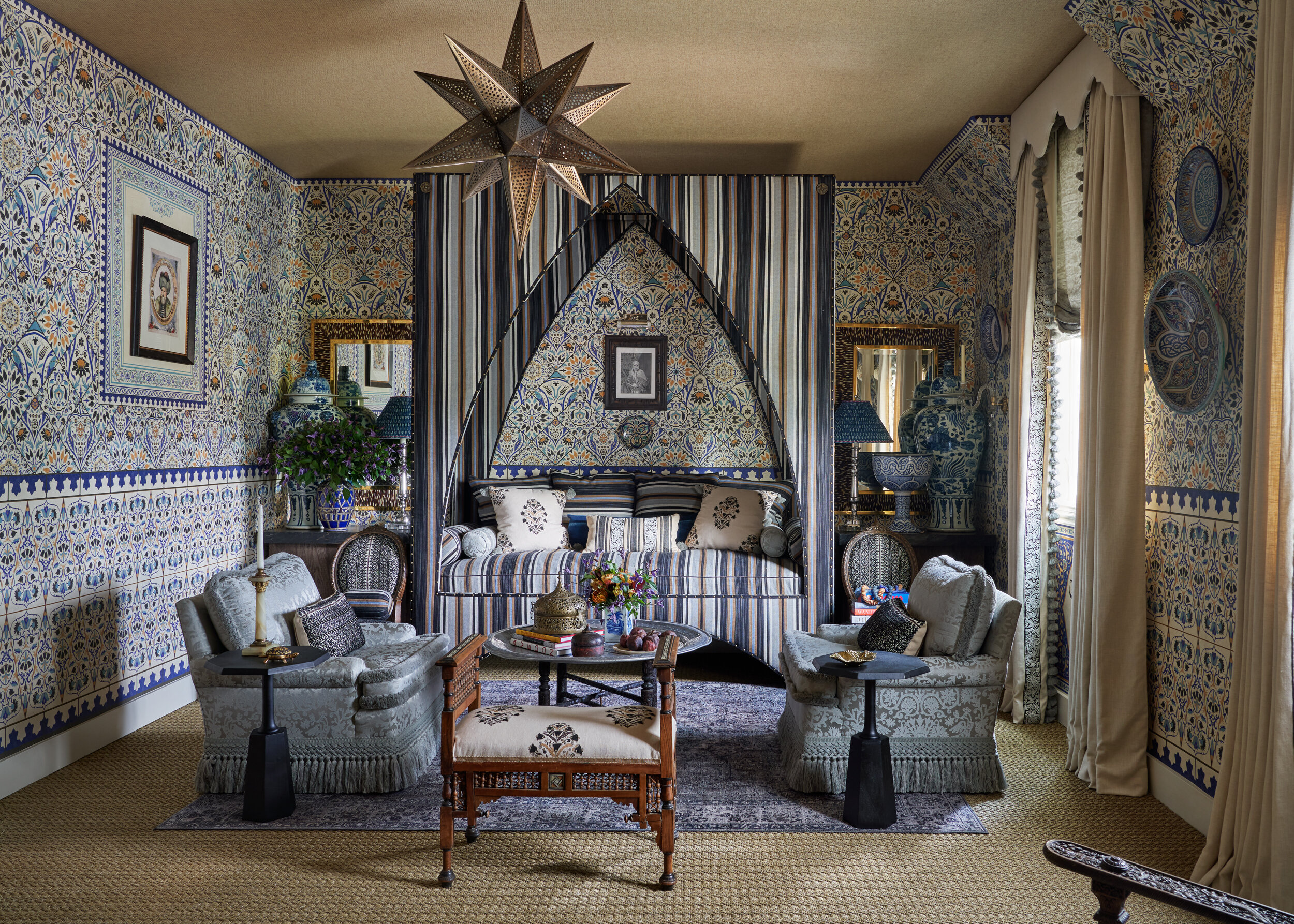
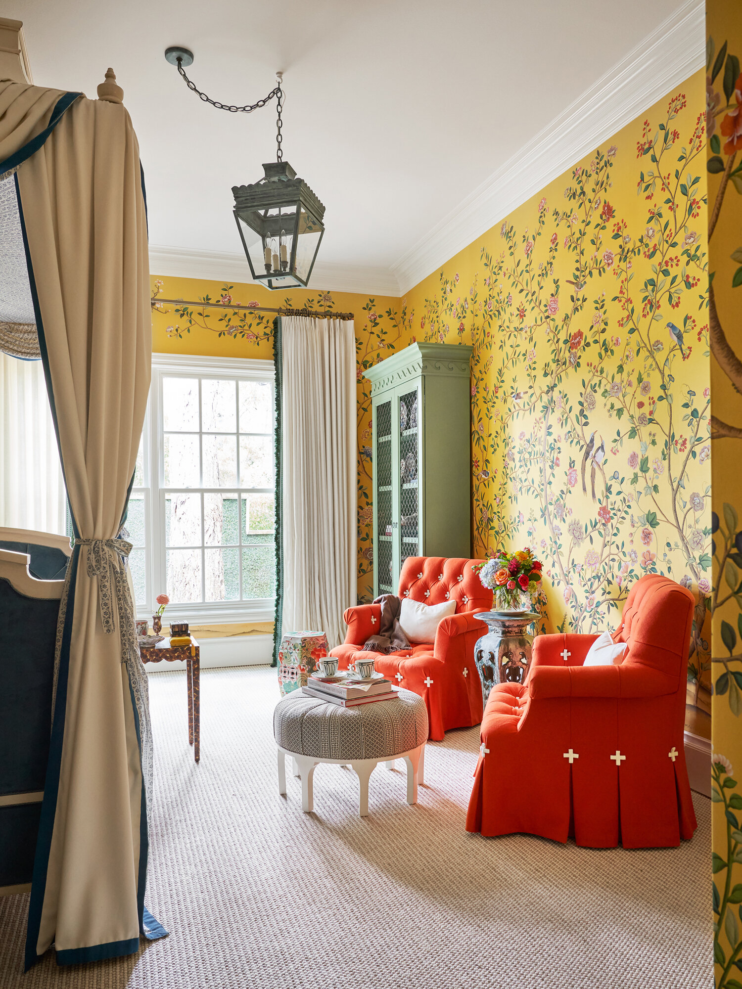
Doniphan Moore Interiors for Kips Bay Dallas Showhome
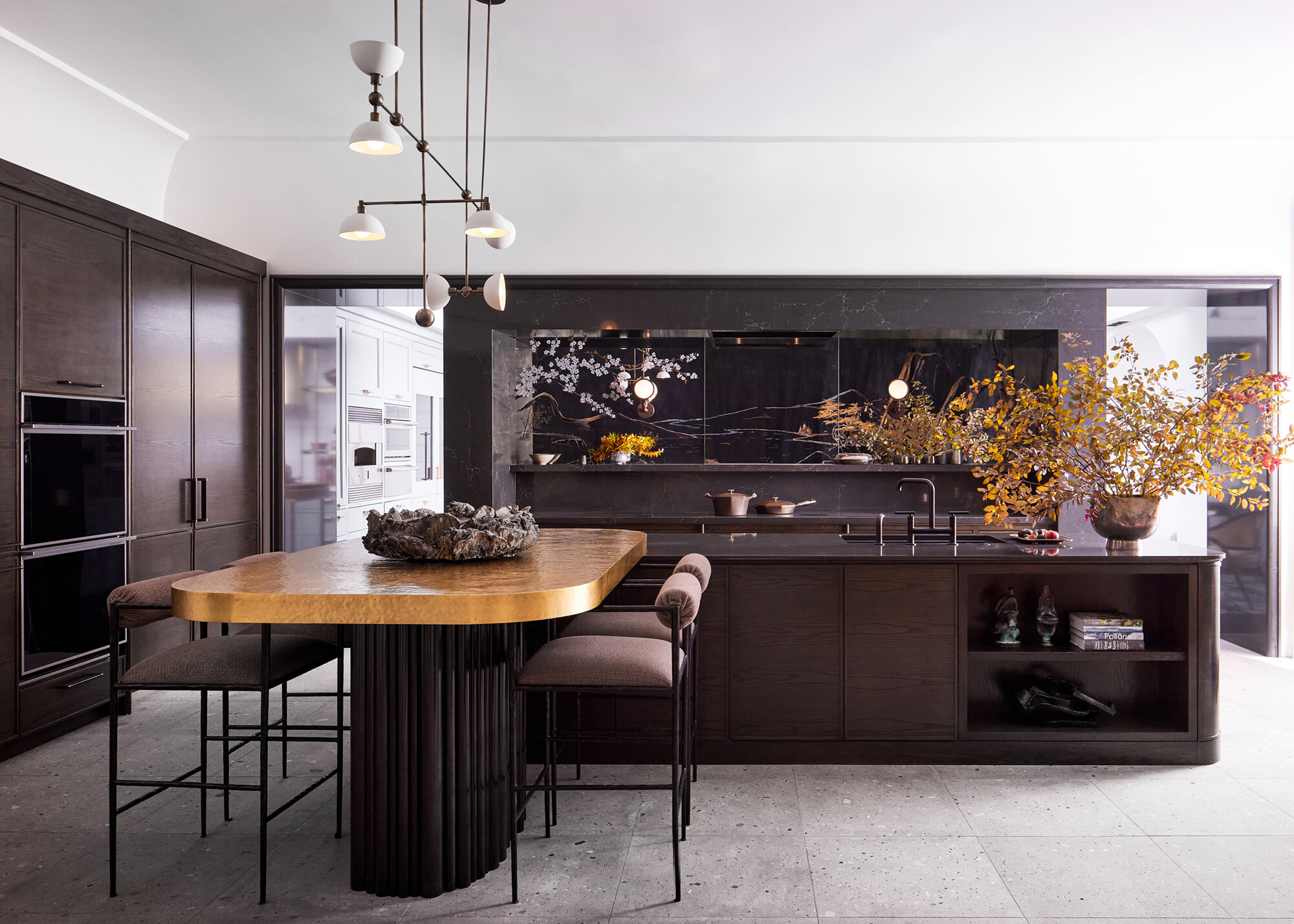
Kitchen Chad Dorsey Design for Kips Bay Dallas Showhome
So how is shooting for a showhome different from photographing a home for an interiors project? First of all, the sheer size was daunting at almost 12,000 square feet. And then there’s the fact that I was shooting for many directors, other than the organizer or designers. In a showhome, you’re also shooting for the media partner, which in this case was Veranda magazine. And you have a lot of suppliers, sponsors, and vendors who have donated to the home and need photos of their products and work.
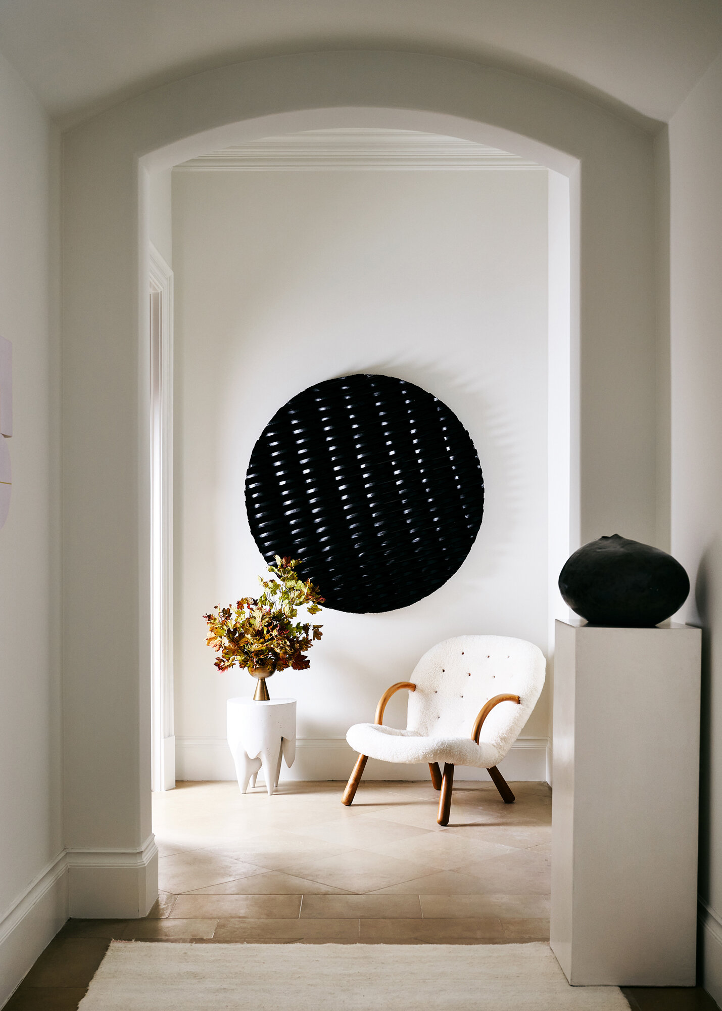
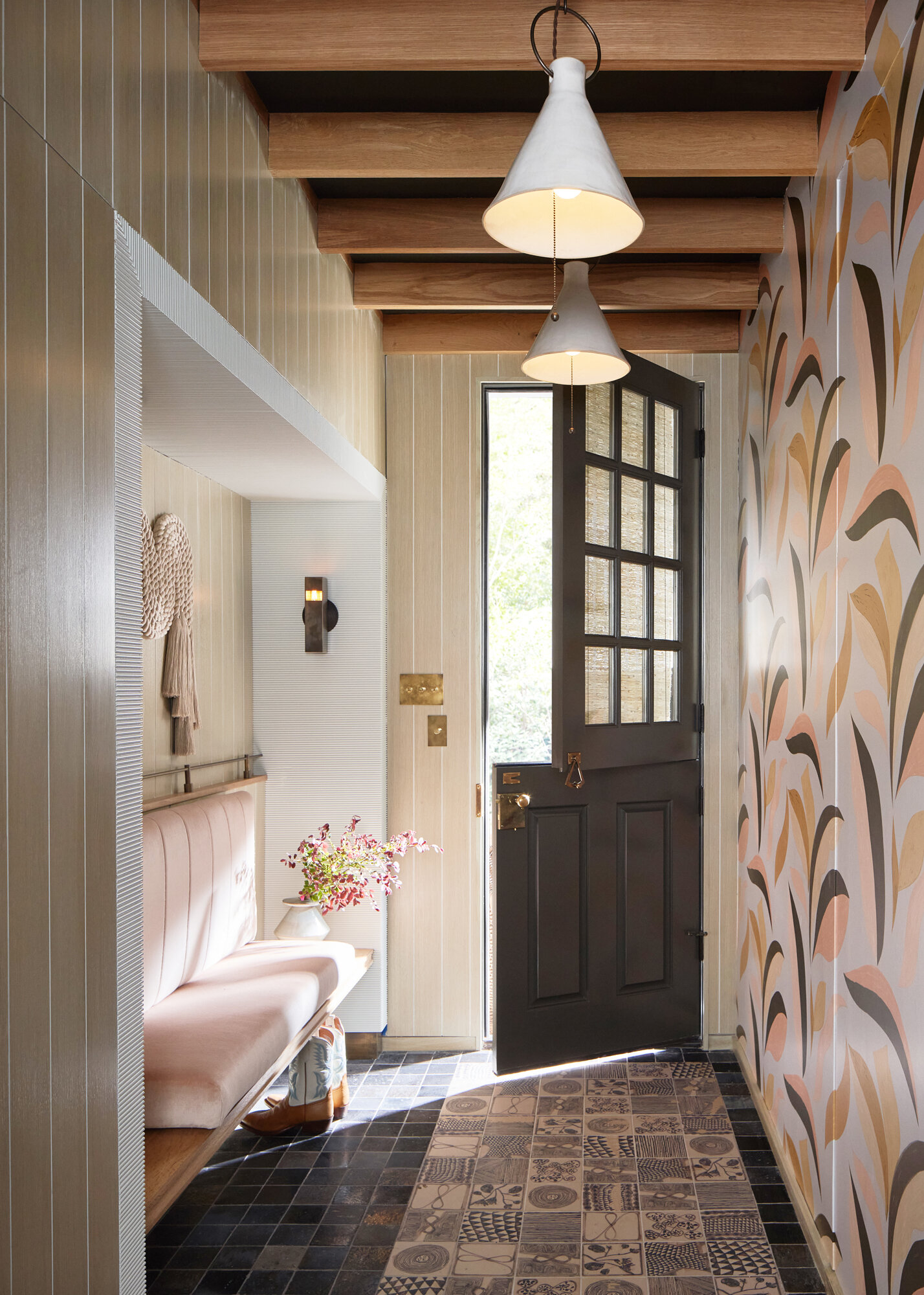
Entry way by Rottet Studio for Kips Bay Showhome
Rather than worrying about what a single designer wants or needs, there are a lot of people involved with what photos and angles are needed. For the most part, that meant bigger, more overall views of each space and fewer detail shots. That way, more product can be included and more companies can use each shot for promotion of their participation in the showhouse.
Long Days, Short Deadlines
We worked in the home for three days, from about 8am to 7pm, so they were long days. Luckily, we were usually alone in the home, both because of Covid and to allow us to work quickly and get the shots we needed without anyone in the way.
The timeline for delivering the photography was also very tight – and not at all the way photographers normally work. For our interiors projects, I take my time to ensure that the photos are perfect, including retouching. For Kips Bay, I worked with one assistant and one digital tech who was doing general basic retouching as I was shooting. We kept it as tight and efficient as possible because the turnaround time was so quick. We shot about 10 rooms a day with 3-5 shots each, and delivered the finished photos at the end of the 3 days. That is definitely not how a normal interiors shoot goes.
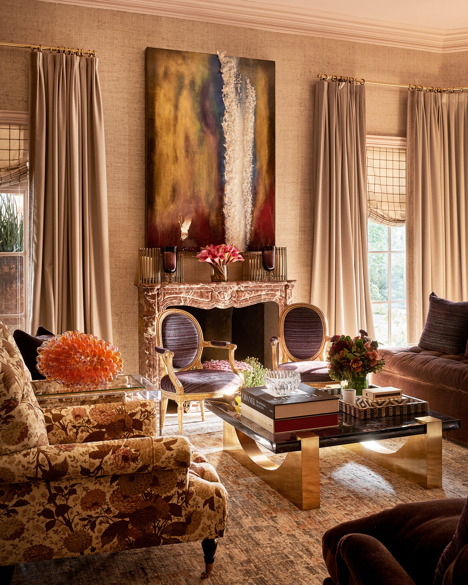
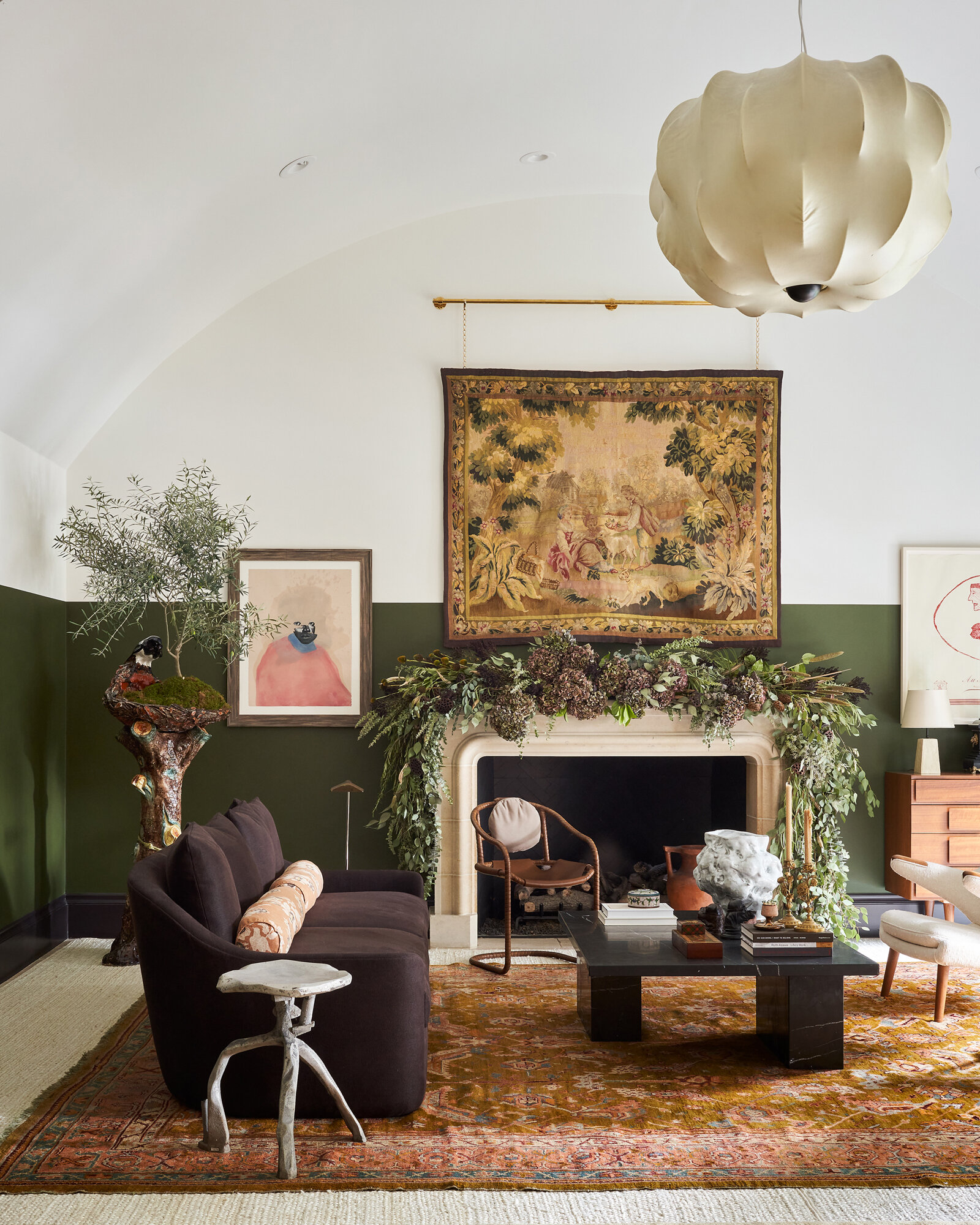
Living room by Mark D Sikes for Kips Bay Showhome
We did a walkthrough ahead of our shooting schedule, to be sure we would photograph rooms with natural light at the right time, and to plot an efficient route that had a good flow.
We also wanted to do justice to every space and every designer and that can be grueling. In a normal interiors project, there are killer moments that you’re excited to shoot, and then there are secondary spaces that aren’t as strong, or that you might skip through.
But in a showhome, every room has a hero moment and every designer deserves equal representation as far as my skill, time, and attention. Everyone should get the same amount of creative effort – and that is exhausting. There’s no room where you can take less time or give less of yourself as a creative.
Creative Challenges
One of the challenges in this huge project was the odd architecture. There were a lot of strange little transitional spaces and interesting angles. The flow was off from an architectural standpoint, and upstairs the room were kind of hidden and tight. That made it more difficult to shoot.
But I have to say that I was blown away by the inventiveness of the designers who were part of the showhome. If you look at the before photos of the house and see the amount of creativity that is displayed in the finished photos, it was an incredible transformation. I have a newfound appreciation for designers and what they can do to a space. It was beyond what I expected.
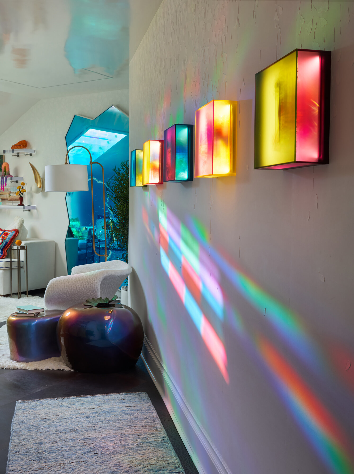
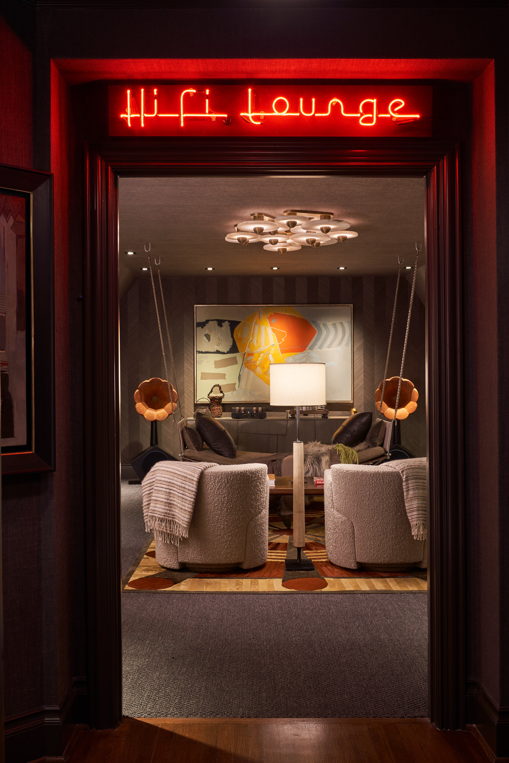
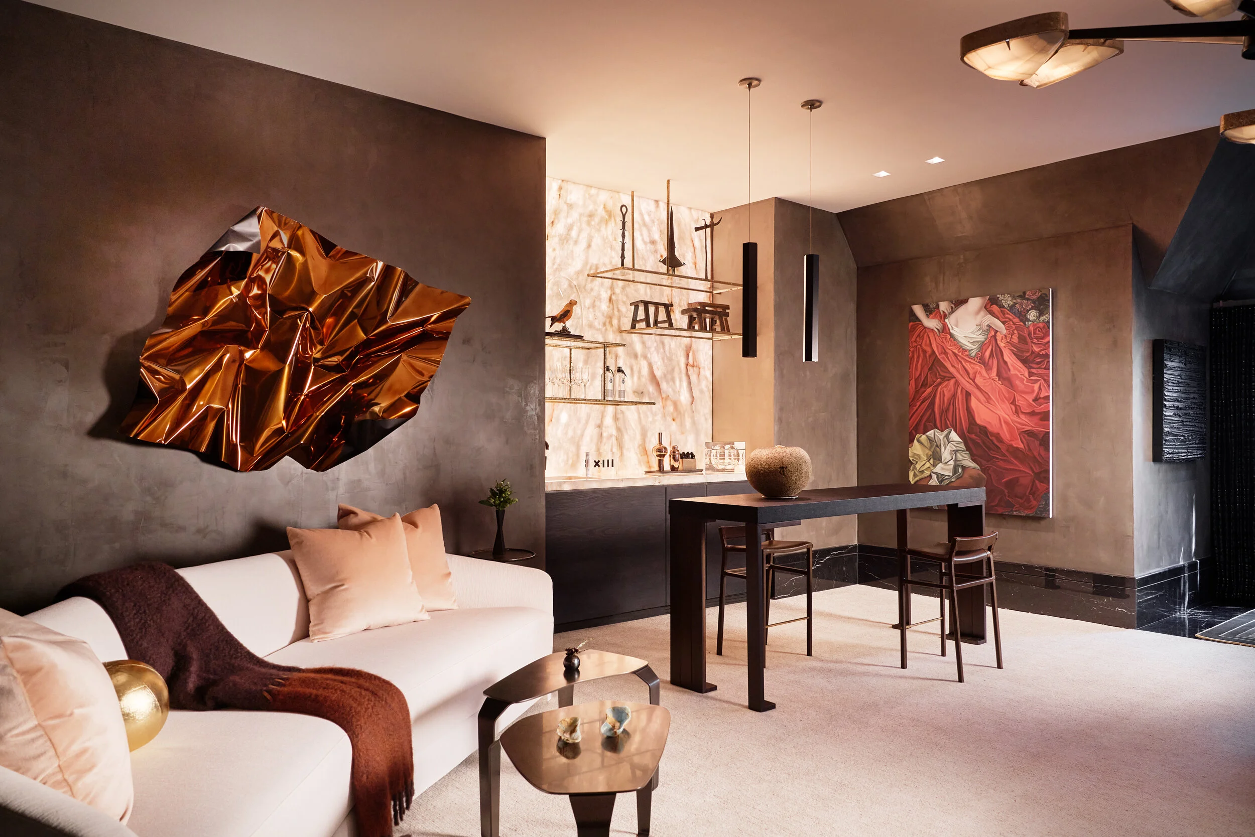
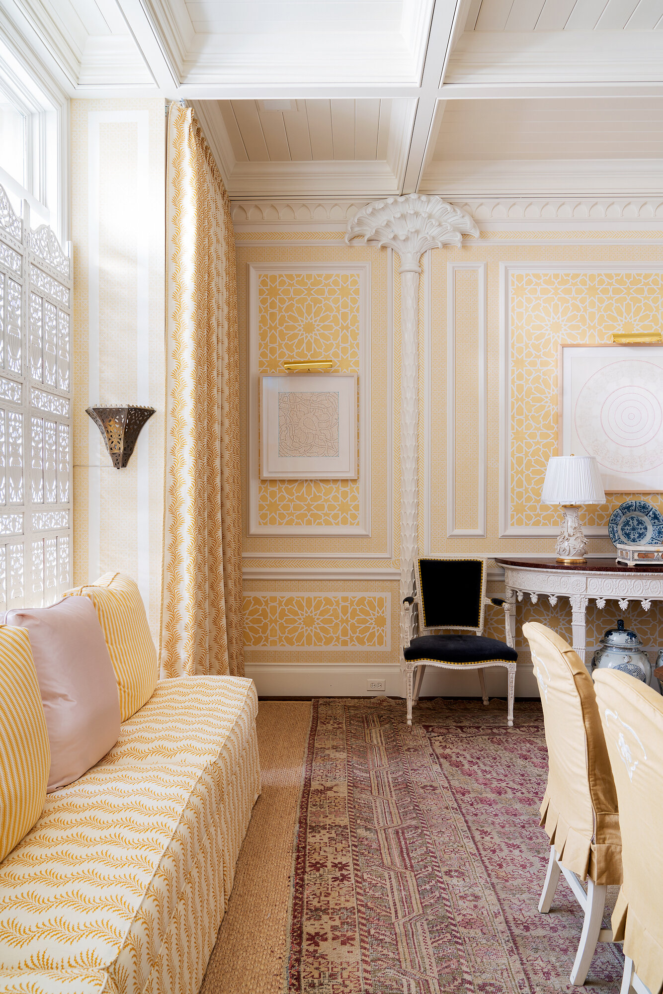
The morning lounge by Marcus Mohon Interiors for Kips Bay Showhome
It was interesting that I didn’t even meet a few of the designers. I did know about half of them since they were past clients. But the organizers tried to keep the home clear while I was shooting.
I was lucky enough to be hired to reshoot spaces for the designers themselves. That meant I was in the house even longer, but it also gave those designers the shots they needed and wanted, particularly those important detail shots.
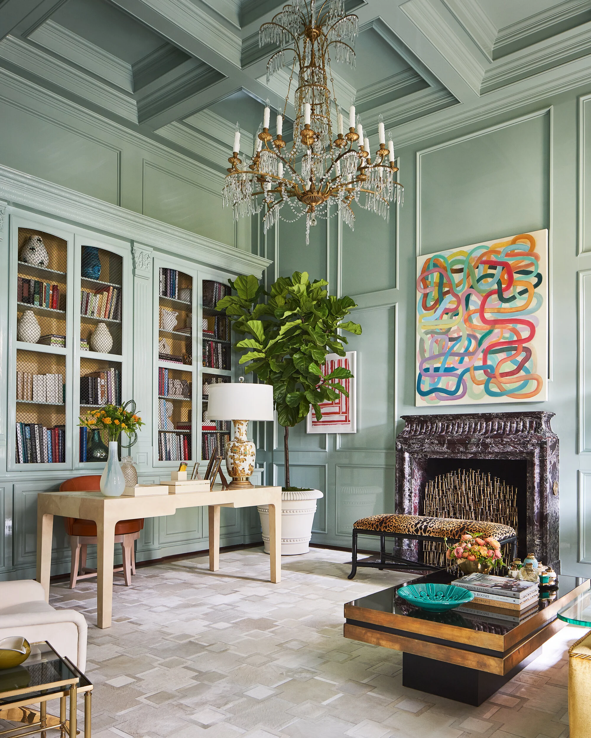
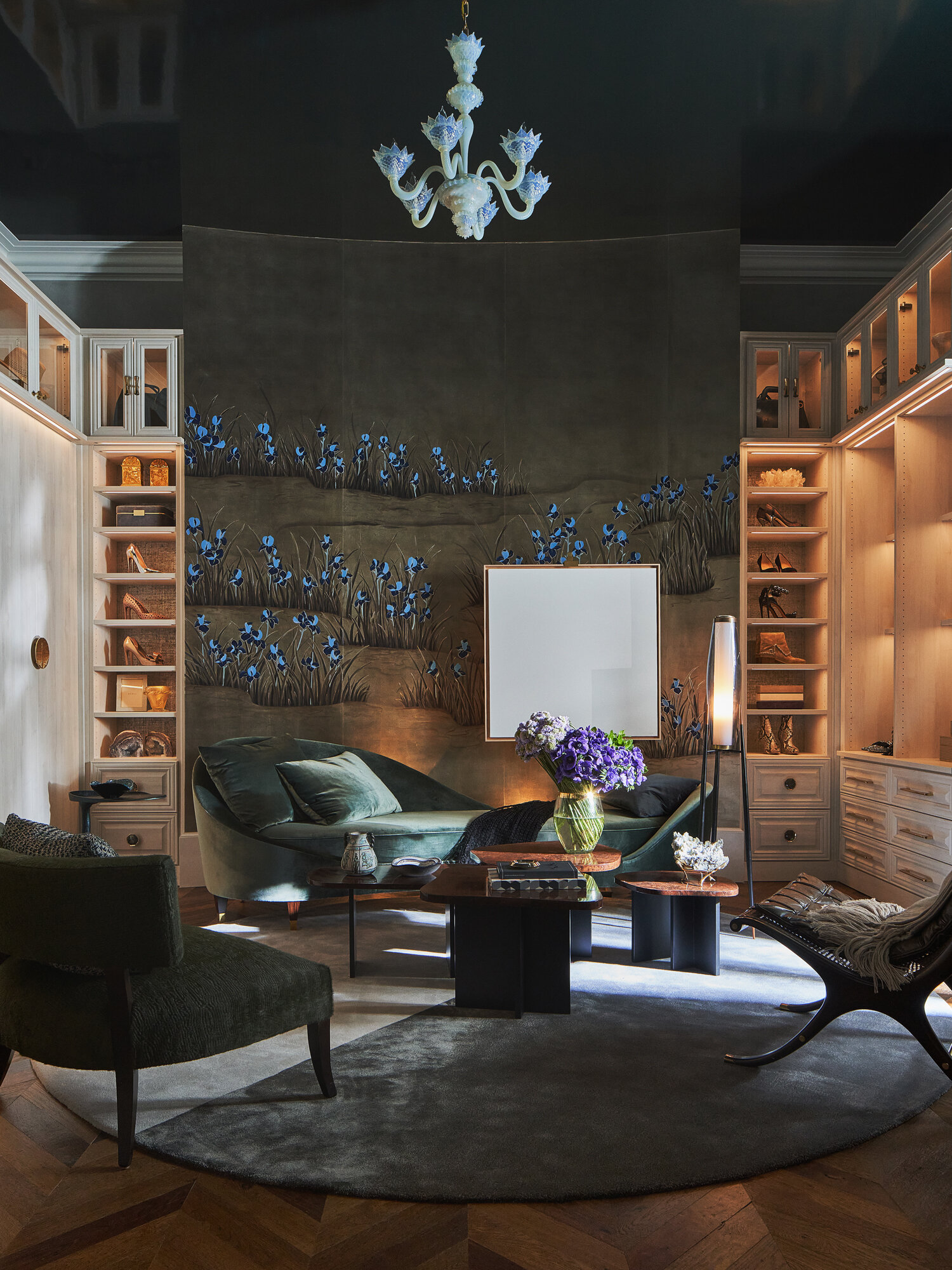
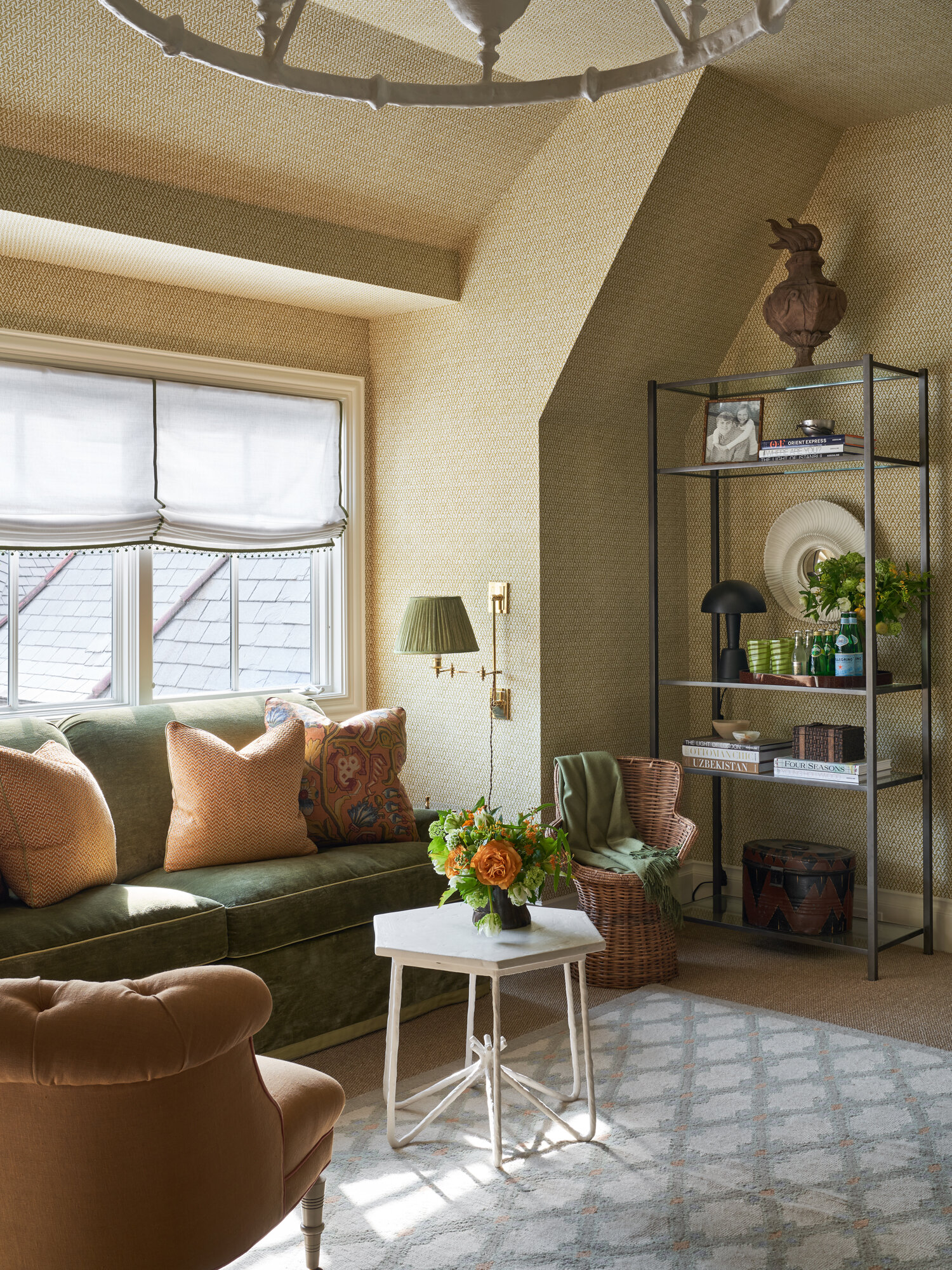
A lady’s study by Jan Showers for Kips Bay Dallas.
La Matadora by Tracy Hardenburg Designs for Kips Bay Showhouse.
Lessons Learned
If you’re a designer who wants to make the most impact and get the best photography from a showhome experience, there are a few things to keep in mind from my perspective.
Some rooms that you’re assigned can be overwhelmed with product. Yes, you may have sponsors you have to take care of, but be careful how much you plan to use in a space. There can be too much going on in the finished photography, which won’t do you any favors.
Hire your own photographer. Remember that, although most organizers will allow you to use their shots, they are going to be wider room shots that showcase as much of the sponsors as possible. They may not be the shots you want and they definitely won’t include a lot of angles or detail shots. Get photos that you can use for your own portfolio and that highlight your work in the best light.
If you’re ever given the chance to select the space you want to design, always think about natural light. That makes for stunning photos, so if you get a space with great natural light, it’s a huge win for you.
Lighting is key to great photos. If you get a room that doesn’t have any natural light – and about half the rooms in the Kips Bay project did not – be sure you use good lighting as part of your design. You want nice soft lights that will enhance the mood of the room, and lighting that’s dimmable and controllable.
Florals are so important for photography, but they can also be expensive. Real, fresh flowers add life to a room – they really do make a difference. Choose flowers that last a long time, it will cost you less than having to replace them over and over. Since most showhomes are open for three to four weeks, having to switch them out can really add up. Avoid fussy arrangements though because they can look messy on camera.
As you can see from the photos, Kips Bay was an incredible project with stunning designs that I was proud to shoot. To see the full showhouse, see the January issue of Veranda.
Thank you Designers Today for featuring Stephen in the October issue sharing his experience of documenting the Dallas Kips Bay Showhouse. To see the FULL interview please click here.


