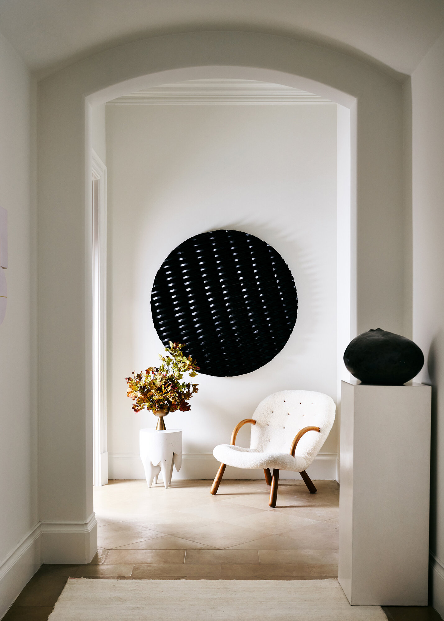
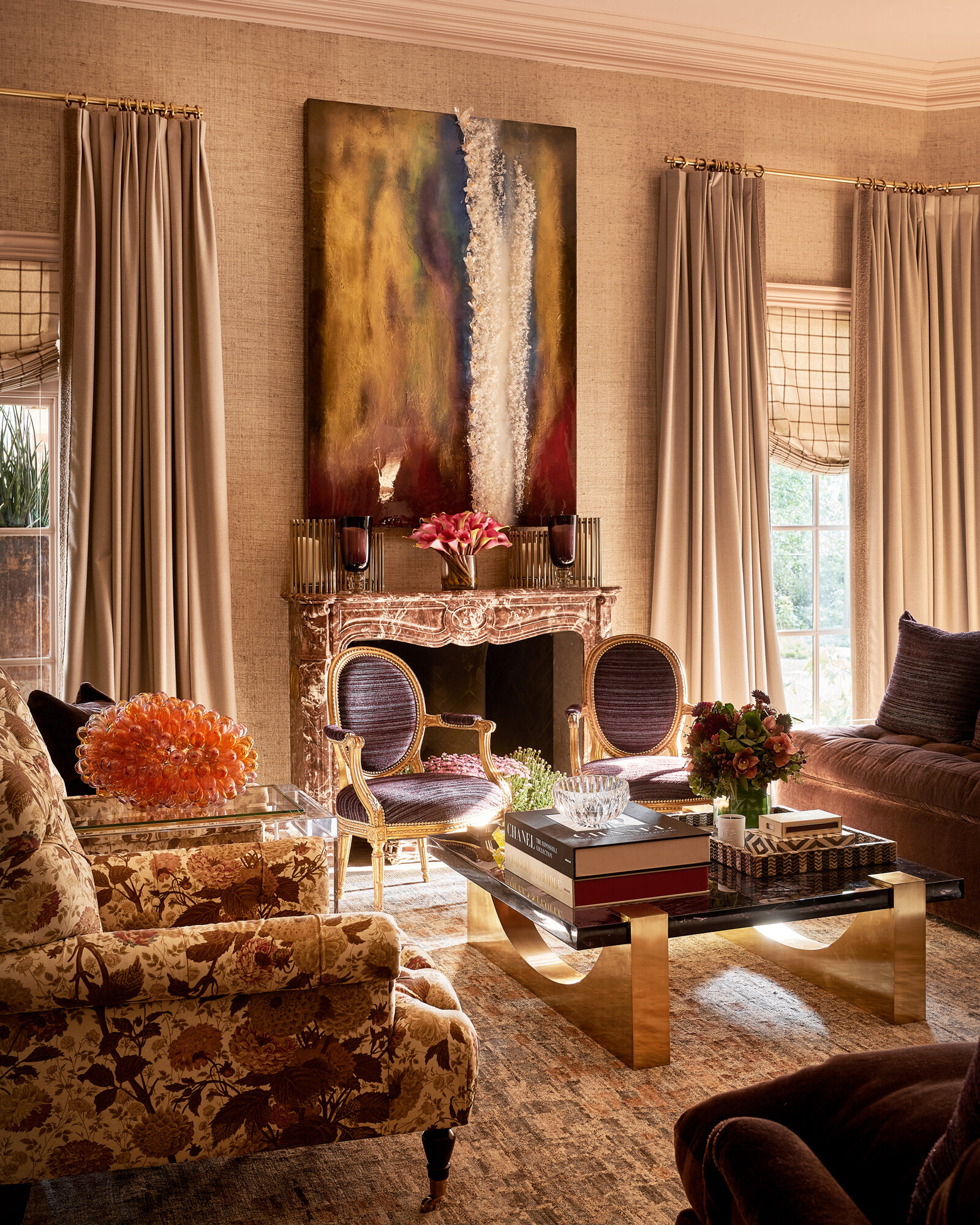
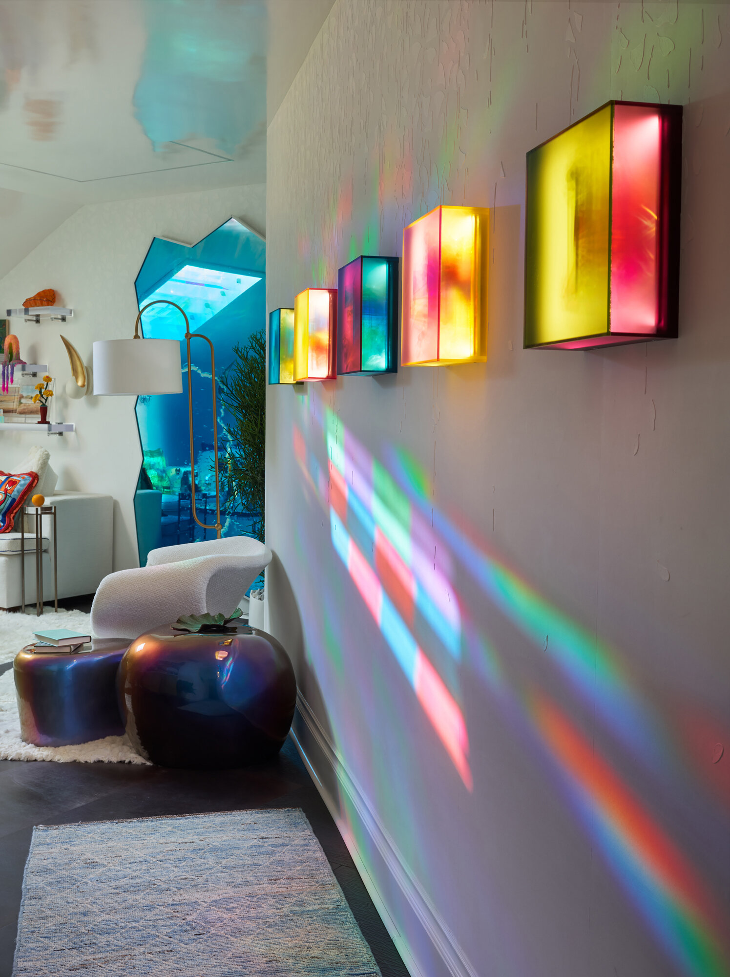
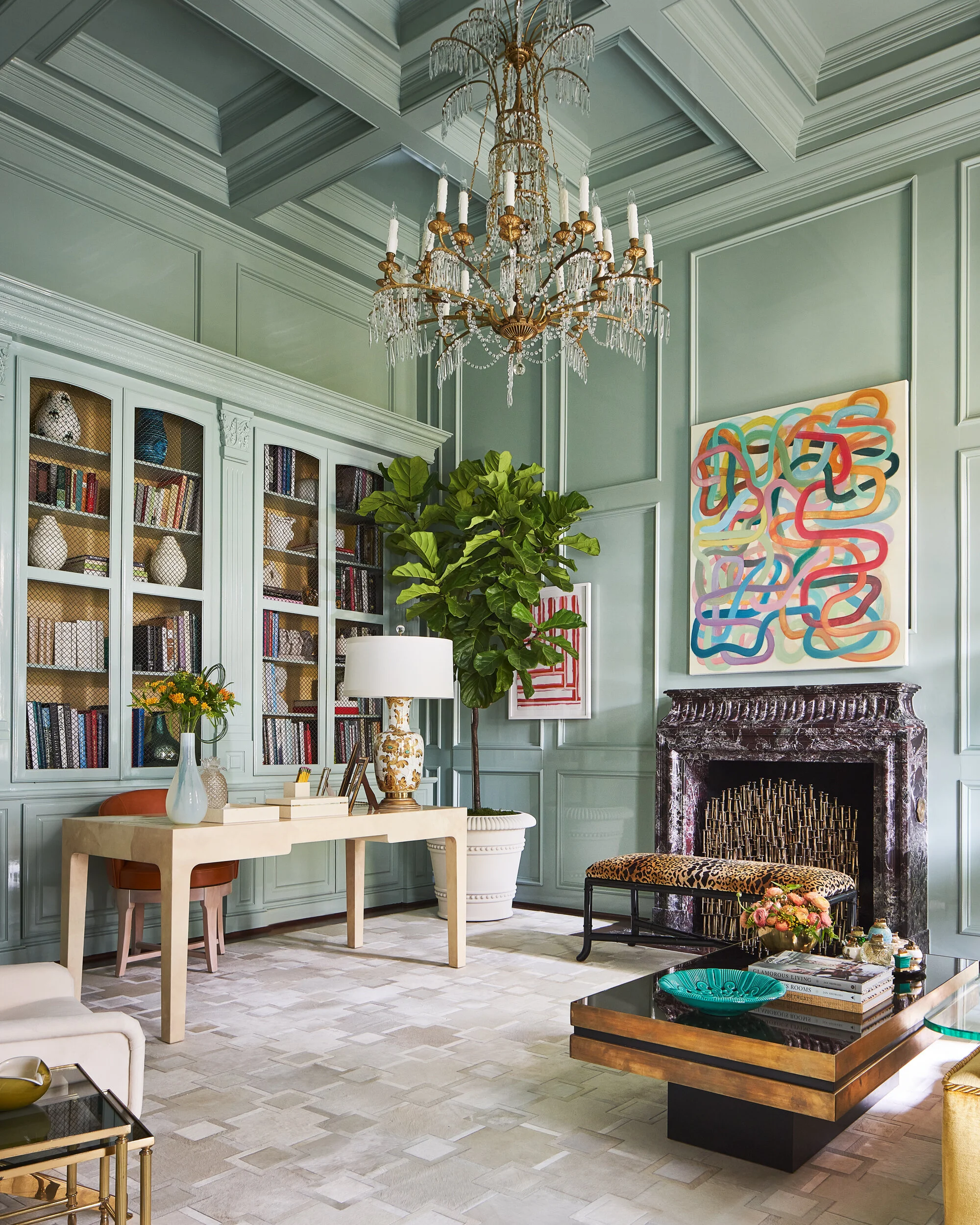
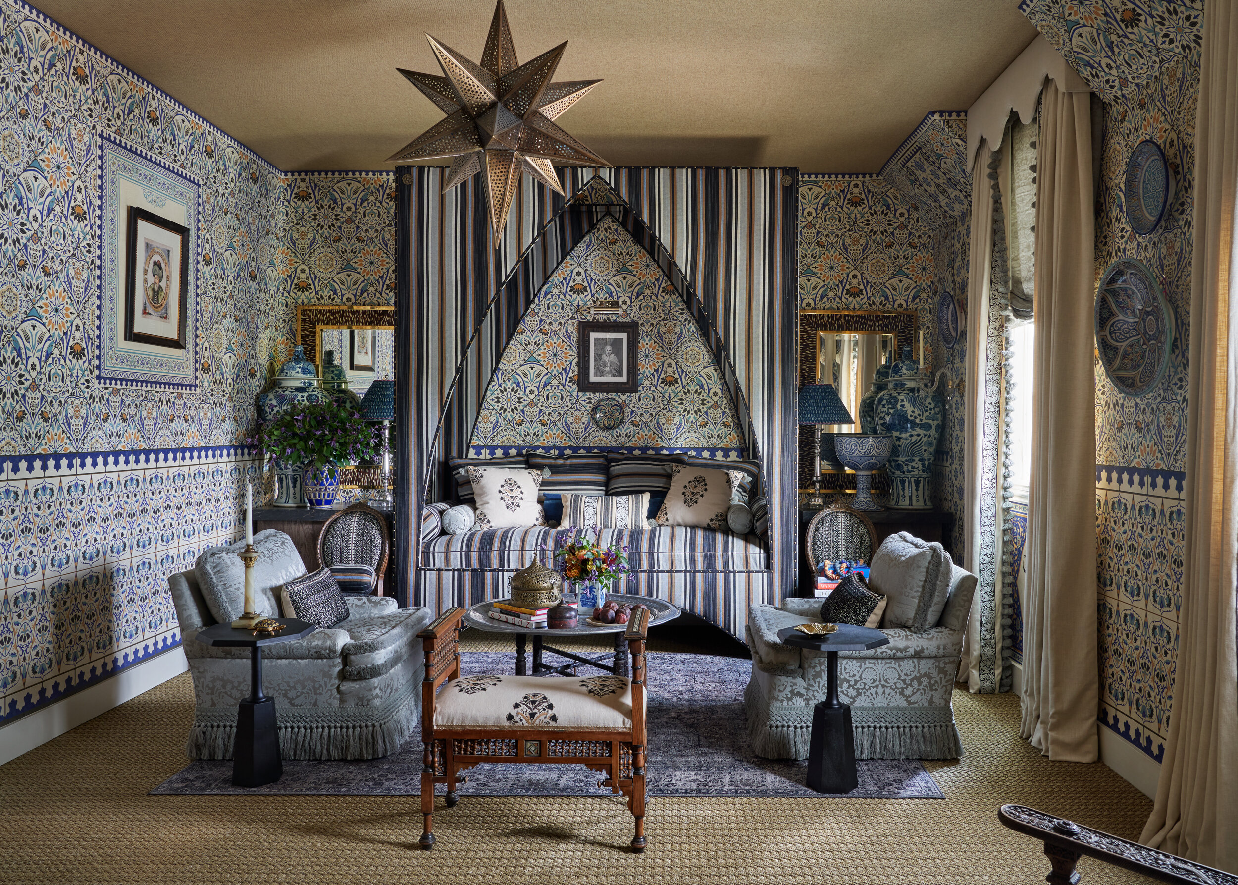
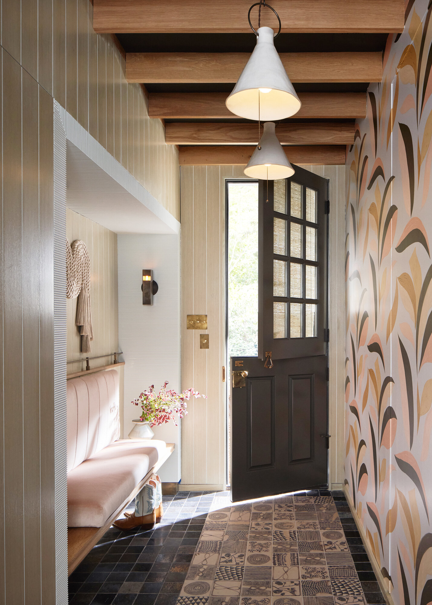
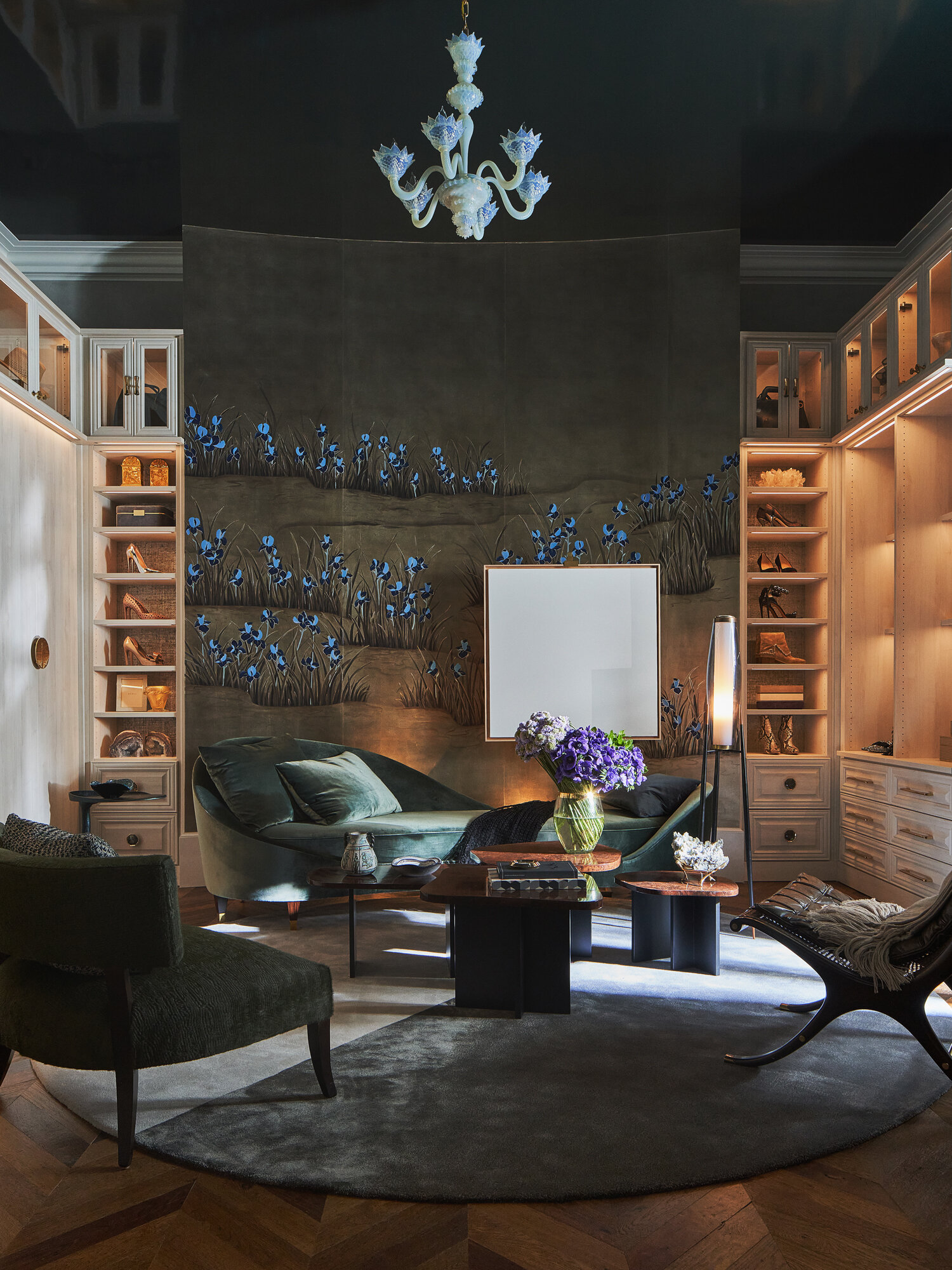
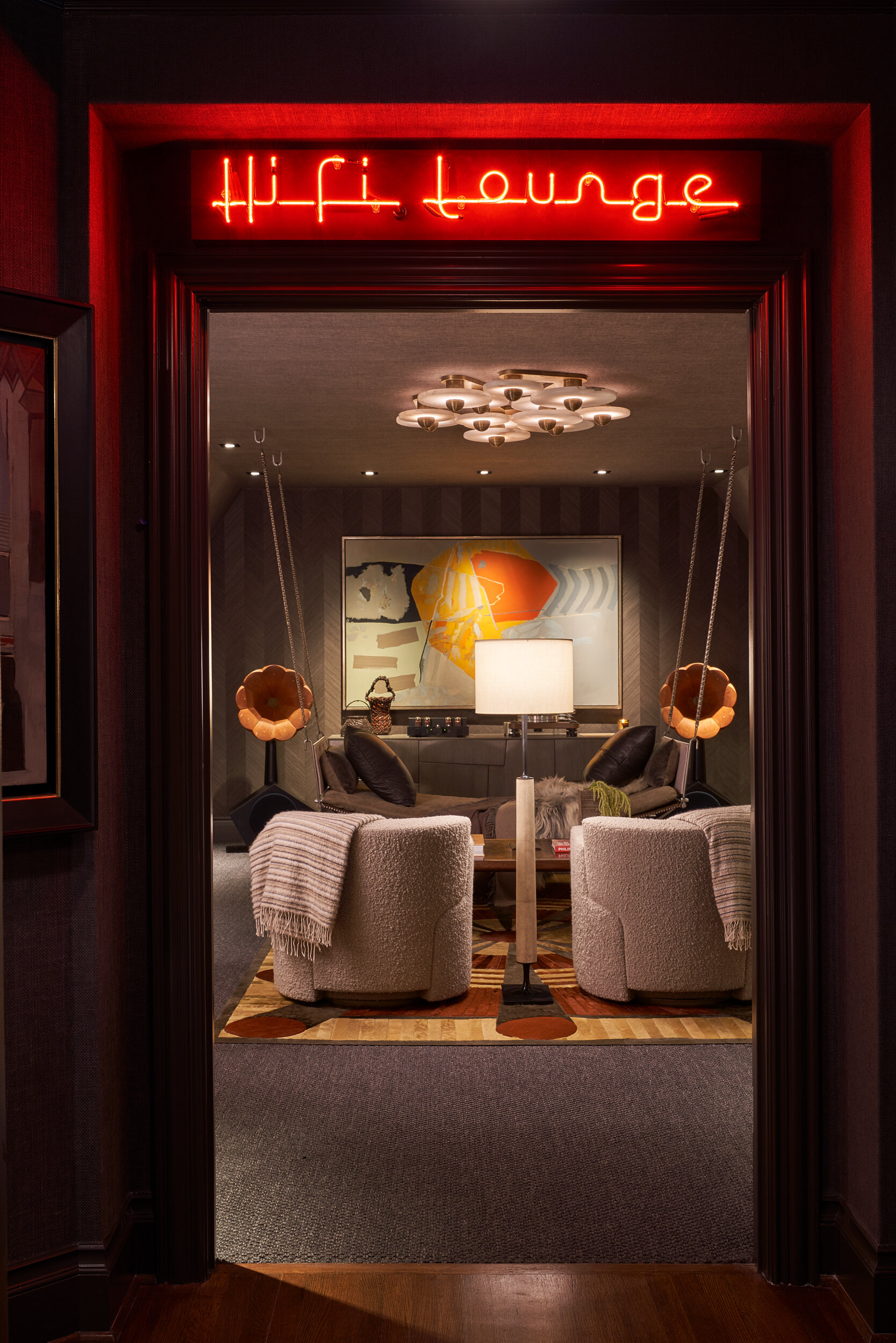
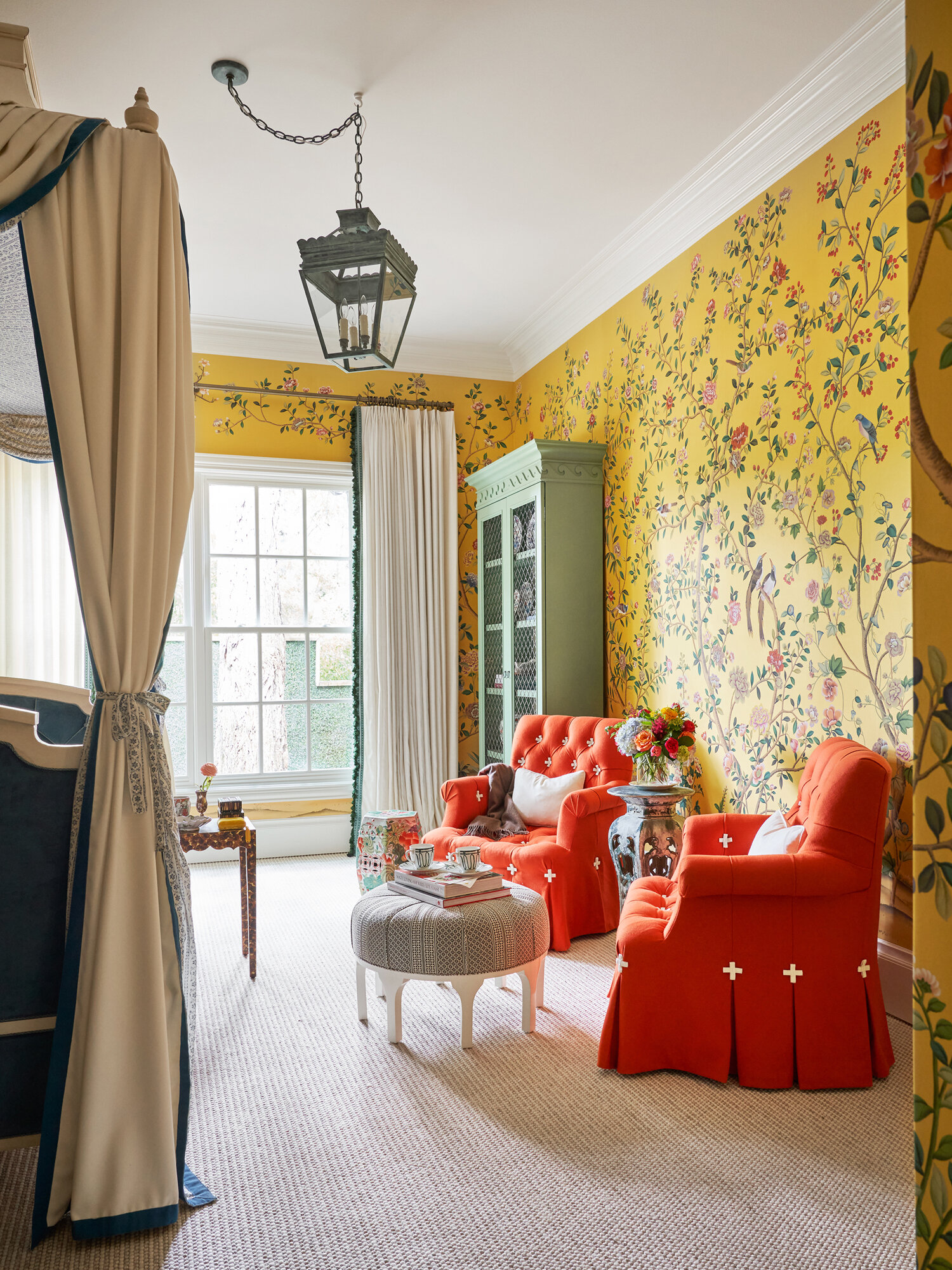
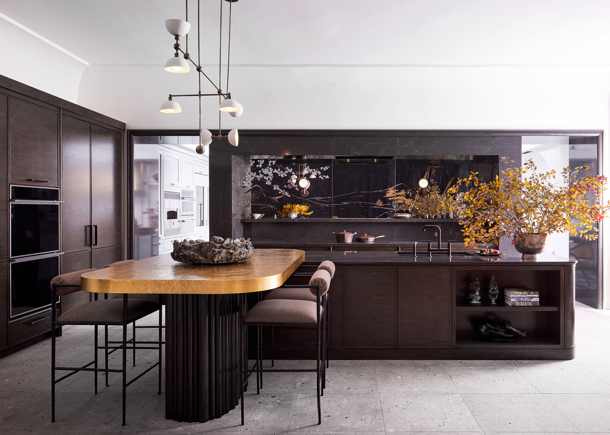
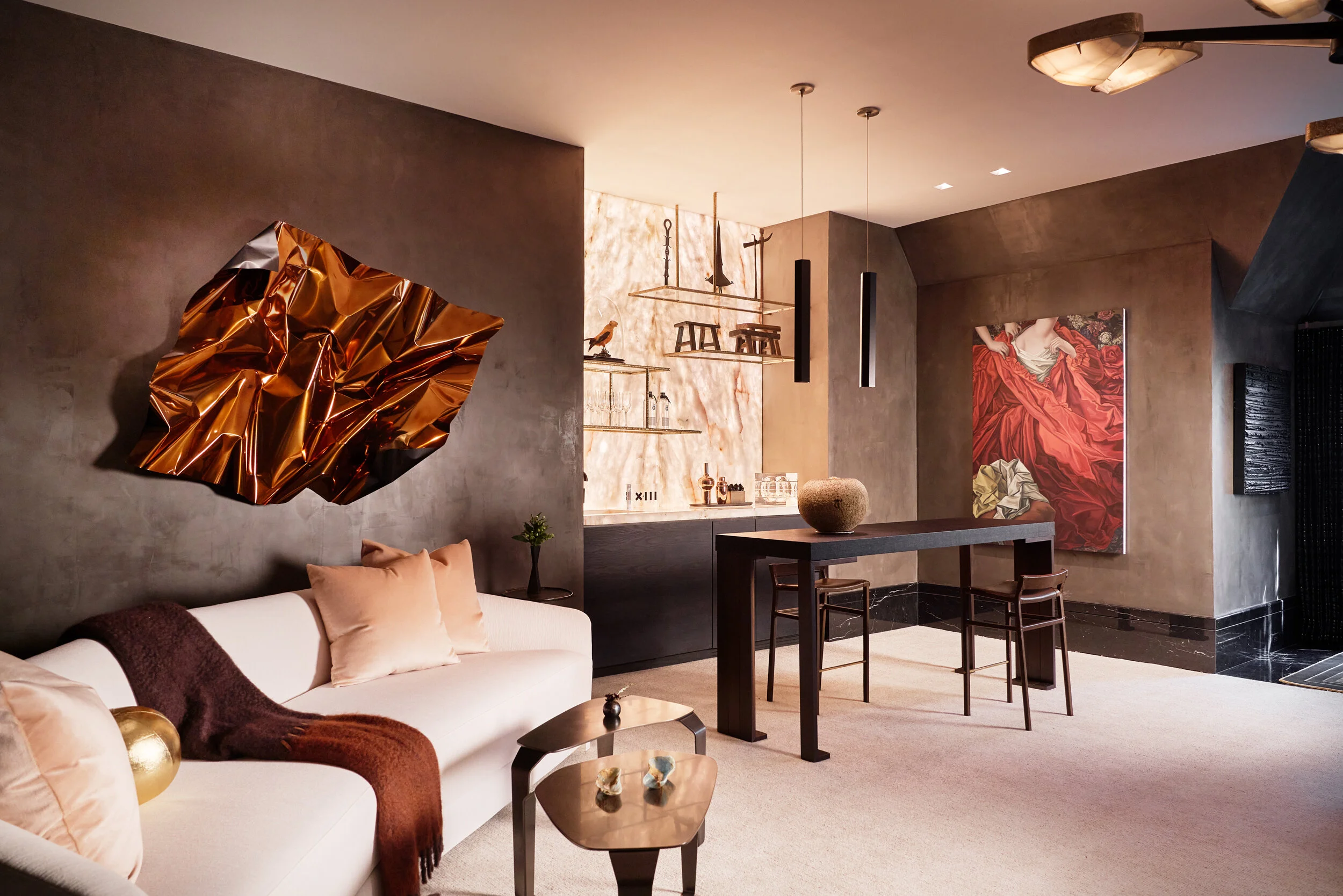
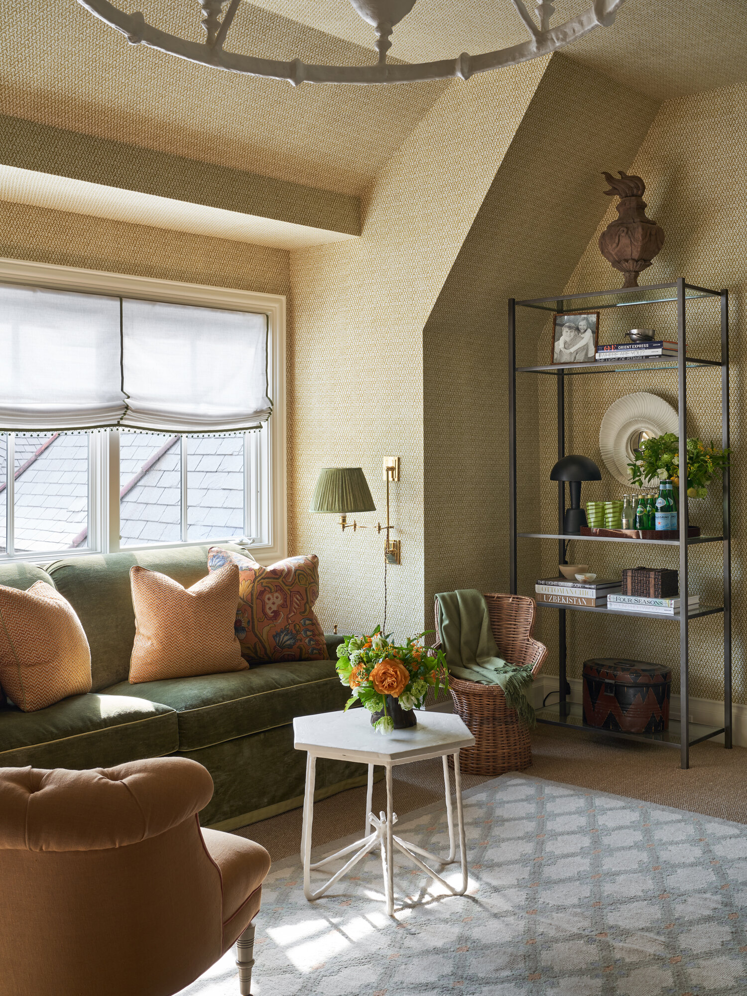
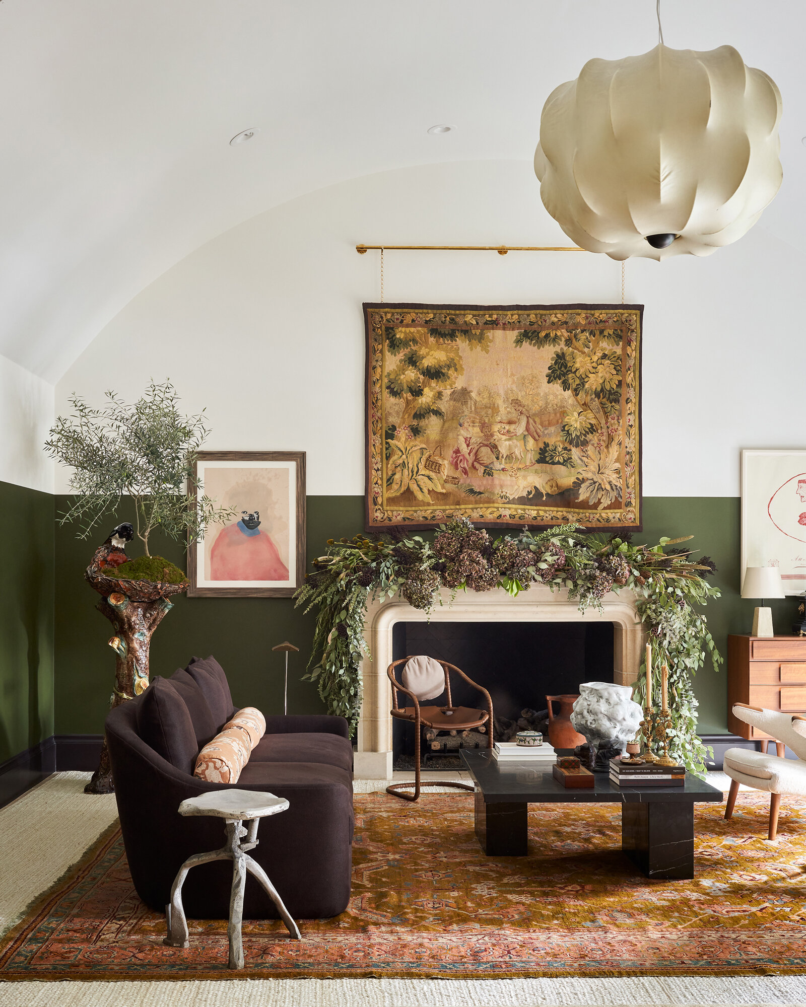
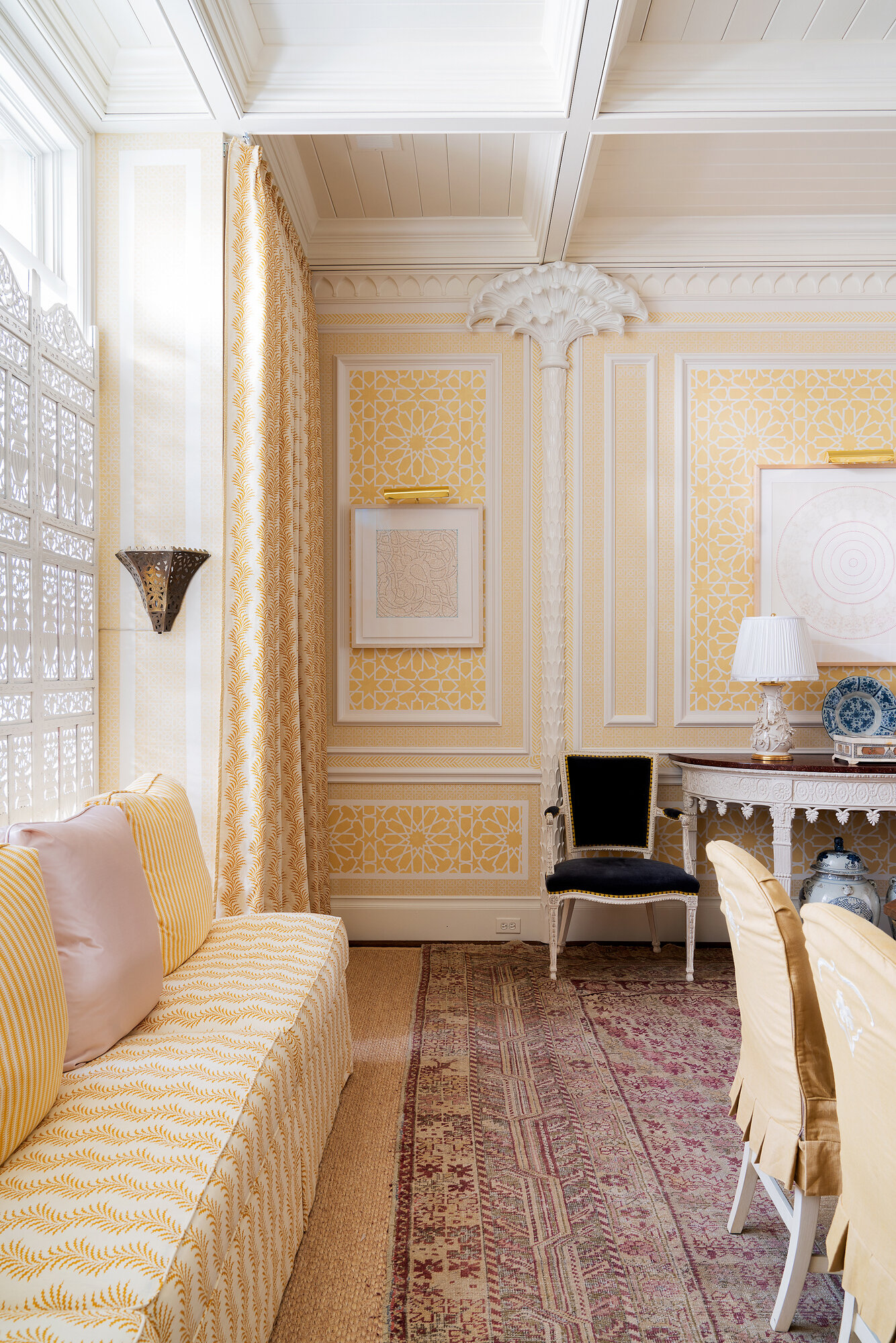
No matter what, 2020 will be a year to remember. It reminds me of that quote about “the best of times and the worst of times.” Despite the pandemic and shutdowns, it was still a good year for the interiors business. I am so grateful to so many talented clients and was honored to have my photographs showcased on many shelter magazine covers and in several books. The years highlight was being selected to be the official photographer for the first Kips Bay Showhouse in Dallas.
At the end of one year and the beginning of another, I think it’s important to look back at pivotal moments in the past 12 months and to celebrate successes. It gives me the motivation to push myself even more creatively and to set challenging goals for the new year. So here’s a look at the year in review for my studio:
PUBLISHED BOOKS
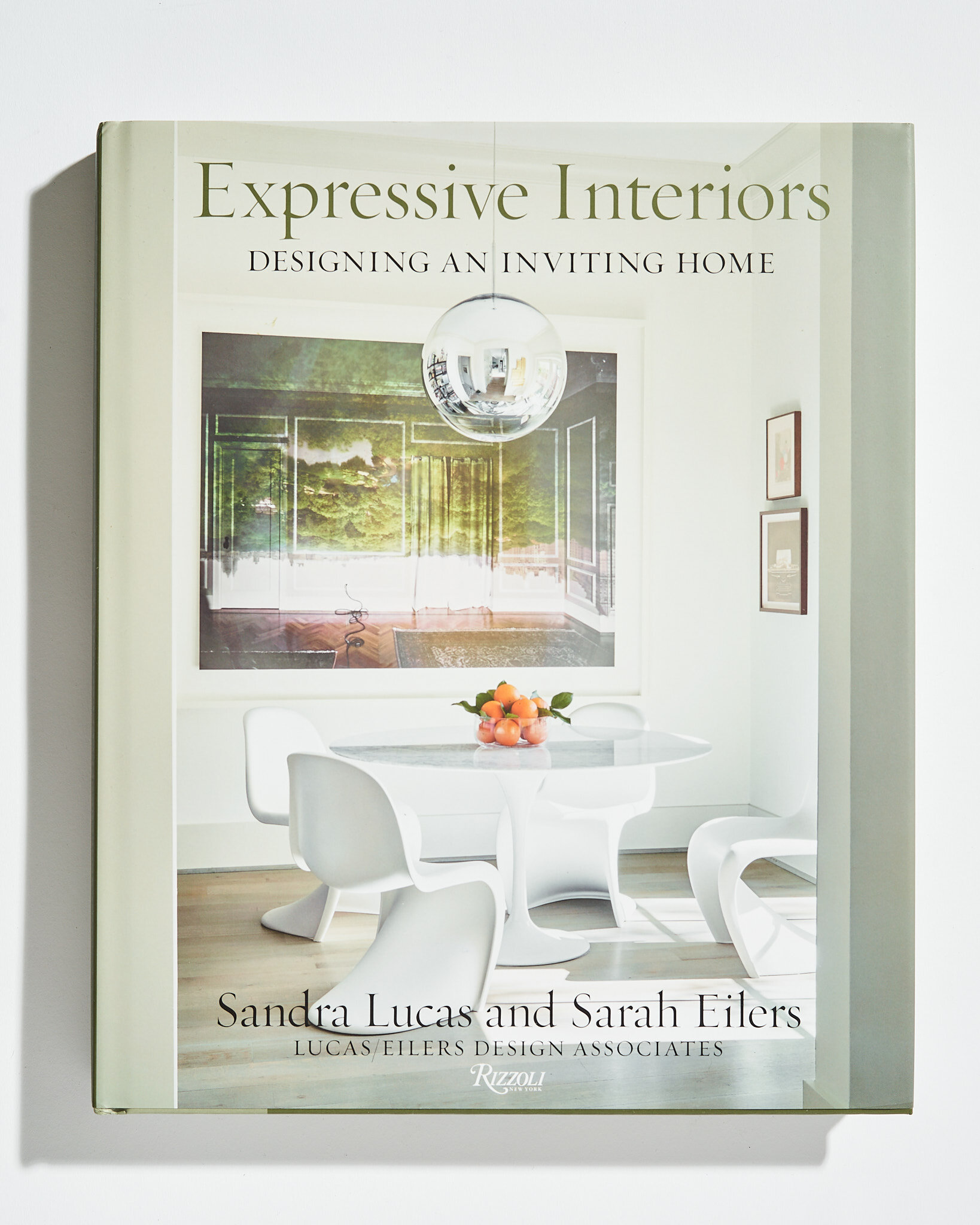
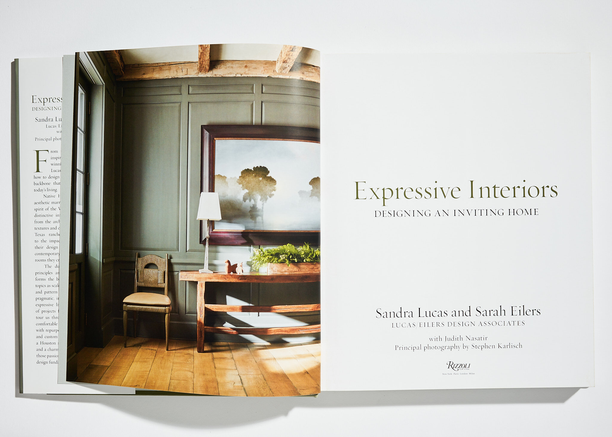
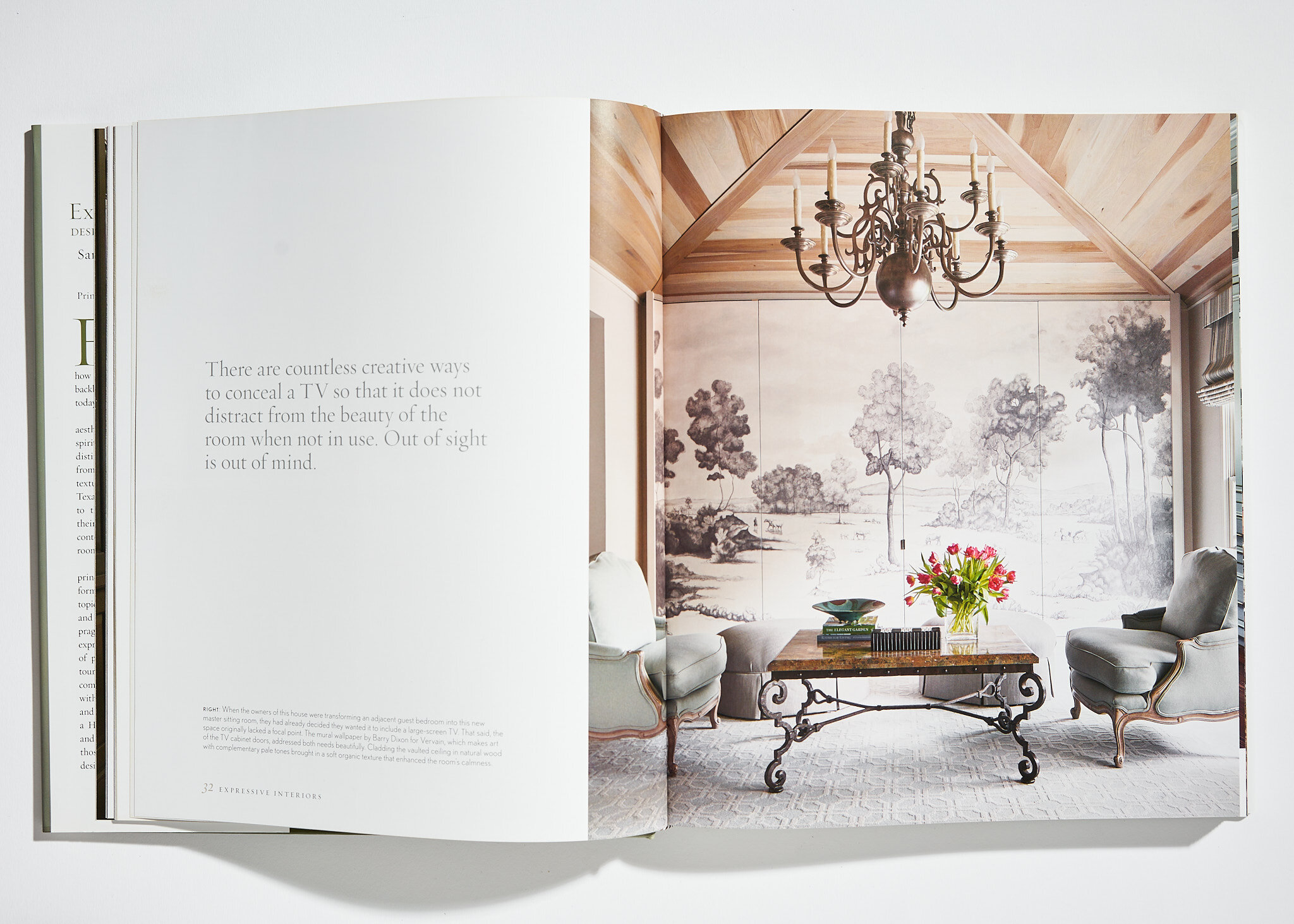
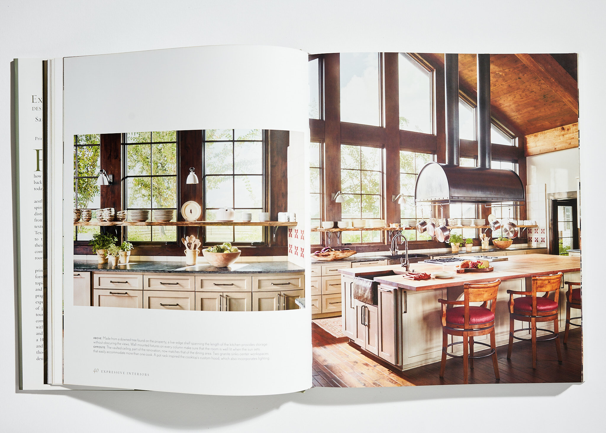
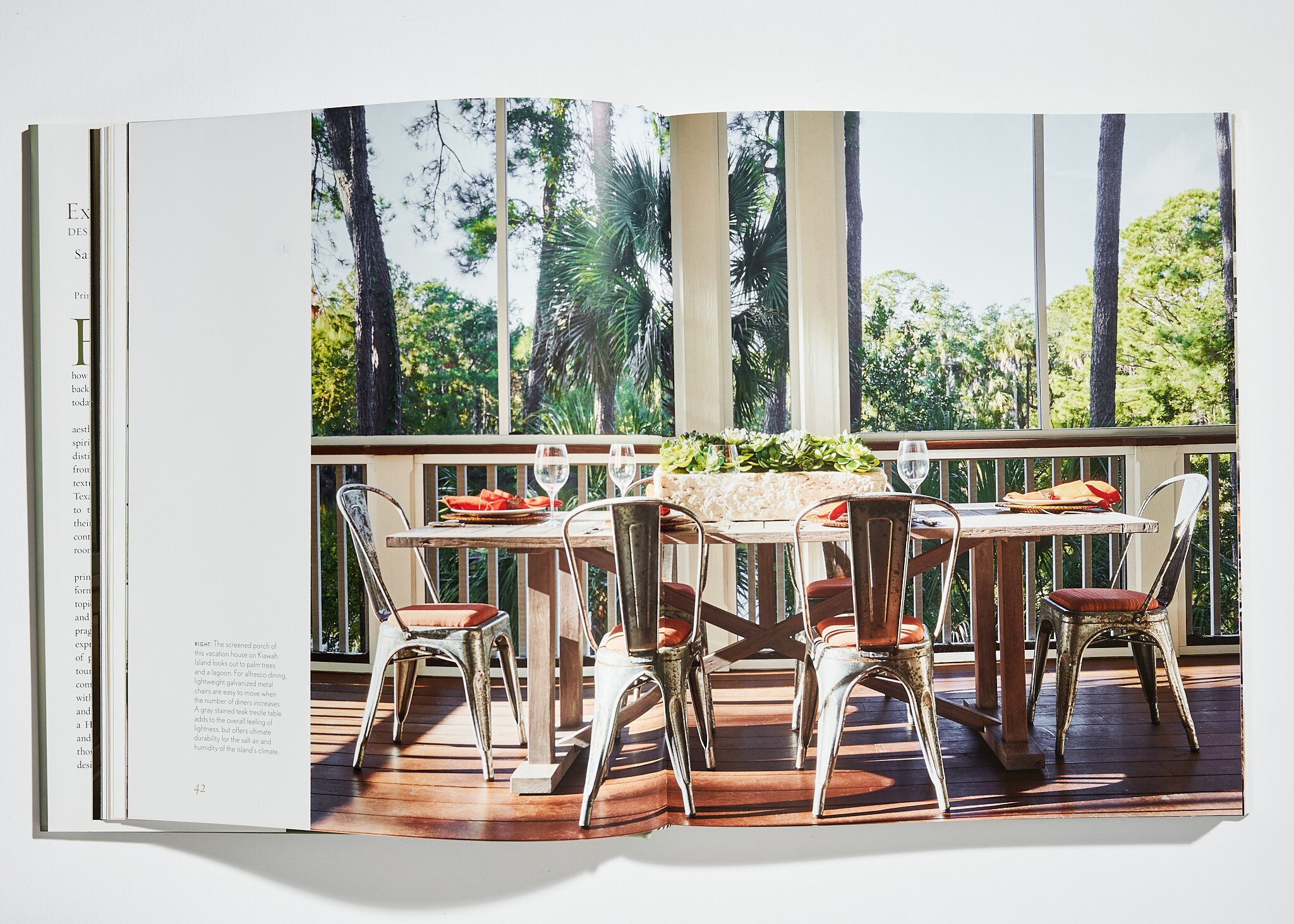
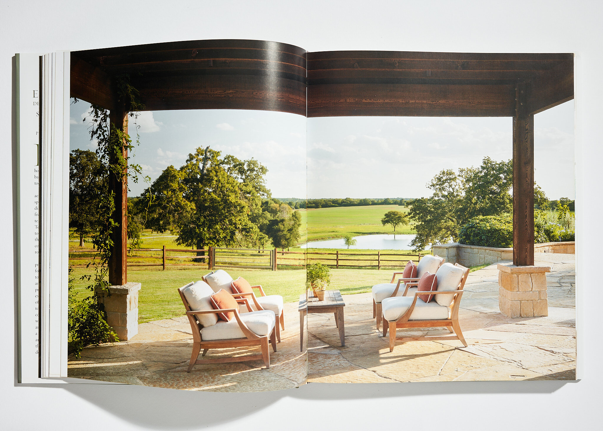
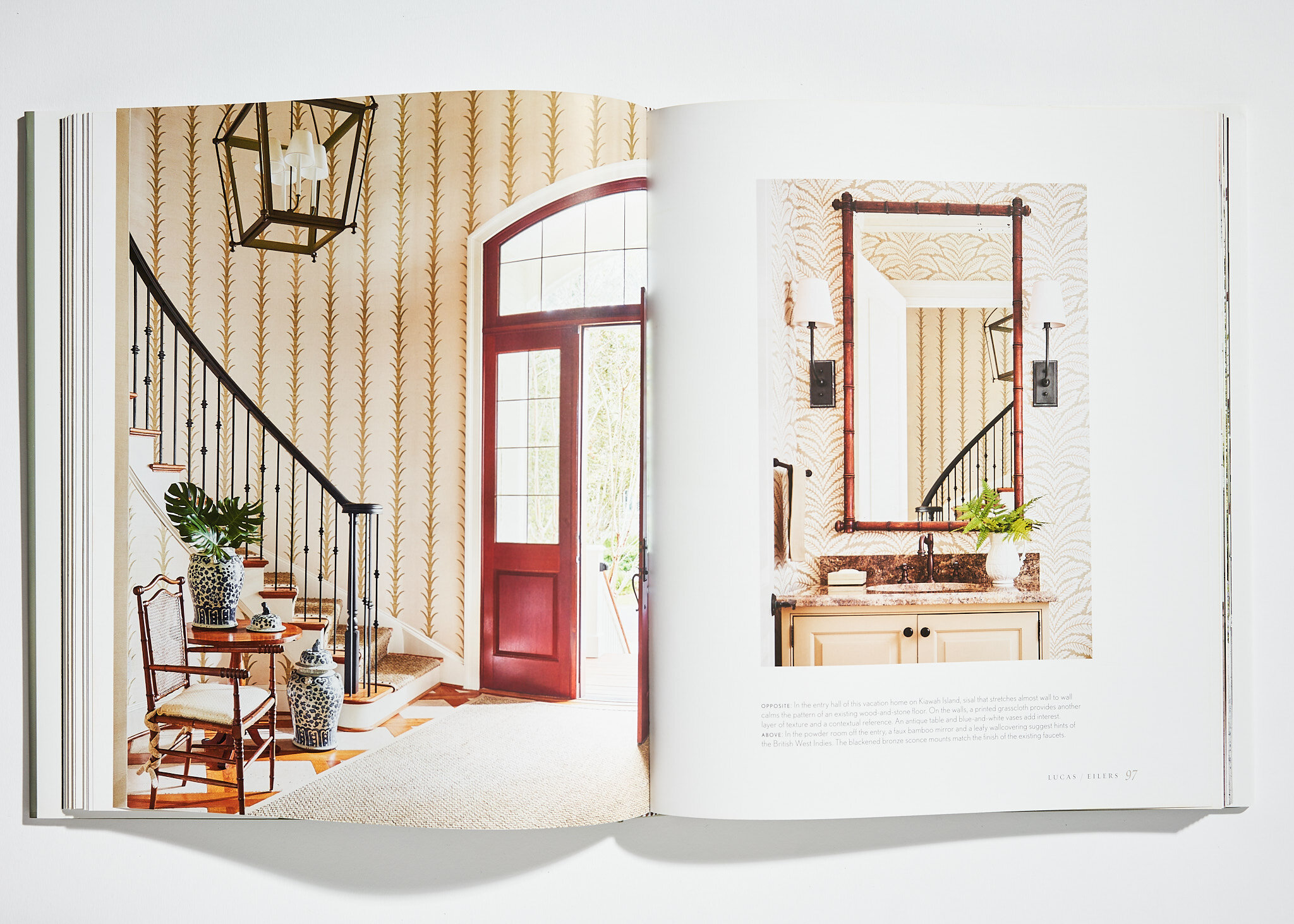
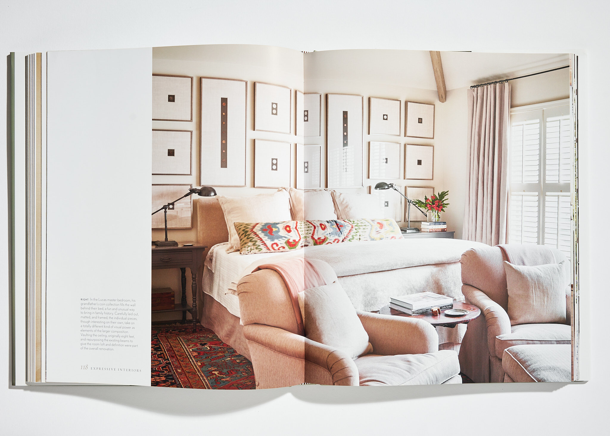
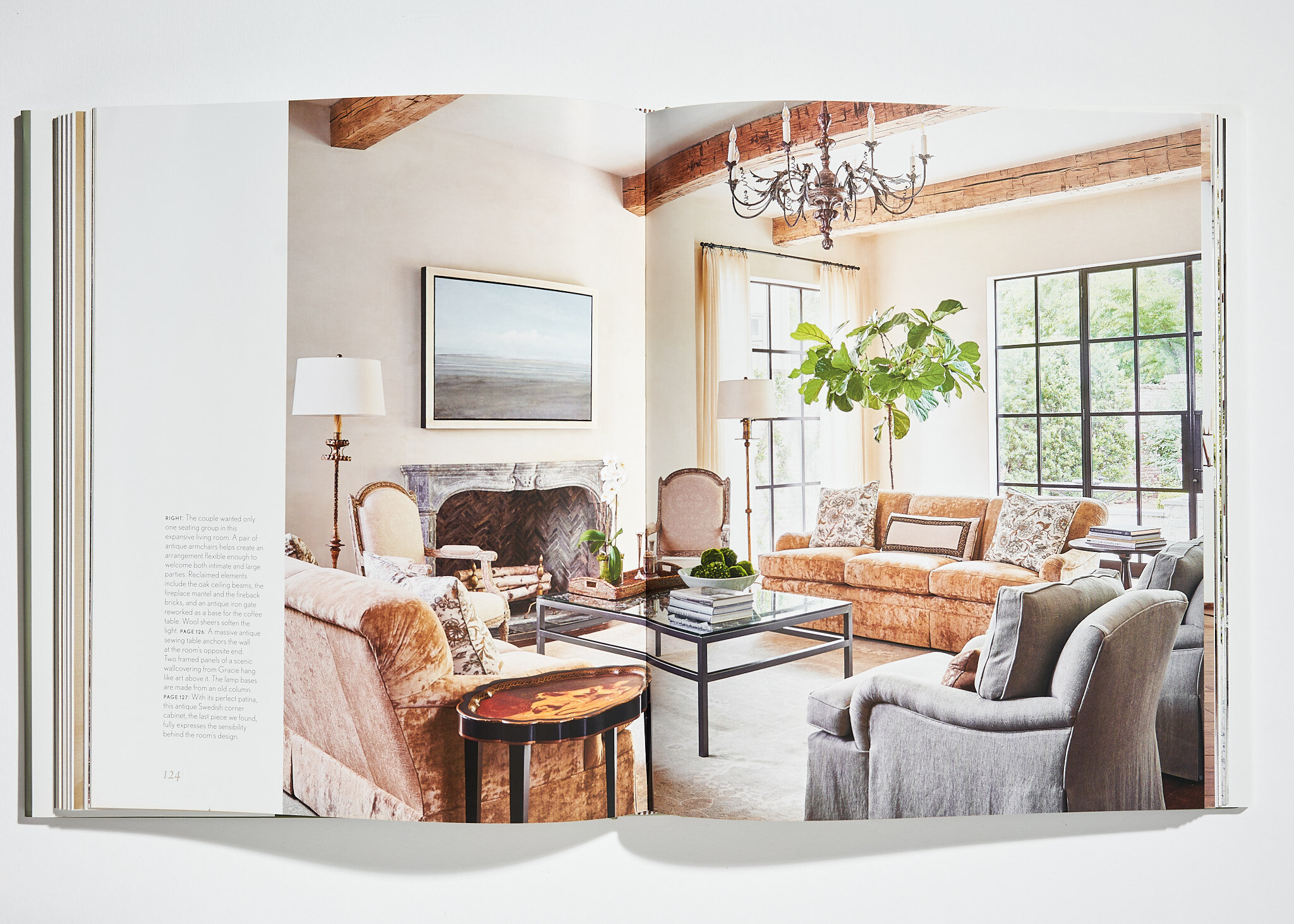
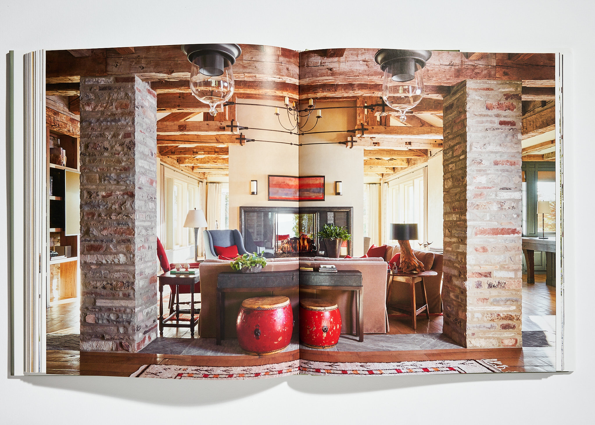
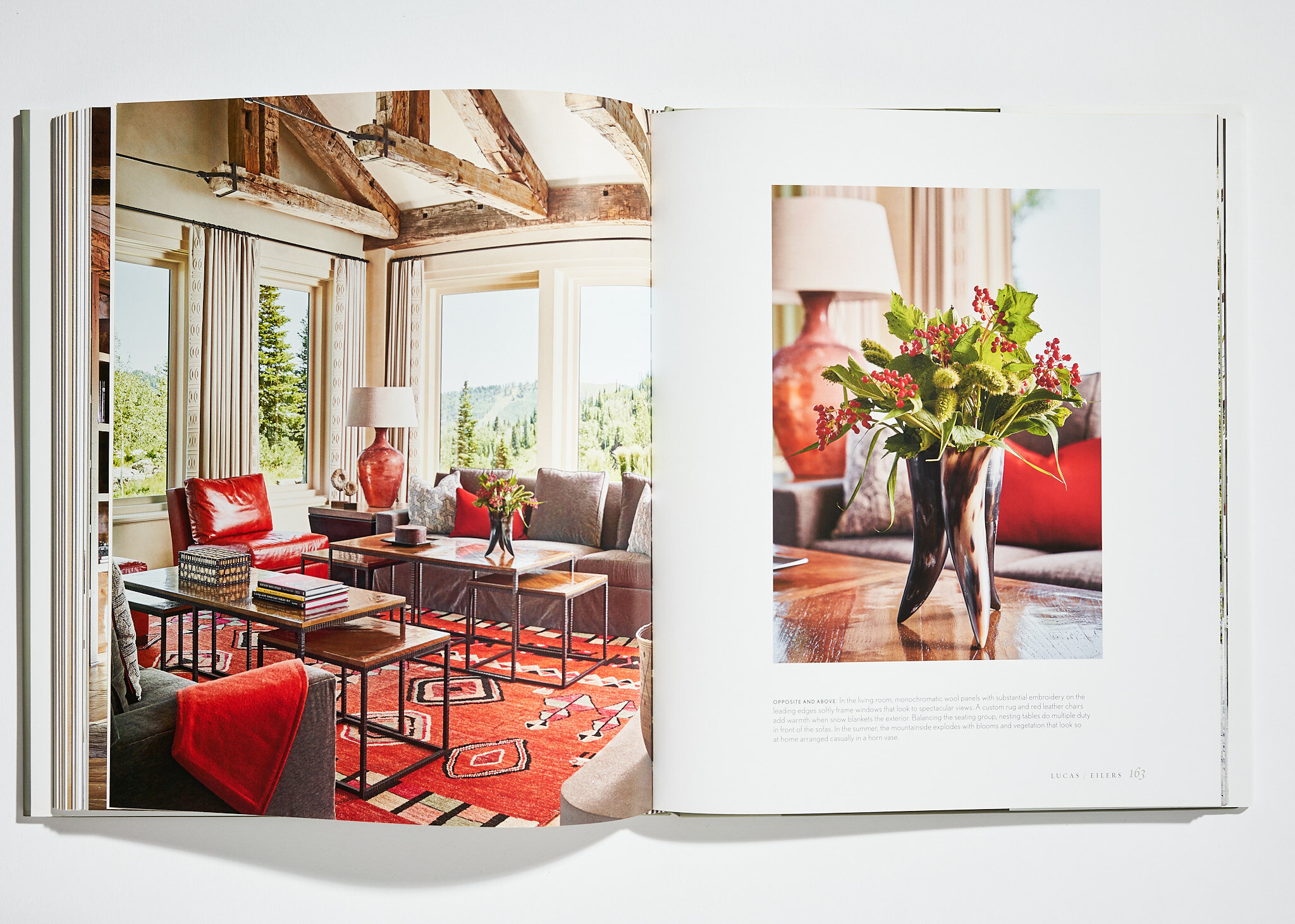
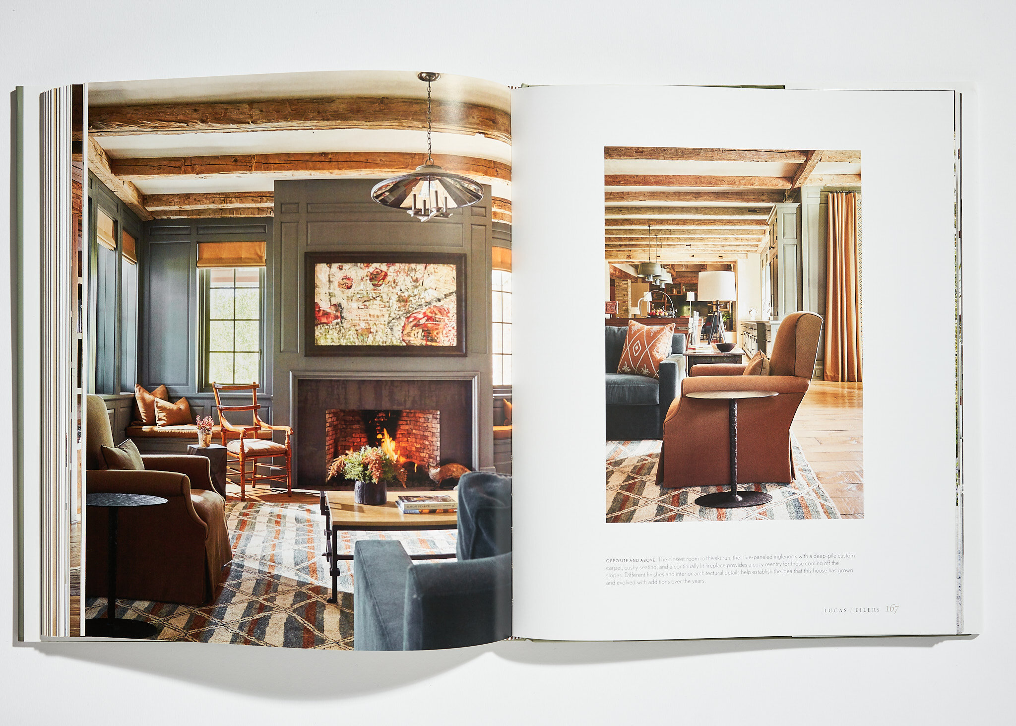
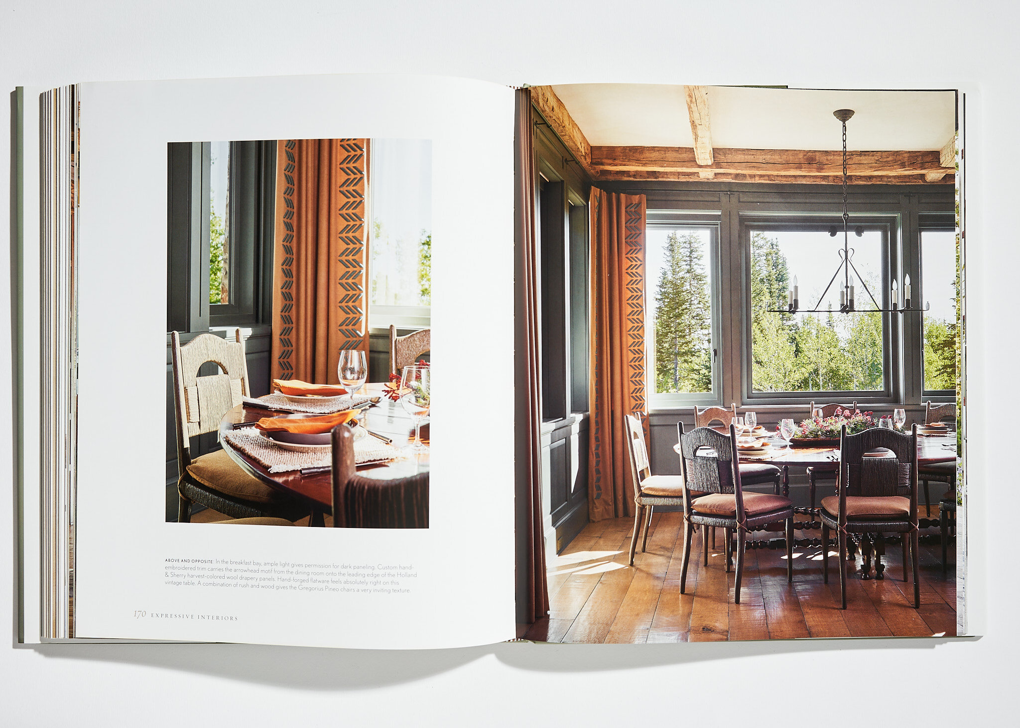
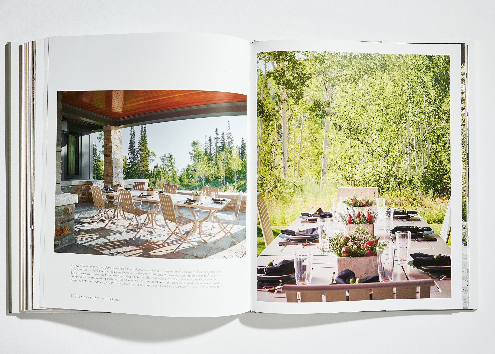
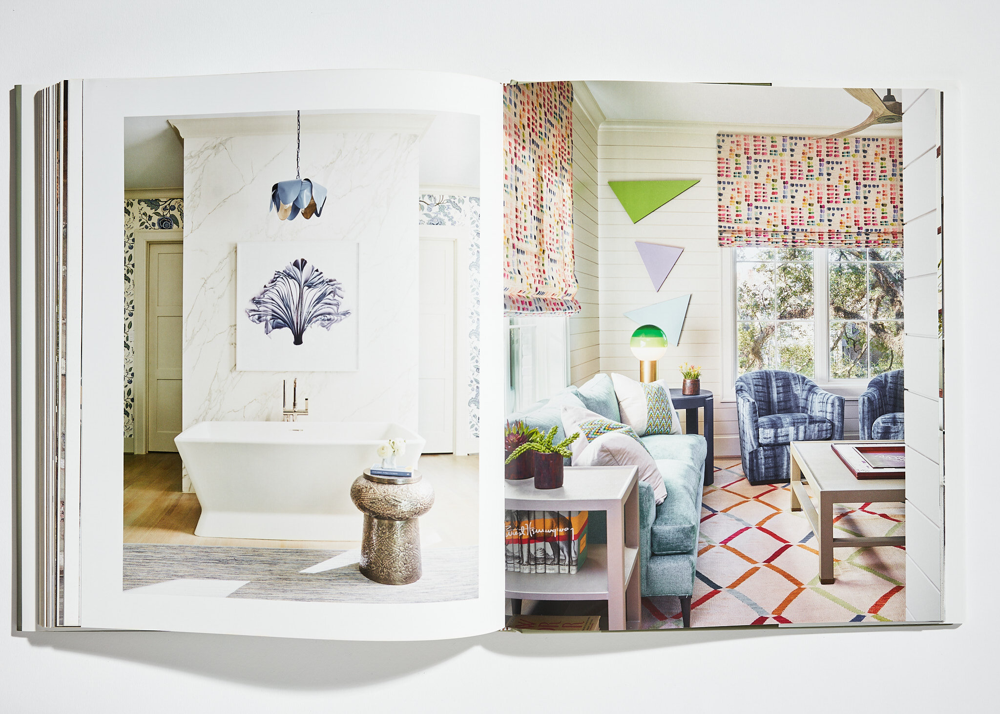
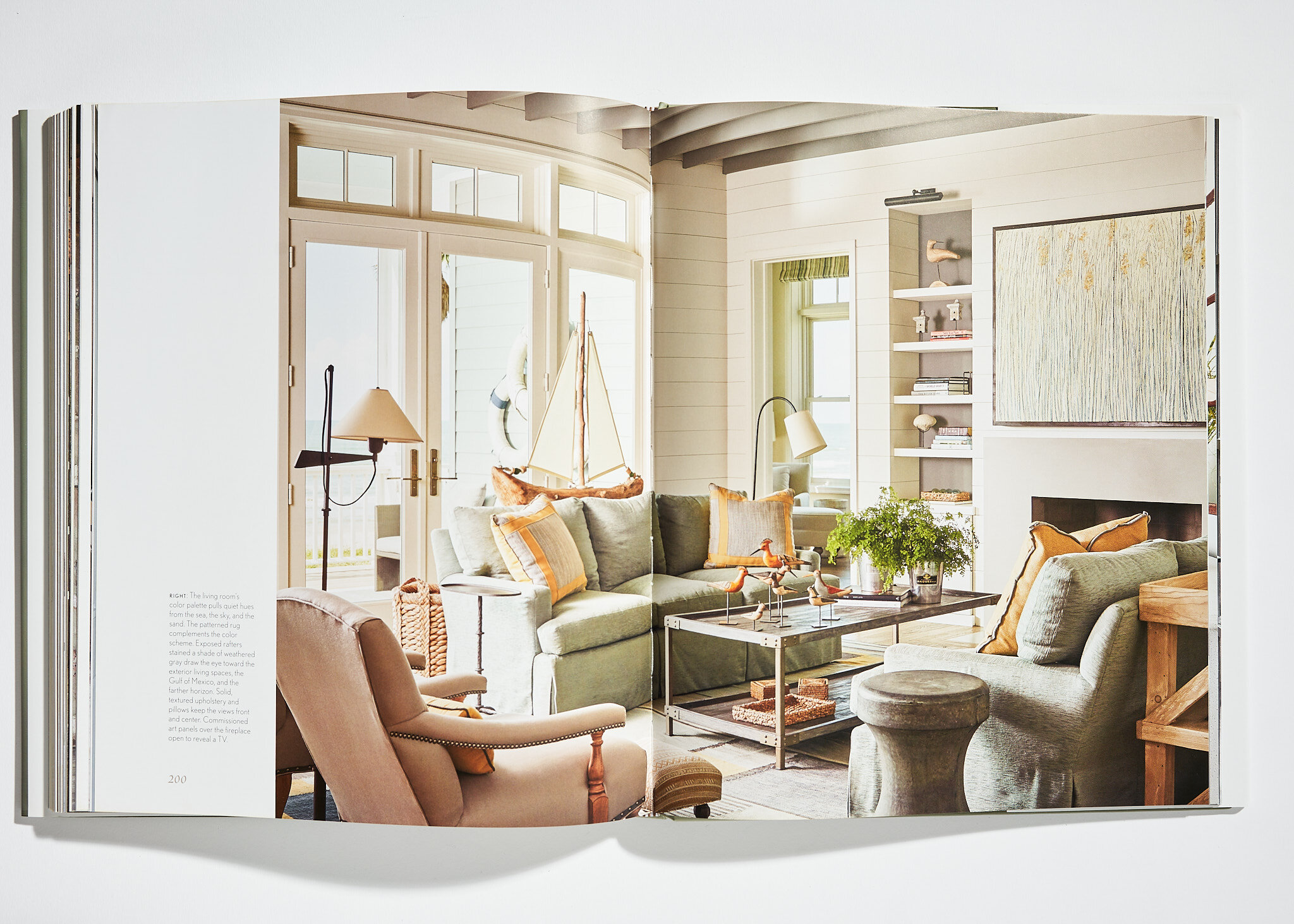
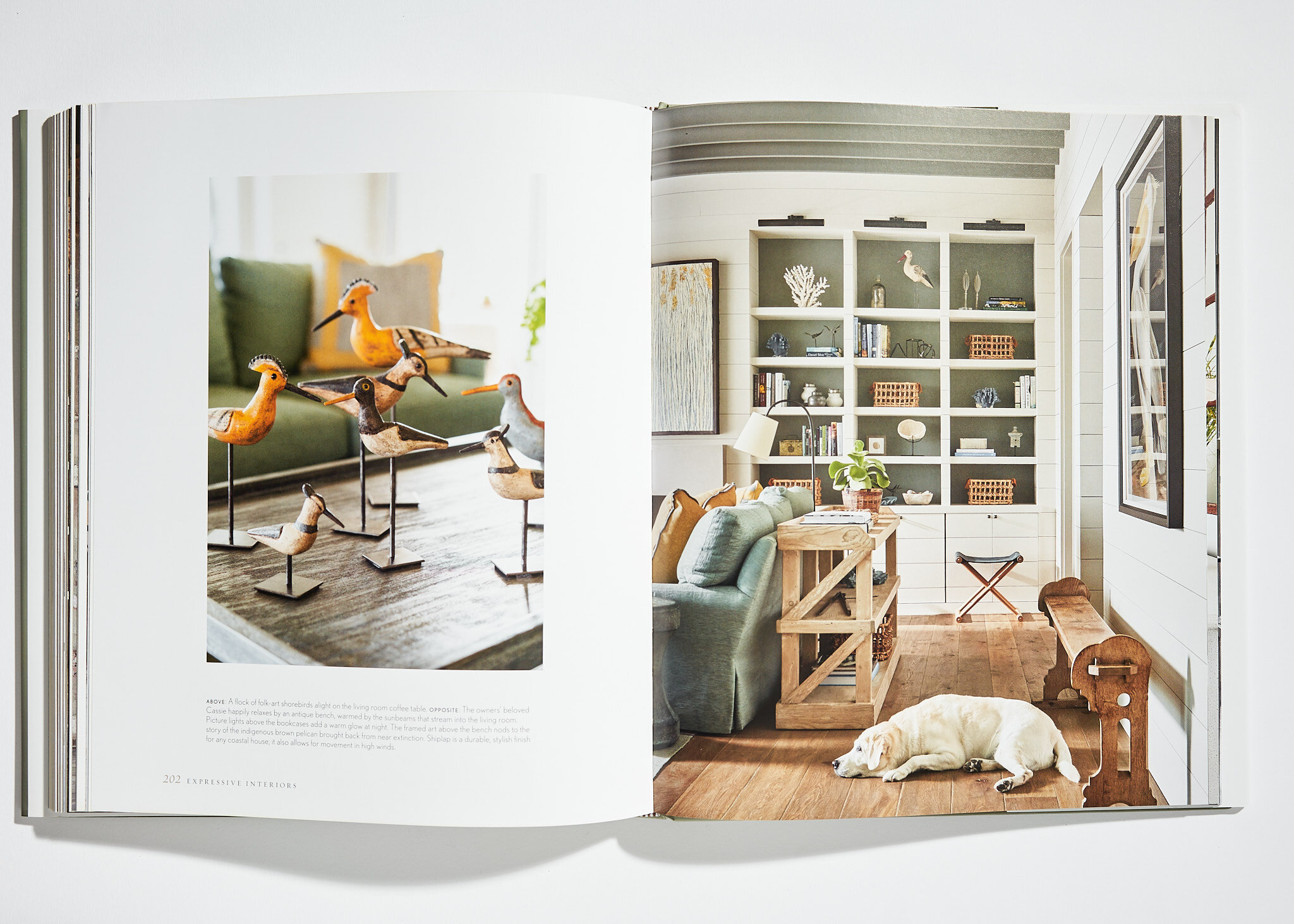
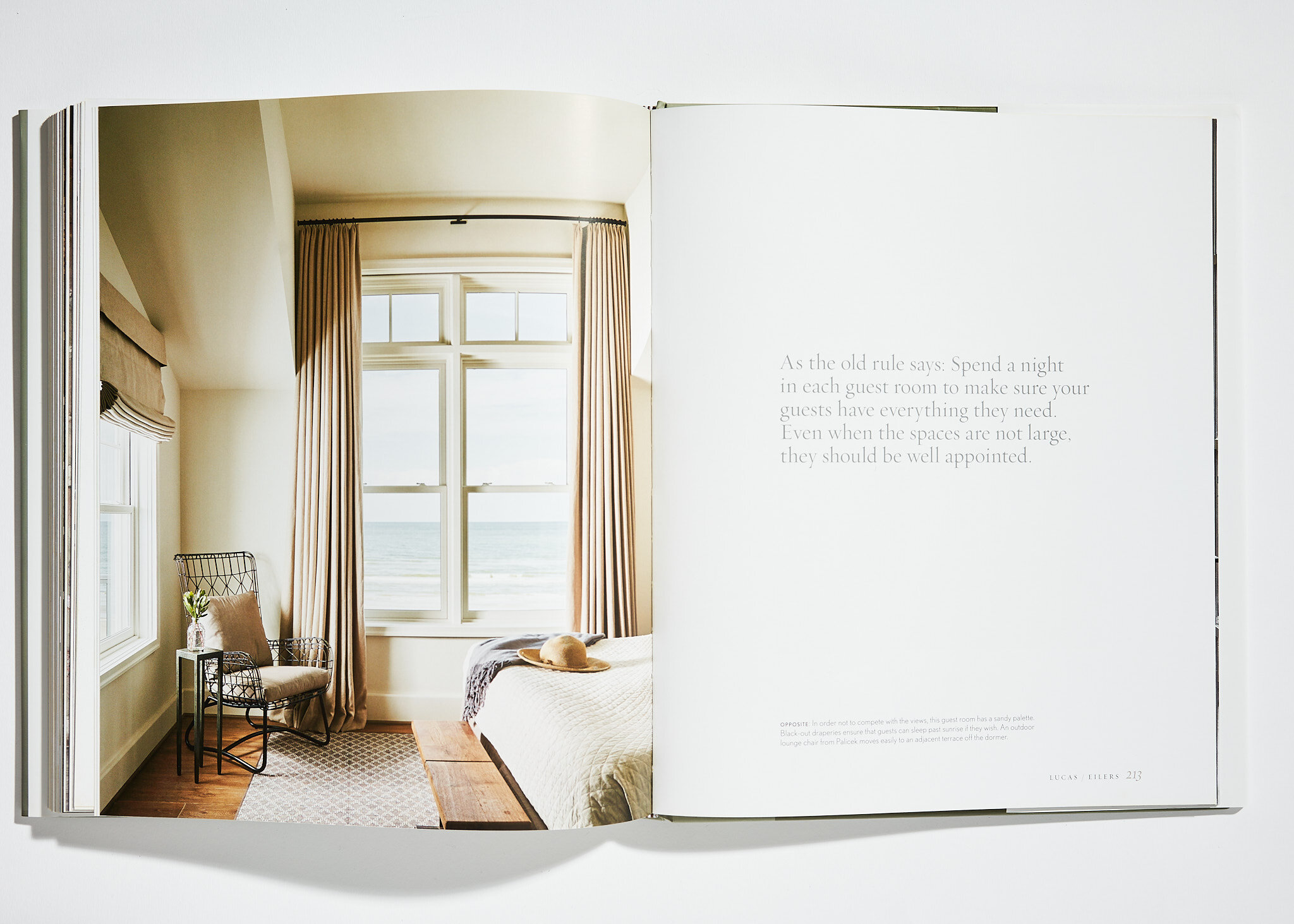
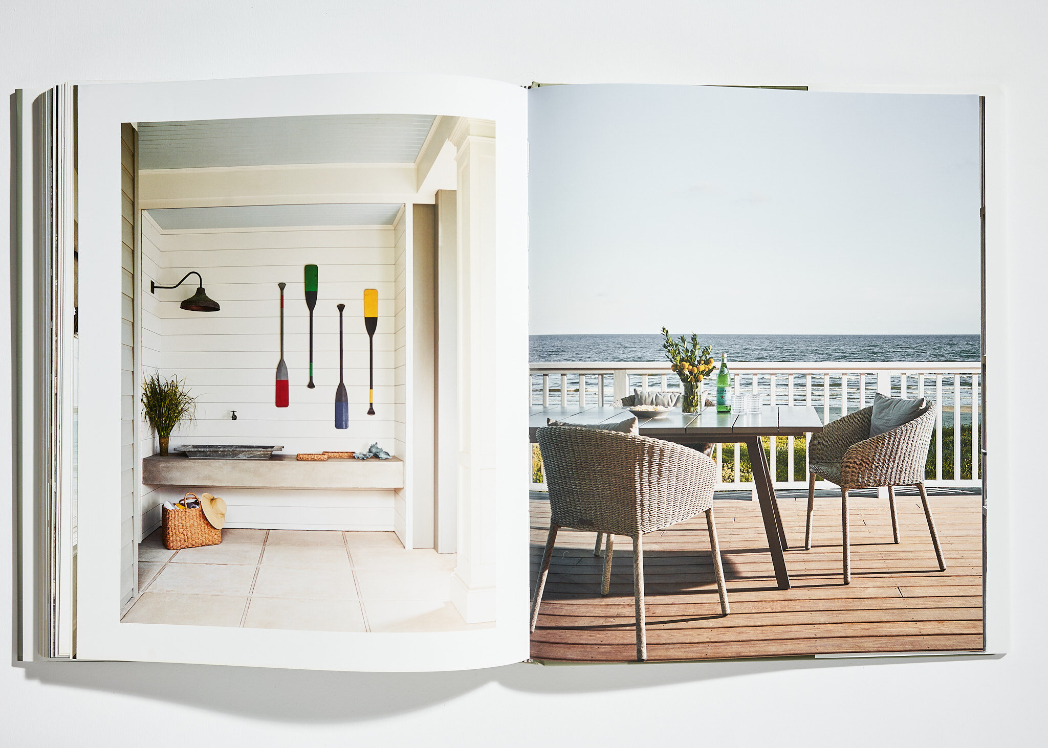
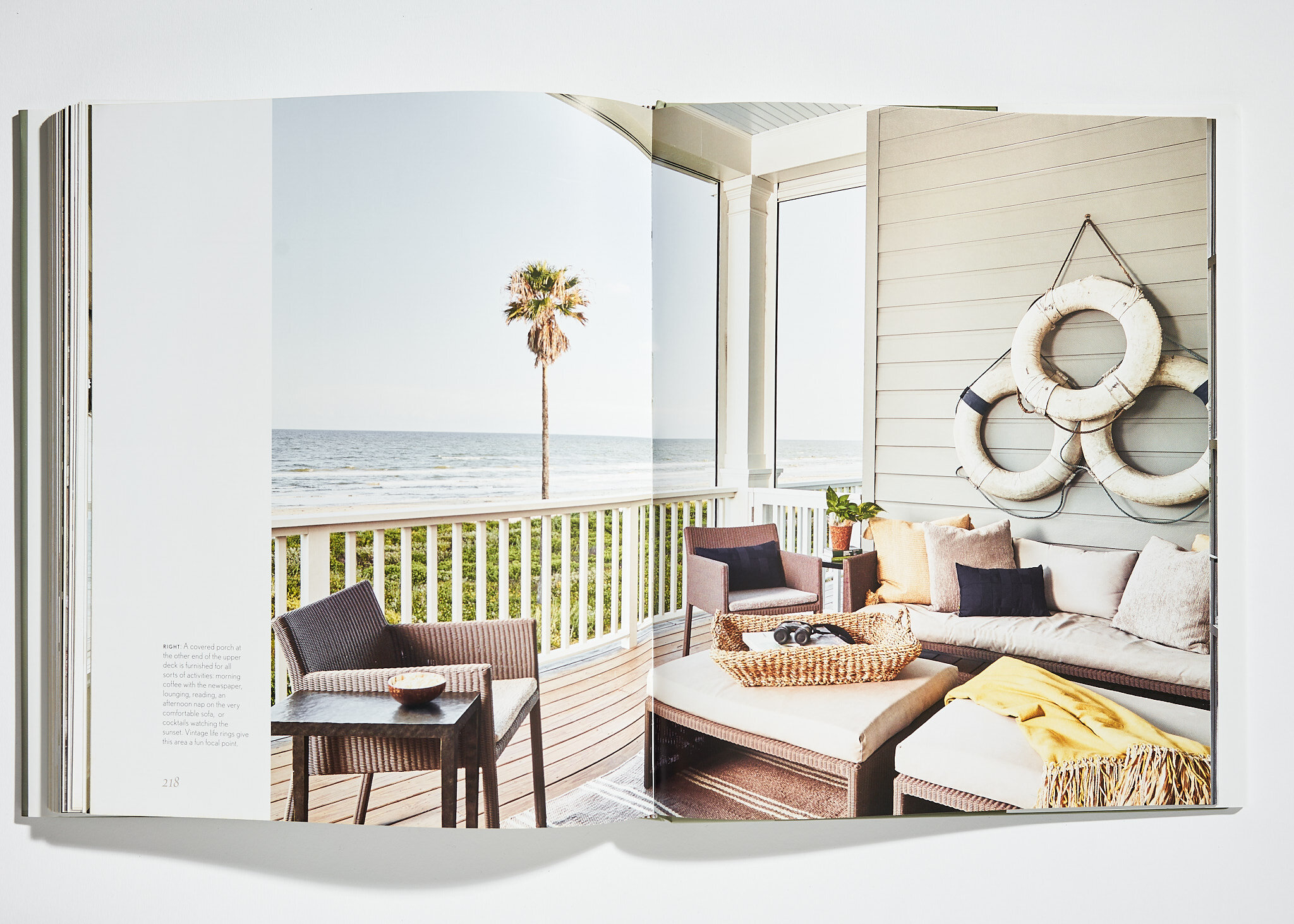
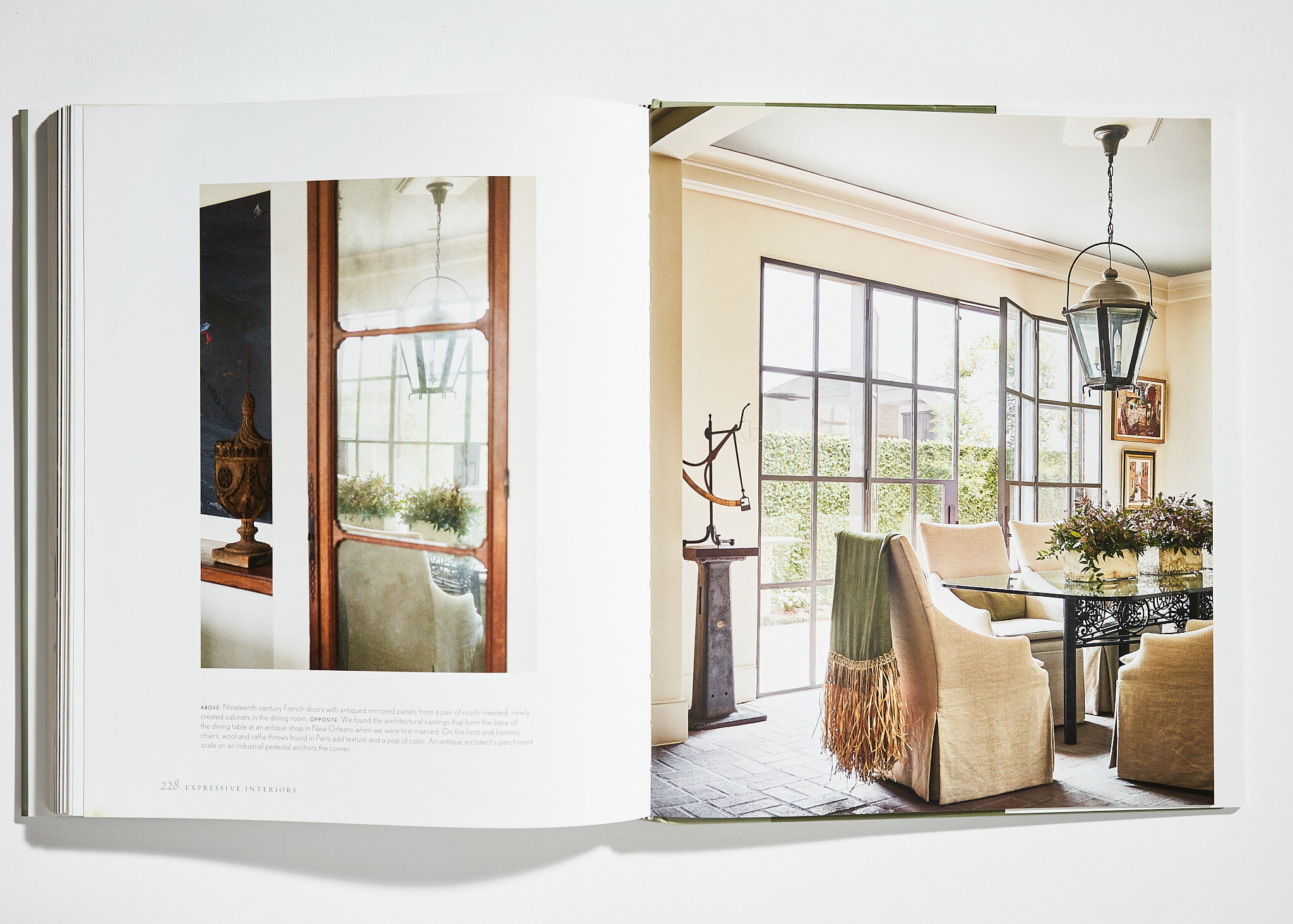
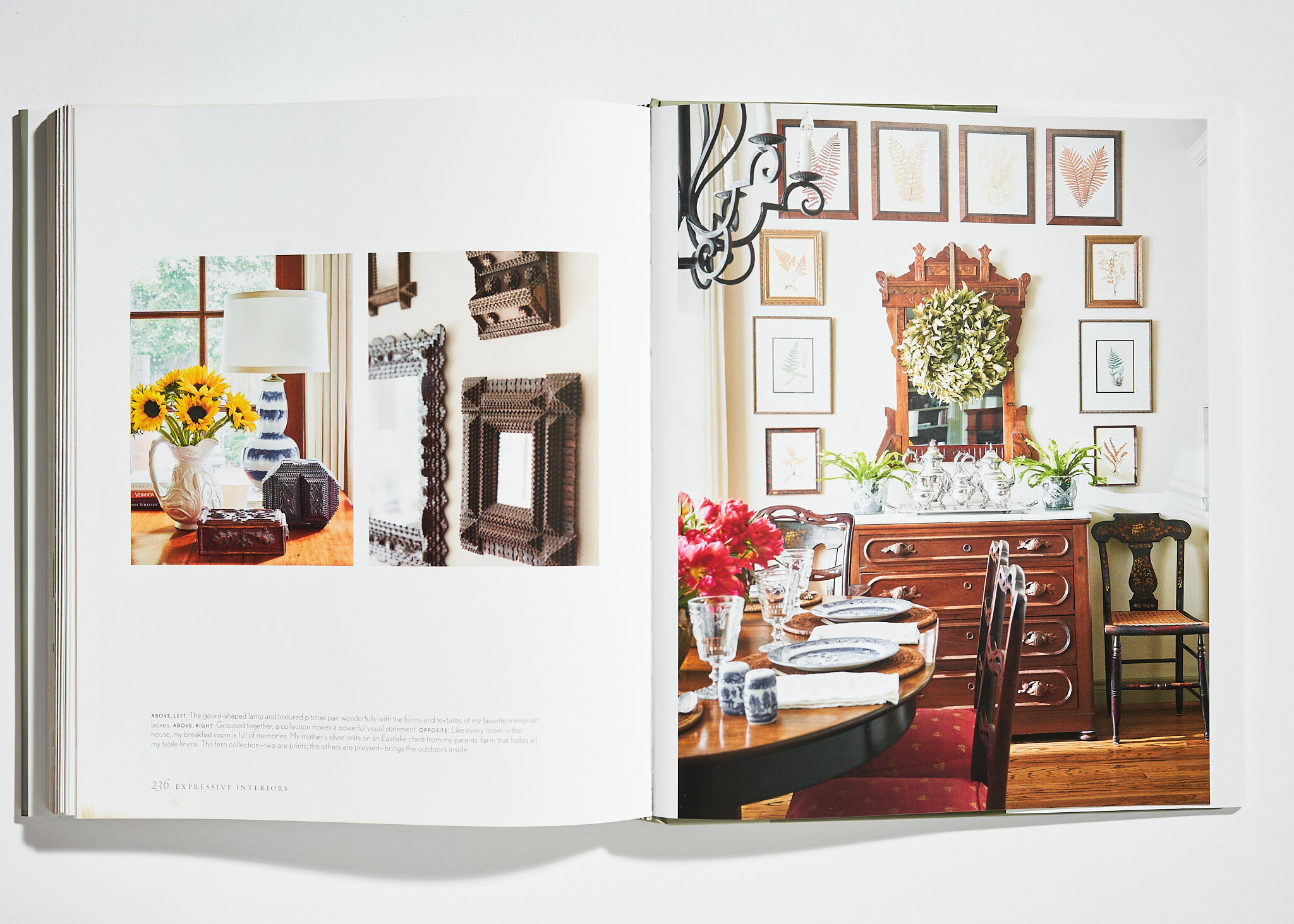
I was so excited to be a part of the Lucas Eilers book Expressive Interiors, published by Rizzoli. In 2019 going into 2020 I traveled with the designing duo of Sandy Lucas and Sarah Eilers to Charleston, Park City, Galveston plus the hill country, and their hometown of Houston to shoot projects specifically for this book. Because of my work with them and other designers, I am always now encouraging all designers I work with to understand how valuable and important it is to always think about how any shoot would look in a book format somewhere down the line.
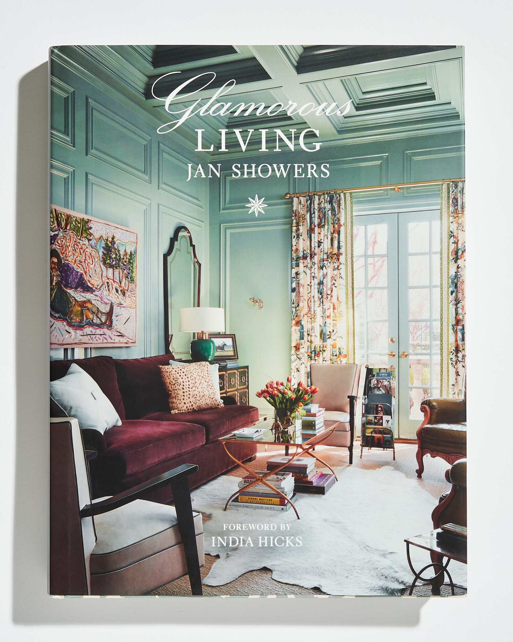
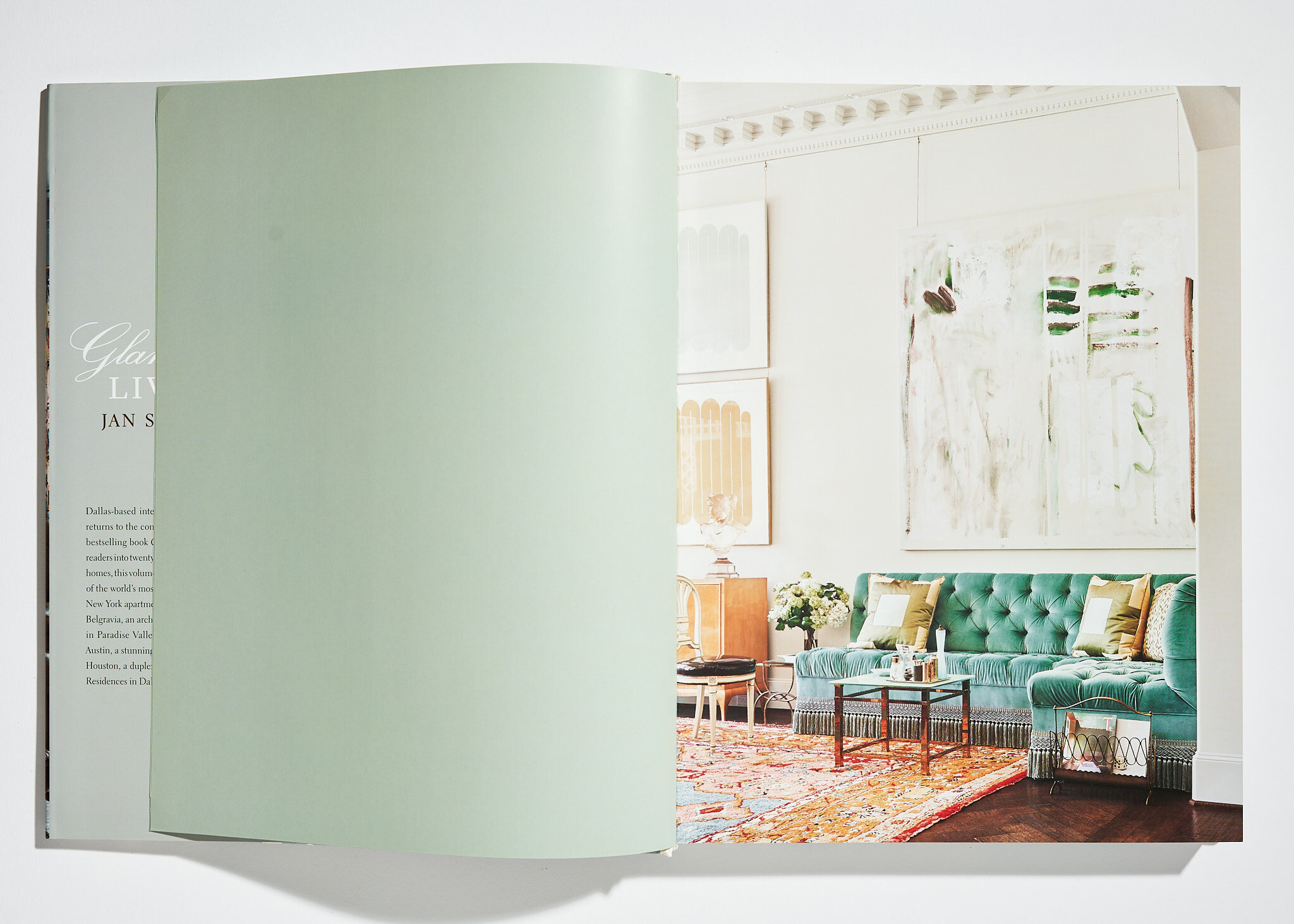
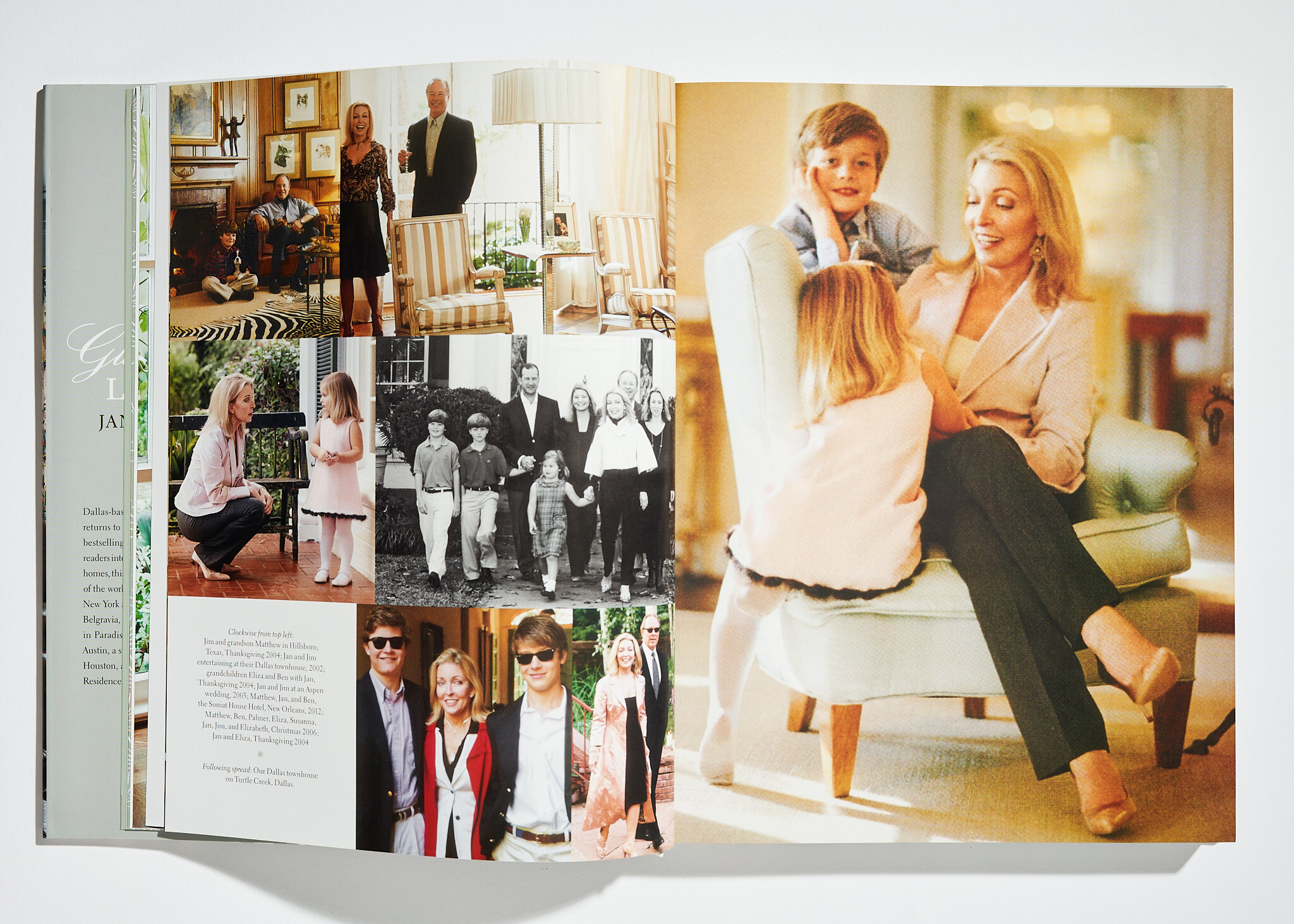
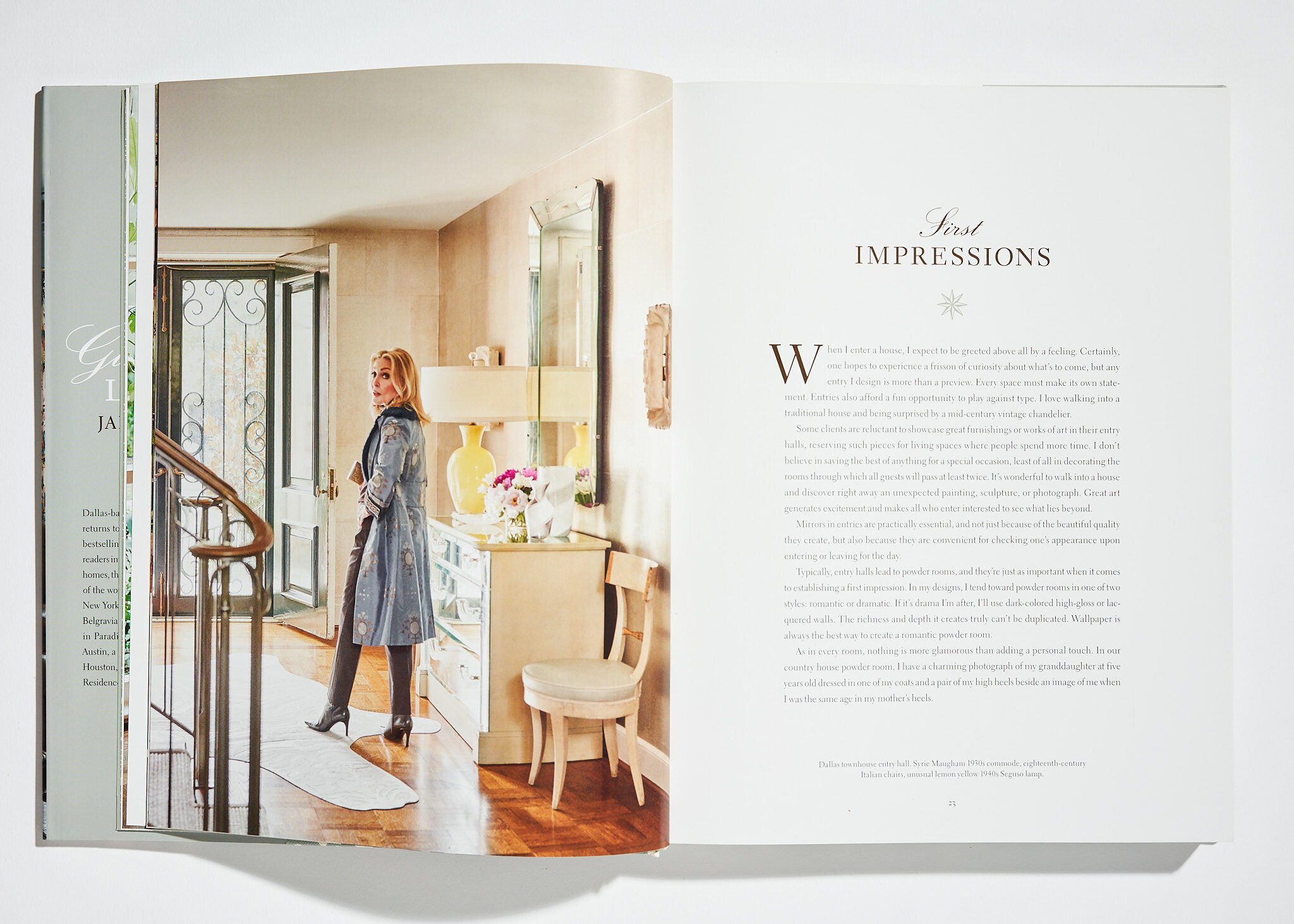
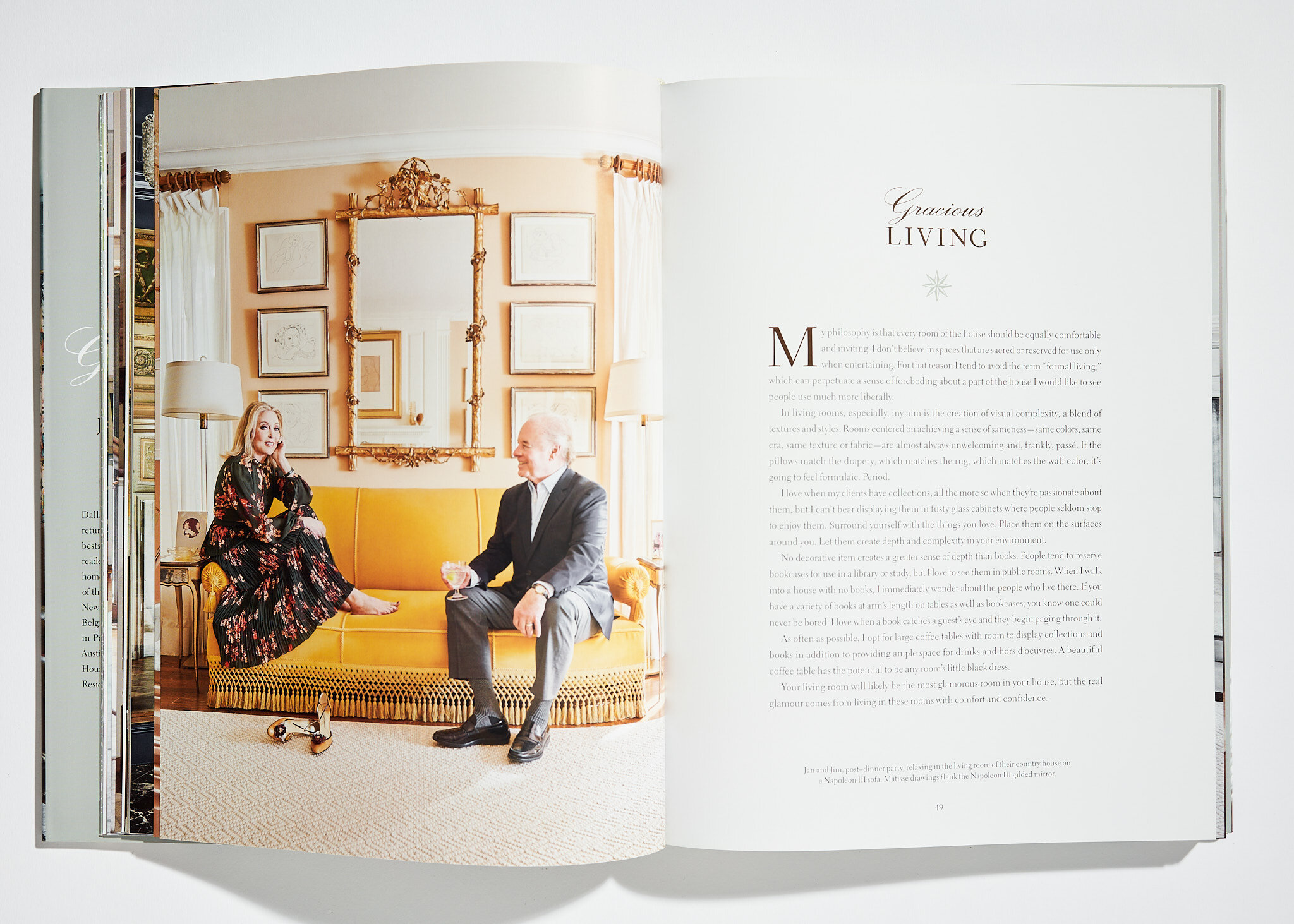
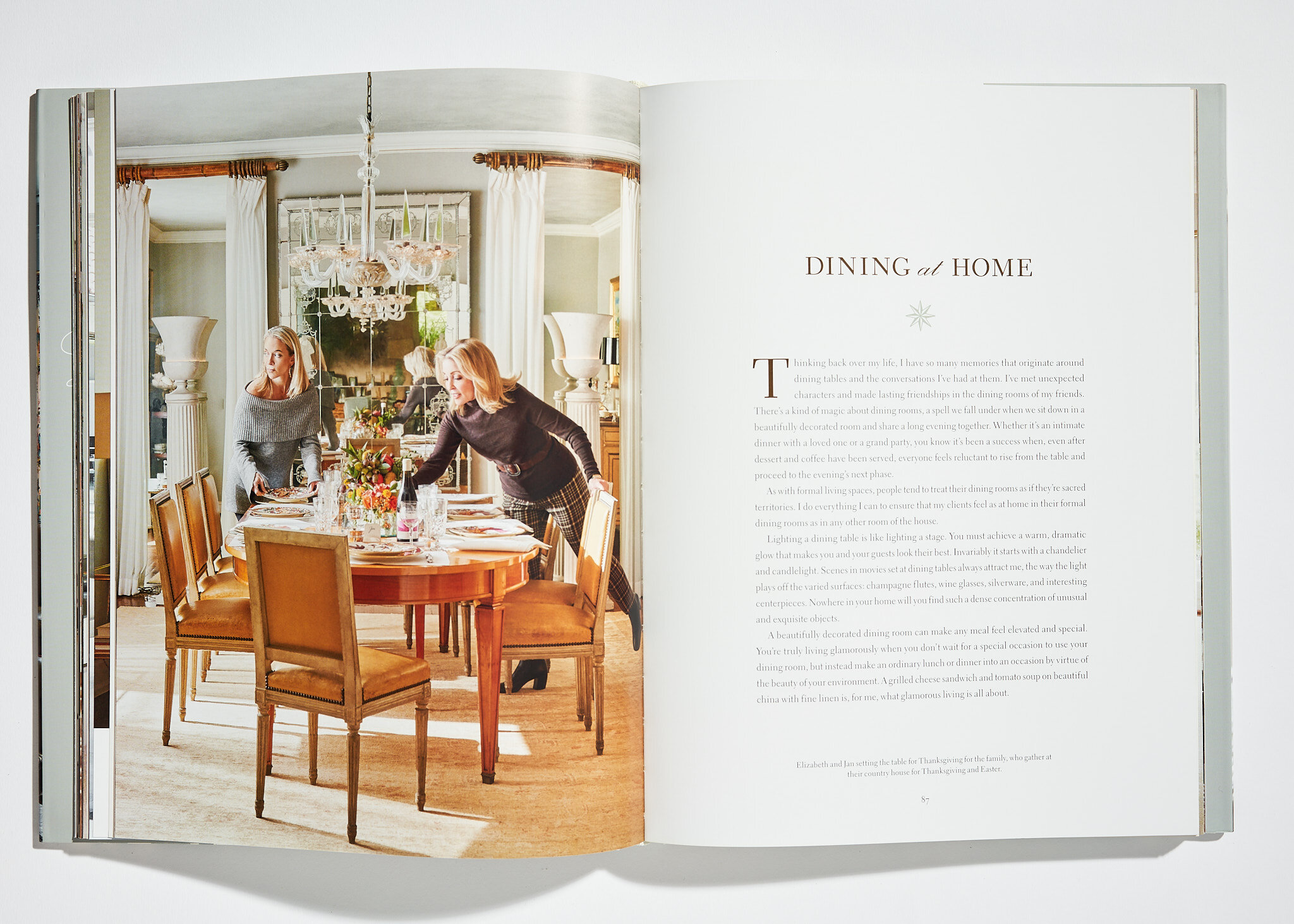
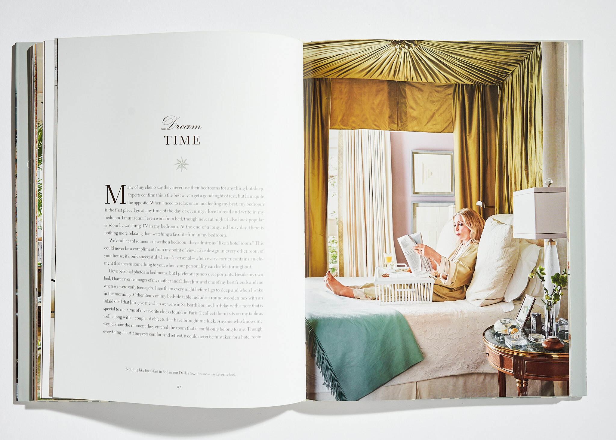
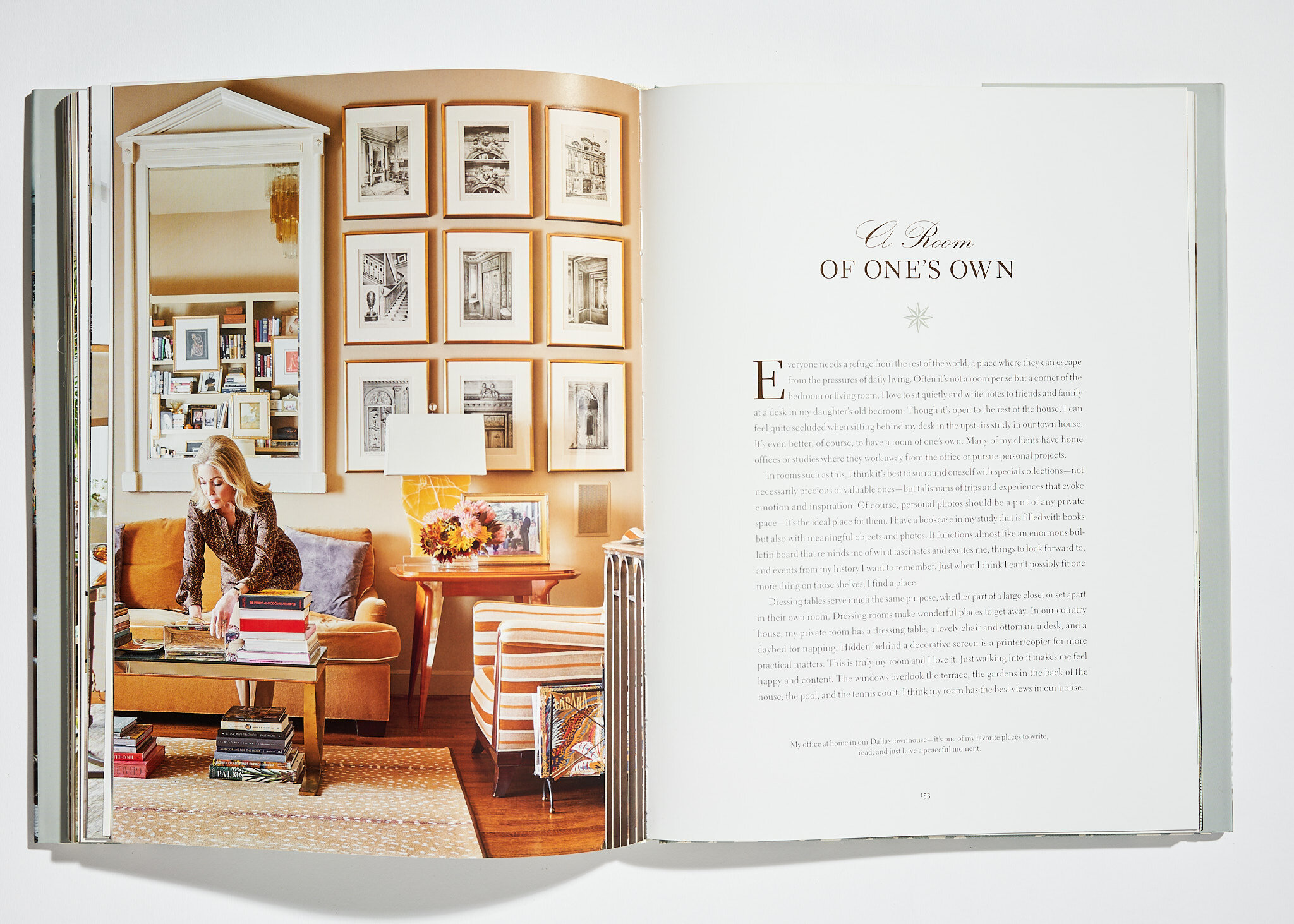
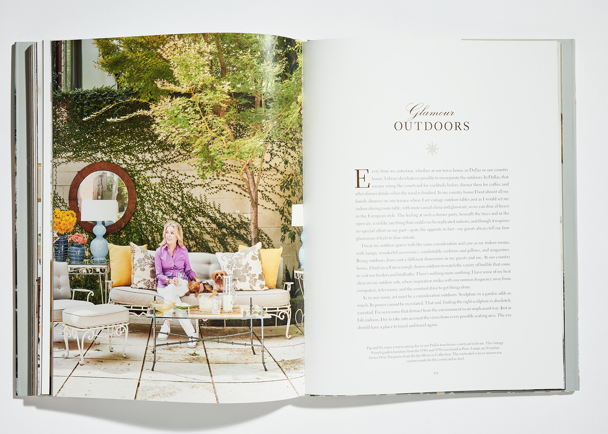
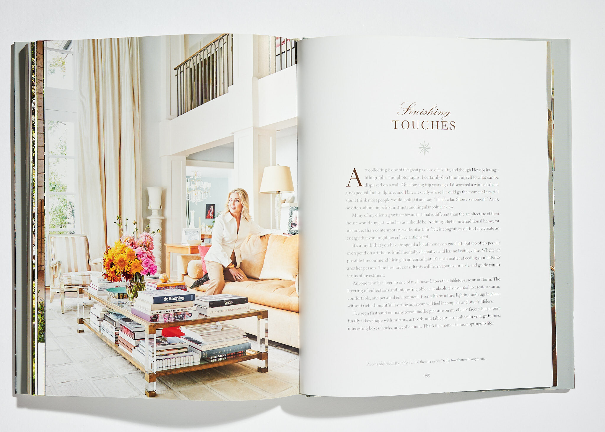
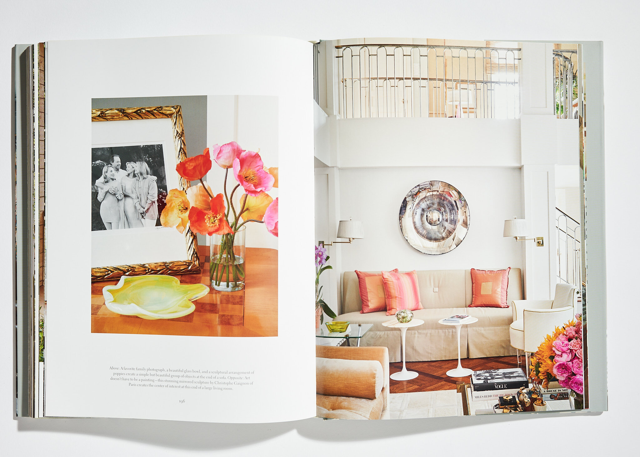
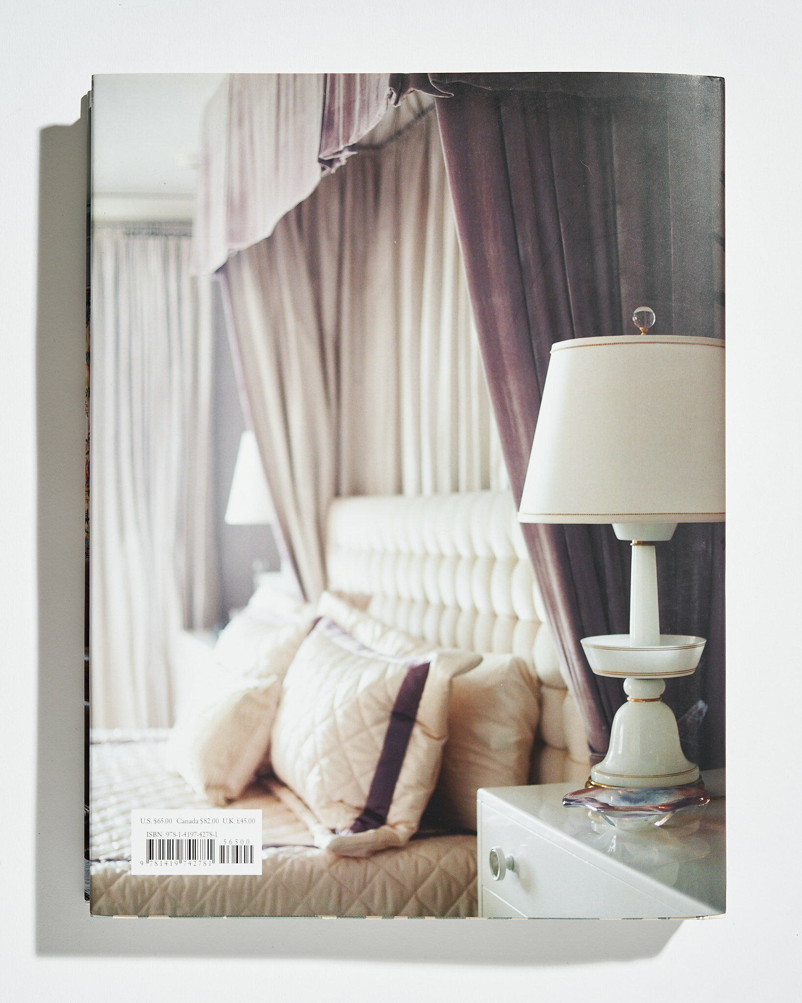
I have loved working with iconic designer Jan Showers over the past 20 years, so I was honored to be able to shoot for her again for her newest book Glamorous Living, published by Abrams in the fall. We worked with Jan a few years ago on her book Glamorous Rooms and a few months ago at the Kips Bay Showhouse in Dallas. She’s an incredible and gracious designer and we’re lucky to be able to collaborate with her.
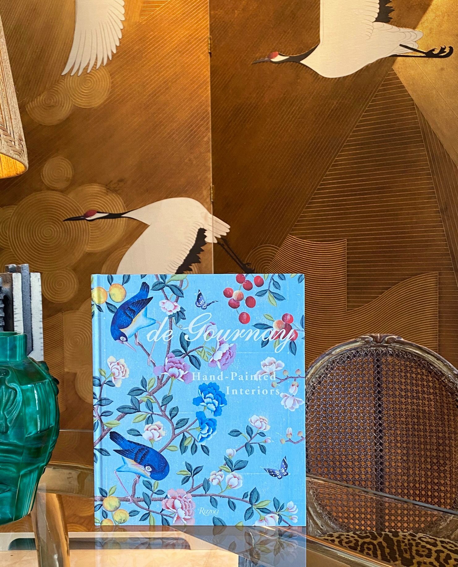
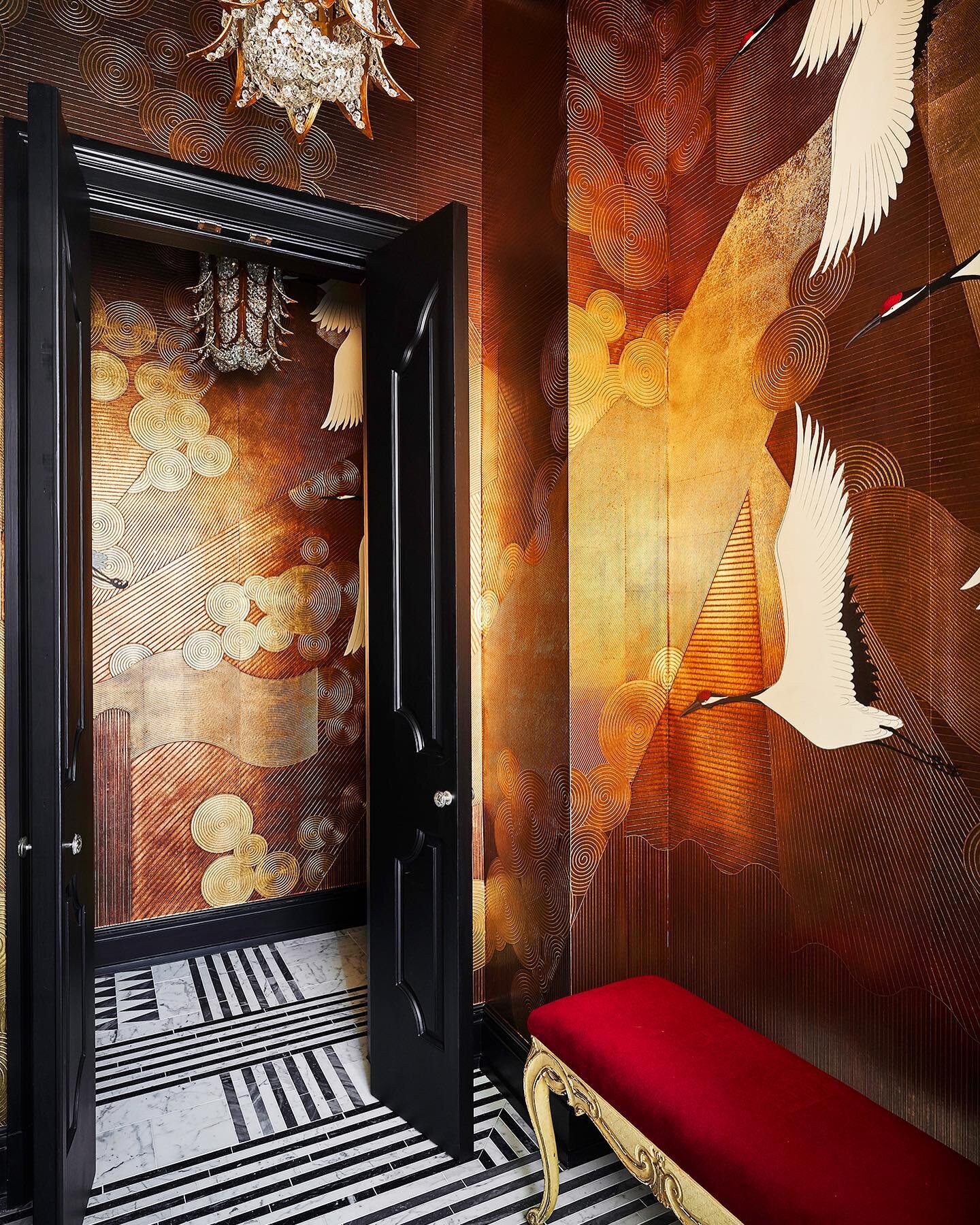
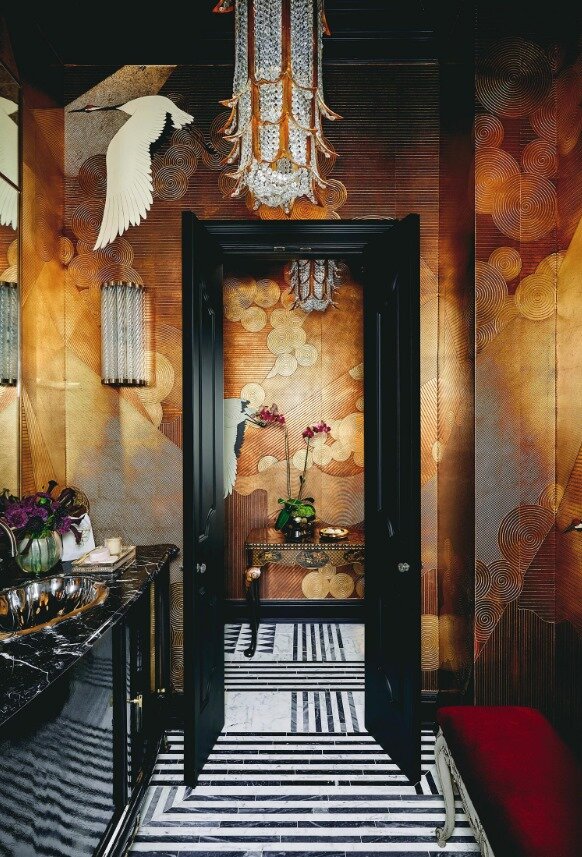
As if that wasn’t enough book love, I also had a photograph featured from the designer Robert Passal shoot in the gorgeous new book de Gournay: Hand-Painted Interiors. It’s a gorgeous celebration of the company’s historic and modern collections of wallpaper, fabric, and porcelain.
COVERS + EDITORIAL
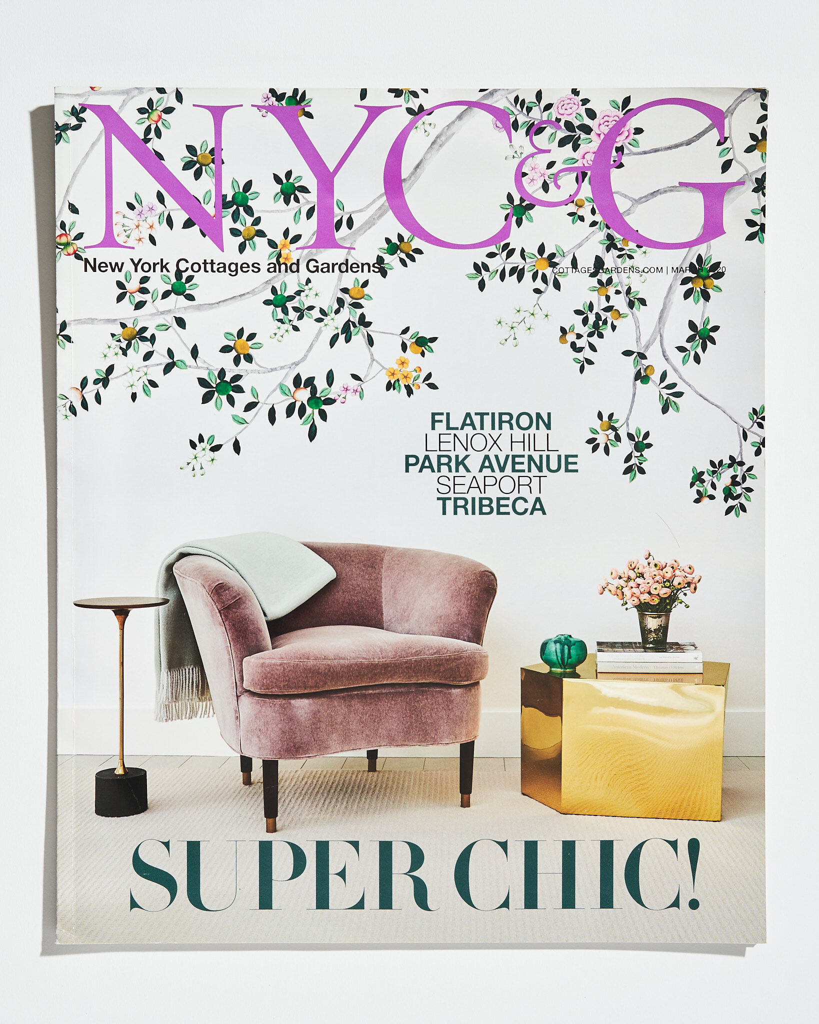
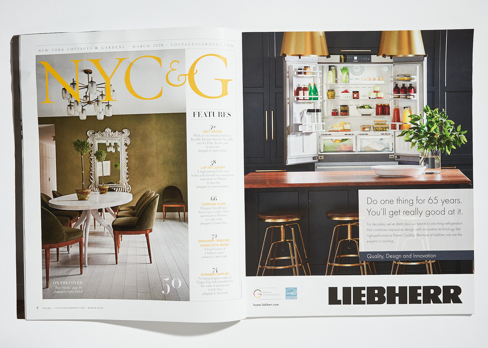
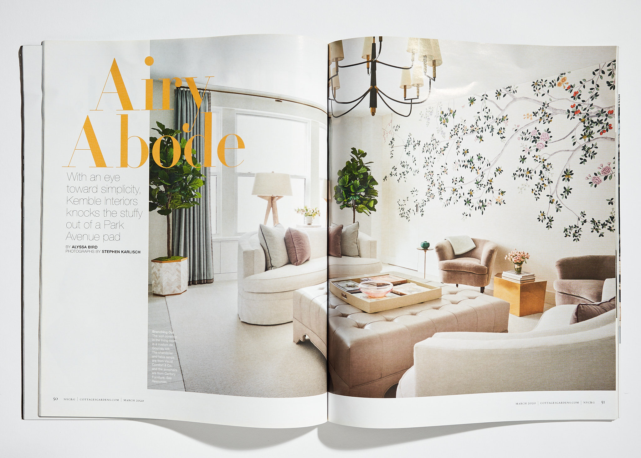
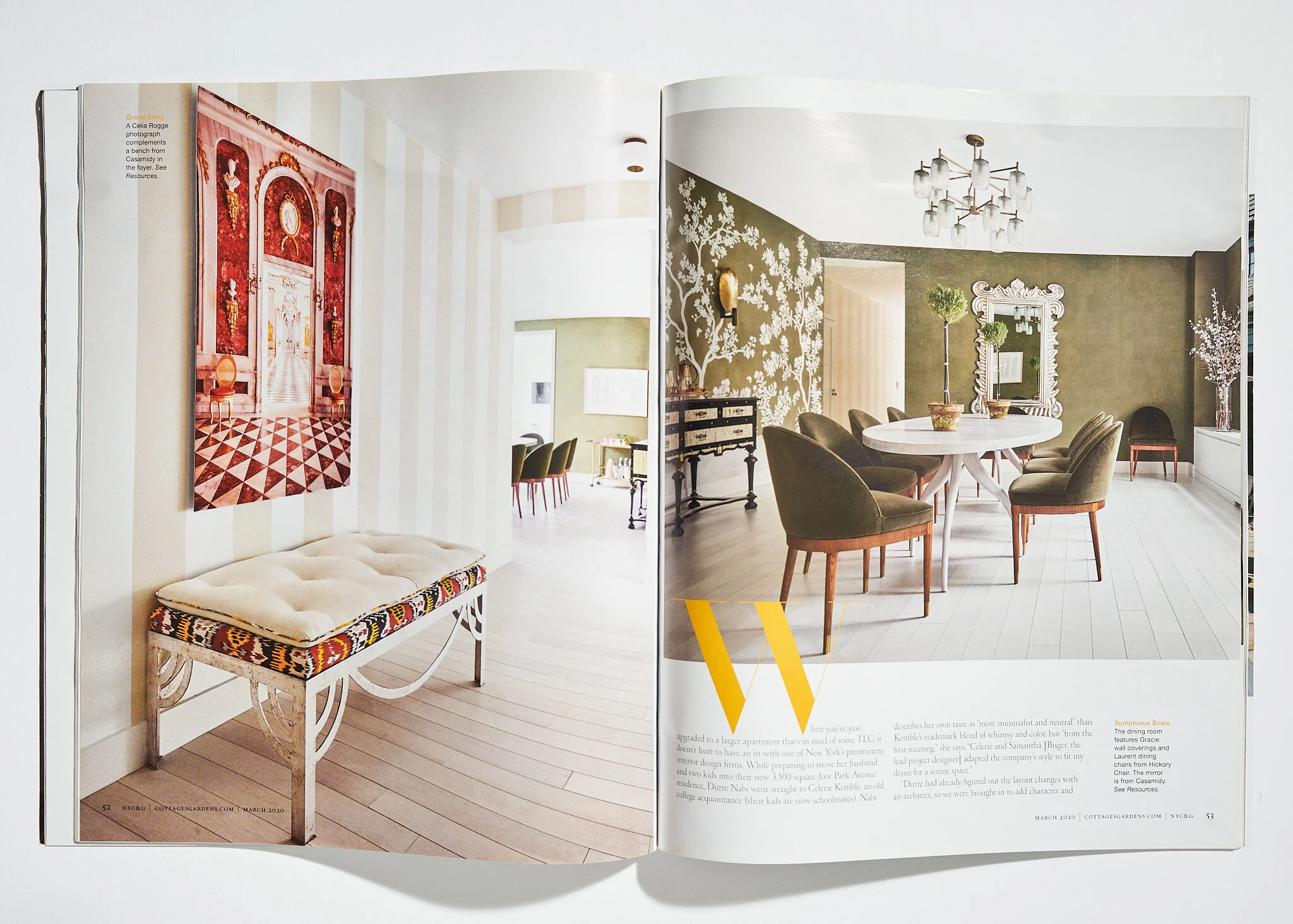
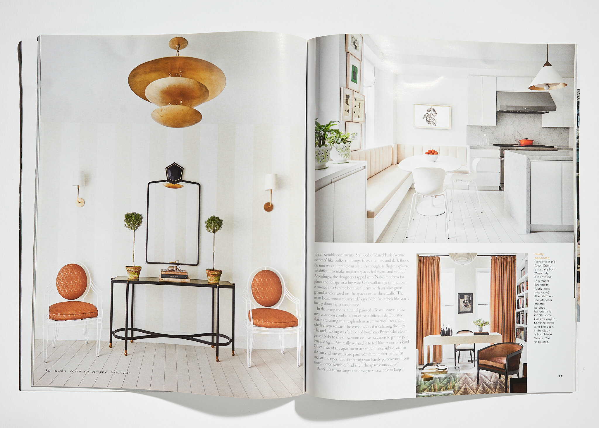
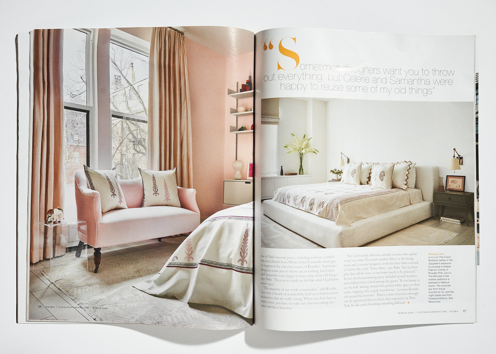
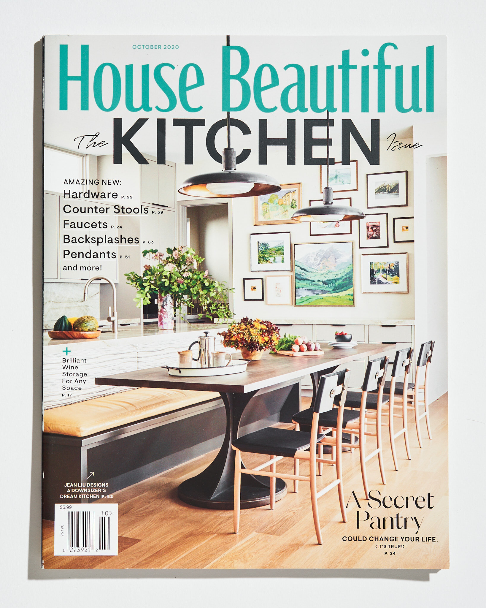
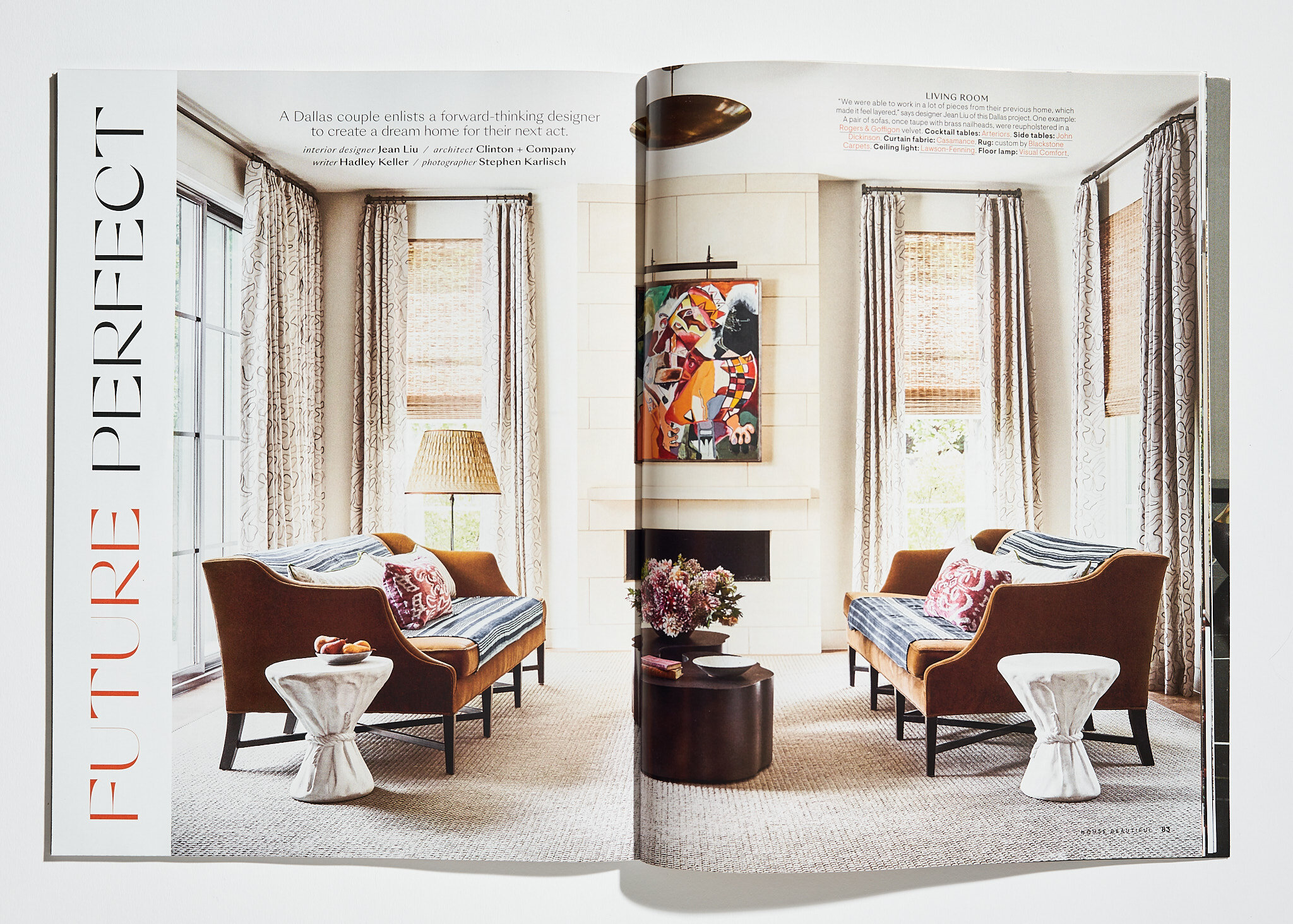
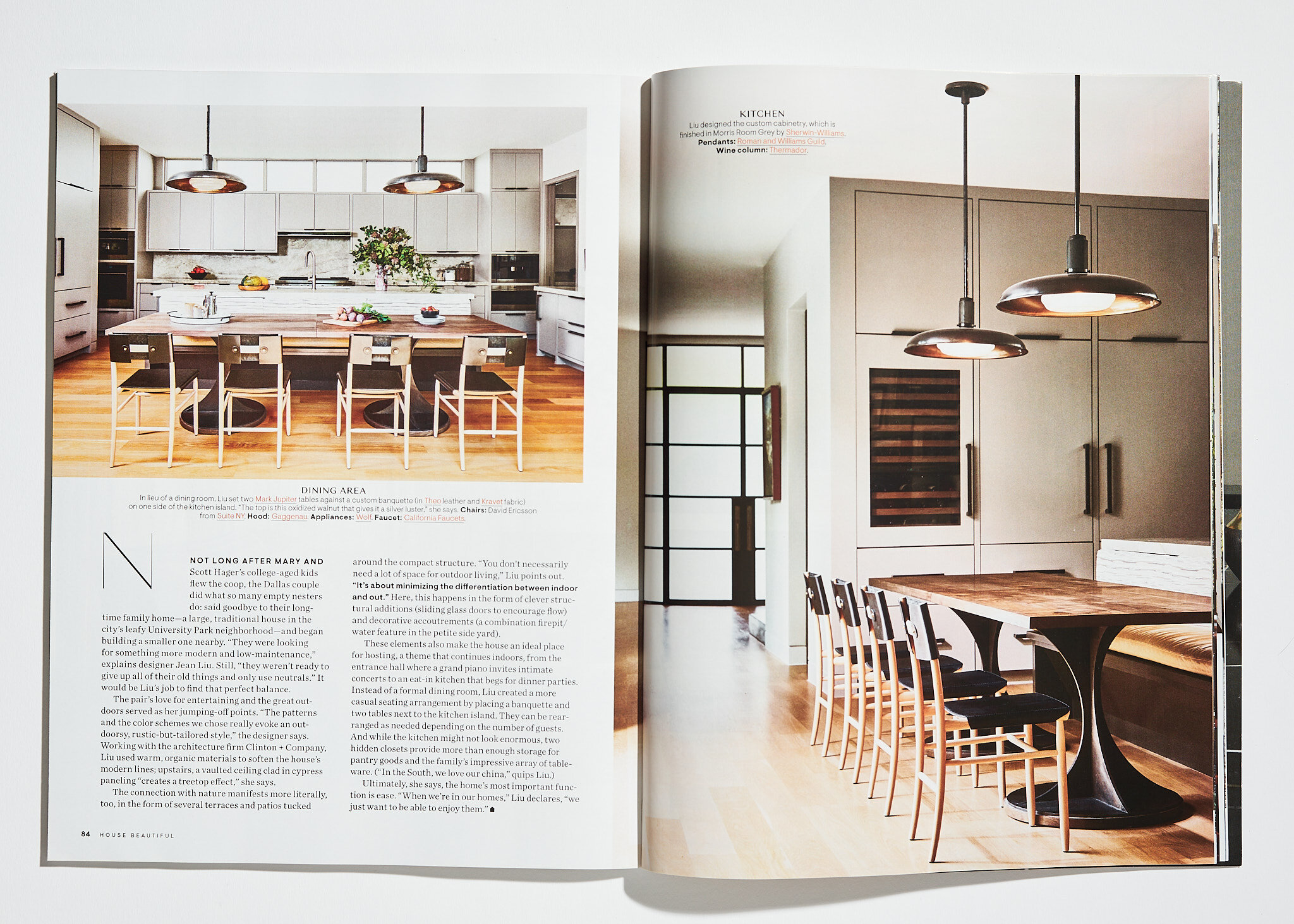
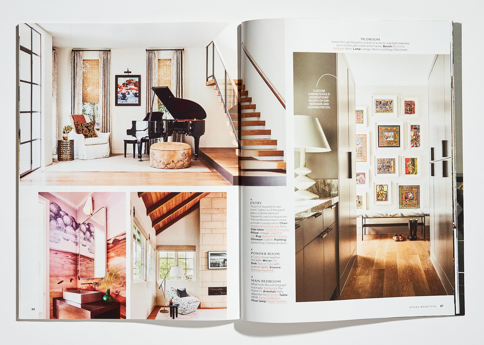
We have a great track record in the studio of getting our work published. And this year was no exception, but what was incredible for us was the number of covers our work garnered. Celerie Kemble of Kemble Interiors began the year with making the cover and a feature in NY Cottages and Gardens from our NY shoot Park Avenue residential shoot. Our photo of a kitchen designed by Jean Liu Design was on the cover of House Beautiful.
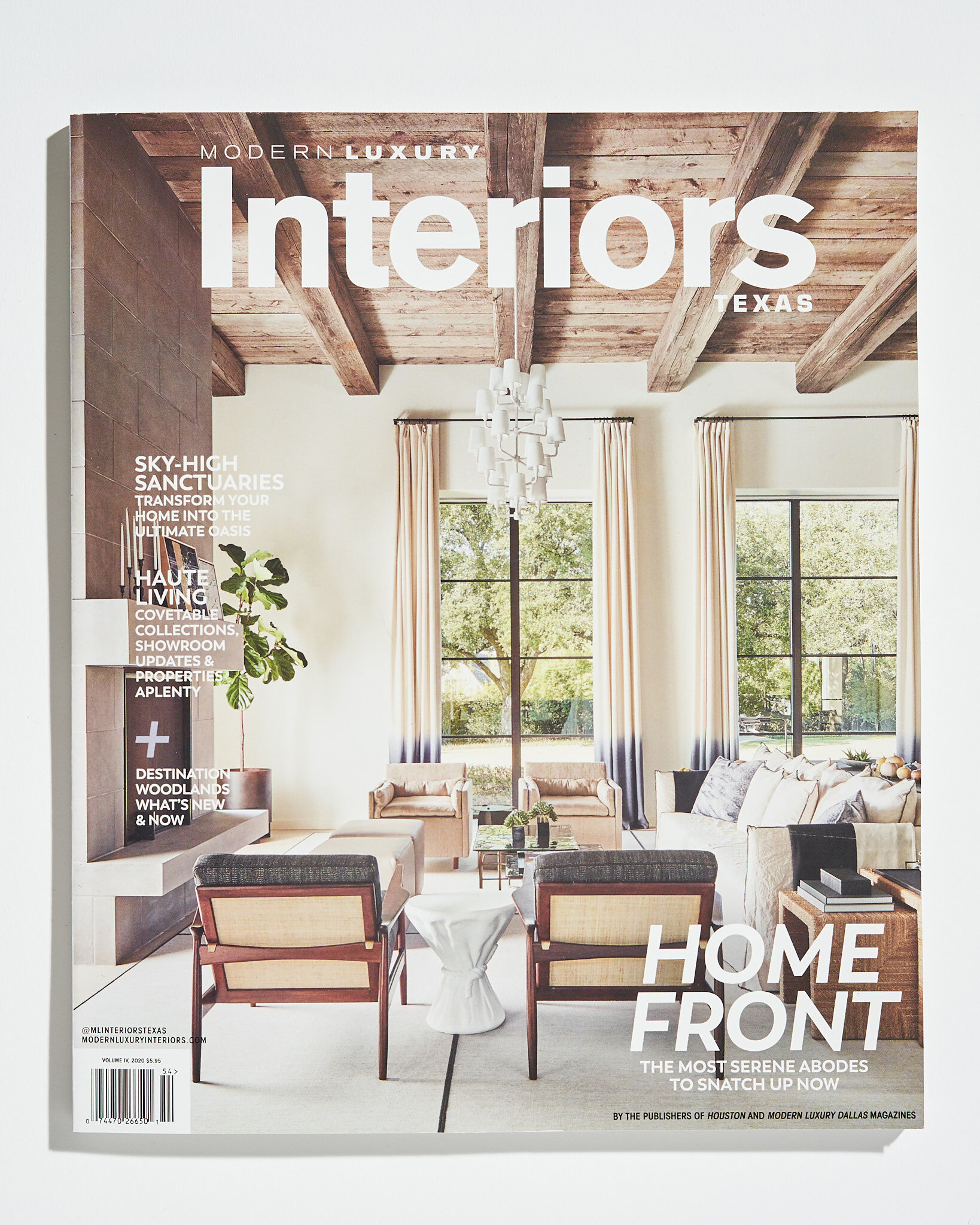
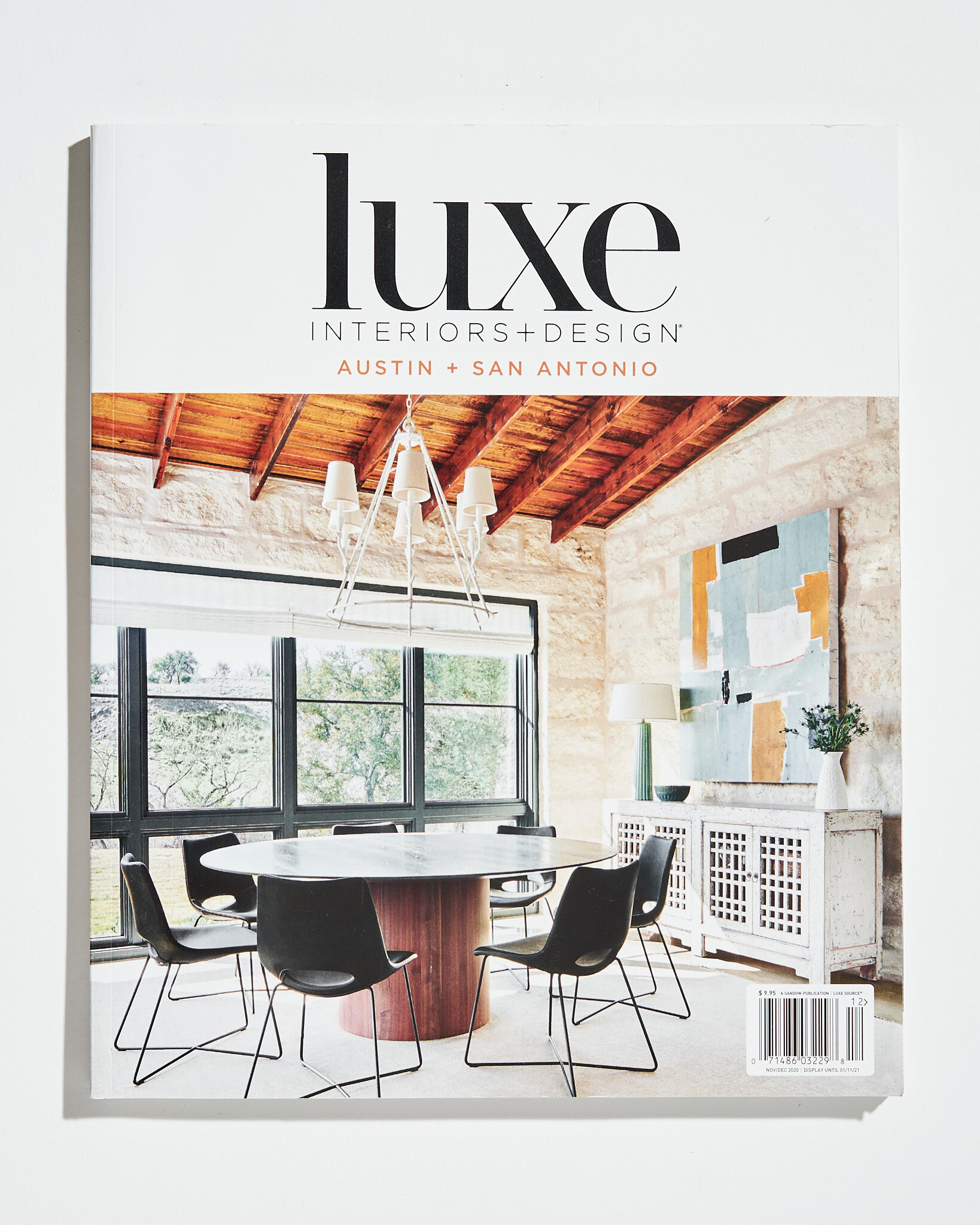
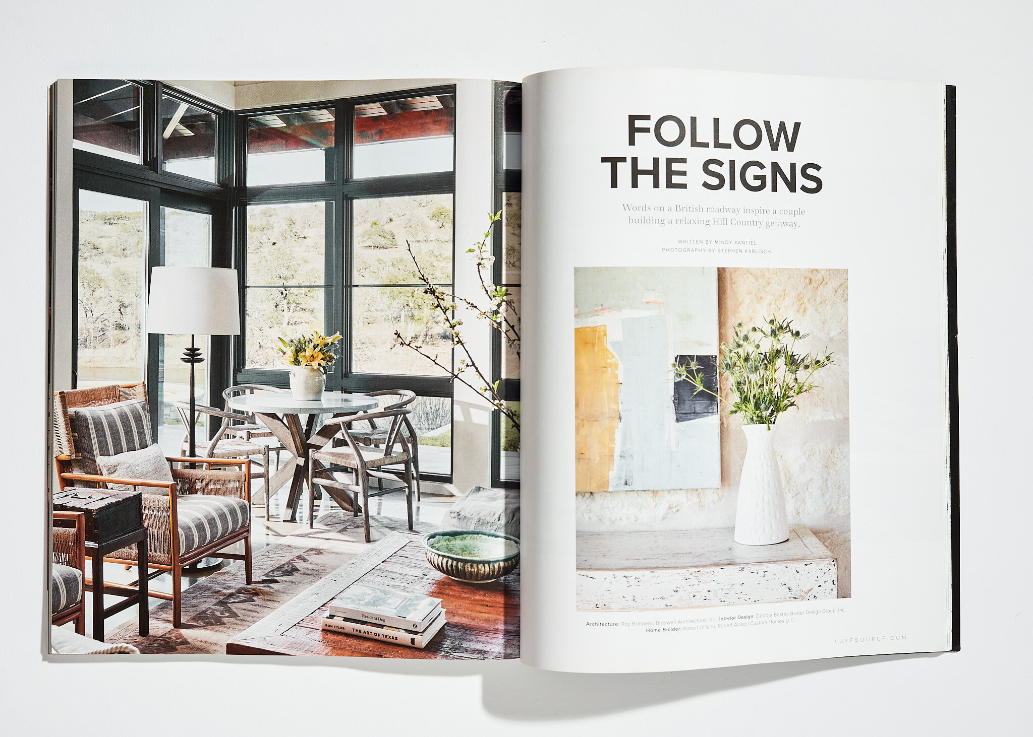
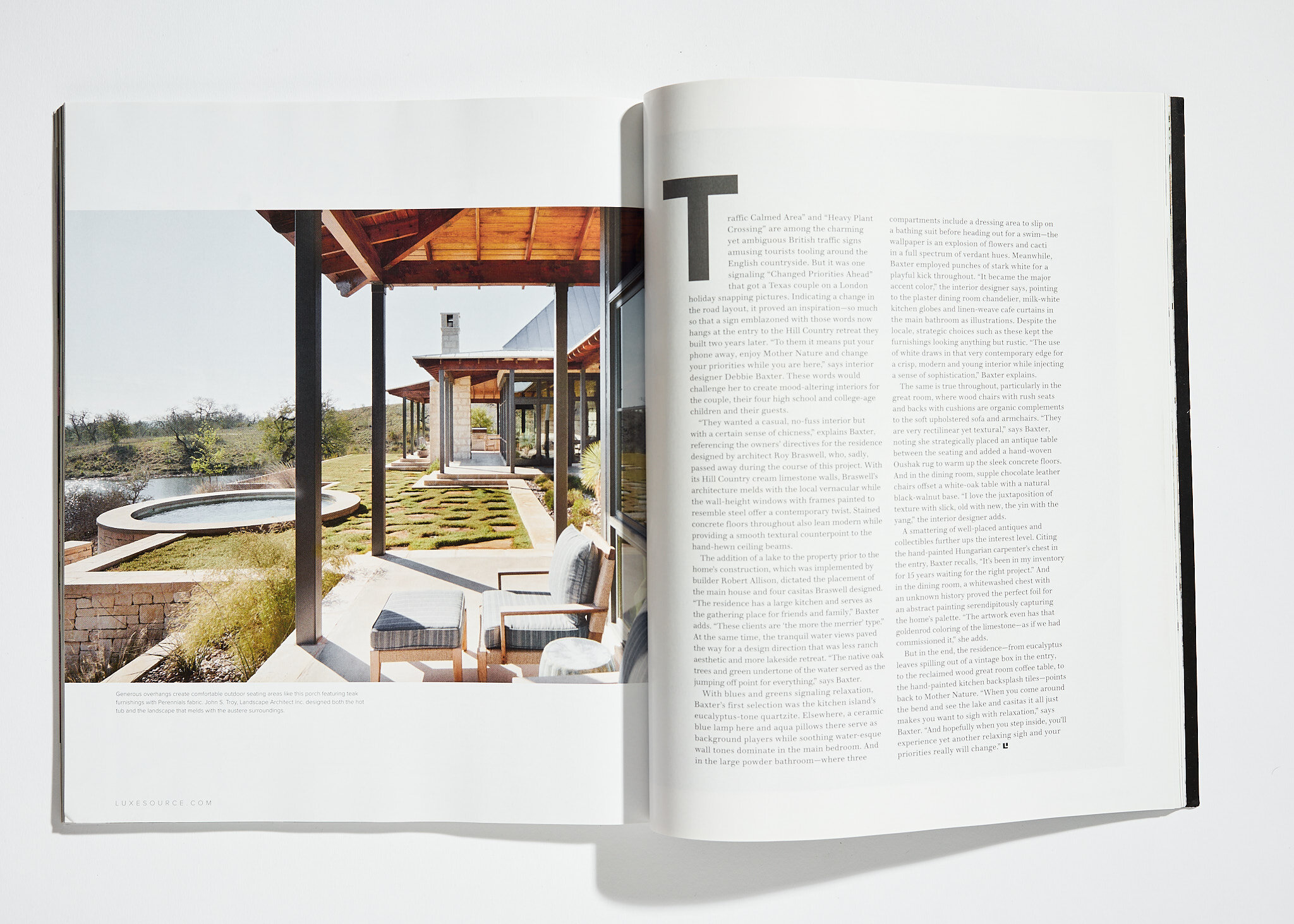
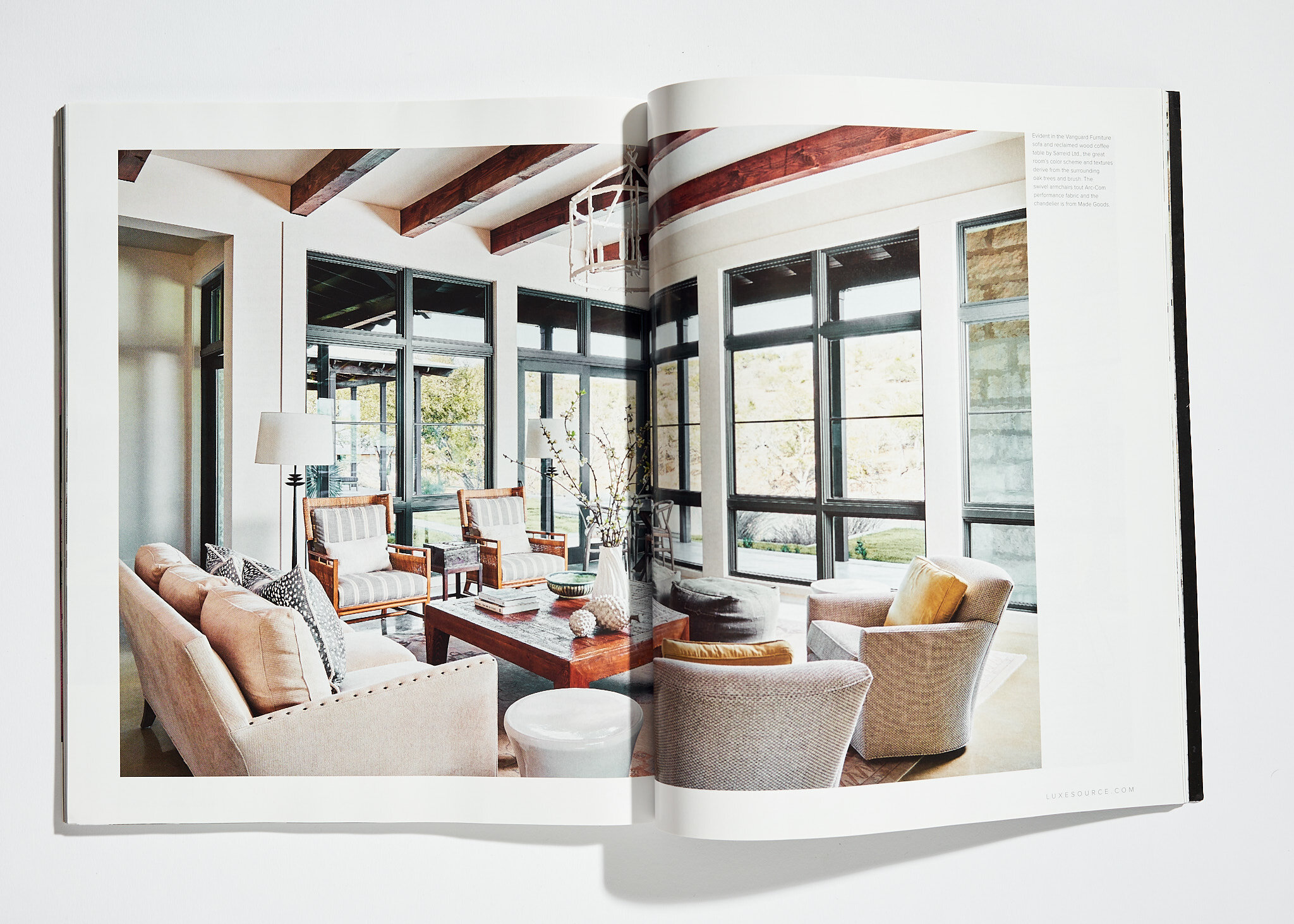
A living room we shot for Emily Summers made the cover of Modern Luxury Interiors. A Hill Country home by Deb Baxter of Baxter Design Group also made the cover of Luxe Austin + San Antonio. And a fantastic set table in a dining room by Cullman & Kravis was featured on the cover of Southern Home.
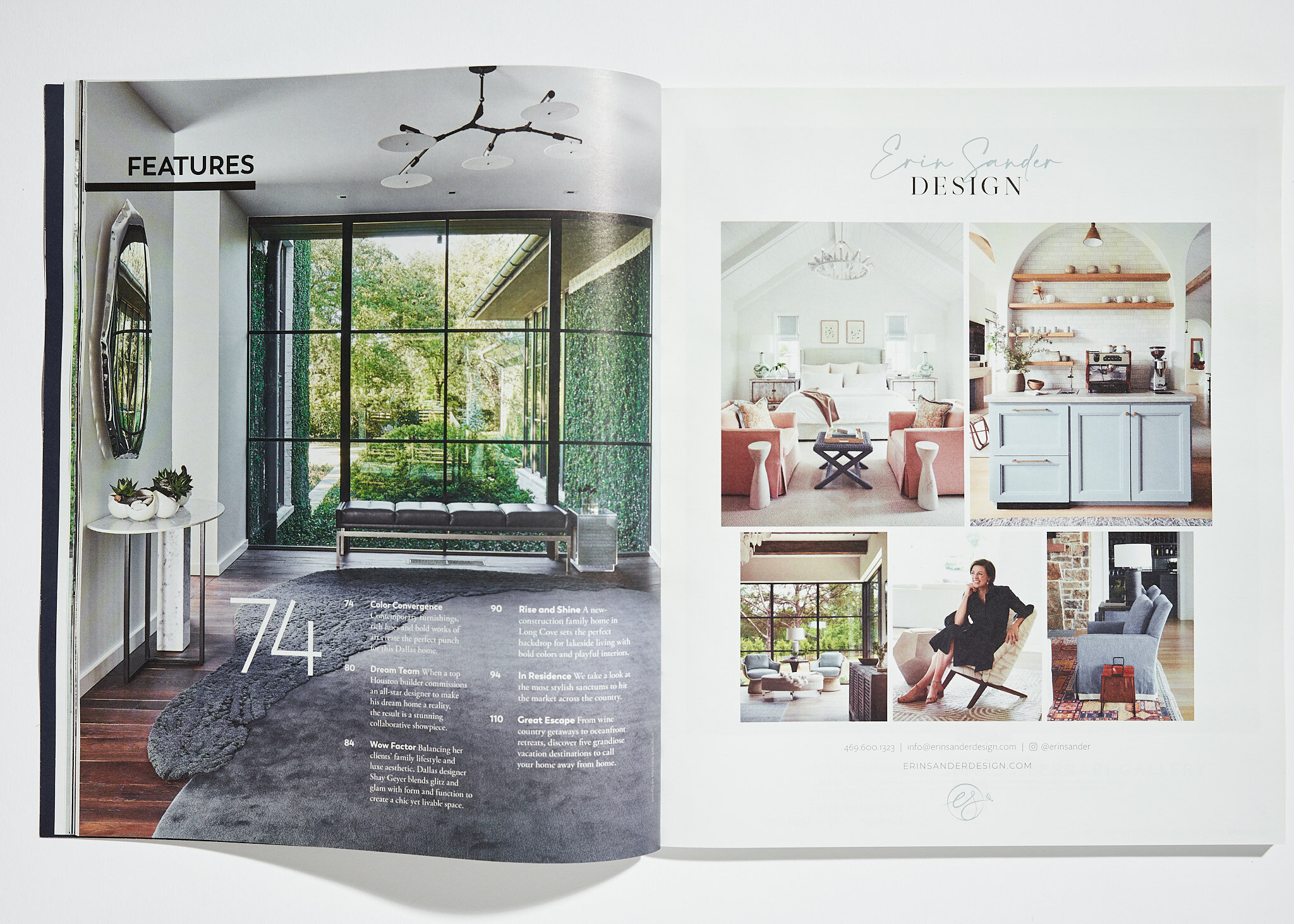
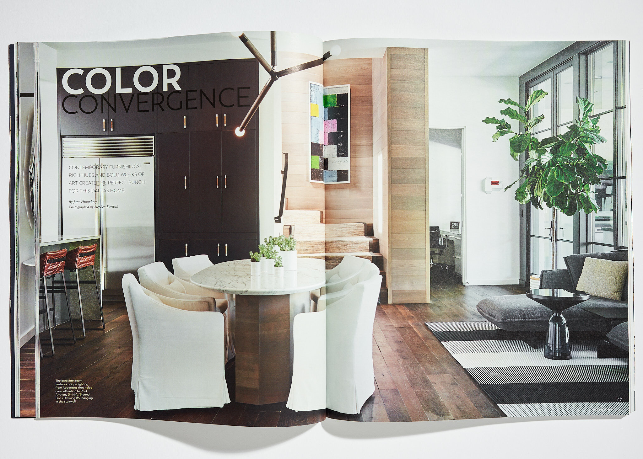
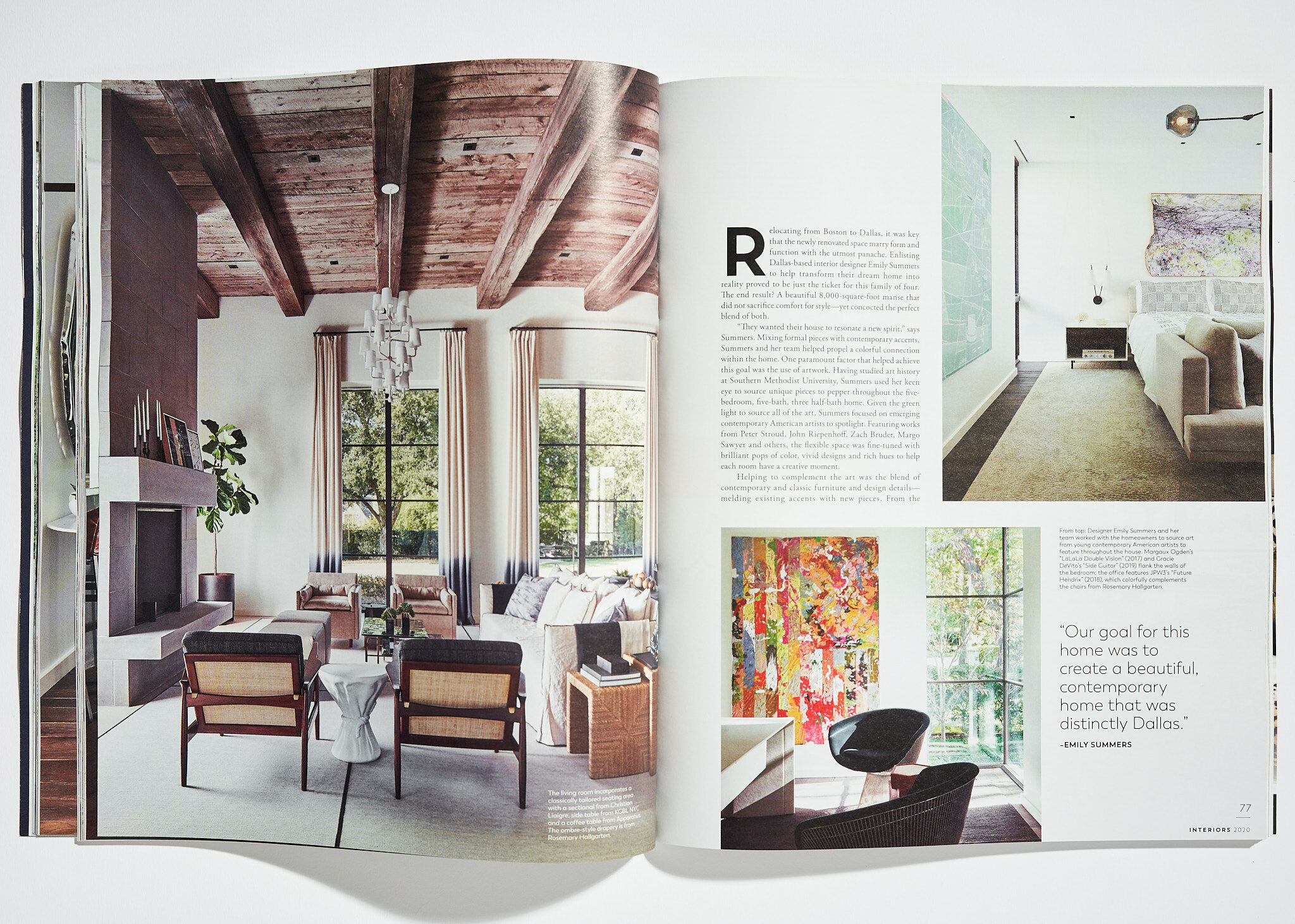
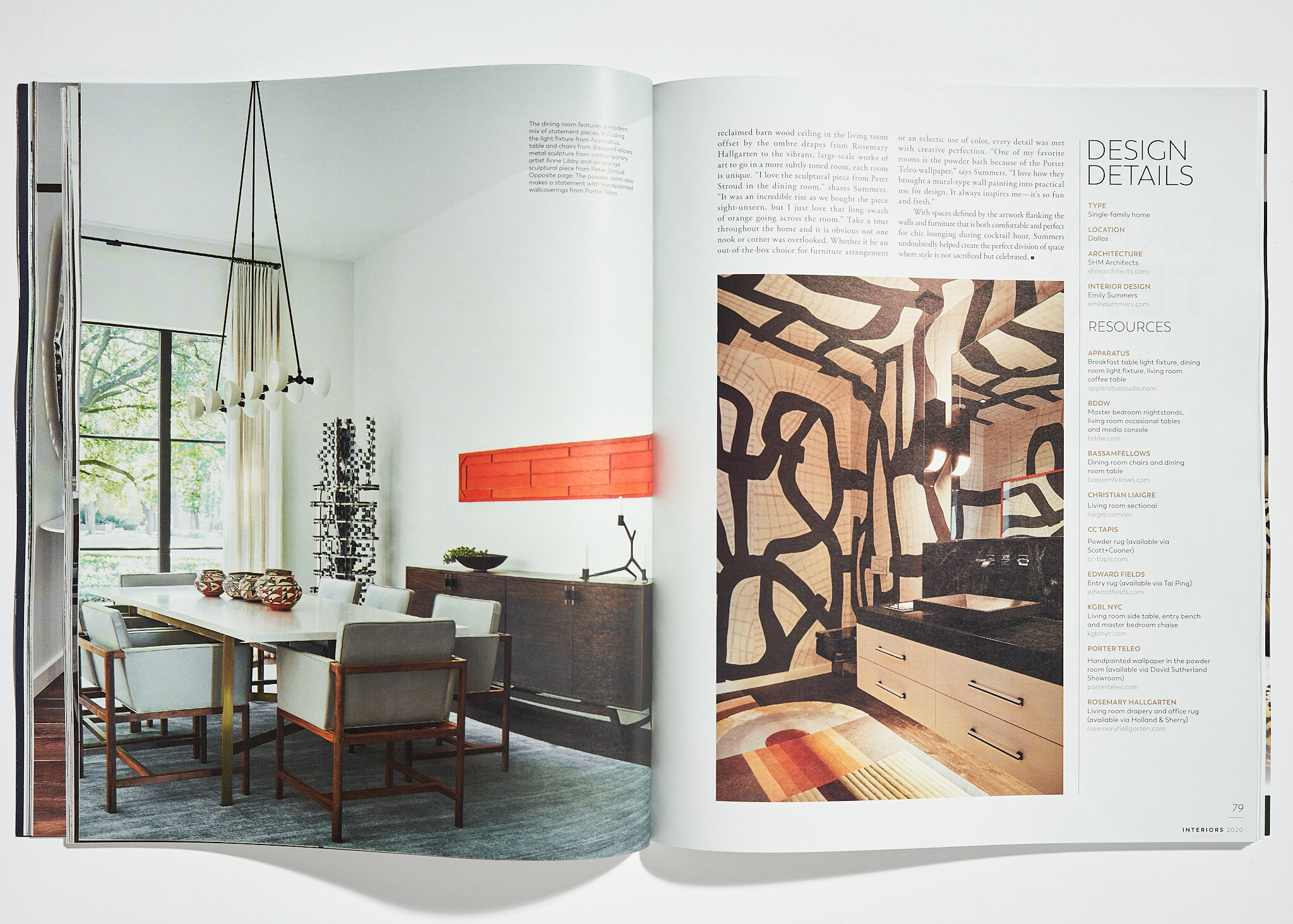
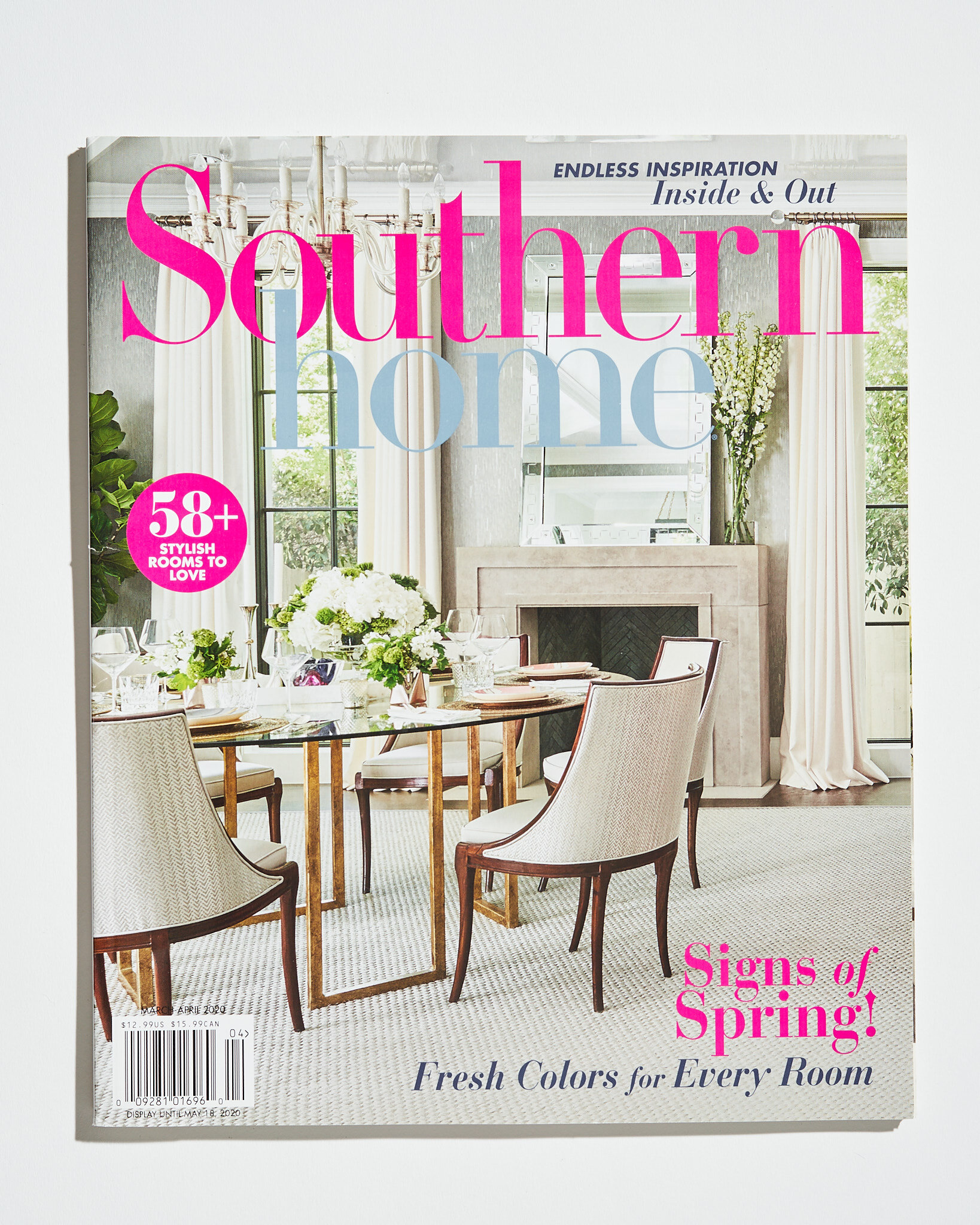
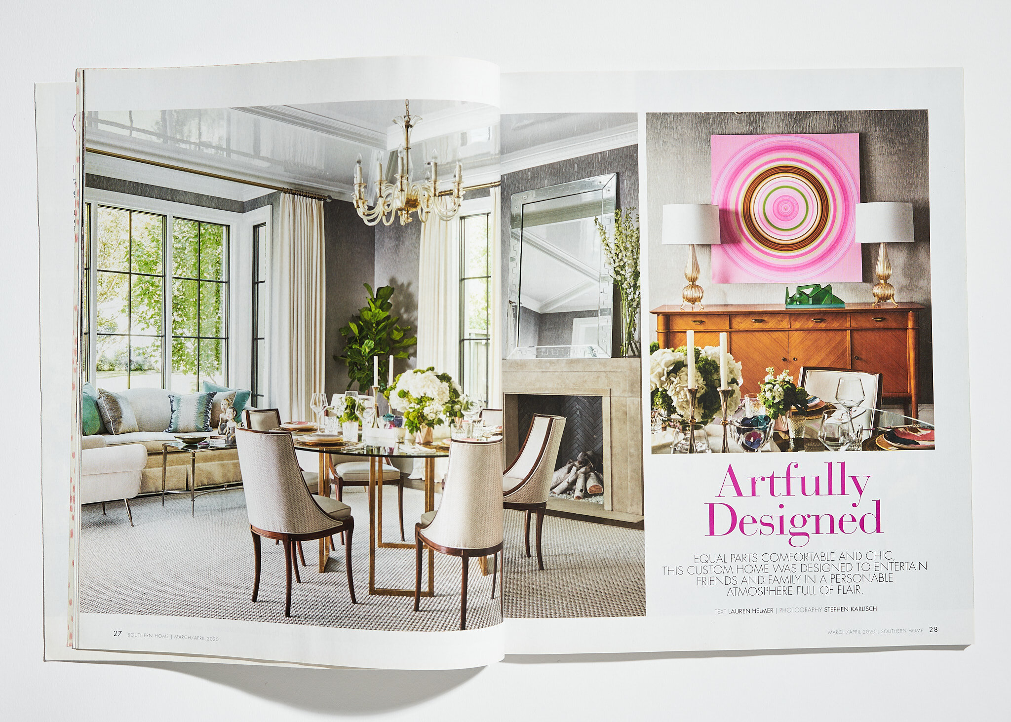
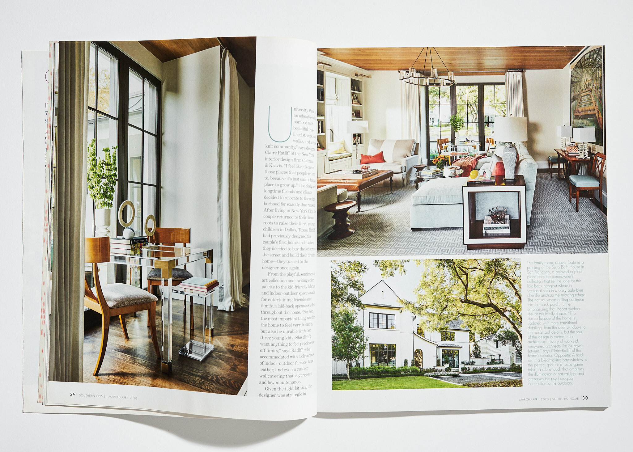
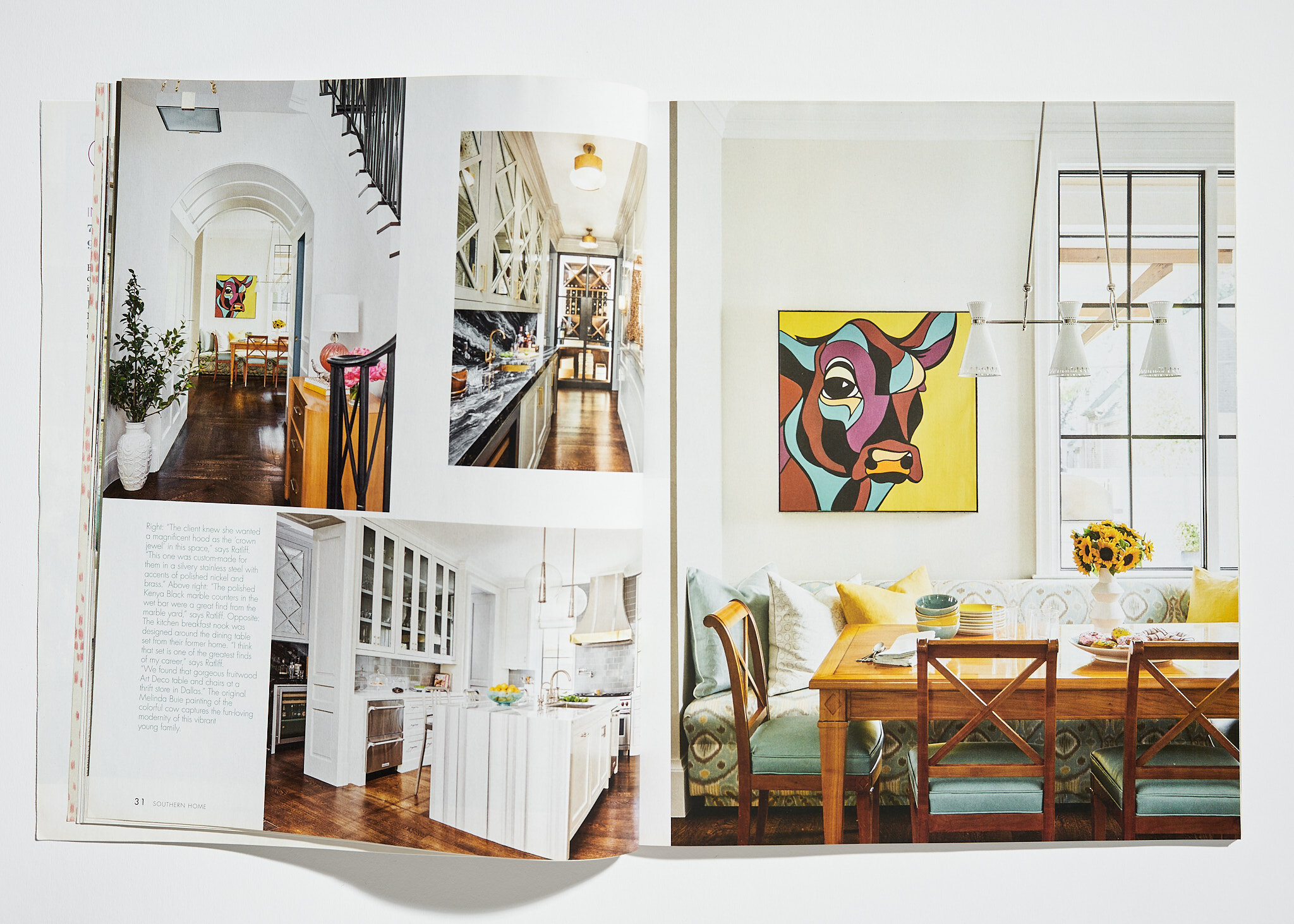
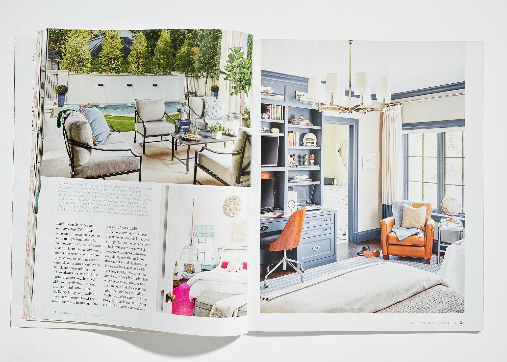
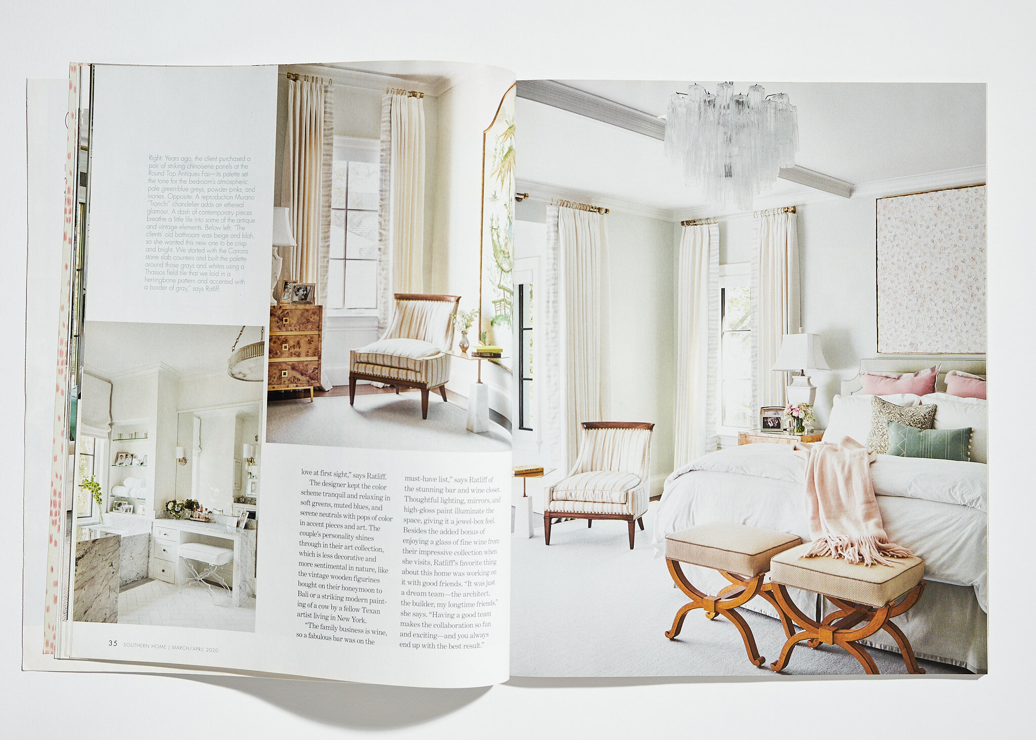
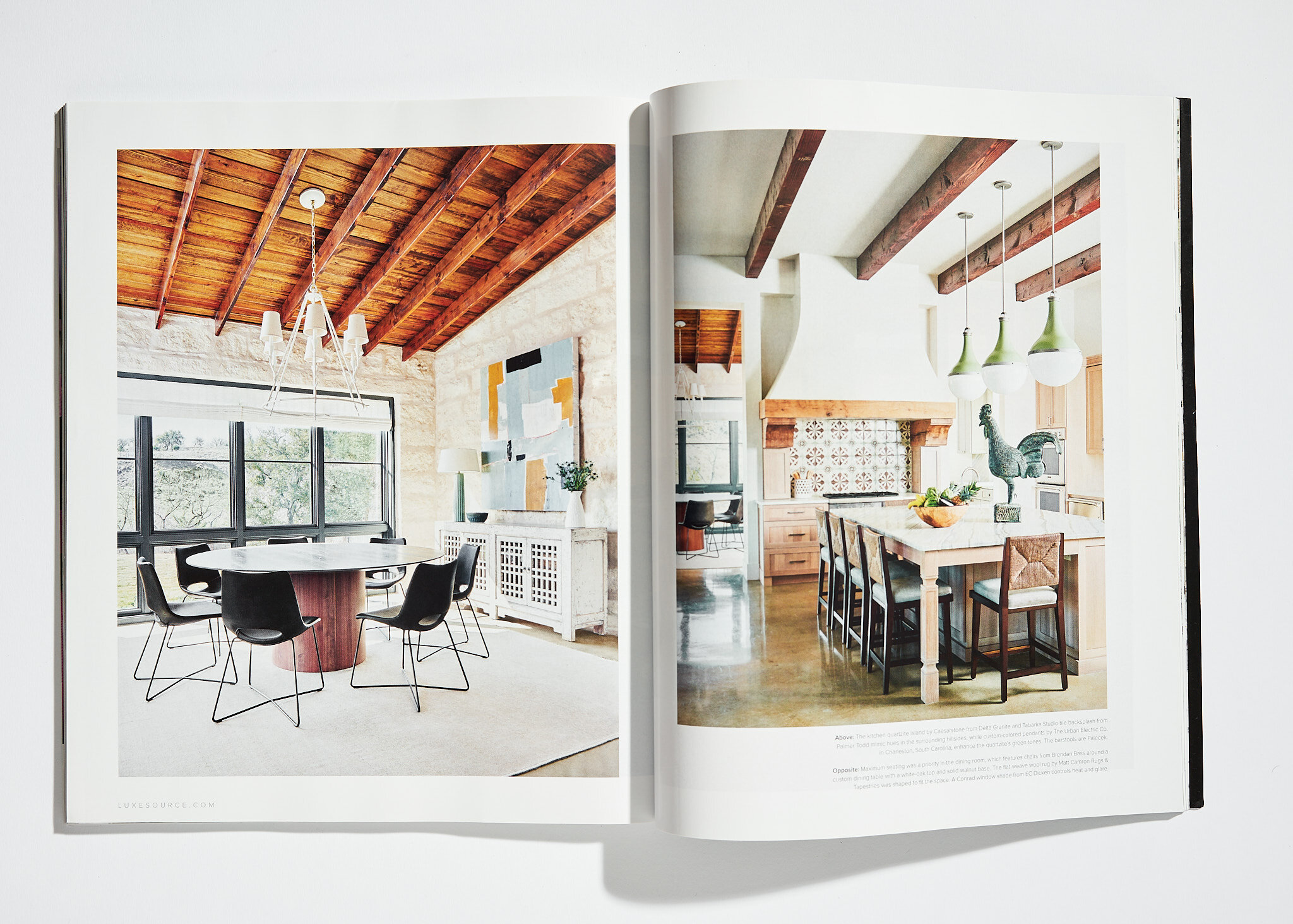
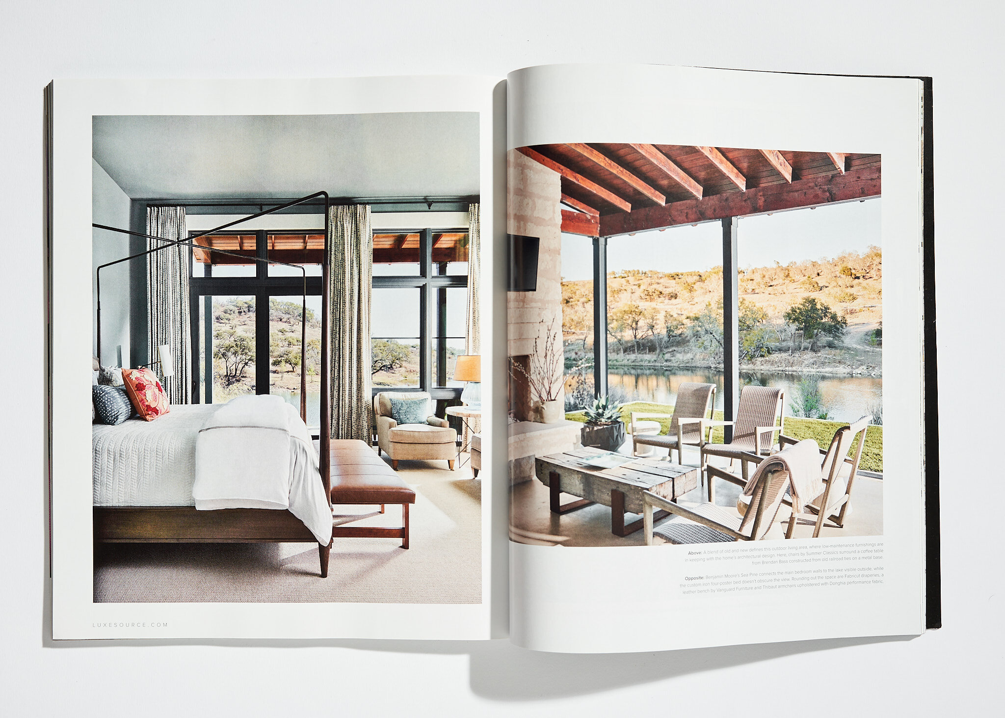
In a time of Covid and economic ups-and-downs, it can be tempting to drop your marketing or decide not to earmark money for professional photo shoots. But I can tell you that would be a big mistake. Shooting your projects is a must for your portfolio and your image marketing. And the local and national exposure is critical for your business. Our photography for leading designers has definitely helped them increase their brand awareness and their businesses in a crazy year.
We’ve had photographs published in almost too many publications in 2020 to name, but here are a few:
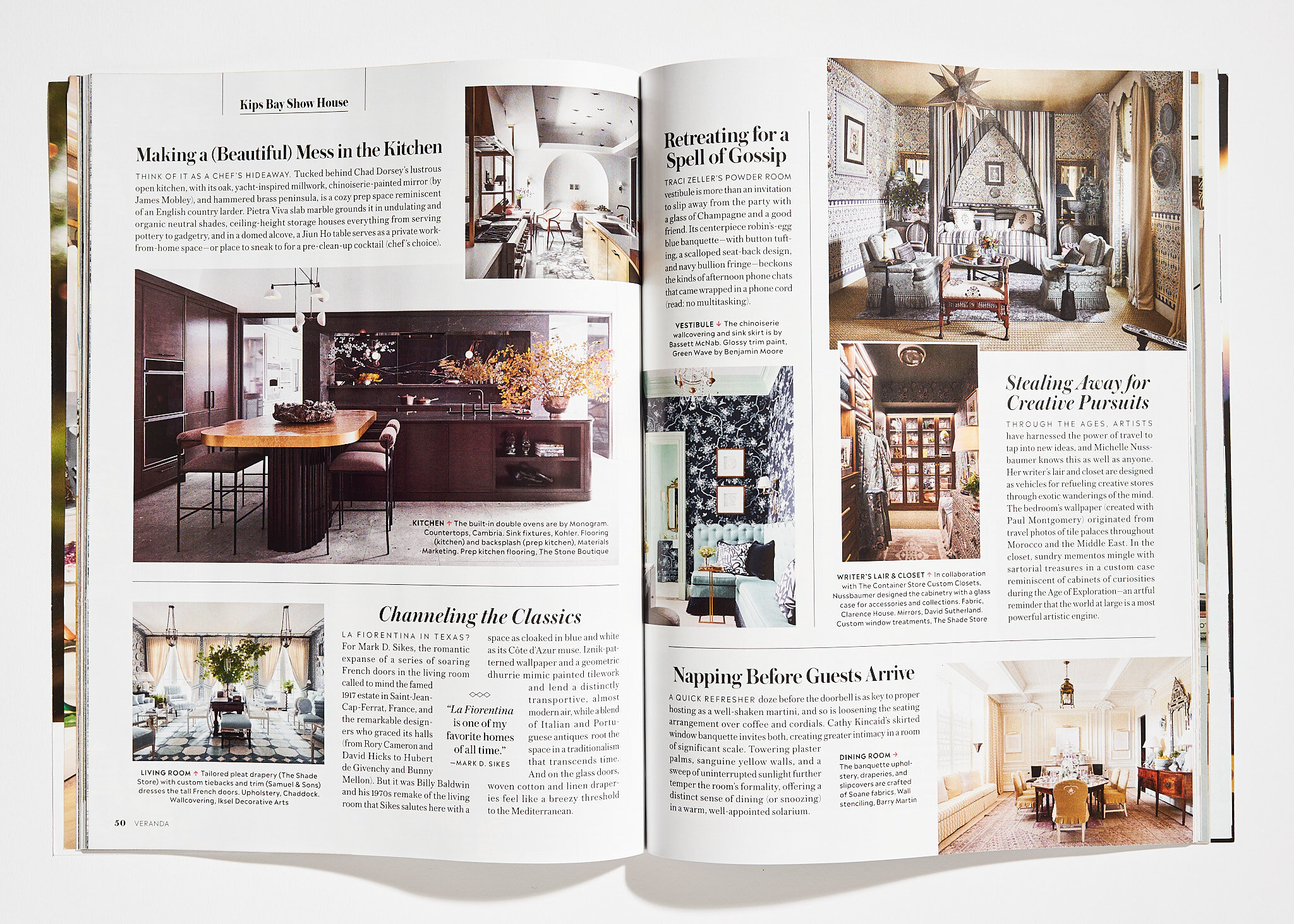
Veranda, featuring various designers from Kips Bay Showhouse, Dallas.
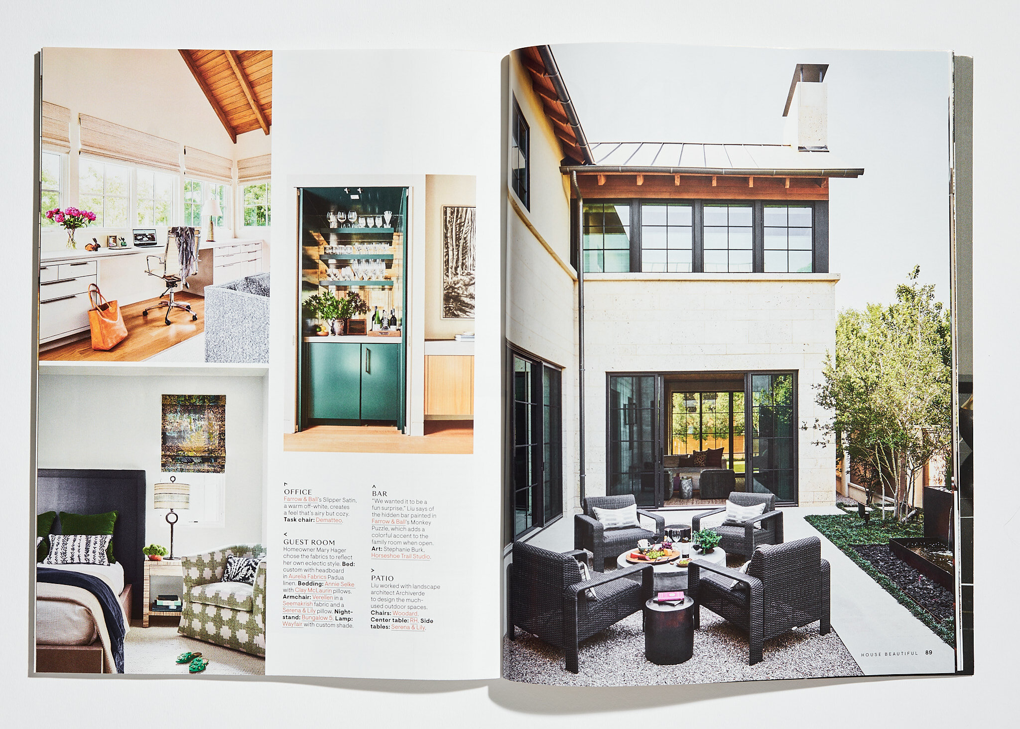
Departures Magazine, featuring work by Jean Liu.
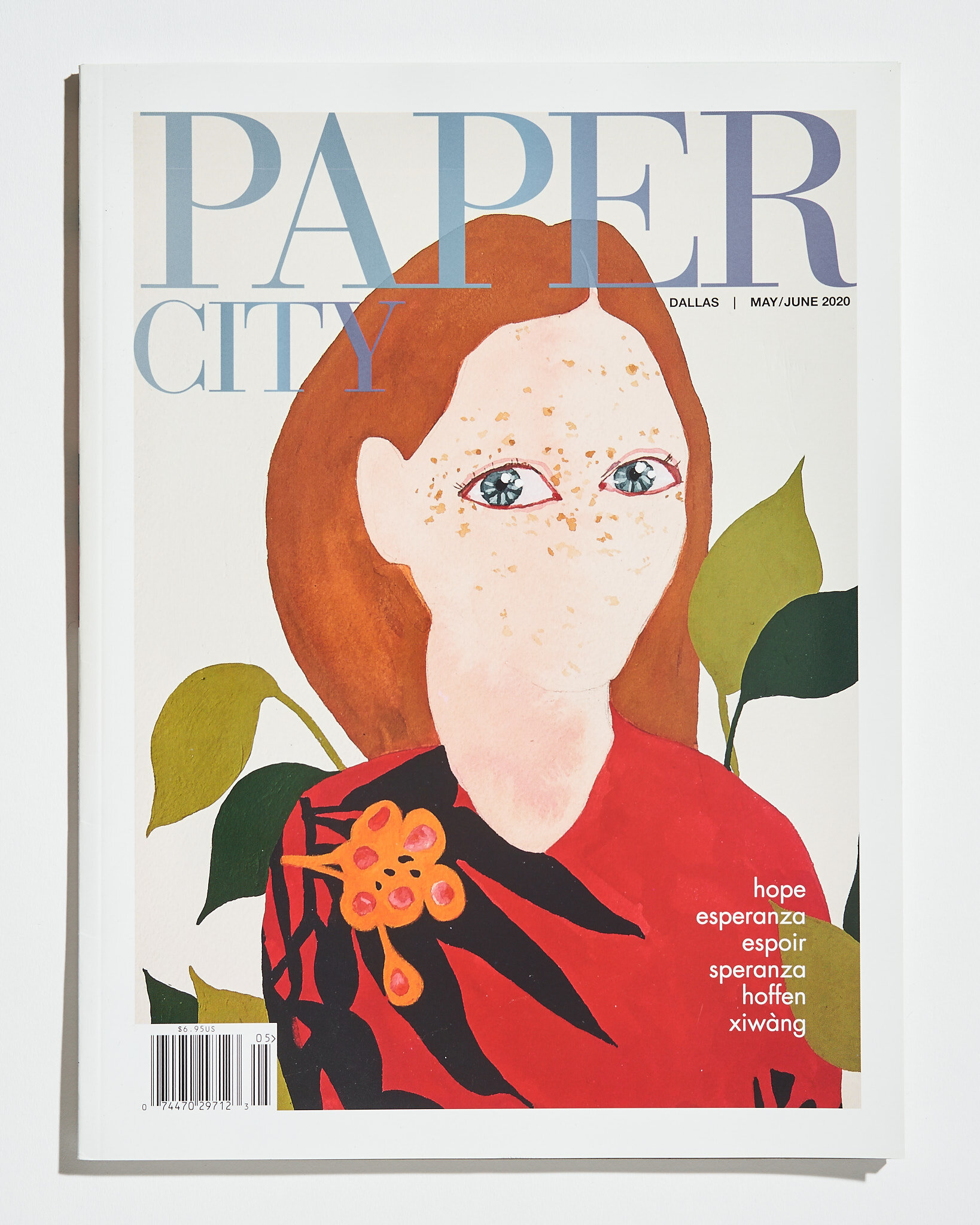
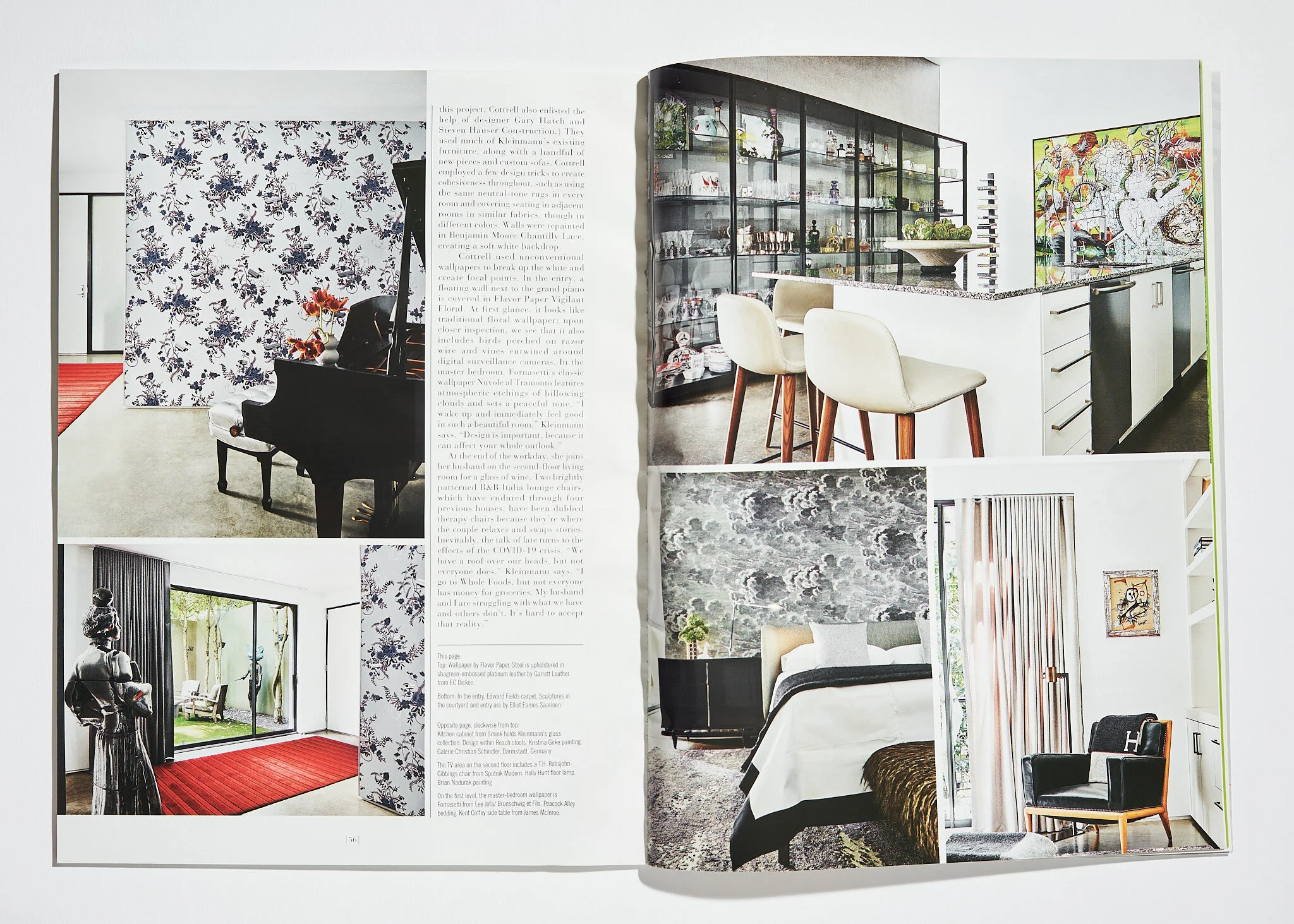
Paper City features, including Chad Dorsey’s work and several Paper City Design Awards winners I shot. The biggest thrill was the Paper City feature on my work for the Kips Bay Showhouse. You can see those photos by clicking here.
Milieu, featuring work by Marcus Mohon
Interiors Magazine, Rue Magazine and California Home Design, featuring Chad Dorsey’s interior work
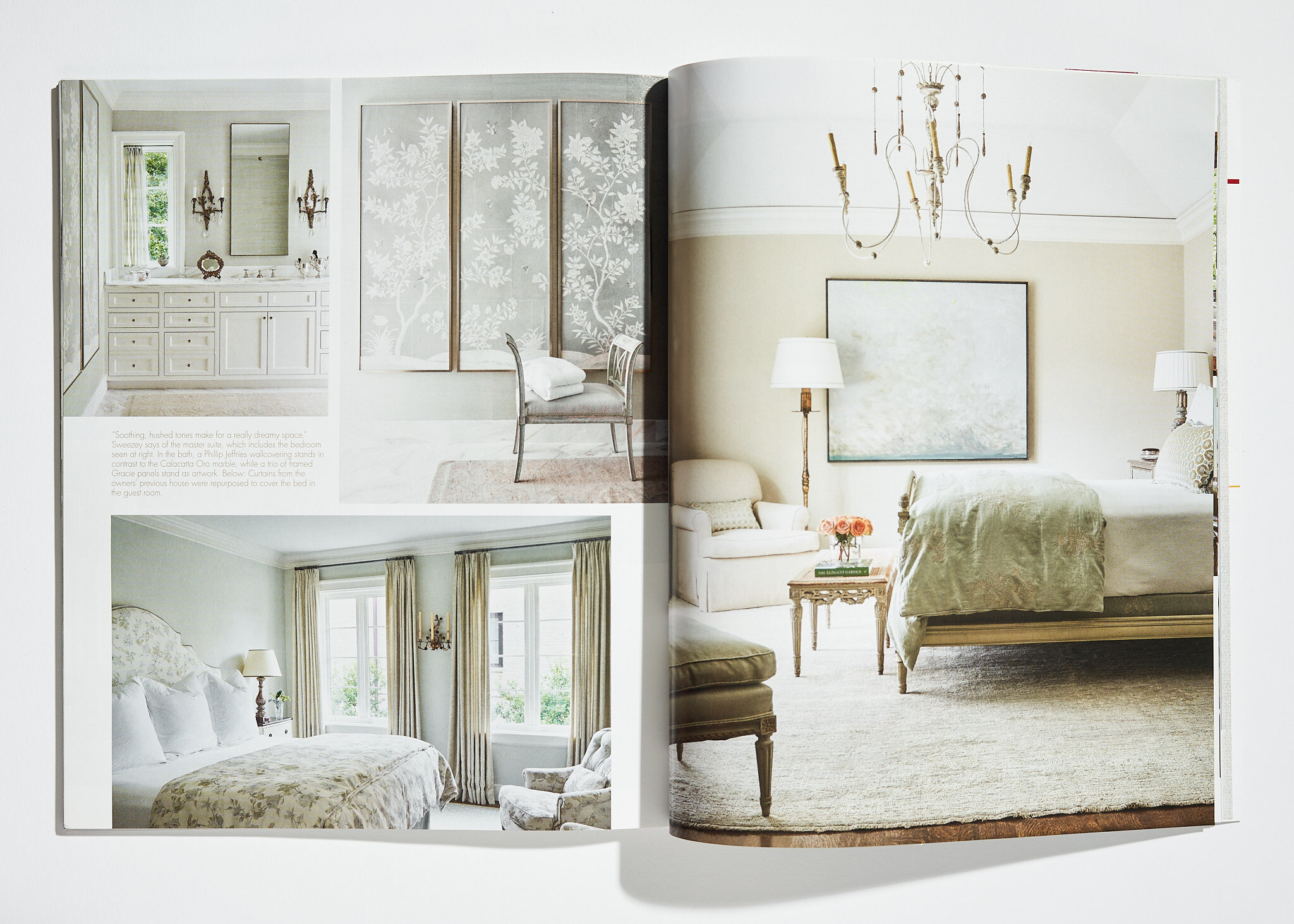
Southern Home Magazine, a Houston home designed by Collins & Sweezey
Flower Magazine, featuring a home designed by Denise McGaha
Gray Design + Culture, featuring Pulp Design Studio
Luxe Magazine, featuring many photos I took of Red award winners
Ralph Lauren Magazine, featuring the one of a kind collection of Tom Perini in the Perini home. Written by Zachary Weiss.
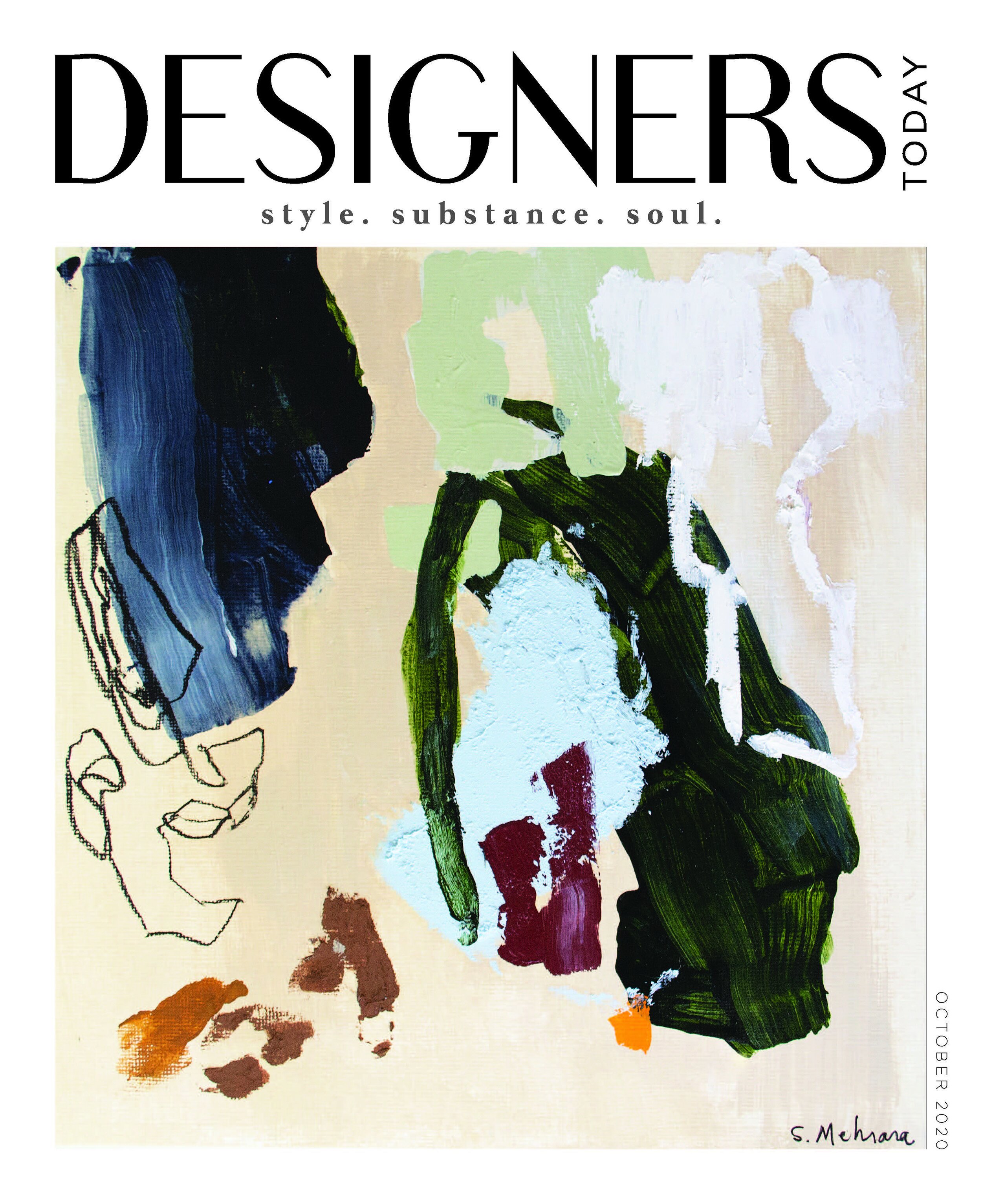
Designers Today, interviews with me about Kips Bay and about working in the time of Covid.
And so many more including an abundance of on-line media. It was a great year for publishing in our studio. We can help you with your image marketing and publishing goals in 2021 – just contact us by clicking here.
PROJECTS + APPEARANCES
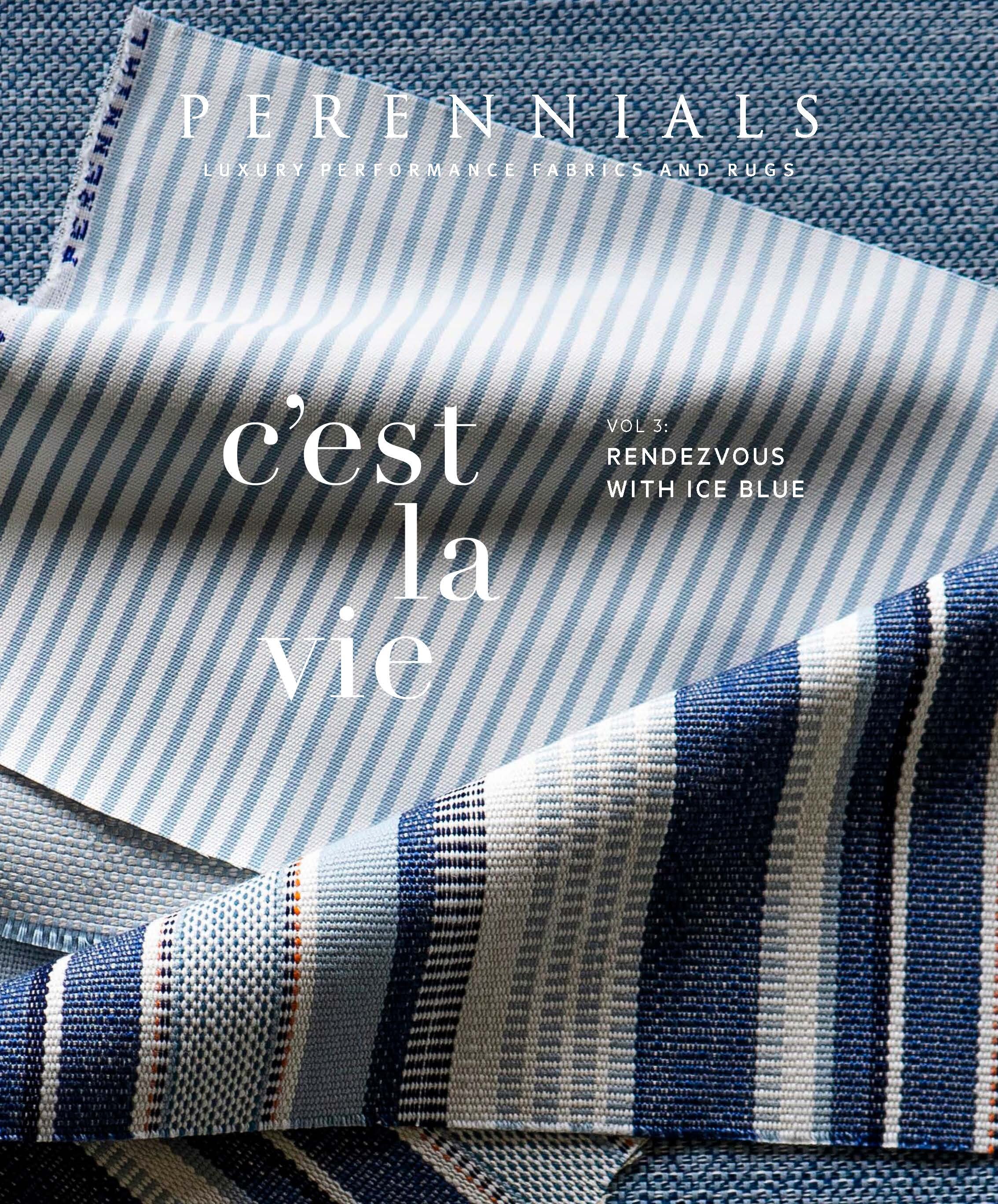
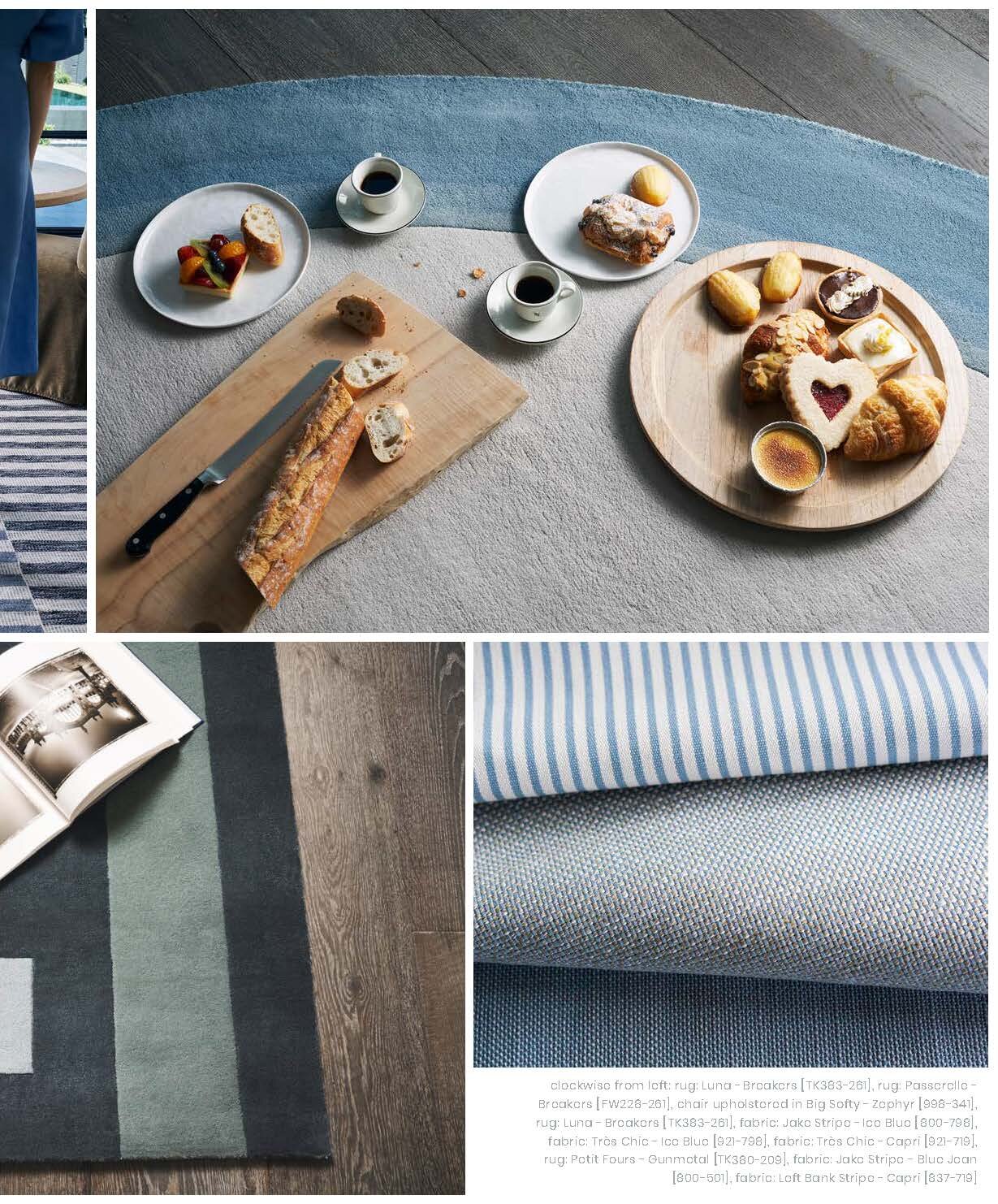
This was a year like no other when it came to large-scale photo shoots and speaking engagements – we had to do things a little differently. I shot catalogs and campaigns for both Sutherland and Perennials this year. And with Perennials we had to rethink our process since it was the Summer of Covid. You can see the entire three issues and read how we pulled it off by clicking here
I love public speaking, especially when I can talk to interior designers. This year we went virtual, including a keynote at the Decorative Center in Houston with Lucas Eilers to talk about their book a couple of weeks ago. I had a great time talking with designer Traci Zeller about tips to take your photography to the next level – it was a keynote for the High Point Market. Also for High Point Market in the fall, I shared a virtual stage with Chad Dorsey to talk about getting the most out of your photography budget.
Podcasts have also become more important than ever for our studio. It’s another great way to talk photography and get the word out about how important image marketing is. I’ve loved talking to great experts in several field, like Kaleigh Wiese and Jane Dagmi. We’re hoping to move to more live interviews and appearances in 2021, but I think we’ll still have a few digital months to go before that happens.
AND NOW TO 2021
So what’s next? The new year starts with a full calendar of shoots of completed projects around Texas and Oklahoma. Due to Covid, shoots have been juggling around for months and we are now making up past ones and newly scheduled ones. We expect the next six months to be full and continue with caution. Hoping travel starts back up by second part of the year to work with clients again around the country. Please visit our blog post on tips about photographing your projects during a pandemic. We already have a few fun things lined up for the new year, including a BIG project we’ve been keeping under wraps. We’re not quite ready to reveal it yet, but look for an announcement early 2021!
If you’re ready to book with us for a 2021 shoot, be sure to contact us as soon as you can. We’re ready to help you reach your image marketing goals and intentions for the new year!


