Posts in marketing
Using Florals for Interior Photography

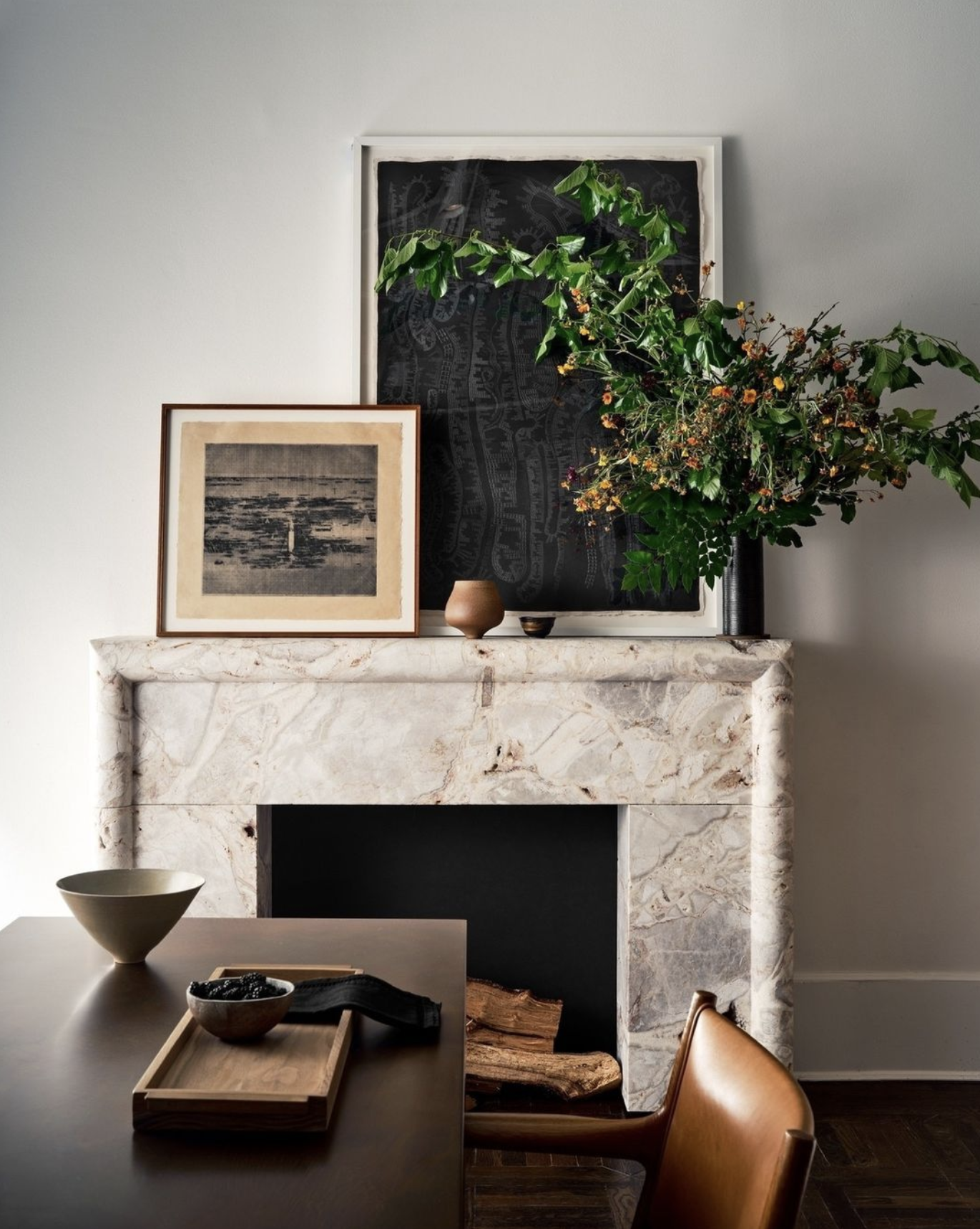
Interior Designer: Tori Rubinson; Stylist: Melanie McKinley
All photographs: Stephen Karlisch

Floral arrangements are so critical when styling interiors for photography. Look through Instagram or the latest shelter publications and you’ll see that the most successful and stunning rooms have some sort of flowers, branches or greenery. Florals are so key to a room’s styling, making a space look fresh and literally alive, even if they aren’t the first thing you focus on when looking at the photo. But there’s a balance between the florals and your interiors. The photos are being taken to show your work in the best way possible, so you don’t want to distract from that with a fussy or over-the-top display. Here are some of the guidelines for florals – and be sure to scroll down for some amazing Instagram accounts to follow for inspiration.

Do You Need a Floral Stylist?

There are three ways you can work with florals for a photo shoot. First, there are interior stylists who are really good at designing floral arrangements. Be sure to ask to see some of their work before you hire them, of course, but having one person to help with all of the styling is going to make things easier. Or you can work with an interior stylist and a floral designer as a team. If you’re really good at putting together arrangements, then you can take on that role, of course. I know of at least three top designers who took courses in botanical arrangements to ensure they could do that for their photos and clients. But remember that you’re already going to be playing several roles during a photo shoot – art director, furniture mover, photo approver – so you may be adding more stress than you need. The key is to get someone who not only understands that the florals need to be gorgeous in the room, but that they also need to create the balance and symmetry that photos need. 

Styling Tips

The most important thing to remember is that whatever plants, flowers, or greenery that you bring into the room are there to add life and enhance the look. They are not meant to be the focus. That’s why you’ll see vases of blooms in a single color – they complement the decor and don’t become the center of attention. 

When you do the walkthrough with the photographer and stylist (and/or florist), decide which angles are going to be shot, and capture them with quick photos, even on your phone. You can then look at those photos and decide where florals are needed.

You can use arrangements to hide something (like a switch), to fill a “blank” area in the photo, or to balance a surface. Knowing the size and shape of what you need will also help you decide on what type of flowers, branches or plants you may need. For example, you could use a small tree in a corner that seems bare. You can use a small arrangement on top of a stack of books to make a more vertical line. Use your arrangements in strategic ways.

And select the type of flowers and plants based on your decor style. A more formal room may need a more artistic arrangement, whereas a boho room may look best with a relaxed grouping of natural flowers.

Finally, if you or an interior stylist will be creating the arrangements, be sure you use a local wholesale florist. Because you are considered a trade, you can get much better pricing that way. Order your flowers ahead of time, too, so you get exactly what you want and so they’re as fresh as possible.

Current Trends

Floral trends come and go – remember the ficus tree that seemed to be in every shot for a while? And the fiddle leaf is almost oversaturated now. Here are the trends that are hot today:

Branches. We’ve seen these for a while, but they aren’t going anywhere. In fact, arrangements of branches have only gotten bigger…literally. These work best in large rooms, to the side of the photo, or when they almost blend into the background. They also can “date” your photo, meaning you can use branches of fall leaves if you want to have your photo considered for an autumn issue. Or flowering branches can make a spring-like statement. The key is to let them arch the way they would as they grow. Don’t force them into positions that look unnatural.

Dried Flowers. We’re not talking about faux looks or strange potpourri types of botanicals. Today’s look is inspired by Parisian markets, so you see more lavender, eucalyptus, and small pampas grasses. Single stems are popular, as well as tied bouquets, and you see a lot of dried grasses mixed with fresh cut flowers, too. 

Single Colors. This look has been on-trend for a long time, and there’s a reason. Bouquets with a lot of color are distracting and will distract from your amazing interior design. They also can make the room look fussy or too busy. This subtle arrangements of one color are complementary to the room, and almost blend into the background. The photo’s viewer will still subconsciously take in the flowers and plants, but it won’t be what they focus on. You can go with a bit of an ombre look with subtle variations of pink, for example, but be careful that it isn’t distracting.

Go Natural. Natural flowers are the go-to today. So instead of tight formal roses, you’ll see wild or rambler roses. Dahlias are having a moment, and so are peonies, ranunculus, poppies and long streams of ivy. The idea is to have loose arrangements that look like they were just plucked from the garden. In those natural arrangements, you want to only use one variety of flower at a time. So a loose bouquet of hydrangea, or a couple of stems of poppies in a small vase. If you do put several varieties together, follow the one-color rule.

Some of our favorite stylists offer some insight into their process of designing with florals:

Jenny O'Connor @jennyoconnorstudio

“I like the floral that is right for the space and the shot. Sometimes that’s fluffy and fussy and sometimes that’s lean and sculptural. It all depends on the space and where the camera is. And a lot of getting a great floral moment comes down to choosing an appropriate vessel for what you want that floral to achieve for the shot.

Maybe this illustrates the difference? But the first I chose the vessel and directed what we wanted here (tall and shapely and wild) and the second I actually did the floral for (the opposite).”

Photography: Stephen Karlisch; Interior Design: Strike by Chad Dorsey; Coco & Dash; Laura Lee Clark

Styling: Jenny O’Connor


Anita Sarsidi anitasarsidi.com

“My floral style tends to be something a bit natural in the room so it doesn’t take center stage but complements the interior and enhances the room.”

Styling by Anita Sarsidi for Mahon Interior Design


Frances Bailey @francesfinds

“My flower philosophy is to select flowers and plants that help support the visual story the interior designer wants to tell. I have a pre-shoot call where I go over each space and we talk about the flower/plant story. Some designers are really into it and some like me to decide but first I need to understand what they want the room to say. I also try to use flowers that they haven’t used in prior shoots or things on their website portfolio to keep things interesting. I buy from the NYC Flower Market but try to use local, in season flowers whenever possible as well.”

Styled by Frances Bailey for Morgan Madison Design.


Who to Follow

Here are inspiring Instagram accounts for interior design, floral designers, and botanical accounts that will give you great ideas for your own floral styling:

Jenny O'Connor @jennyoconnorstudio

Anita Sarsidi anitasarsidi.com

Jimmie Henslee @hensleejimmie

Steve Cordony  @stevecordony

Adam Fortner @adamfortner

Melanie McKinley @melanie.mckinley.stylist

Colin King  @colinking

Flower Magazine @flowermagazine

Floret Flower @floretflower

Sarah Winward @sarah_winward

Frances Bailey  @francesfinds

French Country Cottage @frenchcountrycottage

Justina Blakeney @justinablakeney

Sophia Morena-Bunge @isaisafloral

Charlotte Moss @charlottemossco

Artists, Photographers and Interior Designers – How to Improve Your Search Results with Image Descriptions


By Gayle Mahoney

Remember the Flying Monkeys from The Wizard of Oz, and the way they scurried about in a slightly creepy way? Well, that’s how I envision “web crawlers” or website search engines, they are like creepy little robots that crawl around and scour the World Wide Web in order to find whatever is out there. 

The info the encounter goes back to Google and the other search engines, and is evaluated using very complex automated systems. These algorithms determine how important your website is to your audience, how authoritative your content is, and most importantly for your business, how high in the pecking order your page should be on search results pages. 

In broad strokes, search engines evaluate:

  • The structure of your website – how information is organized, including page hierarchy, if the right style tags (H1, H2, Paragraph etc.) are assigned to text, and if the content on the page is relevant to page names and titles

  • Text content – authoritative, useful content; clear, simple language; phrases people use to search the internet

  • Image file names, image descriptions and alt-text

  • Outside pages that link to your page

Photographers, artists and designers tend to have many portfolios, images and videos on their websites, but without proper labeling, those images have no value to search engines. Many designers are drawn to clean, minimalist design, and don’t want to clutter their pages with too much text. 

Most artists and designers upload hundreds or even thousands of images to their website, but never change the filenames of the images they upload, and fail to include image descriptions and/or alt-text. This makes their images essentially invisible to search engines! 


Three Steps To Maximize the Use of Images on Your Website to Improve Your Search Results

  1. Optimize your image file names by adding relevant information about the photo. Most digital cameras automatically generate a file name for your images, such as “img_2358.jpg”. An example of a better file name might be “Kipps Bay residential interior living room - coffee table detail.jpg” or “©Gayle-Mahoney-original-watercolor-on-paper-white-peonies.png.” Depending on your web platform, you may have to change the file names before uploading, or you may have the option to change the file name at upload.

  2. Add alt text to your images. “Alt text” or “alt tags” describe what’s in your photos to people who use web readers or other adaptive technology to visit your website. It’s an important part of making sure your website is ADA compliant and accessible to all. Alt tags should be somewhat brief and accurately describe what is in the image. You can use your primary keyword for your page, but you don’t want to stuff the alt text with too many keywords. A best practice is to start your alt text with “Image of…” or “Picture of…” and then simply describe what’s in the picture. Alt text is also a way to add searchable information to your image. I try to use some different words in my alt text and page descriptions to provide broader content.

  3. Add image descriptions to your photos. By providing descriptions for each image, you are adding valuable, searchable content to your website. Consider what details will be most interesting to your viewers to include in your image descriptions. On most platforms, you have the option to show or hide image descriptions, or have them show on hover, in case you want to keep your pages clean. Even if you opt to keep your image descriptions invisible to site viewers, they will still be visible to search engines so there is still value to adding them.

If you take the time to optimize the photos on your website, you are making your fabulous designs and artwork searchable by the web robots. Plus, it will give you an edge over your competitors, most of whom are probably not using crafted file names or image descriptions for their photos.

Pro Tips:

  1. Create a text document (Word, Pages, Google Doc, etc.) and keep it as a master list, that way you can cut and paste a lot of titles or phrases that you are likely to use often.

  2. Consider important keywords when you craft your file names, but the most important thing is to be accurate about what’s in the picture and use natural language to describe it. It isn’t helpful to copy and paste the same text in every title or description, but it can save you time if you create a list of titles and description items you use often so you can copy and paste then do a little tweaking.

  3. For your image description, go a little deeper - describe what is important or interesting to your audience: “Contemporary Sag Harbor beach home: This modern Mexican-inspired, family-friendly living room interior shows off the client’s vivid art collection offset by the clean lines and natural hues of custom furniture by Luteca.”

  4. Hiding image descriptions: If you want to keep your portfolios super clean visually and don’t want your image descriptions to display, they can be clicked on or off in Squarespace and some other web platforms. The search engines will see the text even if it is not displayed. But just keep in mind it might be helpful for your visitors to see your descriptions - the can be hidden except on image rollover (when the user puts the cursor over the image).

  5. If you work in Squarespace, you now have the option to import your image metadata when you upload images (Article: https://support.squarespace.com/hc/en-us/articles/205812798-Importing-image-metadata)

QUESTIONS? 

Inbox me at gayle@gaylemahoney.net or visit www.gaylemahoney.net

Gayle Mahoney is a branding and design specialist who works primarily with artists and creative entrepreneurs in luxury markets. She provides website design, maintenance and SEO for www.StephenKarlisch.com

Why Interior Designers Should be Using Pinterest To Grow Their Brand


By Susie Longmire

If you're an interior designer, or an interior photographer, chances are you've got a portfolio full of beautiful images that show off your work in the best possible light. But what happens to those images after they've been used on your website or in a brochure? 

There's no reason for your stunning interior photography to go to waste! Pinterest is a great platform for repurposing your imagery, driving traffic to your website, and dramatically increasing your brand awareness. 

Pinterest is an invaluable tool for anyone who is looking for information or inspiration on any topic, including interior design and home inspiration. If you're not already using Pinterest to showcase your interior design work, you're missing out on a huge opportunity to reach a wide audience!


Stephen Karlisch Pinterest page


What many people don't realize is that Pinterest is actually a search engine platform. After Google and YouTube, it's the third-largest search engine. When used effectively, Pinterest can be a powerful tool for driving traffic and generating leads. For example, you can create pins that link to your website or blog, or you can create pins that link to your other social media accounts. You can also drive traffic to lead magnets to grow your email list. 

With its vast potential reach and its visual nature, Pinterest is perfect for showcasing your interior design portfolio. In addition, Pinterest is a great platform for sharing interior design or photography tips and tricks, which can help to build your reputation as an expert in your field. So if you're not already using Pinterest to promote your business, now is the time to start!

Unlike most social media platforms, which are built around quick hits of content that quickly disappear into the ether, Pinterest is designed for users to pin and save images that they find interesting or visually appealing. This has given rise to a platform that is rich in interior projects, home decor inspiration, and DIY projects. 

Because users are constantly adding new pins to their boards, the content on Pinterest has a very long shelf life. In fact, it's not uncommon for pins to continue to be popular years after they were first posted. This makes Pinterest an extremely valuable platform for design businesses and brands that are looking to reach a sustained and engaged audience. 

Here are some tips on how to grow your Pinterest account:

1.

Make sure you have high-quality, Pinterest-optimized images.

2.

Pin images regularly, and include keywords in the pin titles and descriptions.

3.

Use Pinterest analytics to track your progress and see what's working well.

4.

Use an approved Pinterest scheduler such as Tailwind to schedule out your pins and further your growth

through Tailwind Communities.

5.

Upload regular idea pins to increase your following and widen your reach.

(Hot tip: You can repurpose your Instagram reels as Idea Pins - they are the optimal size!)

Here are some graphic statistics of how we saw our Pinterest audience grow over the past 15+ months.

In early 2021 our Pinterest page was being seen about 10k times, 22 outbound clicks to our site, followed by 220 and in the low 200 engagements per month. Not very impressive, right? In a little over a year we have grown our following almost 4 times, our pins are being seen at an impressive 12 times more than before sometimes up to 250k, and outbound clicks to our site has grown 12 times the amount every month. Our website analytics are showing Pinterest traffic at 7 times the amount than from Instagram. Combined with our other content out there we are seeing our visits grow in the upper thousands each month. Are we getting clients directly from Pinterest? Indirectly, YES! Why? Because Pinterest is a major extension to building our brand through the SEO (Google analytics are HUGE!) to influence interior design around the world. How? Through imagery utilizing the tips mentioned above. Our clients are always credited which helps their SEO and some are now saying they are seeing massive exposure from our imagery more than any others. We know Pinterest is a major piece of the puzzle and these SEO efforts are paying off for us as well as our client. The high end brands are all over Pinterest for the same reason, and if you have product to sell then Pinterest is a must.

We hope this will inspire you to start using Pinterest to help build your brand exposure and showcase your work!

And please check out our Pinterest page.


Pinterest Stats for Stephen Karlisch 2/21-7/22

Pinterest Statistics for Stephen Karlisch Photography Pinterest page from when we started 2/21 to 7/22.


Using Pinterest will ensure your interior photography is working hard for you - even after it's been used in your portfolio or marketing materials. Consider this evergreen marketing for years to come!

Pinterest is a powerful tool that can help you attract new clients and grow your reach - so make the most of it! 

If you would like assistance with your Pinterest growth you can find Susie here.

Thoughts about the future of Veranda from Steele Marcoux on BOH
 

I just finished listening to the latest Business of Home Podcast featuring Steele Marcoux of Veranda magazine, discussing their new issue and commitment to print publishing. It’s an exciting time for fans of Veranda, and fans of printed magazines (not to knock the digital realm, but seriously, aren’t we all a bit tired of scrolling through images on our phones?). Veranda is not just changing the physical size of the magazine, but also doubling the page count, which is going to make this next issue feel more like a Sept issue from years past of one of the major fashion magazines.

All of this means more content, better laid out content, and just overall prettier and more engaging content. This is huge for anyone in our industry, from designers to craftsmen to photographers and stylists.  I feel this will be a defining moment in print, we will all remember the day we laid our hands and eyes on this issue.  

For me personally, I am really happy to hear that one of my favorite magazines is doubling down on print. Steele discusses the push for Veranda to assign and direct (what every magazine used to do…) their shoots for total editorial control. This establishes a narrative and trend base that will be followed for years to come. Whoever is a part of this creative re-birth will become our new guides directing our own shoots and content creation moving forward. Mood boards flooded with thick glossy pages from Veranda, shining brighter than anything else. To be included in any Veranda issue is a major feather in your cap, but now this may become someone’s defining moment in design. 

Cheers to Steele and everyone who fought for this in the halls of Hearst and cocktail parties/dinners/trade shows. Thank you for pushing this through, I cannot wait to get my hands wrapped around it all!

Steele Marcoux courtesy of Veranda

 
Creating the Hero Shot
 

There is a lot of effort that goes into getting that perfect shot – the one with the WOW factor that really showcases your designs in the best way. Some people think those shots are kismet or that they just happen, but I can tell you that the level of energy that it takes to get even just one hero shot is enormous. 

Designer: Emily SummersPhotographer: Stephen Karlisch

Designer: Emily Summers

Photographer: Stephen Karlisch

But all that effort is so worth it. A shot like that can change your career. It can get your project published in the magazine you’ve always dreamed about. It can get you into a top-shelf design book. It can uplevel you to the client work you’ve always wanted. It can change everything. 

So what goes into creating a hero shot? Let’s take a look.

Designer: Chad DorseyStylist: Jenny O’Connor         Floral: Haile WossonPhotographer: Stephen Karlisch

Designer: Chad Dorsey

Stylist: Jenny O’Connor Floral: Haile Wosson

Photographer: Stephen Karlisch

Hire a Stylist

Yes, you are a fabulous designer and your project is probably amazing. But there is a very big difference between what your eye takes in when you are in a room and how that room translates onto a screen or a printed page. A great stylist can see things with a fresh eye and help you make the most of how your room looks digitally. He or she can also offer suggestions for styling for a specific publication you may be targeting. A good stylist will still stay within your aesthetic boundaries, but also knows how to take it up a notch. 

Designer: Michelle NussbaumerPhotographer: Stephen Karlisch

Designer: Michelle Nussbaumer

Photographer: Stephen Karlisch

Be Honest

You know that not every single room in your project is spectacular. That’s really rare and it has nothing to do with your talent. Often there are just some rooms that your client may not have wanted to invest in. Or maybe the budget only allowed for an incredible 2-3 rooms and 4 or so other rooms that are good, but not spectacular. Be very honest with yourself about which rooms are so well-designed that they will make a big impact once they’re photographed. Shooting every single room like it’s a hero shot isn’t often worth the time we’ll put into it. 

Designer: Lucas EilersPhotographer: Stephen Karlisch

Designer: Lucas Eilers

Photographer: Stephen Karlisch

Invest in Experience

There are a lot of very good photographers out there. But just because they know their way around a camera doesn’t mean they know how to properly light and shoot your project. So invest in a photographer who really understands how to get the best interior photos. Go through their portfolio to see who they’ve worked with and what their photos look like. Have they been published in top magazines and in design books? Do their photos showcase an understanding of light and space and style? Invest in a photographer who can give you those incredible shots that you’re looking for.

Patience Is a Virtue

Understand that those hero shots take time. Sometimes a lot of time. We could spend a whole day on 5 shots – but each one of those shots is going to be incredible. Remember that getting a great photo isn’t just a click of the camera. We move lighting and furniture,  we’ll work with the styling, we’ll tweak, we’ll study the shot, and we’ll tweak again. It takes time. I’m a fast photographer, so on a normal day, I can do about 30 minutes per shot, or maybe 15+ shots per day. But remember that I said “shots,” not rooms. So if we do several angles of the same room, that means we might do 4-6 rooms in a day. And not all of those shots will be hero shots. Understand that if you ask the photographer to move faster, then you might get good shots, but maybe not great shots. Taking the time during the photo session means that you’ll have more photos to work with later.

Designer: Celerie KemblePhotographer: Stephen Karlisch

Designer: Celerie Kemble

Photographer: Stephen Karlisch

Make a List

And to be as efficient as possible, once you’ve decided which rooms are the most important, start creating an in-depth shot list. Do you need detail shots? How many? Which angles? What rooms can go to the bottom of the list if we run out of time? Even think about how we’ll move through the house – a quick path that doesn’t move us up and down stairs or across a house will save you a lot of time. You may want to try to do some styling ahead of time so we’ll be able to move quickly once we’re shooting, and always consider the sun (utilize as much natural beautiful light as possible).

Use these tips to help you and your photographer snap those perfect hero shots. They will definitely help get your work noticed by editors and your target clients.

Have you planned out your next shoot for your marketing this year? We want to hear from you.

 
2020 Year in Review (Press!)
 

No matter what, 2020 will be a year to remember. It reminds me of that quote about “the best of times and the worst of times.” Despite the pandemic and shutdowns, it was still a good year for the interiors business. I am so grateful to so many talented clients and was honored to have my photographs showcased on many shelter magazine covers and in several books. The years highlight was being selected to be the official photographer for the first Kips Bay Showhouse in Dallas

At the end of one year and the beginning of another, I think it’s important to look back at pivotal moments in the past 12 months and to celebrate successes. It gives me the motivation to push myself even more creatively and to set challenging goals for the new year. So here’s a look at the year in review for my studio:

PUBLISHED BOOKS

I was so excited to be a part of the Lucas Eilers book Expressive Interiors, published by Rizzoli. In 2019 going into 2020 I traveled with the designing duo of Sandy Lucas and Sarah Eilers to Charleston, Park City, Galveston plus the hill country, and their hometown of Houston to shoot projects specifically for this book. Because of my work with them and other designers, I am always now encouraging all designers I work with to understand how valuable and important it is to always think about how any shoot would look in a book format somewhere down the line.  

I have loved working with iconic designer Jan Showers over the past 20 years, so I was honored to be able to shoot for her again for her newest book Glamorous Living, published by Abrams in the fall. We worked with Jan a few years ago on her book Glamorous Rooms and a few months ago at the Kips Bay Showhouse in Dallas. She’s an incredible and gracious designer and we’re lucky to be able to collaborate with her.


As if that wasn’t enough book love, I also had a photograph featured from the designer Robert Passal shoot in the gorgeous new book de Gournay: Hand-Painted Interiors. It’s a gorgeous celebration of the company’s historic and modern collections of wallpaper, fabric, and porcelain. 

COVERS + EDITORIAL

We have a great track record in the studio of getting our work published. And this year was no exception, but what was incredible for us was the number of covers our work garnered. Celerie Kemble of Kemble Interiors began the year with making the cover and a feature in NY Cottages and Gardens from our NY shoot Park Avenue residential shoot. Our photo of a kitchen designed by Jean Liu Design was on the cover of House Beautiful.

A living room we shot for Emily Summers made the cover of Modern Luxury Interiors. A Hill Country home by Deb Baxter of Baxter Design Group also made the cover of Luxe Austin + San Antonio. And a fantastic set table in a dining room by Cullman & Kravis was featured on the cover of Southern Home

In a time of Covid and economic ups-and-downs, it can be tempting to drop your marketing or decide not to earmark money for professional photo shoots. But I can tell you that would be a big mistake. Shooting your projects is a must for your portfolio and your image marketing. And the local and national exposure is critical for your business. Our photography for leading designers has definitely helped them increase their brand awareness and their businesses in a crazy year.

We’ve had photographs published in almost too many publications in 2020 to name, but here are a few:

And so many more including an abundance of on-line media. It was a great year for publishing in our studio. We can help you with your image marketing and publishing goals in 2021 – just contact us by clicking here.


PROJECTS + APPEARANCES

This was a year like no other when it came to large-scale photo shoots and speaking engagements – we had to do things a little differently. I shot catalogs and campaigns for both Sutherland and Perennials this year. And with Perennials we had to rethink our process since it was the Summer of Covid. You can see the entire three issues and read how we pulled it off by clicking here

I love public speaking, especially when I can talk to interior designers. This year we went virtual, including a keynote at the Decorative Center in Houston with Lucas Eilers to talk about their book a couple of weeks ago. I had a great time talking with designer Traci Zeller about tips to take your photography to the next level – it was a keynote for the High Point Market. Also for High Point Market in the fall, I shared a virtual stage with Chad Dorsey to talk about getting the most out of your photography budget. 

Podcasts have also become more important than ever for our studio. It’s another great way to talk photography and get the word out about how important image marketing is. I’ve loved talking to great experts in several field, like Kaleigh Wiese and Jane Dagmi. We’re hoping to move to more live interviews and appearances in 2021, but I think we’ll still have a few digital months to go before that happens.


AND NOW TO 2021

So what’s next? The new year starts with a full calendar of shoots of completed projects around Texas and Oklahoma. Due to Covid, shoots have been juggling around for months and we are now making up past ones and newly scheduled ones. We expect the next six months to be full and continue with caution. Hoping travel starts back up by second part of the year to work with clients again around the country. Please visit our blog post on tips about photographing your projects during a pandemic. We already have a few fun things lined up for the new year, including a BIG project we’ve been keeping under wraps. We’re not quite ready to reveal it yet, but look for an announcement early 2021!


If you’re ready to book with us for a 2021 shoot, be sure to contact us as soon as you can. We’re ready to help you reach your image marketing goals and intentions for the new year!


Why Image Marketing Is More Critical Than Ever
 

Any marketing strategist or business coach will tell you that during economic uncertainty the last thing you should do is stop or slow down your marketing. In fact, if your brand disappears from the landscape, people may assume you’re actually out of business. The smart business move is to continue to post on social media, use email marketing, and showcase your new work on your website and branded materials.

Editorial press samples from imagery that Stephen shot recently. We have seen these passed around all over social media and pinterest.

And what is the one thing that is most critical to that marketing? Your photography. You need detail shots and behind-the-scenes photos for social media. You need updated personal photos to show you’re not only still in business, but you’re thriving. And you need to have every room of every project professionally shot. These images showcase the best of what you can do – and they are critical decision makers for your potential clients. 

Below are behind the scenes blog post that were iphone captures from our client Lucas Eilers. All and more was used in their social media throughout the year. Their new book, Expressive Interiors, published by Rizzoli, was a huge project all of 2019 and it launches in September. Stephen traveled all over the country with Sandy and Sarah which helped give their book a cohesive look in imagery .

Below shows how Perennials teamed up with Stephen to create marketing content for their new rug line when everything had been cancelled due to the shutdown. From one shoot they created a new catalog, inspiration boards, social media content and ads.

We can help you not only photography your projects, but we also specialize in showcasing the best of your brand. Plan your shoot, think ahead just like you are planning your marketing. We help style each shot to so your work attracts even more attention from your marketing efforts. It’s beyond photos – it’s image marketing at its best.

Want to learn more? Click here to get in touch.