Posts in Interior shoot
Celebrating the Best Designers of Dallas - 2023 Paper City Design Awards

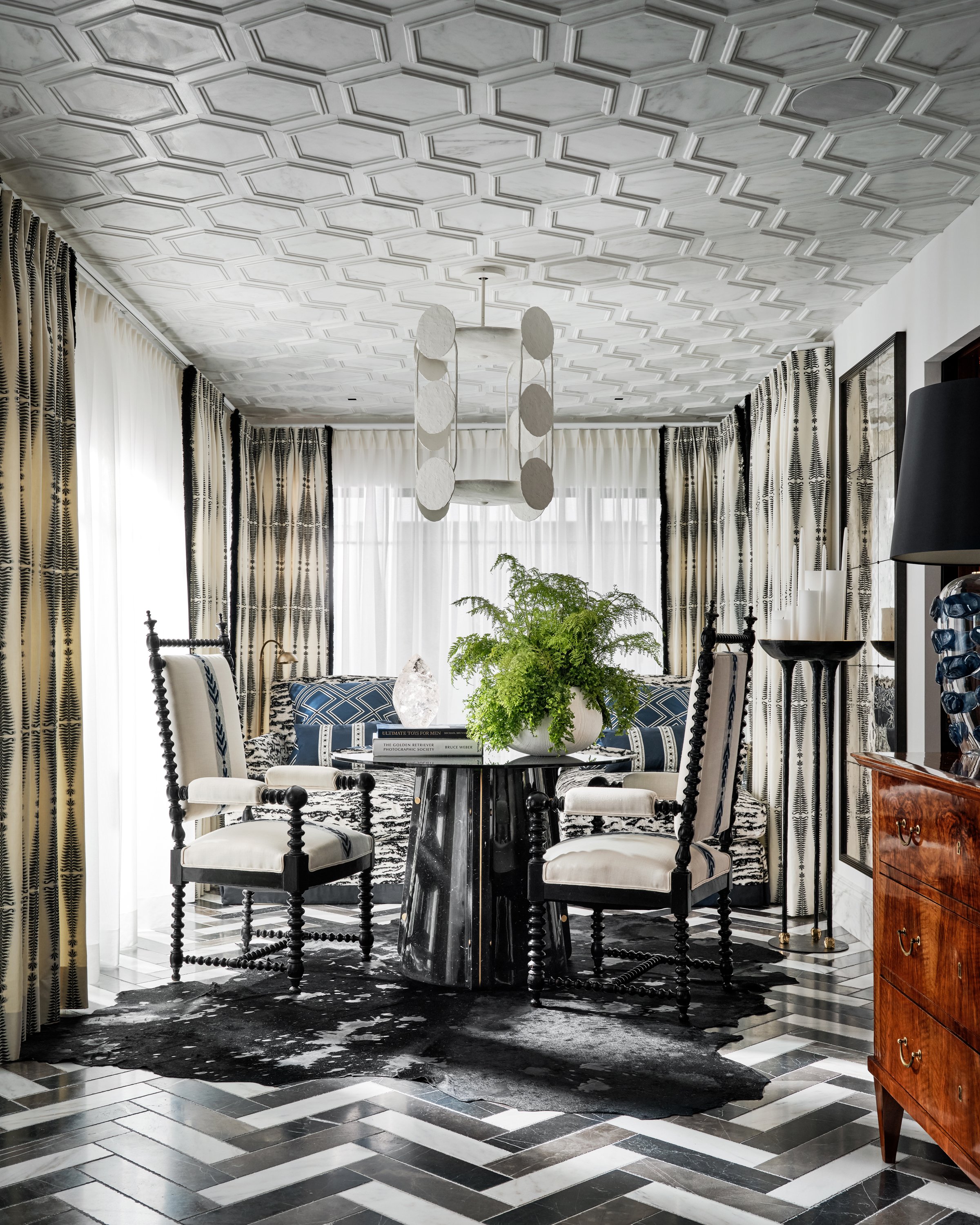
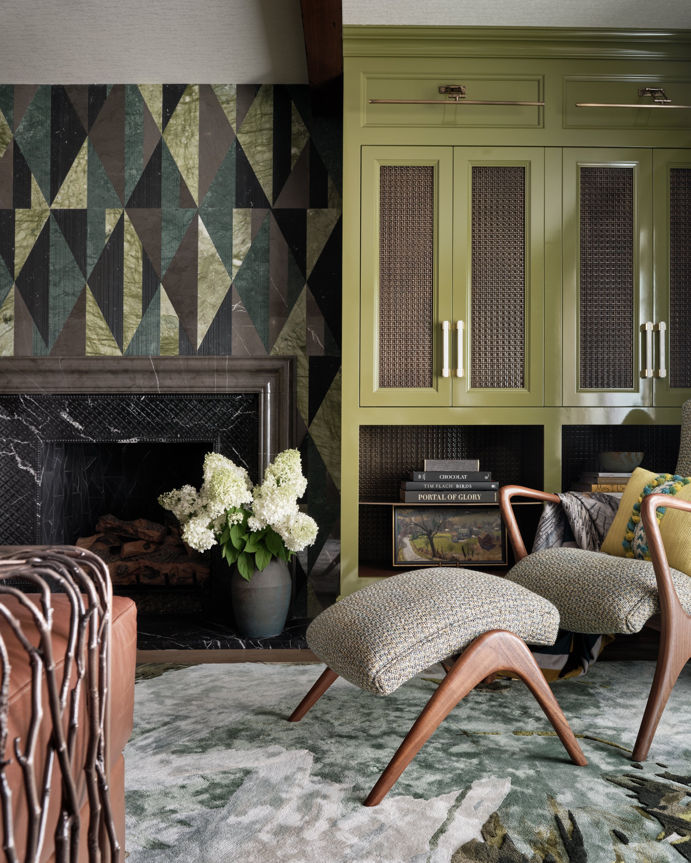
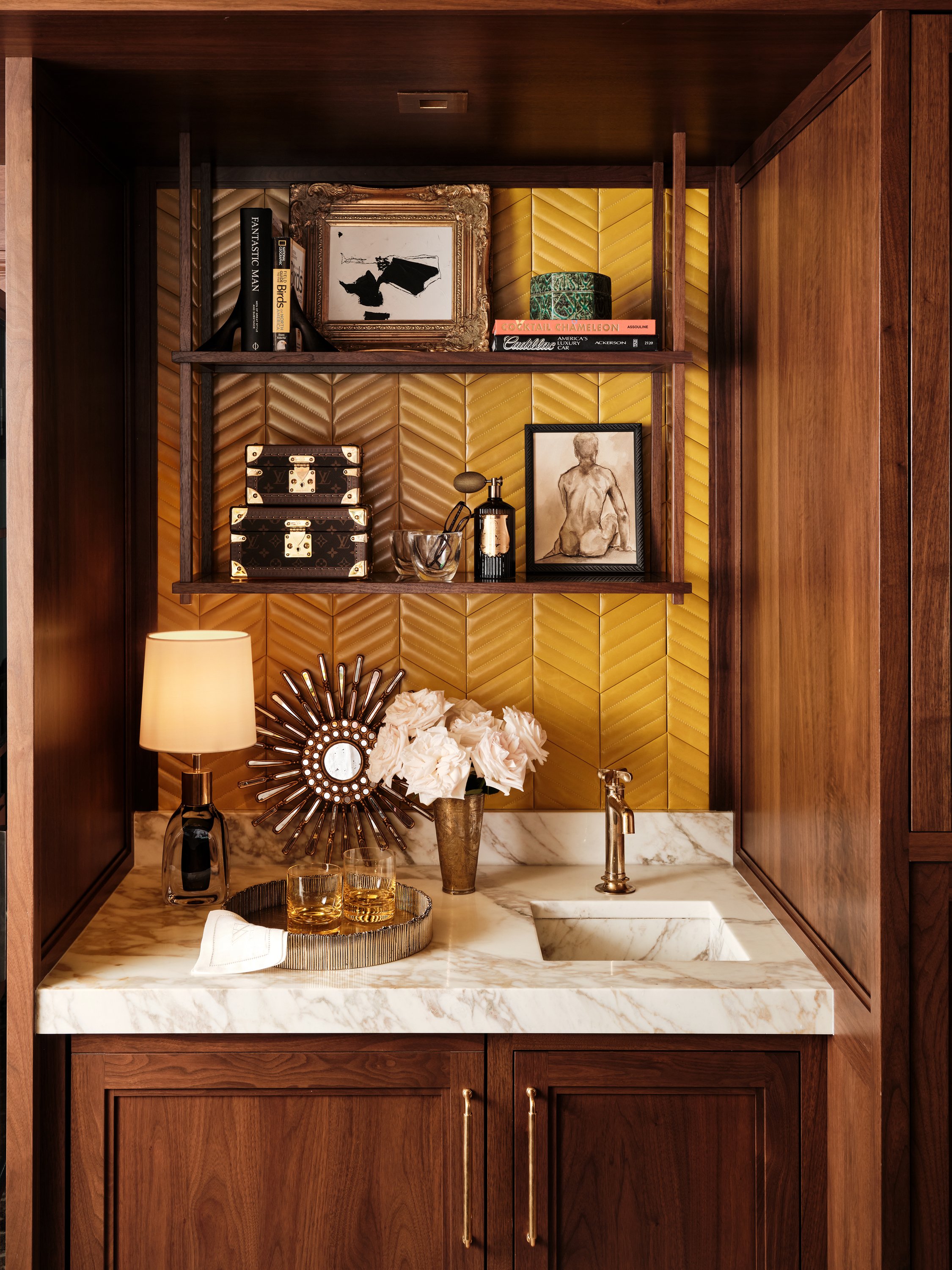
The winners of the 2023 Paper City Design Awards in Dallas were recently announced, and I am delighted that several of my design clients made it to the list! It's an honor to witness their hard work and dedication get recognized.

The 2023 Paper City Design Awards honors outstanding projects by the best interior designers and architects in Dallas and Fort Worth. The winners were selected from hundreds of submissions in 21 categories, and their projects represent the very best in Dallas.

WINNERS

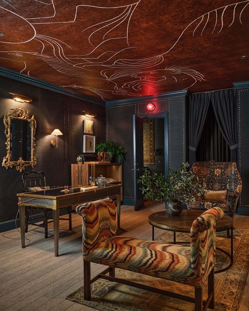
Singular Space: Bath - Laura Lee Clark Interior Design.

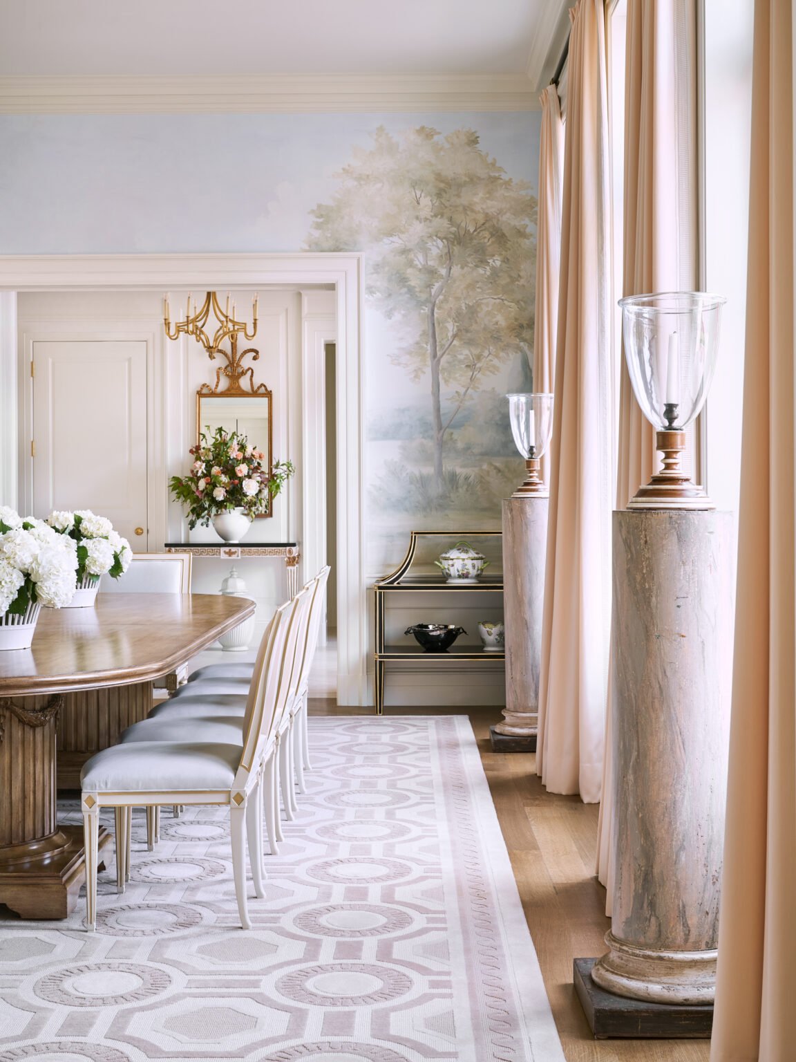
Singular Space: Dining Room - Pickering House Interiors.

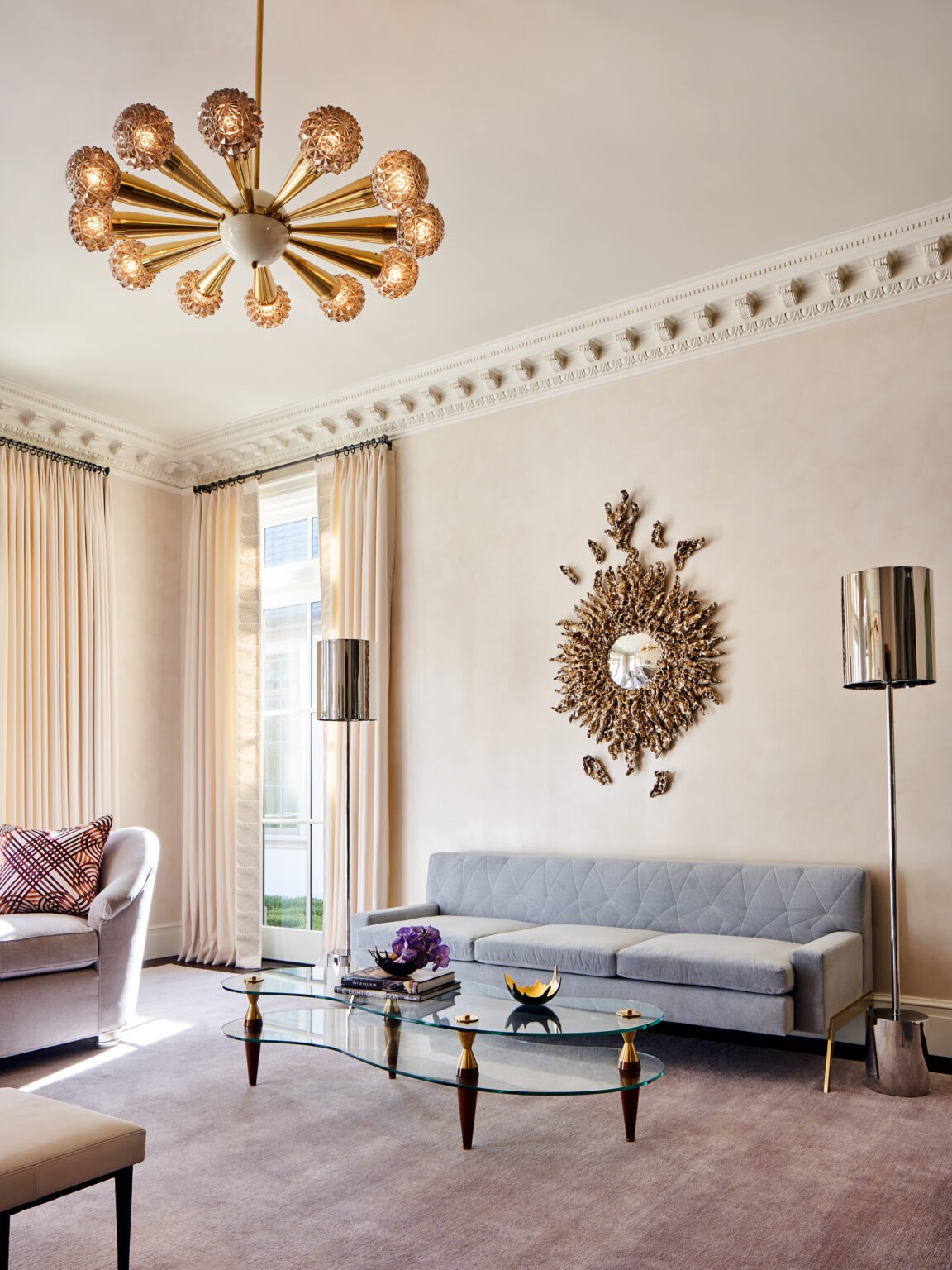
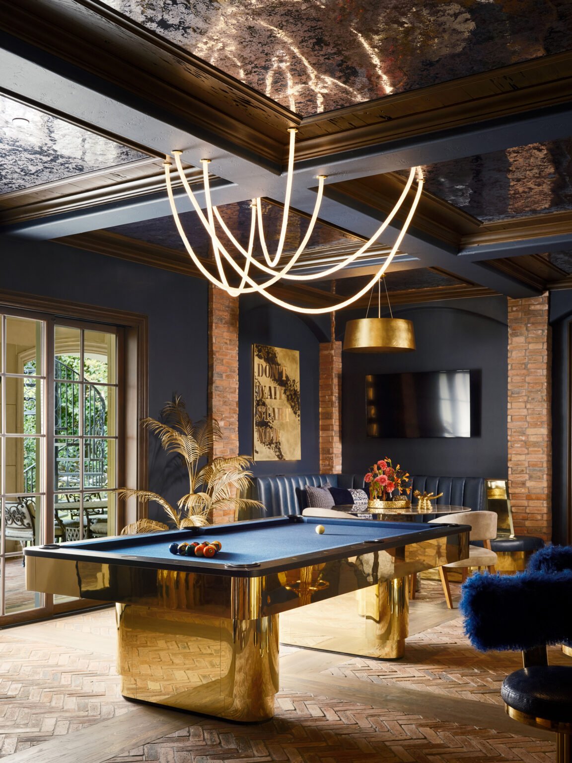
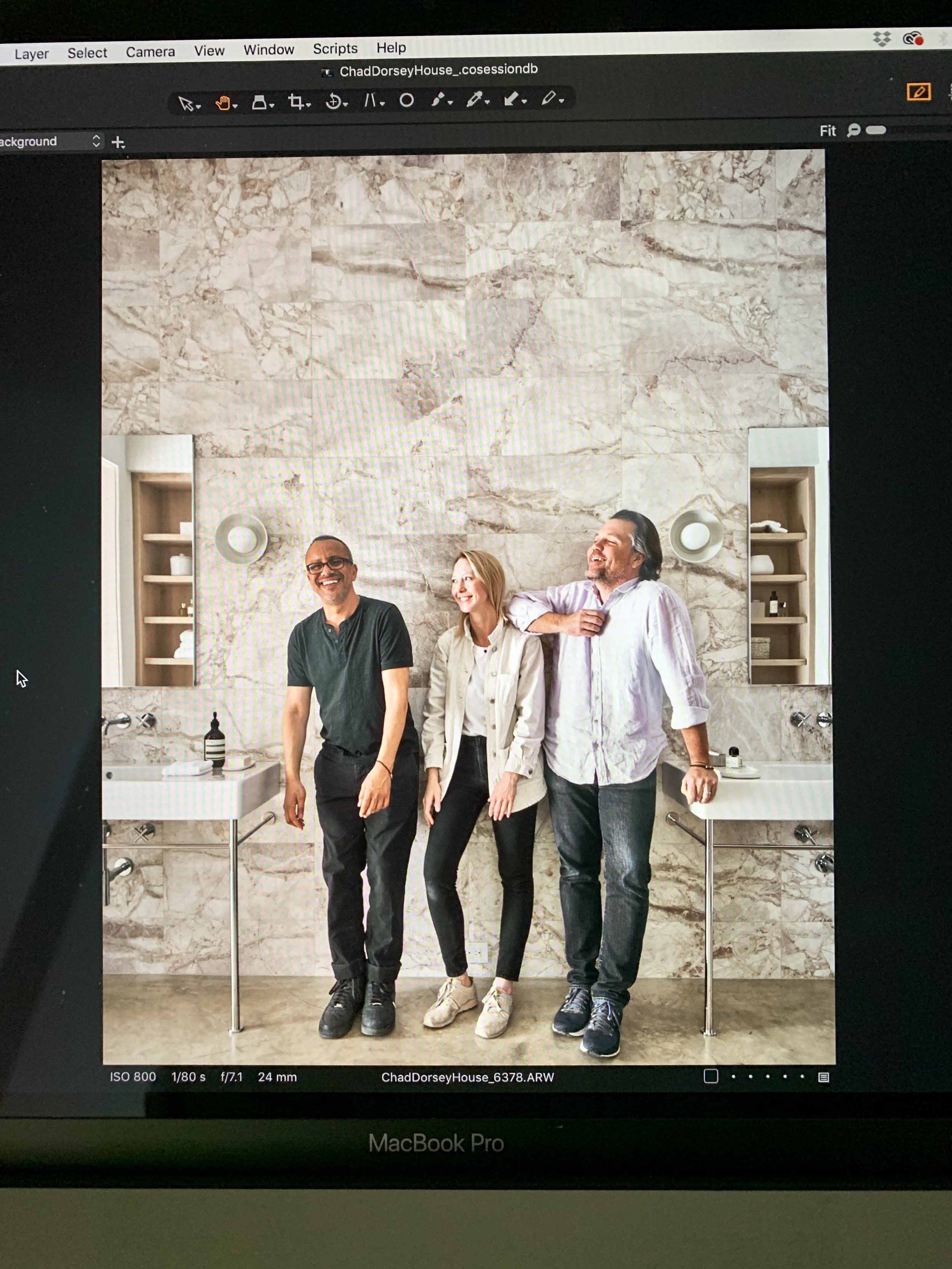
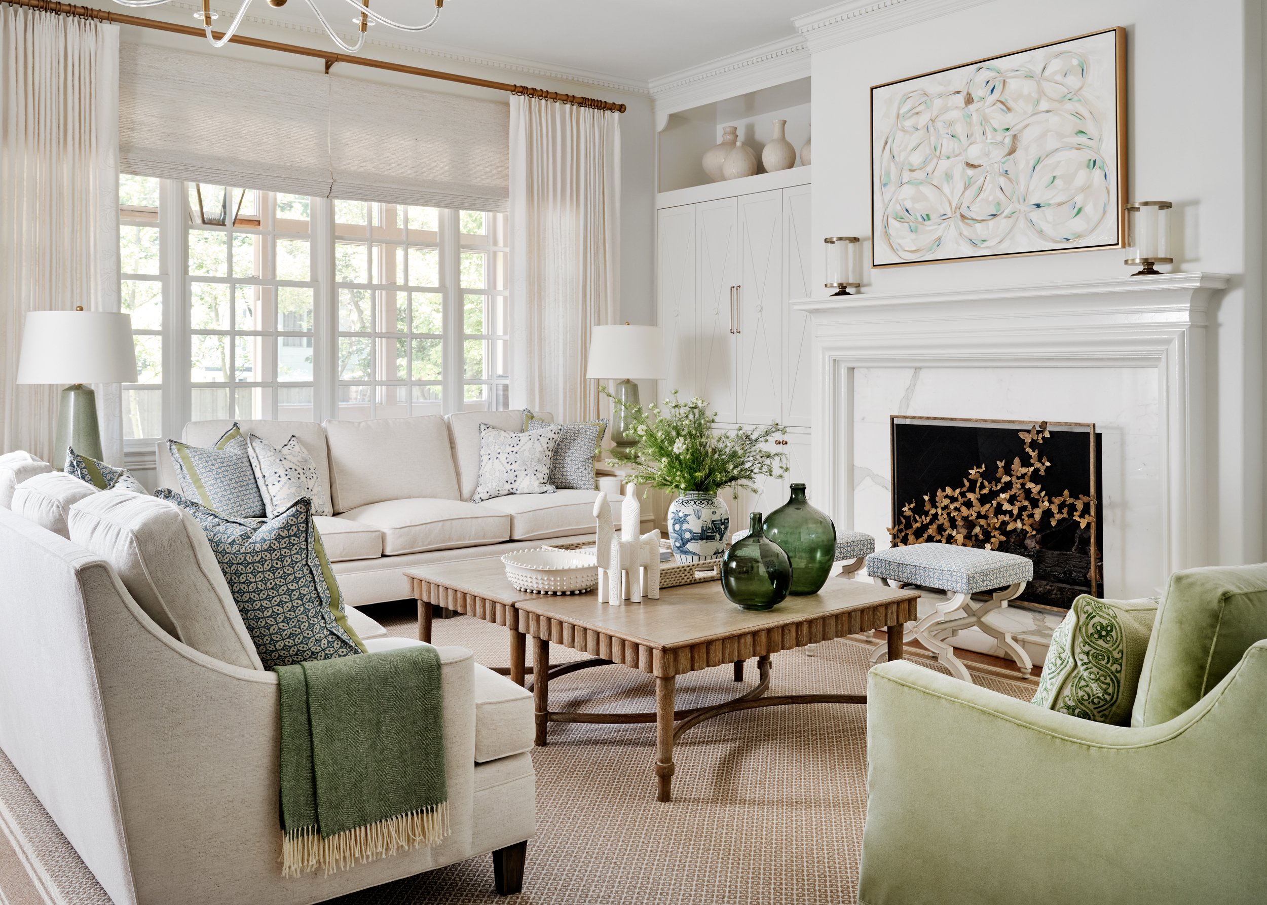
Singular Space: Living or Great Room, Entertainment, Recreation and Media Room - Chad Dorsey Design with additional recognition for Blume Architecture.

HONORABLE MENTIONS

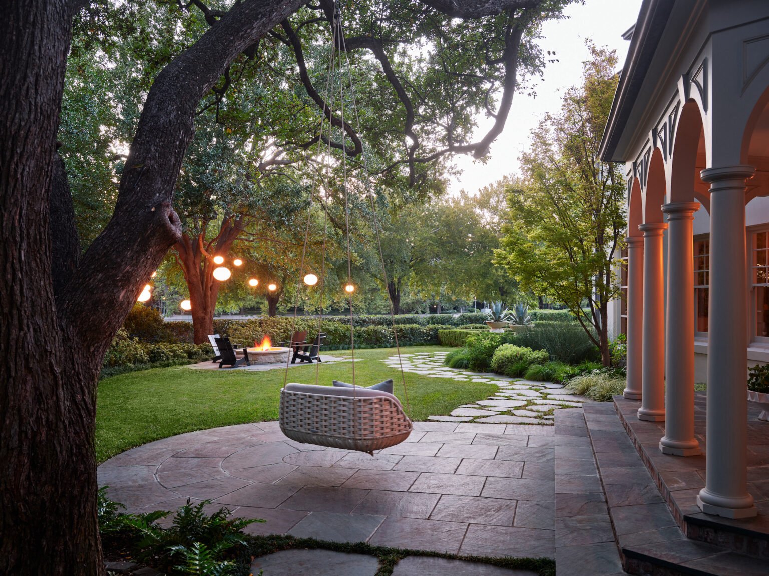
Residential Landscape Design - Melissa Gerstle Design.

Residential Interior Design Under 3500 Square Feet - Heidi Arwine Interiors.

Singular Space: Living or Great Room, Entertainment, Recreation and Media Room - Laura Lee Clark Interior Design.

Use of Small Space - Powder Bath, Bar, Laundry, Foyer - Janet Gridley Design.

Congratulations to the winners at the 2023 Paper City Design Awards in Dallas! It's always a treat to see local designers and architects come together to showcase their incredible talents.

All interior photographs by Stephen Karlisch.

See all of the winners of the 2023 Paper City Design Awards here

Chad Dorsey Design with additional recognition for Blume Architecture.

Creative Focus: Claire Crowe
 
 
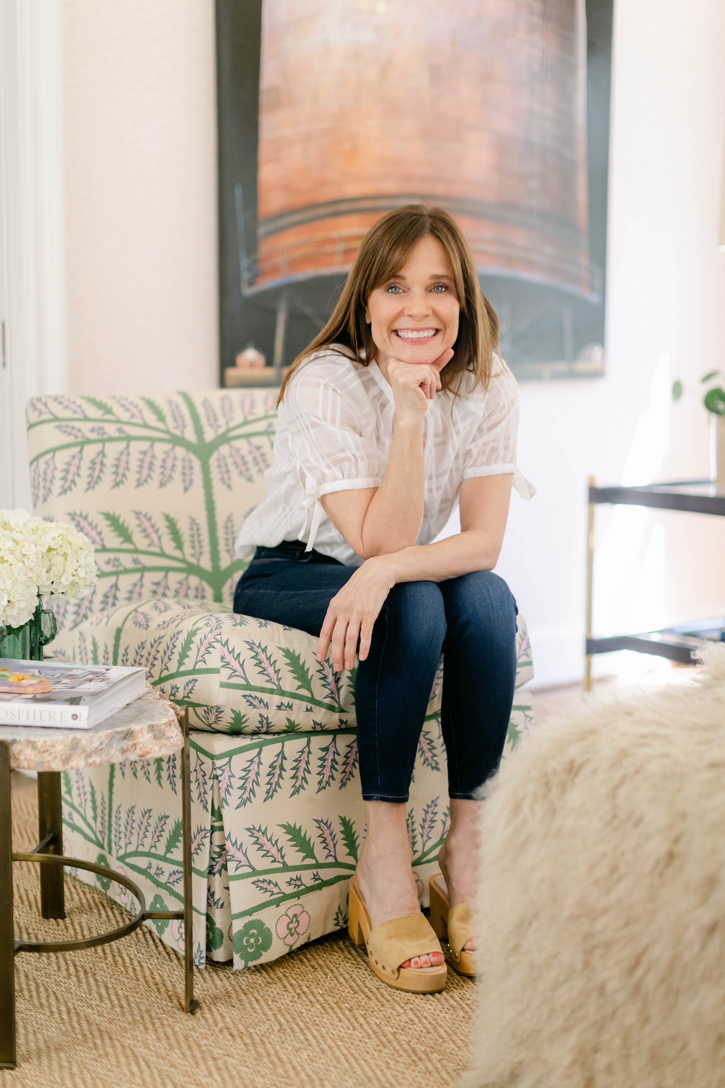
Photo portrait of designer Claire Crowe


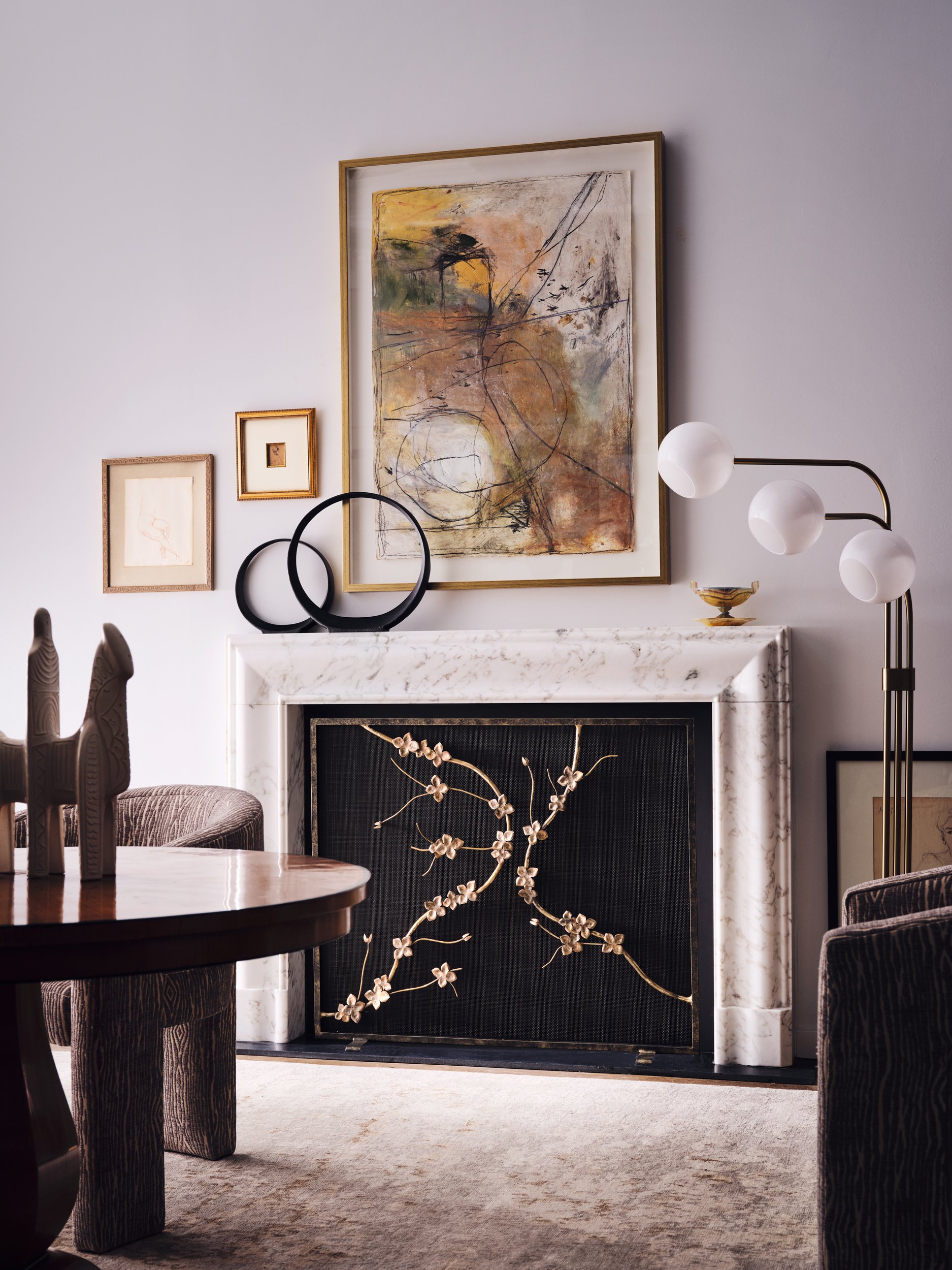
I first heard of Claire years ago when a stylist wanted me to throw a couple of fireplace screens in my car and drive them up to Oklahoma City for a shoot. That sent me down to pick up the screens at Claire's studio in the design district and I was blown away by her talent, operation and her personality. We discussed shooting something together for a long time but finally made it happen in 2023. Claire's studio has a couple of faux fireplace setups to display her screens, and the challenge was to make it look like it wasn't in her office environment. A little light trickery from me and a lot of help from stylist Heidi Adams created a couple of vignettes that sold the right vibe. I'm really happy with how this all turned out, and working with people you enjoy is always a plus! 

I had wanted to put a Creative Focus blog post up about Claire because she is a local artisan and Claire's designs are instantly recognizable.  We love to see our community support one another.  Heidi Adams, the stylist on that firescreen shoot, used some of Claire's screens for props in a home shoot and was excited to hear the homeowner purchased the screens.  Our circle is small in this local market and we hope to see us all support and thrive together.


Interior Designer: Tori Rubinson; Stylist: Melanie McKinley


HOW IT ALL BEGAN

Claire Crowe was inspired to create something original and compelling for her own home. Armed with a sketchbook and an idea, she set off on a creative journey which led her to create one of America’s premier metalwork design companies more than a decade ago. Since then, her designs have been incorporated in many living spaces, both residential and commercial, often adding a layer of luxury to the fireplace or walls that needed a touch of sculptural beauty and intrigue.

Her goal is to continue creating handcrafted, American-made pieces that honor nature and gain beauty and character as they age.


Interior Designer: Tori Rubinson; Stylist: Melanie McKinley


What is the mission of your company?

Our mission is to design with both a modern and timeless sense of creation and strive to use ancient craft techniques in fresh new ways. Since 2010, we have specialized in artisan metalwork designs for the home. Inspired by the enduring expressions of nature and the inherent beauty of metals, semi-precious gemstones and hand blown or cast glass, the collection honors nature's most exquisite forms: butterflies, insects and quirky earthly shapes such as a curled leaf or a speckled egg. 

What’s new this year?  

We're working on a collection of new lighting for 2023. Our lights will be locally designed and built in Texas. We're responding to our design community's request for lighting that can be customized in size, scale, material and finish. We are also working on pieces that incorporate antiqued, blown and cast glass.

If you could select one design styles from history to be popular again, which one would it be? 

I love the exuberance of the art deco period, particularly the ironwork of Edgar Brandt. His work has this timeless quality, as though it might have been completed recently.

What advice would you give yourself at 20? 

Use the sun screen! 

If you need inspiration for a design project, what do you do first? 

Flip through old art books or other sources of visual inspiration I've collected, and then sleep at least twelve hours. Clarity comes the next day. 

What would you say is key in selecting a photographer for your projects? 

The key is working with someone who understands my brand. I want our pieces to play a role in those spaces where people make memories unwinding, connecting or just being. The photographer needs to see this spirit - this intent to honor the places where people gather. Often it's the fireplace.

What is your business philosophy or motto? 

There's nothing more important to us than living well at home, taking the time to unwind and connect with the ones we love.  Our collection is designed with that in mind because it's the small daily practices that make all the difference. 

If you weren't an interior designer, what would your profession be? 

A writer. But I would miss working with my hands. 

Why did you choose design?  

Design found me. I saw a void in the marketplace for compelling fire screen designs and set out to make two for my own home. More than a decade later, I’ve designed dozens and the idea stack continues to grow.

How would you define your work in three words? 

Innovative, organic and artistic.

What modern design trend makes you cringe? 

Imported products that are essentially copycats of emerging designer's work. I’m also not sure about fringe on sofas again.

What is one thing no one knows about you? 

I’m obsessed with plants. I need a bigger home to accommodate all the plants I would like to live with. 

What are some of the podcasts you listen to and why? 

Making Sense for existential ponderings; Art Juice for creative inspiration; and Prof G for news and economic insights. 

A book that everyone should read? 

The Untethered Soul

What’s inspiring you in life (in the industry) right now? 

Freedom. Rigid, stark lines are softening and freedom to do what makes you smile is in style again. Minimal or maximalist, it's all a go.

Screen Designs: Claire Crowe
Claire Crowe Collection website
Instagram
Facebook

Stylist – Screens photoshoot: Heidi Adams
Heidi Adams website
Instagram

Interior Designer: Tori Rubinson
Tori Rubinson Interiors website
Instagram

Stylist: Melanie McKinley
Instagram

We would love to feature your creative talents from our industry on our award-winning blog. Shoot us an email at hello@stephenkarlisch.com to find out how.


Using Florals for Interior Photography

Interior Designer: Tori Rubinson; Stylist: Melanie McKinley
All photographs: Stephen Karlisch

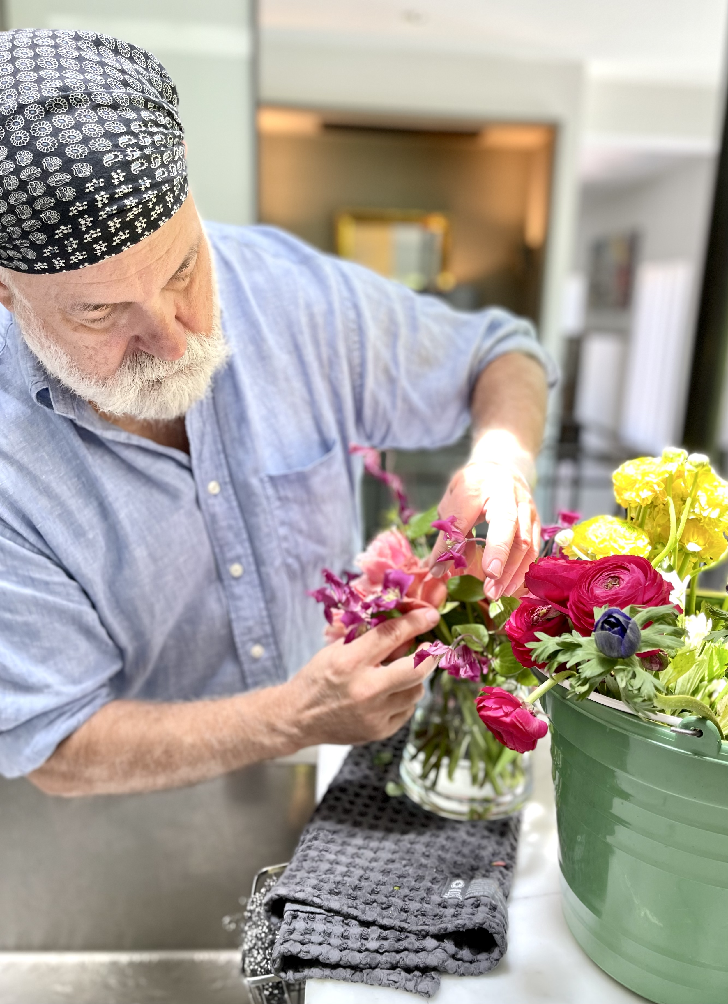
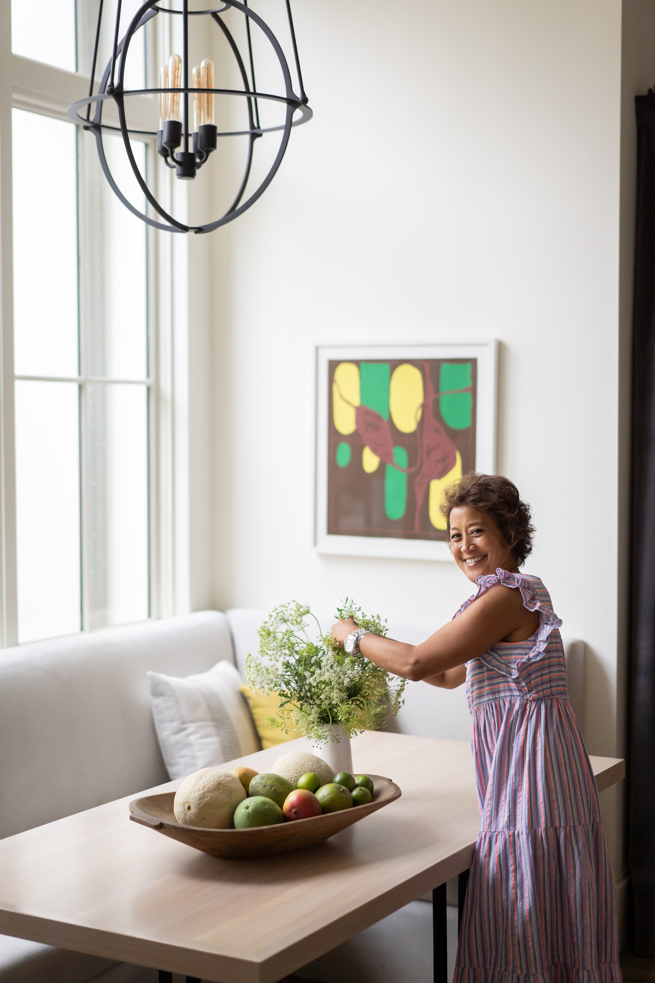
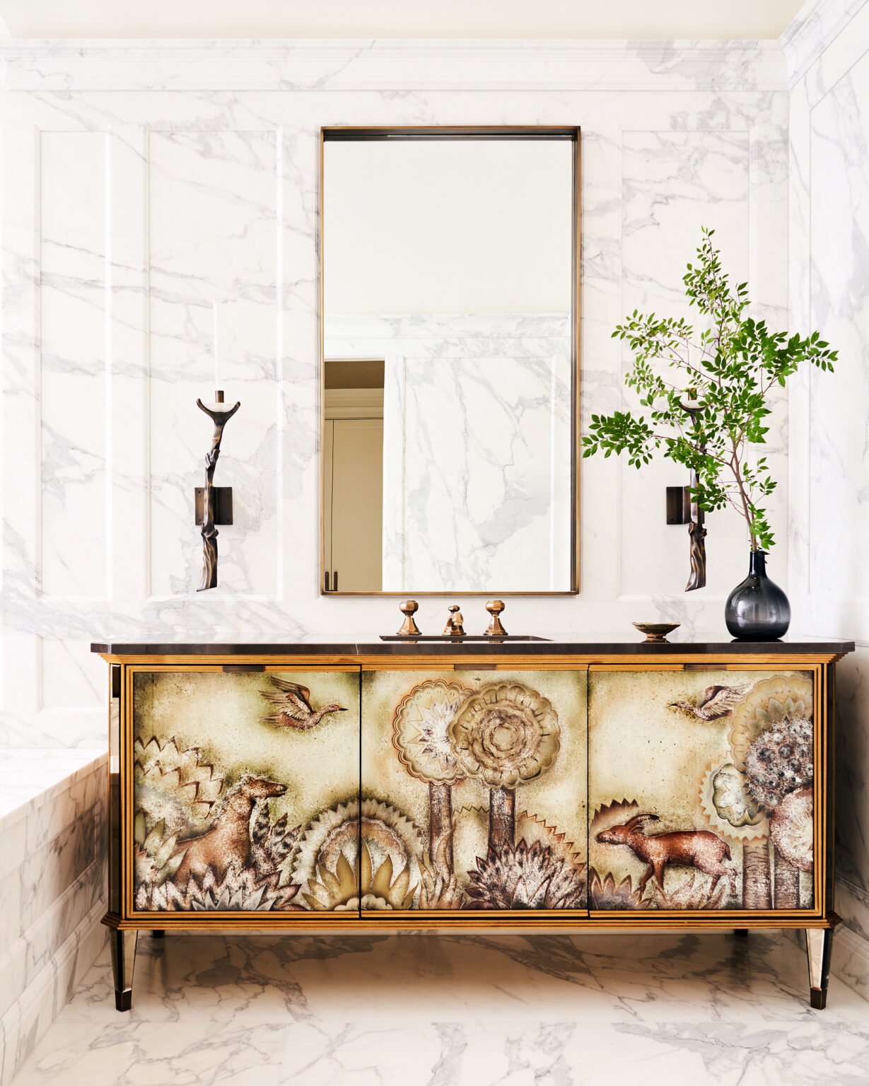
Floral arrangements are so critical when styling interiors for photography. Look through Instagram or the latest shelter publications and you’ll see that the most successful and stunning rooms have some sort of flowers, branches or greenery. Florals are so key to a room’s styling, making a space look fresh and literally alive, even if they aren’t the first thing you focus on when looking at the photo. But there’s a balance between the florals and your interiors. The photos are being taken to show your work in the best way possible, so you don’t want to distract from that with a fussy or over-the-top display. Here are some of the guidelines for florals – and be sure to scroll down for some amazing Instagram accounts to follow for inspiration.

Do You Need a Floral Stylist?

There are three ways you can work with florals for a photo shoot. First, there are interior stylists who are really good at designing floral arrangements. Be sure to ask to see some of their work before you hire them, of course, but having one person to help with all of the styling is going to make things easier. Or you can work with an interior stylist and a floral designer as a team. If you’re really good at putting together arrangements, then you can take on that role, of course. I know of at least three top designers who took courses in botanical arrangements to ensure they could do that for their photos and clients. But remember that you’re already going to be playing several roles during a photo shoot – art director, furniture mover, photo approver – so you may be adding more stress than you need. The key is to get someone who not only understands that the florals need to be gorgeous in the room, but that they also need to create the balance and symmetry that photos need. 

Styling Tips

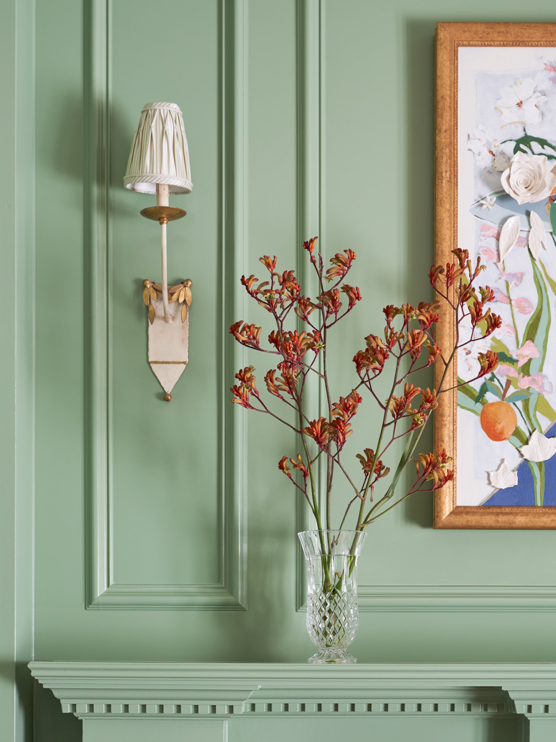
The most important thing to remember is that whatever plants, flowers, or greenery that you bring into the room are there to add life and enhance the look. They are not meant to be the focus. That’s why you’ll see vases of blooms in a single color – they complement the decor and don’t become the center of attention. 

When you do the walkthrough with the photographer and stylist (and/or florist), decide which angles are going to be shot, and capture them with quick photos, even on your phone. You can then look at those photos and decide where florals are needed.

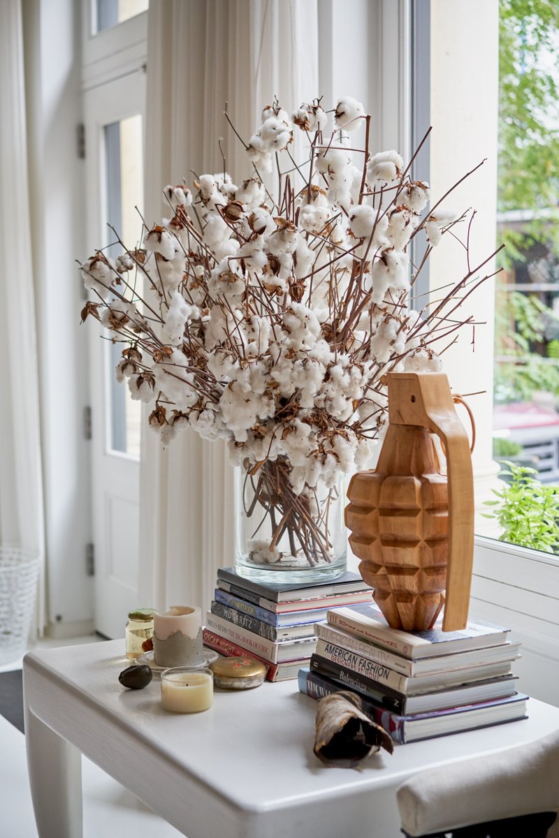
You can use arrangements to hide something (like a switch), to fill a “blank” area in the photo, or to balance a surface. Knowing the size and shape of what you need will also help you decide on what type of flowers, branches or plants you may need. For example, you could use a small tree in a corner that seems bare. You can use a small arrangement on top of a stack of books to make a more vertical line. Use your arrangements in strategic ways.

And select the type of flowers and plants based on your decor style. A more formal room may need a more artistic arrangement, whereas a boho room may look best with a relaxed grouping of natural flowers.

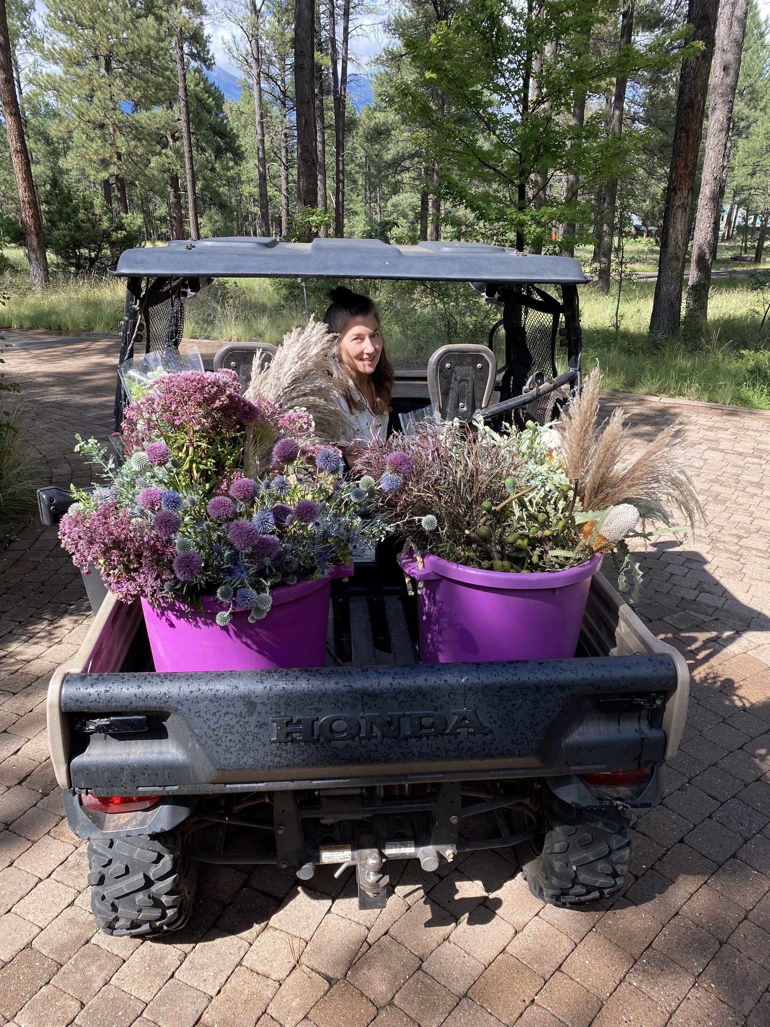
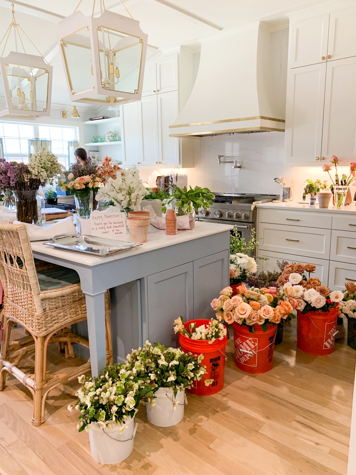
Finally, if you or an interior stylist will be creating the arrangements, be sure you use a local wholesale florist. Because you are considered a trade, you can get much better pricing that way. Order your flowers ahead of time, too, so you get exactly what you want and so they’re as fresh as possible.

Current Trends

Floral trends come and go – remember the ficus tree that seemed to be in every shot for a while? And the fiddle leaf is almost oversaturated now. Here are the trends that are hot today:

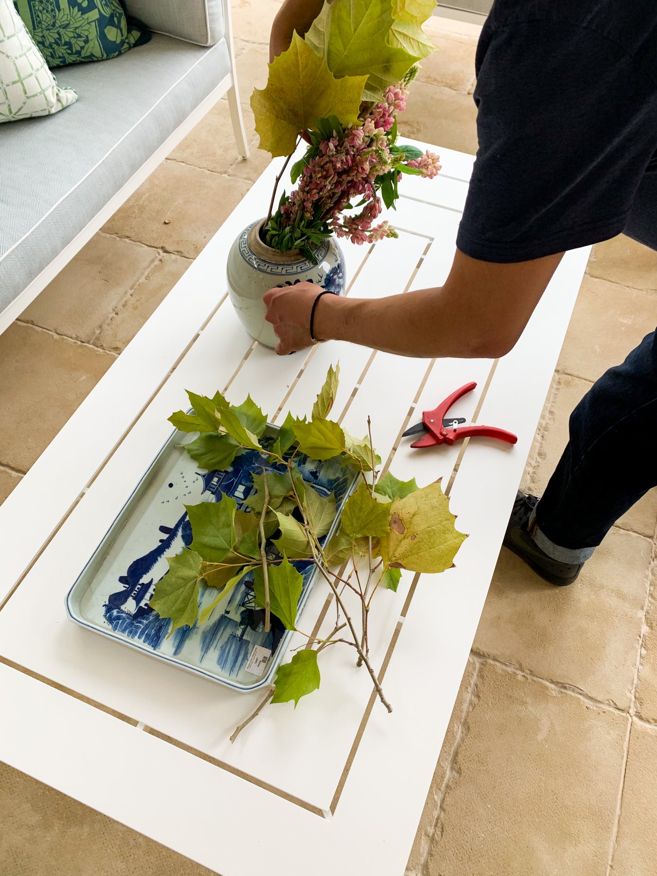
Branches. We’ve seen these for a while, but they aren’t going anywhere. In fact, arrangements of branches have only gotten bigger…literally. These work best in large rooms, to the side of the photo, or when they almost blend into the background. They also can “date” your photo, meaning you can use branches of fall leaves if you want to have your photo considered for an autumn issue. Or flowering branches can make a spring-like statement. The key is to let them arch the way they would as they grow. Don’t force them into positions that look unnatural.

Dried Flowers. We’re not talking about faux looks or strange potpourri types of botanicals. Today’s look is inspired by Parisian markets, so you see more lavender, eucalyptus, and small pampas grasses. Single stems are popular, as well as tied bouquets, and you see a lot of dried grasses mixed with fresh cut flowers, too. 

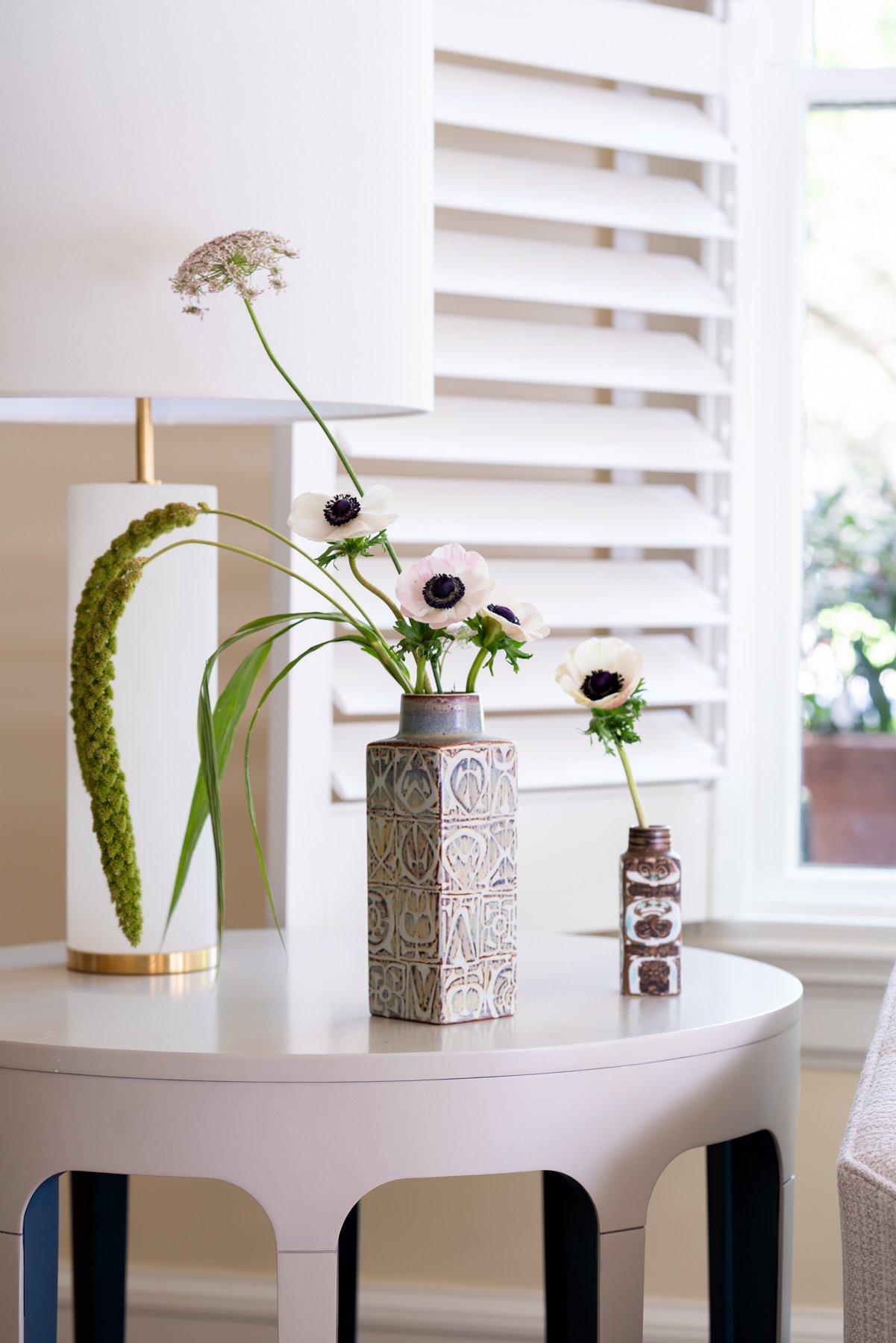
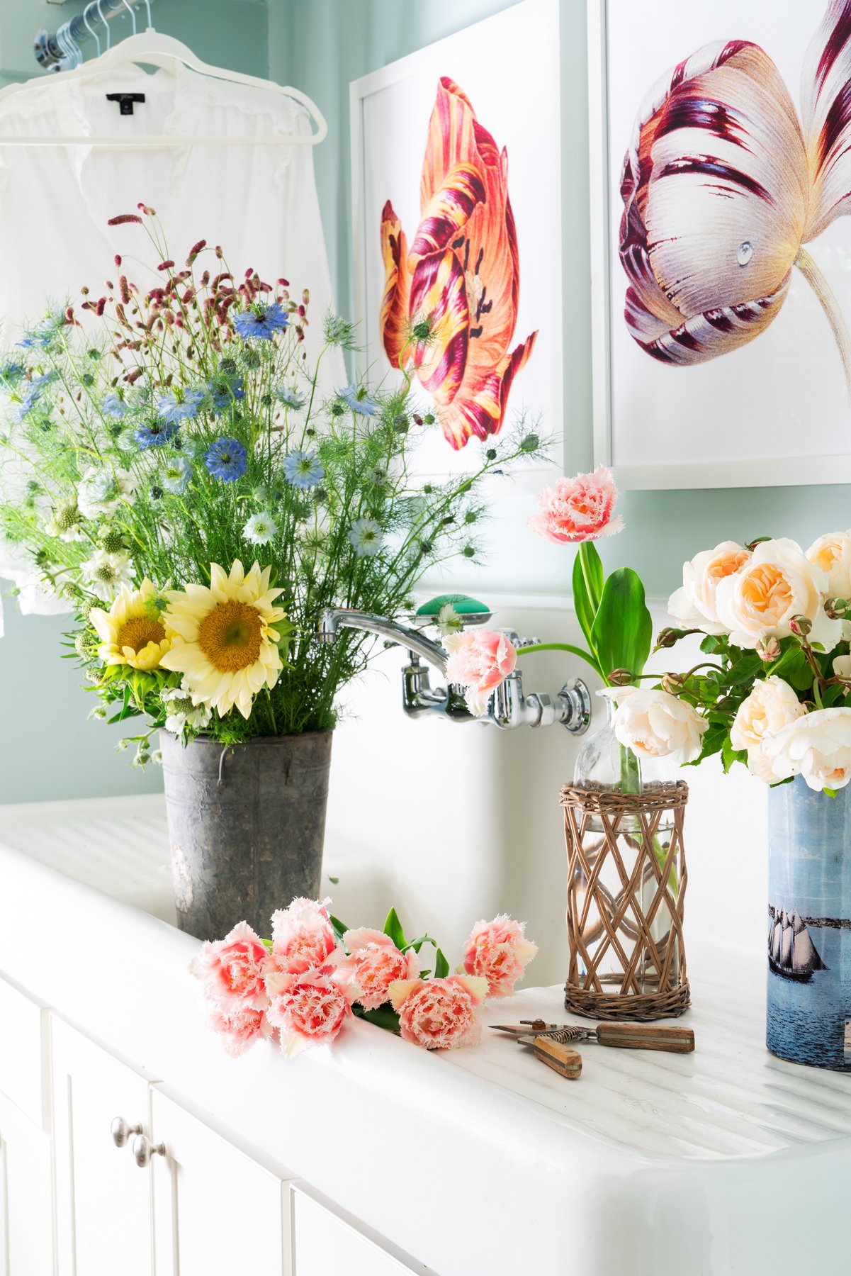
Single Colors. This look has been on-trend for a long time, and there’s a reason. Bouquets with a lot of color are distracting and will distract from your amazing interior design. They also can make the room look fussy or too busy. This subtle arrangements of one color are complementary to the room, and almost blend into the background. The photo’s viewer will still subconsciously take in the flowers and plants, but it won’t be what they focus on. You can go with a bit of an ombre look with subtle variations of pink, for example, but be careful that it isn’t distracting.

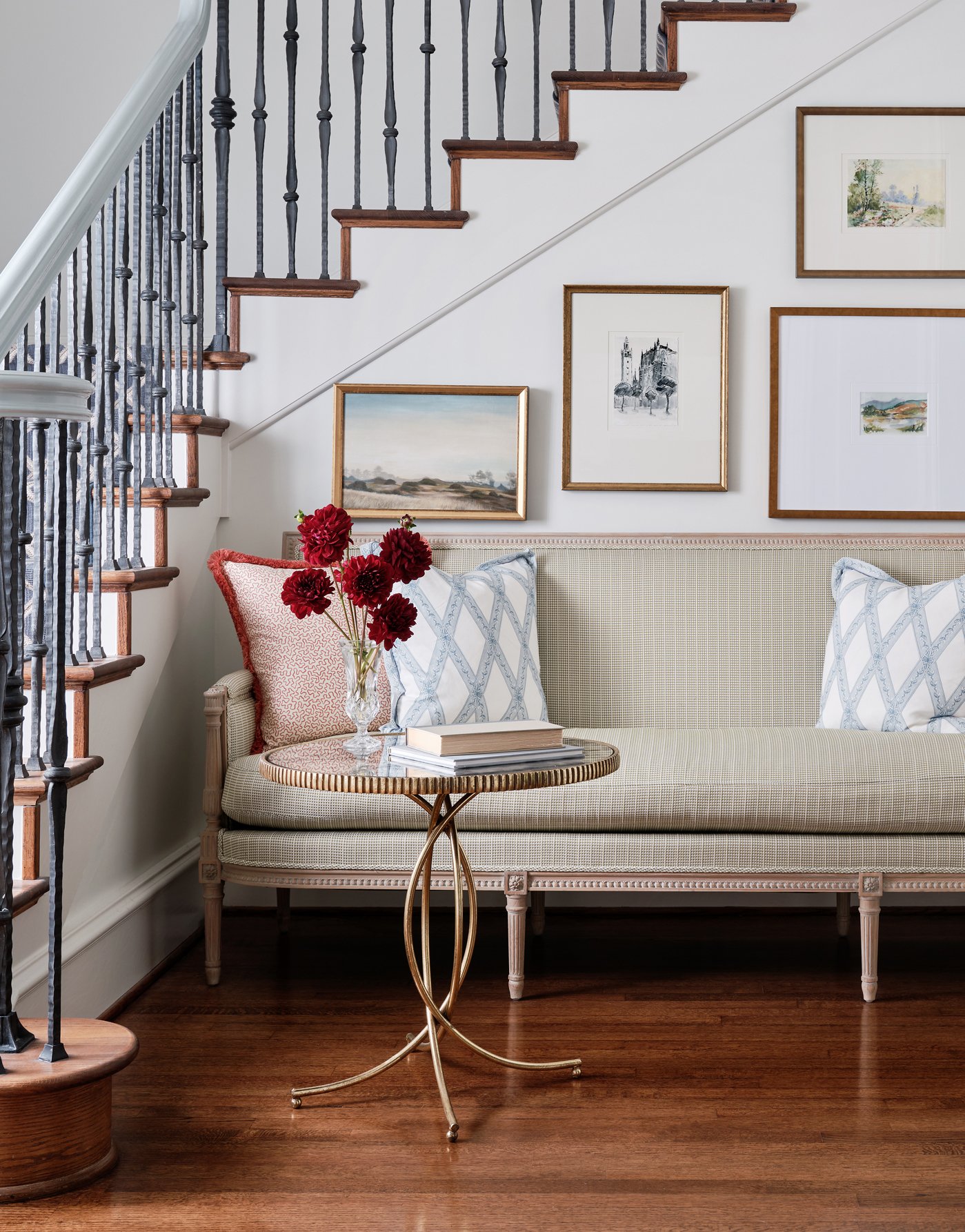
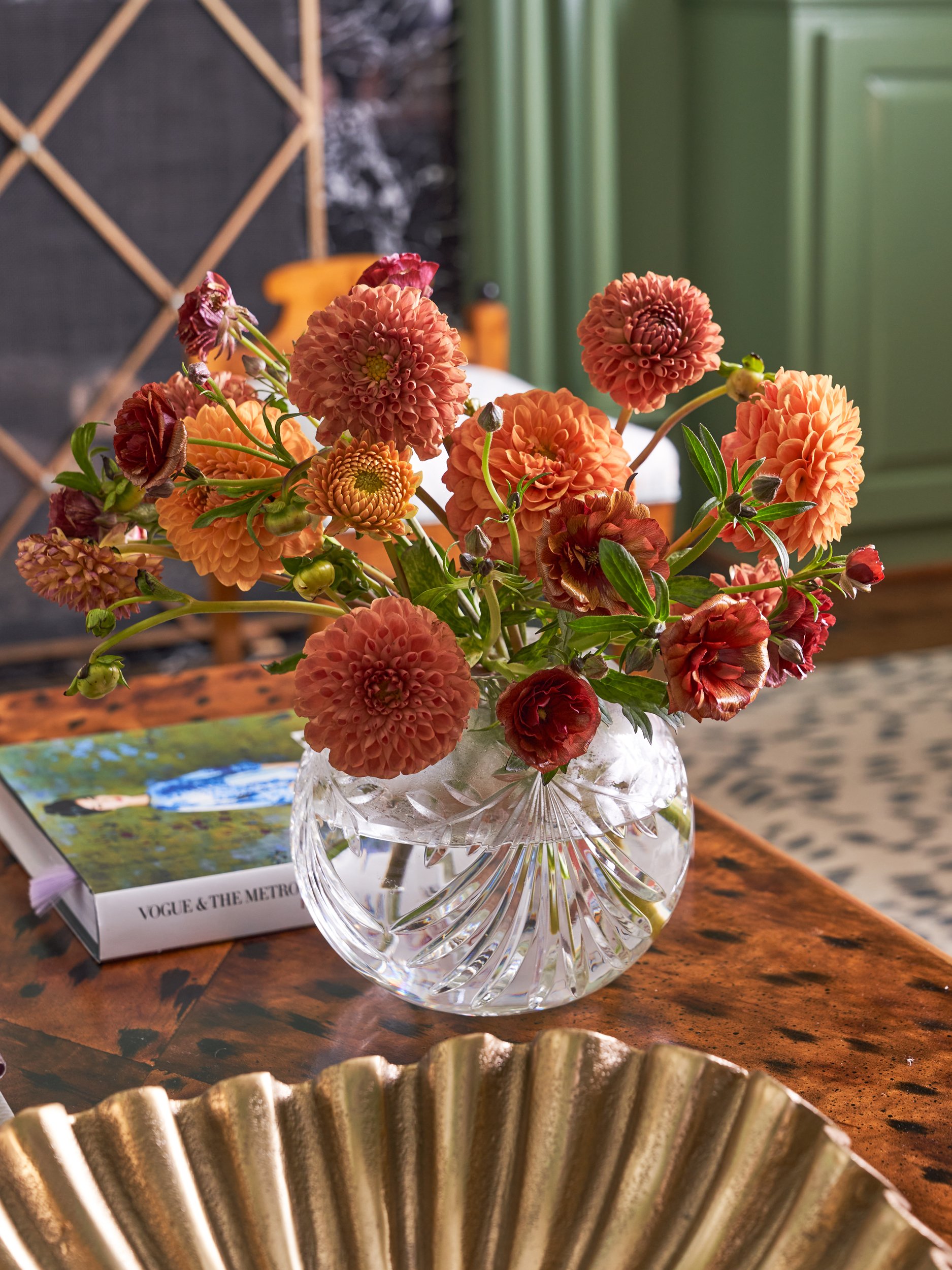
Go Natural. Natural flowers are the go-to today. So instead of tight formal roses, you’ll see wild or rambler roses. Dahlias are having a moment, and so are peonies, ranunculus, poppies and long streams of ivy. The idea is to have loose arrangements that look like they were just plucked from the garden. In those natural arrangements, you want to only use one variety of flower at a time. So a loose bouquet of hydrangea, or a couple of stems of poppies in a small vase. If you do put several varieties together, follow the one-color rule.

Some of our favorite stylists offer some insight into their process of designing with florals:

Jenny O'Connor @jennyoconnorstudio

“I like the floral that is right for the space and the shot. Sometimes that’s fluffy and fussy and sometimes that’s lean and sculptural. It all depends on the space and where the camera is. And a lot of getting a great floral moment comes down to choosing an appropriate vessel for what you want that floral to achieve for the shot.

Maybe this illustrates the difference? But the first I chose the vessel and directed what we wanted here (tall and shapely and wild) and the second I actually did the floral for (the opposite).”

Photography: Stephen Karlisch; Interior Design: Strike by Chad Dorsey; Coco & Dash; Laura Lee Clark

Styling: Jenny O’Connor


Anita Sarsidi anitasarsidi.com

“My floral style tends to be something a bit natural in the room so it doesn’t take center stage but complements the interior and enhances the room.”

Styling by Anita Sarsidi for Mahon Interior Design


Frances Bailey @francesfinds

“My flower philosophy is to select flowers and plants that help support the visual story the interior designer wants to tell. I have a pre-shoot call where I go over each space and we talk about the flower/plant story. Some designers are really into it and some like me to decide but first I need to understand what they want the room to say. I also try to use flowers that they haven’t used in prior shoots or things on their website portfolio to keep things interesting. I buy from the NYC Flower Market but try to use local, in season flowers whenever possible as well.”

Styled by Frances Bailey for Morgan Madison Design.


Who to Follow

Here are inspiring Instagram accounts for interior design, floral designers, and botanical accounts that will give you great ideas for your own floral styling:

Jenny O'Connor @jennyoconnorstudio

Anita Sarsidi anitasarsidi.com

Jimmie Henslee @hensleejimmie

Steve Cordony  @stevecordony

Adam Fortner @adamfortner

Melanie McKinley @melanie.mckinley.stylist

Colin King  @colinking

Flower Magazine @flowermagazine

Floret Flower @floretflower

Sarah Winward @sarah_winward

Frances Bailey  @francesfinds

French Country Cottage @frenchcountrycottage

Justina Blakeney @justinablakeney

Sophia Morena-Bunge @isaisafloral

Charlotte Moss @charlottemossco

New year new published featured shoots!

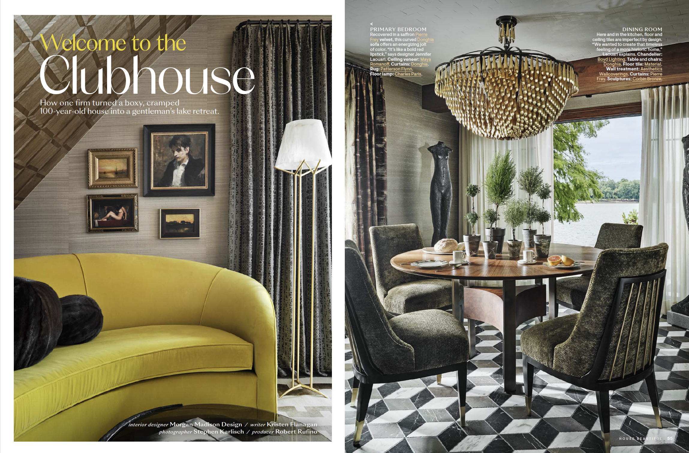
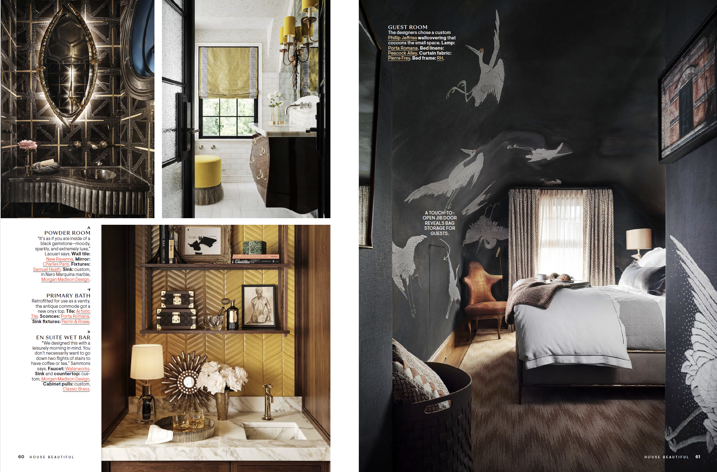
Excited to start 2023 with a national feature in the annual House Beautiful Small Spaces and a local feature in D Home! Congratulations and thank you to interior designers Tanner Morgan of Morgan Madison and Teddie Garrigan of Coco & Dash.


Magazine spread in House Beautiful featuring photos by Stephen Karlisch

A couple of years ago I got a message from a young designer (Tanner Morgan) in Cleveland, wanting to discuss photographing a project he was working on. It was very early in the process for him, in fact none of the actual construction had even started at this point, but Tanner really wanted to make a connection with me and get me on board for this journey. I was a bit skeptical at first, not knowing anything about Tanner at that time and his online presence as a designer was limited, but he also was very young and excited to get going. His passion for this project quickly became evident and I was ready to go along on this ride. Through many calls, emails, facetimes and updates to the progress on this home, we brought in Frances Bailey, one of the world's top interior stylists, to soften the edges of this project and get it to a national editorial level. 

The three days we spent shooting this project was a highlight in my photography career. Being a part of the process from the beginning engaged my curiosity and brought out my best. We stayed out on this lake property in a charming guest house and enjoyed sunsets and sunrises together, bringing us all pretty close during that week. 

Tanner transformed this simple lake house into a showpiece, each room better than the last, and not one square inch left untouched. The details in every surface are remarkable, a testament to Tanner's own personal style, a character himself you will never forget. 

Writer: Kristen Flanagan
Photographer: Stephen Karlisch @stephen_karlisch_photo
Interior Designer: Morgan Madison Design @morganmadison__
Producer: Robert Rufino
Stylist and floral: Frances Bailey @francesfinds


Photo of living room interior by Stephen Karlisch in D Magazine
Photo of sitting room interior by Stephen Karlisch in D Magazine
Photo of bedroom interior by Stephen Karlisch in D Magazine
Photo of hallway interior by Stephen Karlisch in D Magazine

Teddie Garrigan, owner of a unique retail furniture/design shop in Dallas called Coco and Dash, reached out to me to photograph her apartment in Dallas recently. She lives in a high rise in Uptown, near the Katy Trail, that has been a favorite for many in the design world for years. They could do an HBO series about this place, seriously, full of character(s). 

Teddie and her daughter Courtney run the shop together and their interior design business, and I was thrilled to get the opportunity to document her home. From a life of travel and living in many foreign countries (she has a great story to tell!), she lives a collected life. Layers of color and texture rule her world, and I've rarely photographed a space that I've felt more at home in. Working with stylist Jenny O'Connor on this was the perfect mix. She was able to blend in some simple floral to accent the shots, but not overwhelm, and help move some items around to create perfect compositions from the cameras point of view. The apartment was glowing from so much natural light, being in a high rise with nothing around to block the sun, the rooms just come alive as the day moves on. It's always hard to pack up and leave a shoot like this one, so many more stories in there to be told, maybe I'll get a chance to get back in there someday soon.  

Writer: Kendall Morgan
Photographer: Stephen Karlisch @stephen_karlisch_photo
Interior Designer: Teddie Garrigan, Coco and Dash @cocoanddash
Stylist and floral: Jenny O'Connor @jennyoconnorstudio

Creative Focus: Shazalynn Cavin-Winfrey

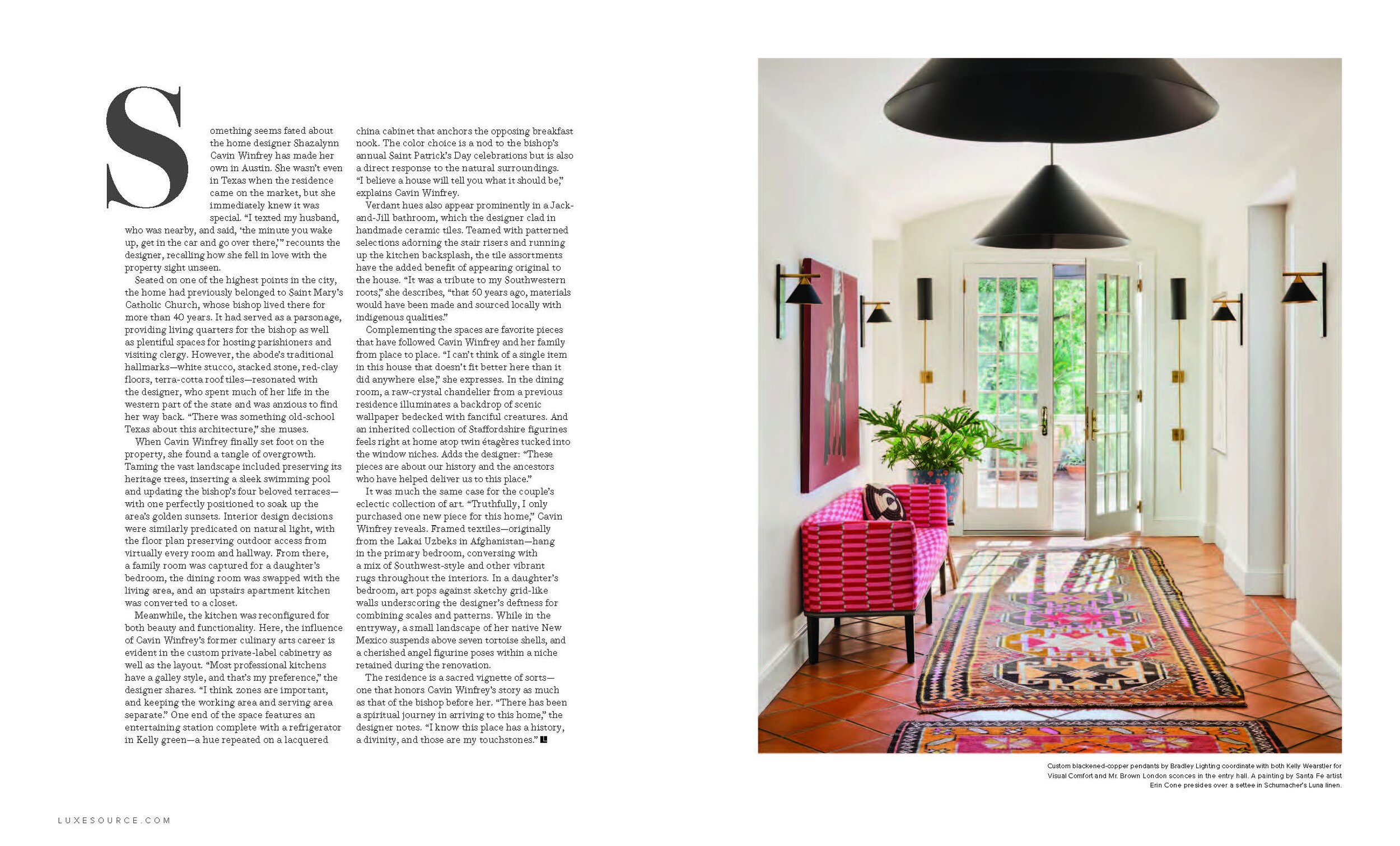
The first time shooting and working with Shazalynn Cavin Winfrey was with a very personal assignment, her own home. She had updated this former parsonage by making it more functional without losing its connection to the past. We worked with the talented Frances Bailey (Stylist) and had a wonderful time during this two day shoot in Austin. The project landed as the cover story in the Sept/Oct 2022 issue of LUXE Austin + San Antonio. The backstory of this house is worth checking out from the article. Seeing how she has transformed this into a comfortable, sprawling home, with surprises around every corner, showcases her style and skill as a top designer. 

We’re excited to feature Shazalynn in this Creative Focus series. 


Shazalynn with her sweet Lulu. She lost Lulu summer of 2022 and this photo is so special to Shazalynn that Stephen captured from the interior shoot.


Her story…

Shazalynn Cavin-Winfrey, owner and lead designer of SCW Interiors, has had a lifelong passion for design that has taken her from growing up in the Southwest to settling in the Northeast. For more than 20 years she’s honed her craft, building on what she learned at the University of Texas, the Culinary Institute of America, and Parsons School of Design. From her experience running her own catering company, as a mother and wife, and as a highly recognized designer, she’s come to believe that a centered home is the key to a rewarding life.

“I was born in Roswell, New Mexico to teenage kids. My children believe that I was literally dropped off by the aliens and maybe they are right. My nickname is the mothership. My early influences include spending so much time with my grandparents while my parents were busy trying to become adults. I have an uncle who is four years older than me if that gives you some perspective. So my time spent in their houses and with my grandmother was so critical to the person I would grow into and particularly to design and my love of food and cooking. There was so much history she would impart with everything she did and brought into the home and I must have been a sponge.”

Shazalynn grew up in a family of creatives and lawyers mainly in the oil business. She was discouraged from becoming a designer because it might not be a feasible way to support herself, and her grandmother thought being a school teacher was much more practical. 

“After all, I would have summers and holidays and I probably would not work very long once I got married. This still makes me laugh. During my time at the culinary institute of America I would travel to the city and look at the different options for design schools because it was still where my heart was and so encourage your kids to follow their passion because my path was definitely not a straight one and I always wonder what might have been.”

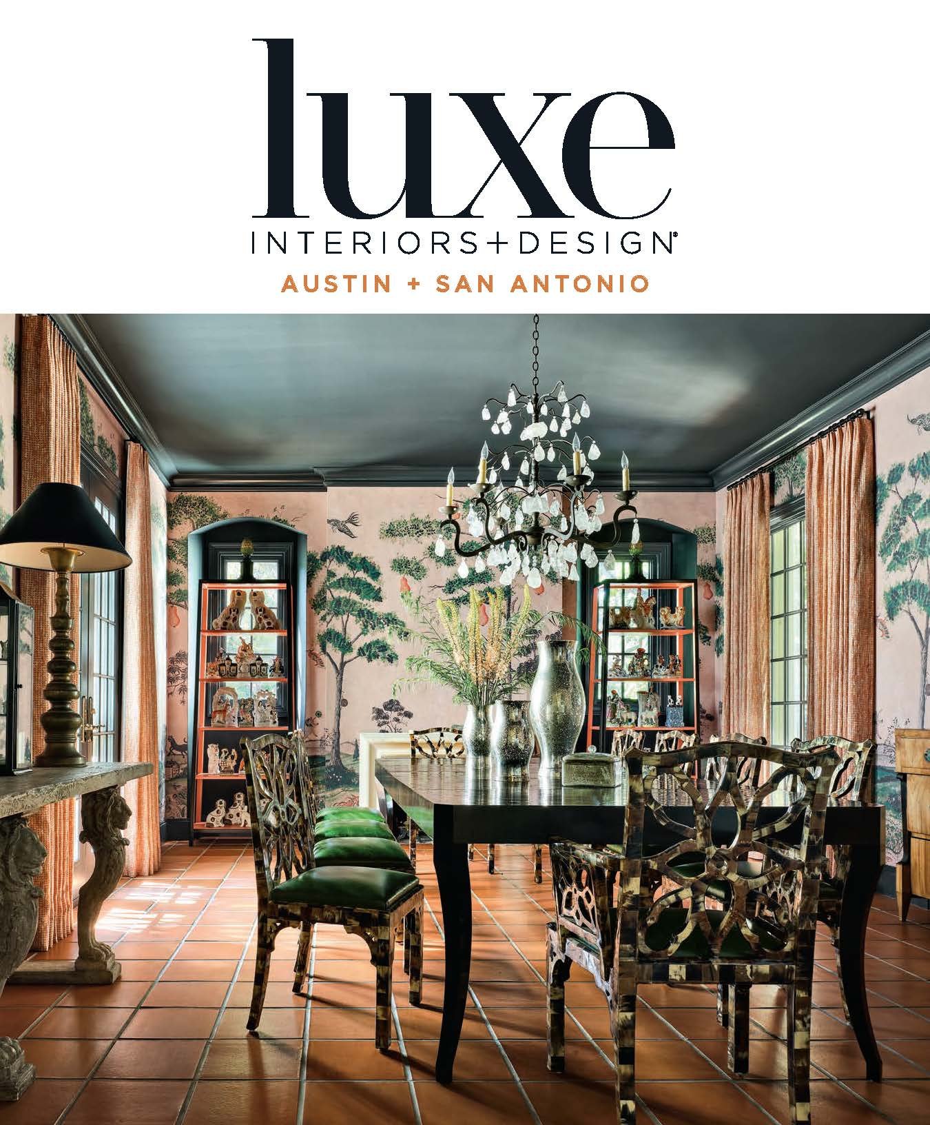
“Behind the divine new look of a Texas home that belonged to a Bishop.”

Cover & feature story in Sept / Oct 2022 issue of Luxe Interiors + Design Austin + San Antonio

Photography by Stephen Karlisch. Styling by Frances Bailey

Interior Design Shazalynn Cavin Wifnrey, SCW Interior, LLC

Let’s see and hear a little more from Shazalynn

Things that I think make our work different is that being southern, I love a good story. Storytelling is an art form and I really love to impart my clients’ story into their homes. It sometimes takes some coaxing because not everyone feels that their past or their childhood is what they necessarily want to represent in their homes. But the truth is that imprinting starts so early and it informs our personal likes and dislikes. It would be boring if I just inserted myself into other people’s homes so I am really sensitive to where and who people come from and what shaped them I could tell you a million stories about these particular situations. I believe that designing your home should be a very self actualizing experience for the owner. Many people don’t spend much time thinking about what they like and don’t like so it is a great exercise and I am grateful people trust me to help them. Our homes are retreats that should feed our souls and nurture us to be strong in a fast changing external environment. It is one reason why I think kids rooms and bedrooms in particular are so important. So many people are only worried about the spaces other people can see and that is very telling when we begin the process.  

I am fairly certain my clients think I am sort of hippie with expensive taste. I don’t place much value in dressing a certain way which is probably not ideal. My job is physical so I dress accordingly. I have had someone ask if I was driving the old beat up suburban out front because he was shocked at an early meeting and another client who calls me the bohemian designer. I am not sure what this says about me but I value humility and I would much rather buy designer fabrics than designer cars.  


Portrait by Erin Cone

The portrait of my children with their motherless head was commissioned and is by Santa Fe artist Erin Cone.  I was so captured by her work in particular her hands.  She had not previously painted small children but was willing to give it a go.  At the sitting my son would not let go of my hand so I told her to just paint it like you see it but omit my head (crazy hair all day everyday). The outcome is for me iconic and Erin has enjoyed a prolific career which delights me to this day.

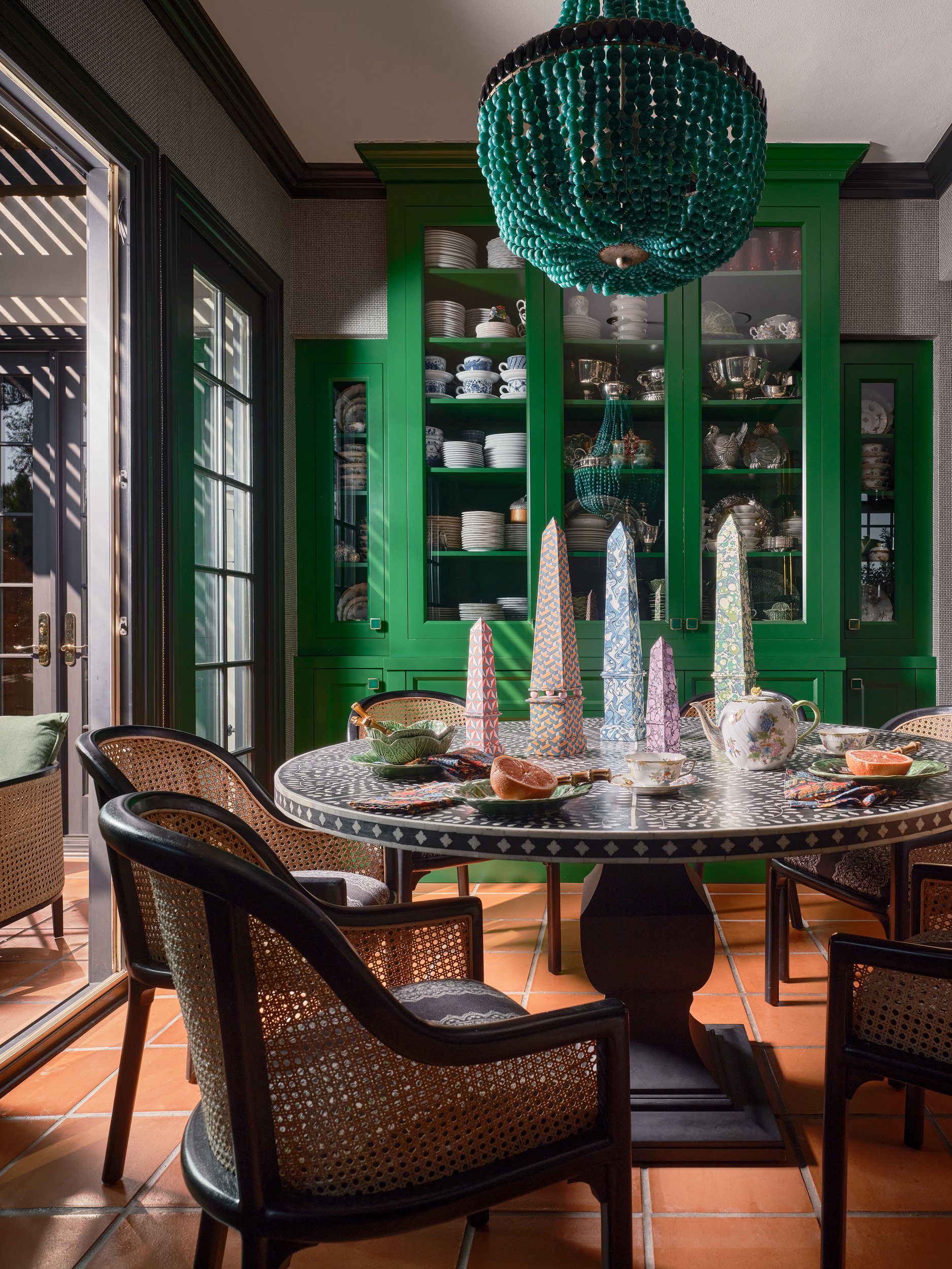
The kitchen….the heart of the home.

An homage to the Bishop who lived in the home for 40 years and would dismiss lent for one day each year in order to celebrate St. Patrick’s Day at the home with parishioners. I love to experiment with color and the custom green refrigerators were an opportunity to include this color. The interior of the coffee bar is a nod to our Alma Mater and love for the Longhorns. I cook all the time so the space is really about form, function and not worrying about it looking messy. I love to share a meal with people and this allows me to have everything I need within a few steps


What advice would you give yourself at 20?

HAVE MORE FUN, FEAR less, find what really makes you happy, and invest in your friendships. I was so worried about being self-supporting and making good grades and generally making everyone else happy that I forgot to stop and smell the roses. Life is a marathon not a sprint and I was definitely a sprinter. 

If you need inspiration for a design project, what do you do first?

My office knows that when I drive by myself I usually find the answers to most of the things I need to work through. Even if it is just to grab lunch I come back feeling more focused on the solutions.


Pattern Play

…one of my favorite things in life. I spent a lot of time playing board games growing up and putting together puzzles. Thinking about this now I realize I became hard wired to work through how things connect particularly in spaces. I always say visual memory is the only thing I have working up there.

The more casual nature of the home.

I personally believe cohesion exists when there is a plot twist. The more organic nature of the bedding against the linear lines in the space presents an opportunity to draw connections to the artwork and more casual nature of the home. I love structure but I am drawn the less serious side of things and this is the balance.


What would you say is key in selecting a photographer for your projects?

Someone who listens, is efficient and finds the humor in life. Oh and it is really nice if they don’t have 13,000,000 dietary restrictions when ordering lunch.

Which movie or TV set is your favorite from a design perspective? 

WILLY WONKA – FOREVER!

When the season premiere of “Showhouse Showdown” aired on HGTV featuring my project I received an email from a woman in California who had recorded the show to watch once her kids went to bed. She emailed me to tell me that I was her Willy Wonka. I have the email from her framed because it meant so much to me that she made that reference. True Story.


Coolio- This bathroom was a hot mess and once we started drawing it out on paper this is what worked. I grew up in a home at one point that had an atrium in the middle of the house. Granted it had 4 walls of glass with massive skylights but I always dream about that space. This bathing space creates the feeling of that for me. Plants line the walls, the water creates amazing acoustics within the glass and the skylights drench the space with the Texas sun which I have loved my entire life.


Favorite city to recharge?

SANTA FE – It feels like home. The climate is always perfect. The big blue sky, the smells, the food, ten thousand waves…. not much I don’t love about Santa Fe.  


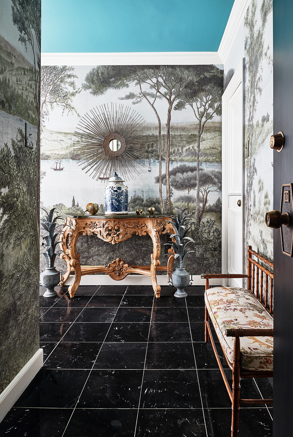
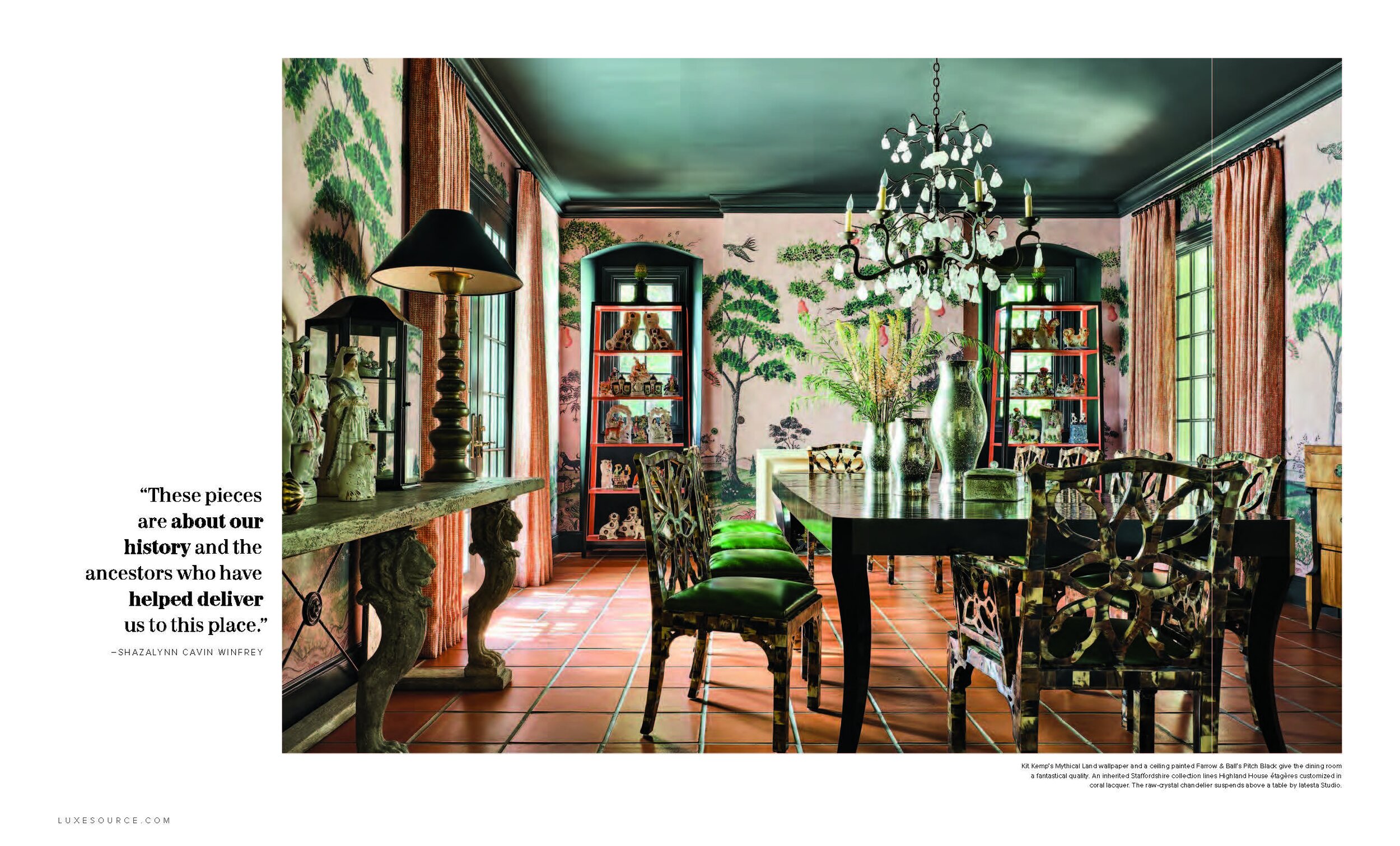
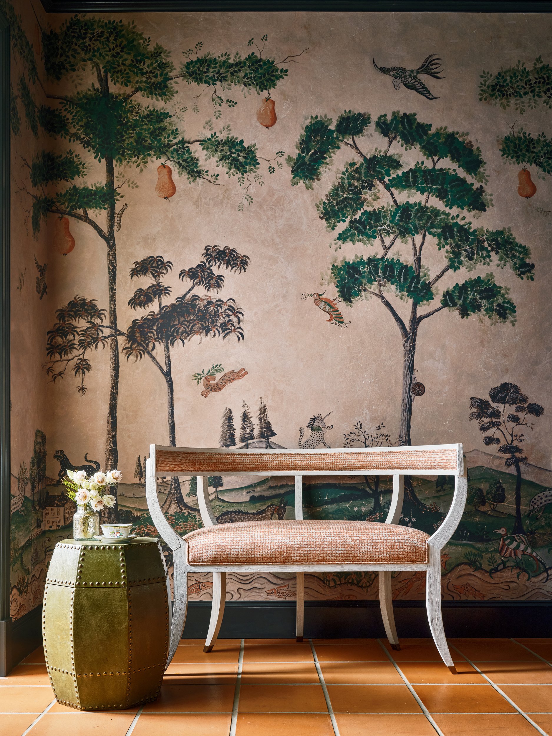
This dining room shot makes me so happy. The light filtering in the mornings is so special. When the sun sets it does exactly what it should. It catches those crystals and cuts across segments of the space through the smaller windows on the front and side of the house. I always tell clients to consider when and how you use your dining room. Also consider how the color and pattern look in candle light and other low lighting. The terracotta is very grounding for me. I am from the desert so it is only natural that I feel right at home against this color.


BTS fun with Frances Bailey, Shazlynn and Stephen.

SCW Interiors has been published in:

LUXE
House Beautiful 
Veranda
Décor
Arts & Crafts Home
Traditional Home 
and many others

To learn and see more of Shazalynn Cavin Winfrey’s talents please visit  SCWInteriors.com and be sure to follow her Facebook and Instagram pages.

We would love to feature your creative talents from our industry on our award-winning blog. Shoot us an email at hello@stephenkarlisch.com to find out how.
Creative Focus: Tori Rubinson


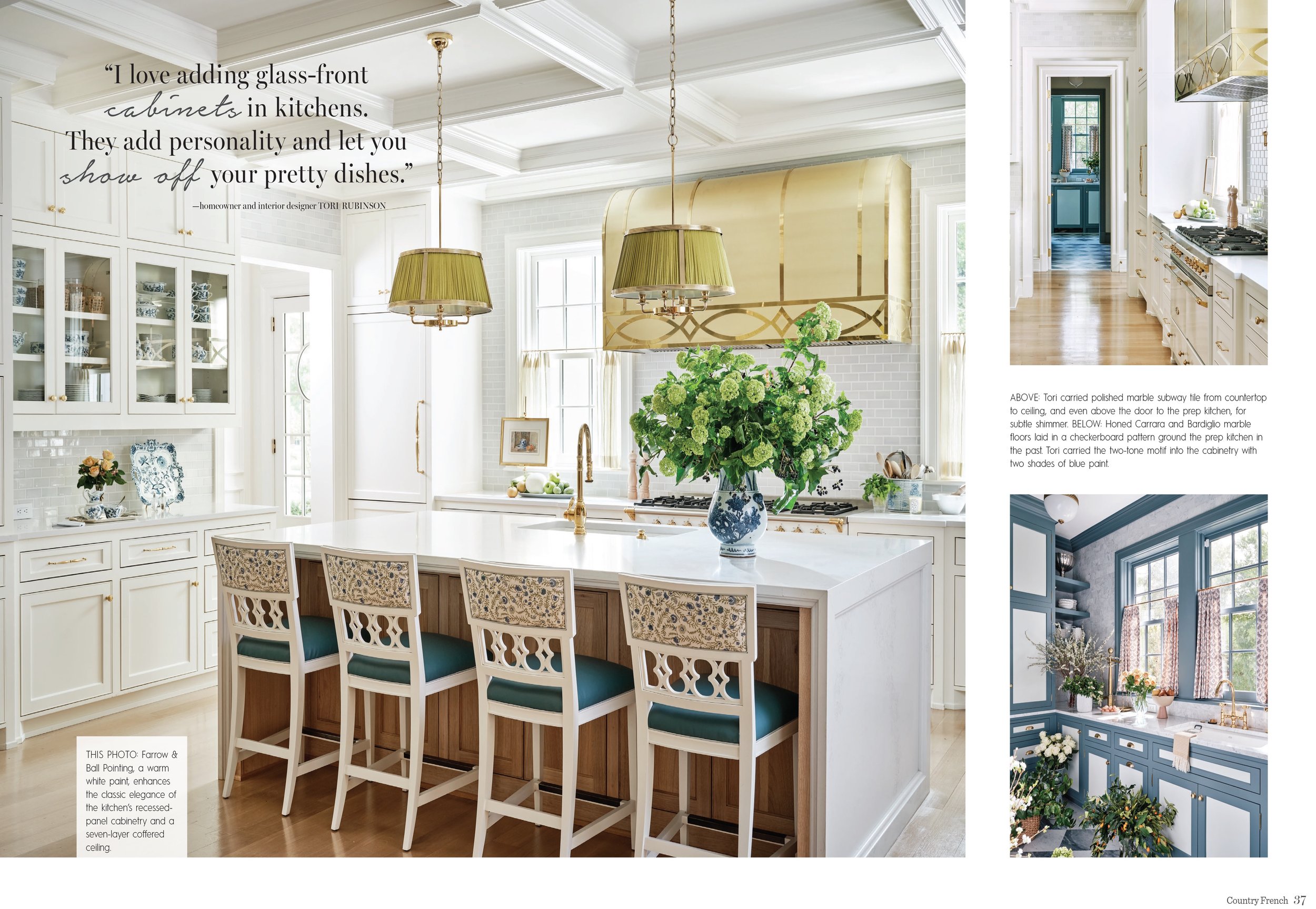
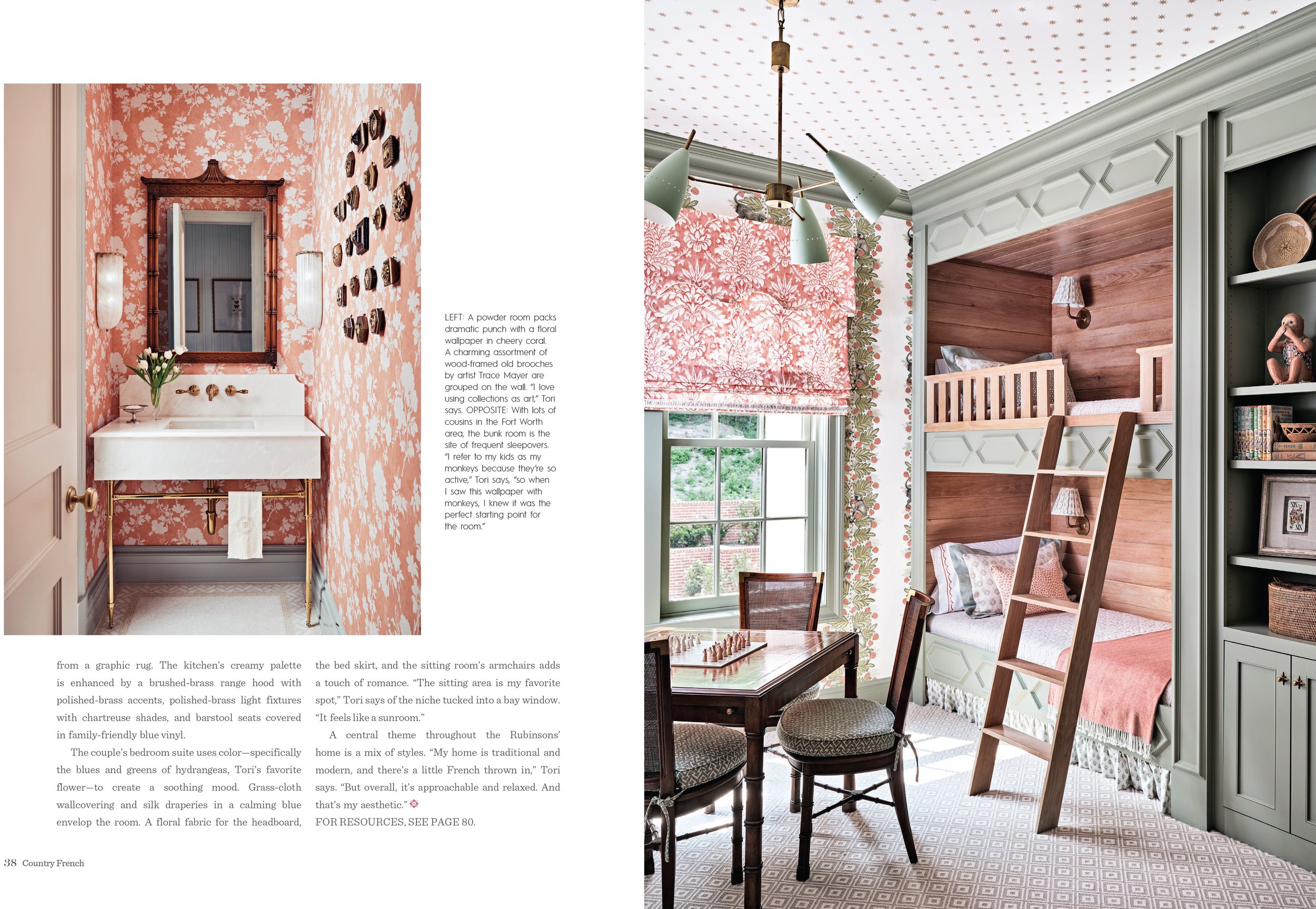
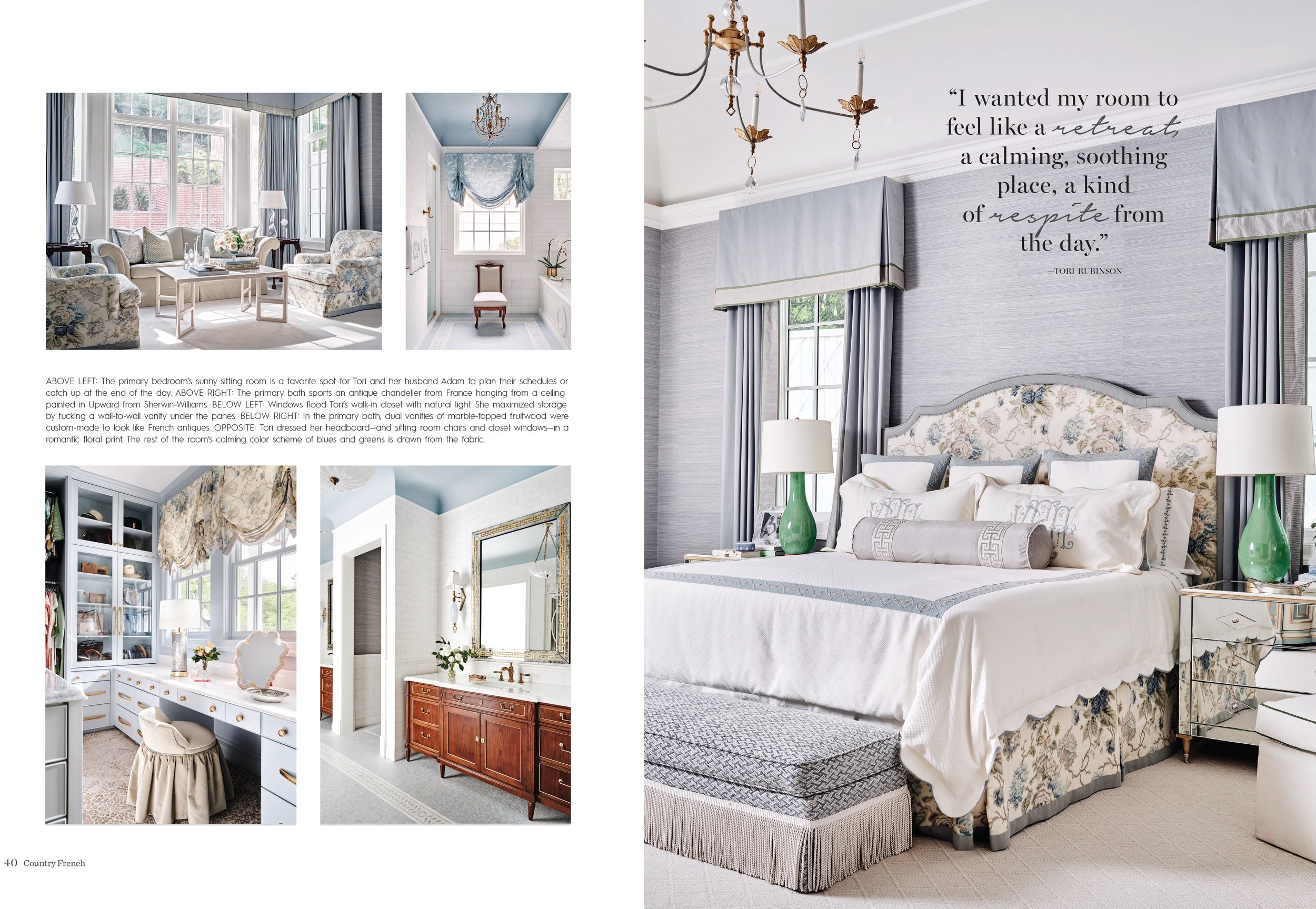
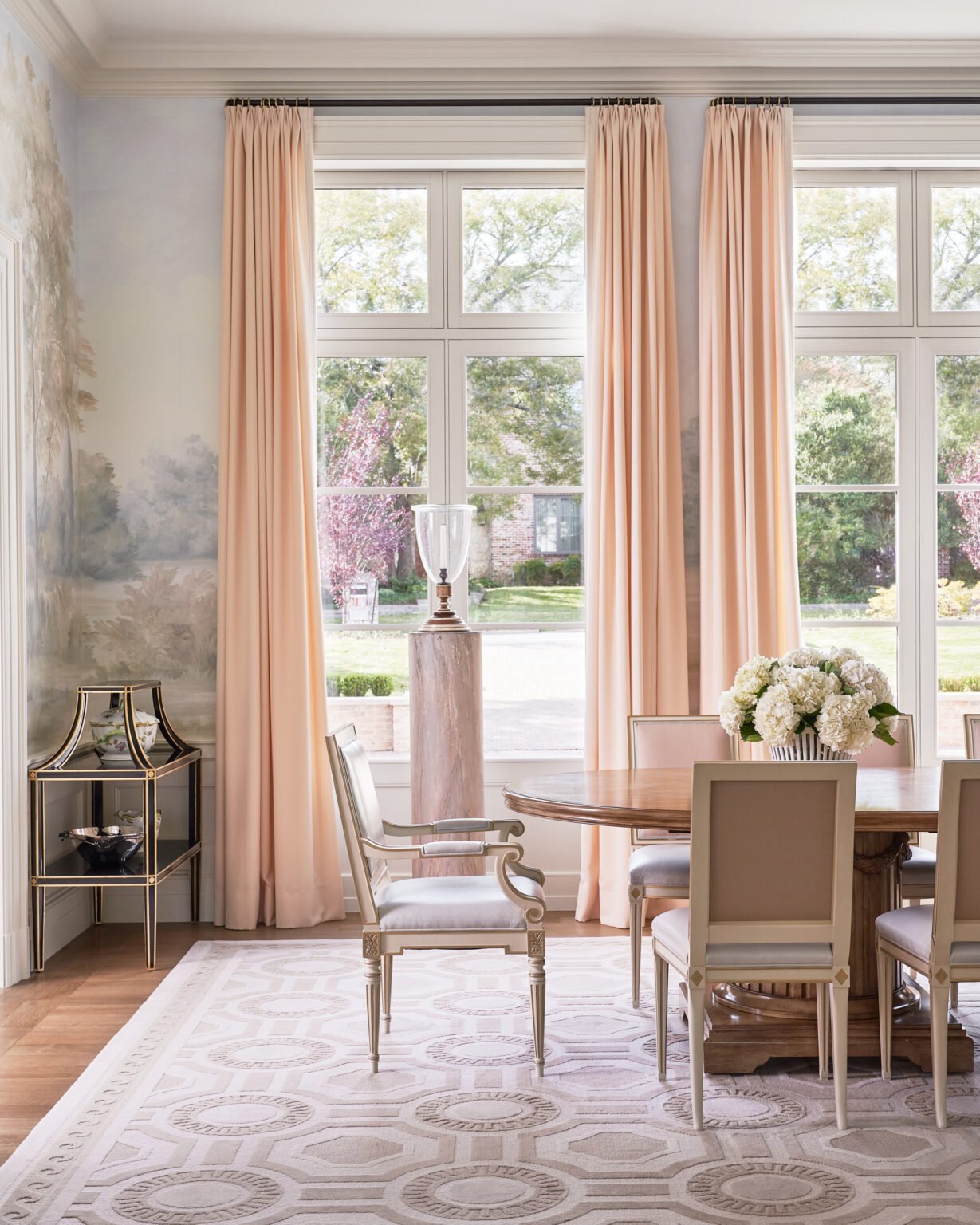
Tori Rubinson contacted me a few years ago to take some new photos of her home in Ft. Worth, Texas.  From that early photoshoot we have been working together on several large projects in Texas, including her new home and also a Showhouse in Ft. Worth.  

The evolution of Tori as a designer and leading interior design firm in Texas and beyond has been a fun one to witness and I have been fortunate to document. Her style is timeless, she is loved by so many, and working alongside her is about as great as it gets from a photographer's perspective. I can only imagine how much growth she will have in the next few years, the word is out and her team is growing. 

Enjoy this quick little glimpse about Tori!

Her story…

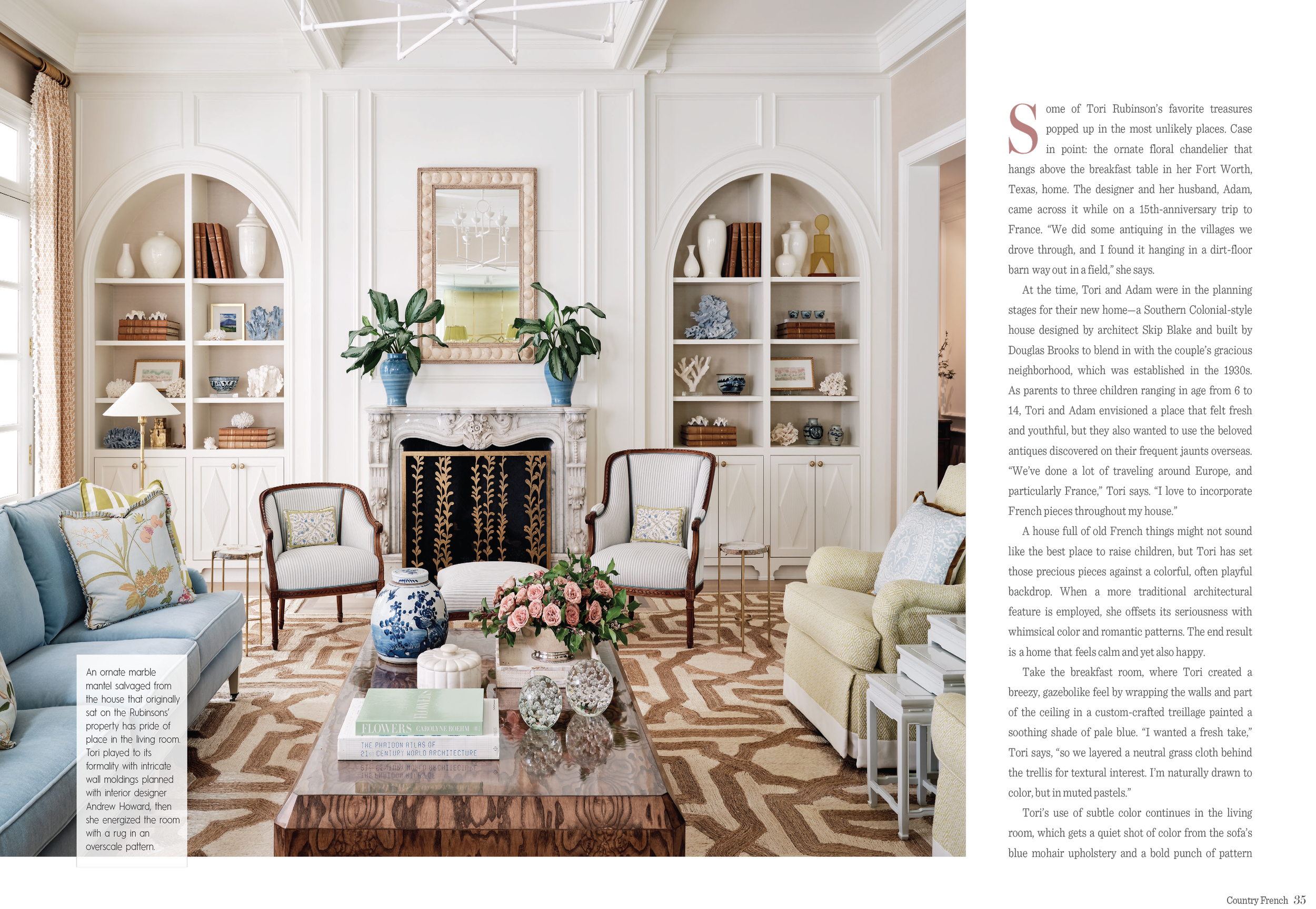
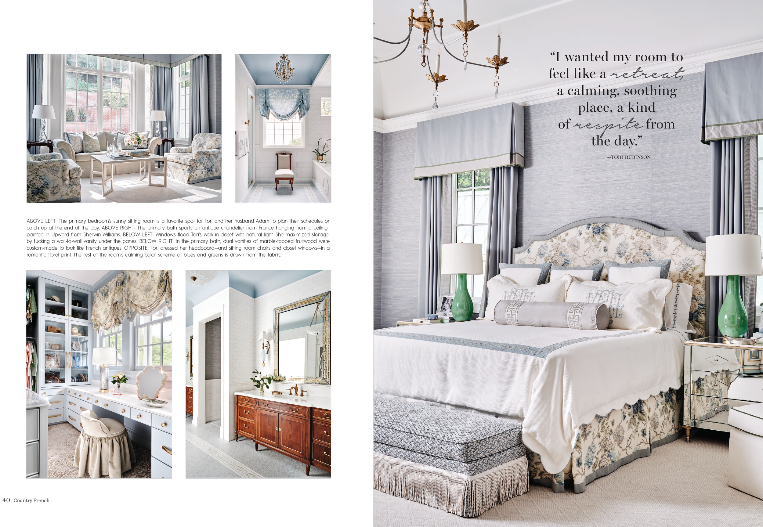
Tori Rubinson is a Texas-based designer, passionate about classic interiors and homes built to last. She has a reputation for creating layered interiors that seamlessly blend old with new — and for creating spaces that are as comfortable as they are beautiful. 

A lifelong love of interiors — along with a natural eye — led her to start work for one of Fort Worth’s most high-end builders a decade ago. Tori learned the industry quickly, while simultaneously cultivating her own design point of view. Friends and family began to consult her on home projects, and after the requests started to pile up, Tori launched her own interior design business in 2013. 


Tori has been featured in Country French, Luxe Magazine, Southern Living, Southern Home Magazine, was recognized as a 2022 and 2021 D Home Best Designer and featured in the Wall Street Journal. She has won numerous design awards, most recently including two Regional Awards from the prestigious Luxe Red Awards.

September 2022 issue of Country French magazine.

Photography by Stephen Karlisch. Styling by Megan McKinley

Let’s see and hear a little more from Tori.…

If you need inspiration for a design project, what do you do first?

I have constantly inundated myself with visual imagery. I read design books (past and present), I love to travel and visit the most beautiful places, I take tons of pictures wherever I go, I scour Instagram and Pinterest for inspiration. Imagery of architectural elements, of fashion, of textiles and patterns, of designers I love, furniture and accessory companies, artists, etc. A room may begin with one element, like a piece of art, a fabric or a rug. And then it just builds upon that one element!


What would you say is key in selecting a photographer for your projects?

You need to love their work. Pay attention to the lighting of the images. The angles of the images also tell you if the photographer has an eye for how to capture interiors.

What's your favorite travel destination?

I absolutely love traveling throughout Europe. The architectural details of the past are what inspires me the most!  


What advice would you give yourself at 20? 

Trust your instincts and go for it! Stay true to yourself, always. I think that is what I have done and why I have been successful in building my design business..  

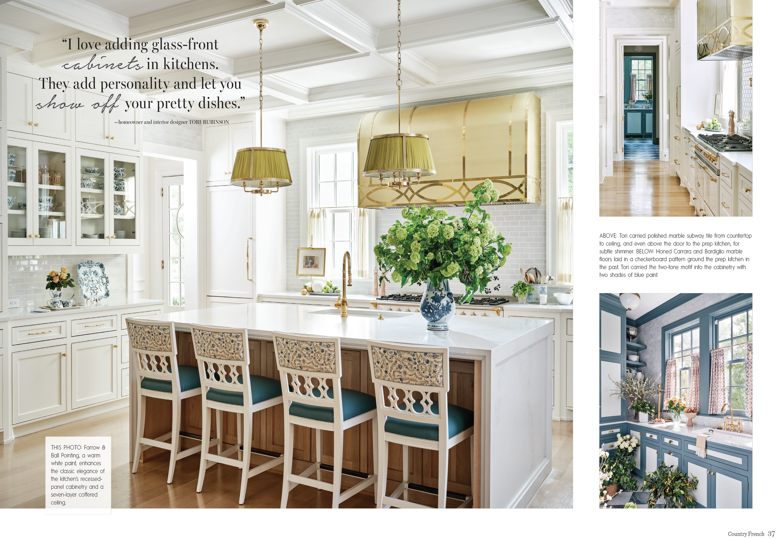
Tori Rubinson kitchen design

What's the number-one red flag you look for in potential clients? 

I really enjoy working with kind and level headed clients. If they show me they are unrealistic about budgets and timelines and are unwilling to receive guidance on these things, then it is definitely a red flag for me!

What modern design trend makes you cringe? 

The home style Modern Farmhouse White with Black Windows. CANNOT HANDLE IT! Quit tearing down masterpieces to build those cheap boring white boxes!!! Please!!!

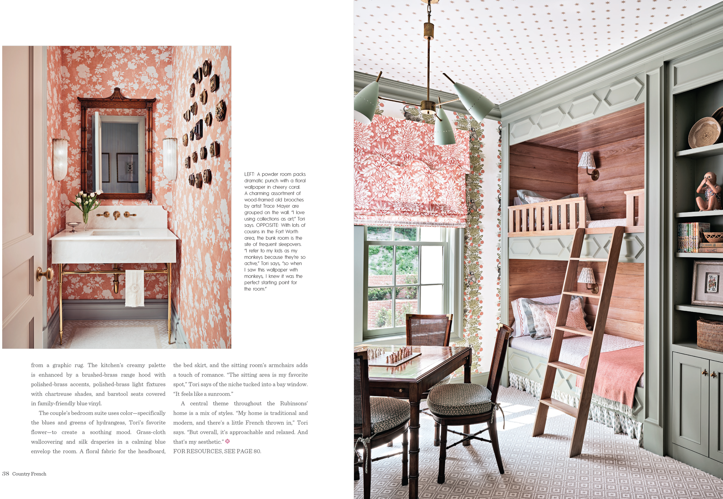
Tori Rubinson interior design

Tori Rubinson Interiors is now offering Full Design-Build services. Architectural planning, landscape design, and complete interior design. Keeping everything in house allows for a very efficient process with spectacular results

Awards-

  • 2022 LUXE RED Award - Best Use of Color

  • DHome Best 2021 and 2022

  • FT Worth Home Design Awards 2019 & 2021

Published in

LUXE feature January 2022

Southern Home January/Feb. 2022

Southern Living April 2021


To learn and see more of Tori Rubinson Interior talents please visit Tori Rubinson Interiors website and be sure to follow her instagram.

We would love to feature your creative talents from our industry on our award-winning blog.

Shoot us an email at hello@stephenkarlisch.com to find out how.


September Press Roundup

We are enjoying a flurry of recent press coverage highlighting recent interior photography projects!

I always get a charge out of seeing my photographs featured in both print magazines an online articles, and I love interacting with talented designers and stylists. I am so honored to work with these amazing designers and publications!

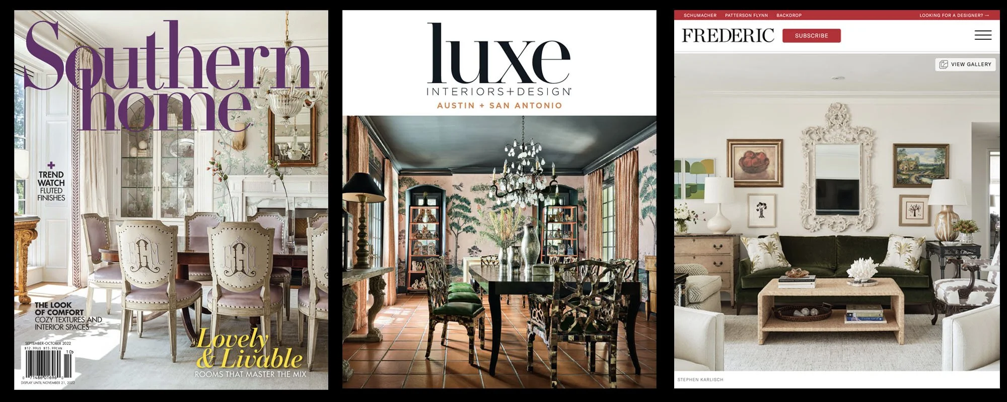
A huge thank-you to Country French, Southern Home, Luxe Interiors+Design and Frederic!


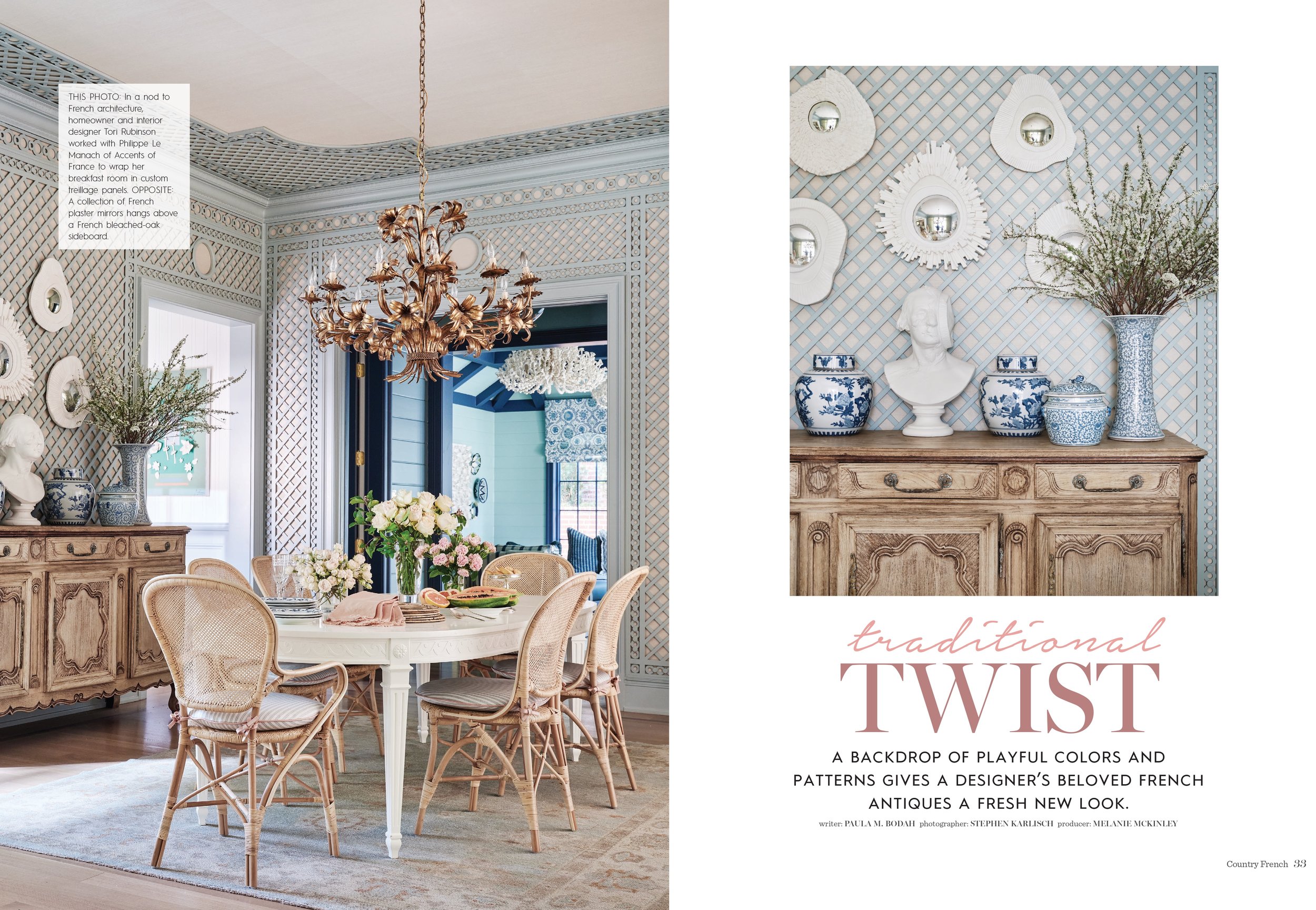
Country French magazine – Fall/Winter 2022

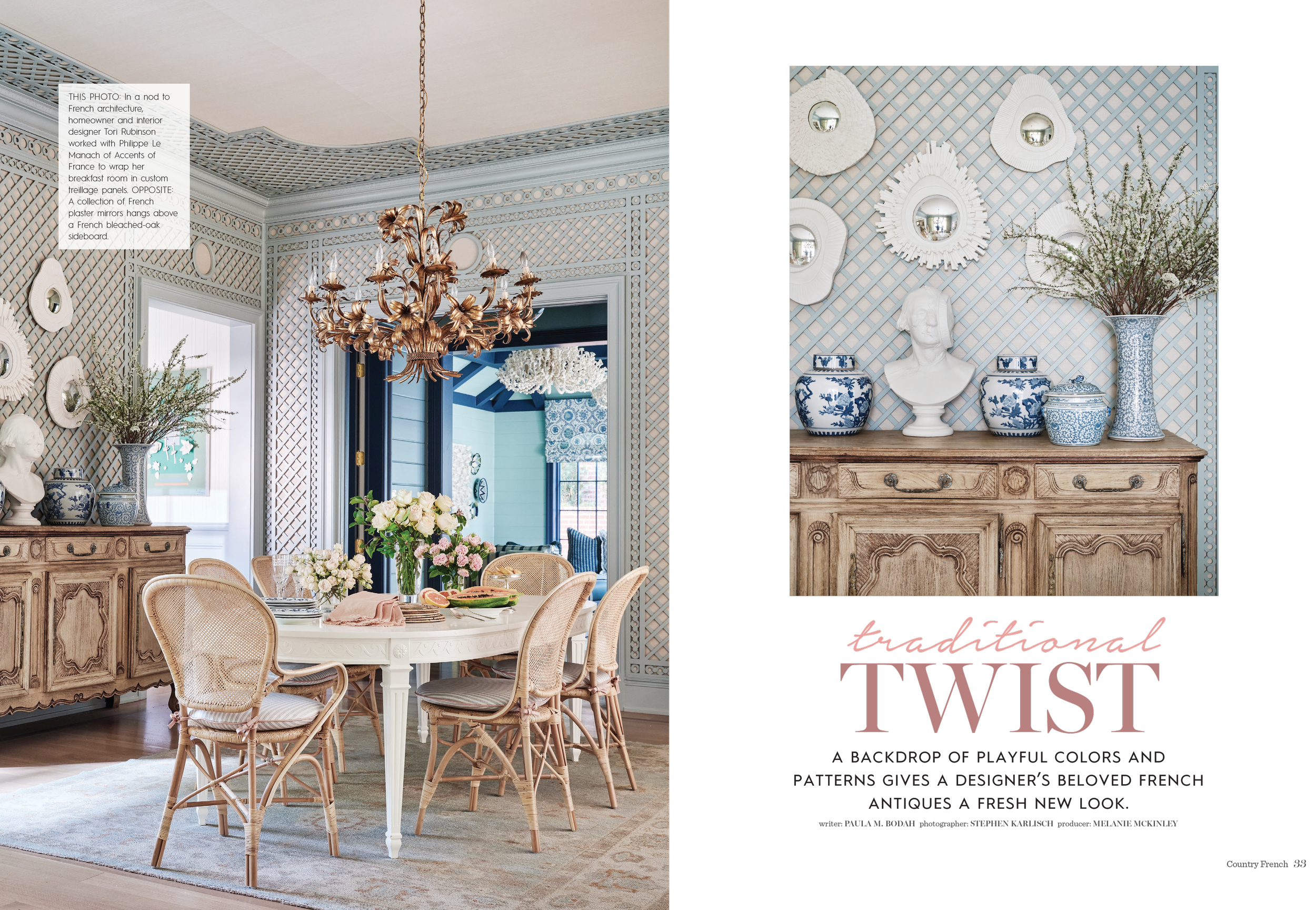
Traditional Twist - A backdrop of playful colors and patterns gives a designer’s beloved French antiques a fresh new look

Writer: Paula M. Body
Photographer: Stephen Karlisch @stephen_karlisch_photo
Interior Designer: Tori Rubinson @torirubinsoninteriors
Stylist: Melanie McKinley

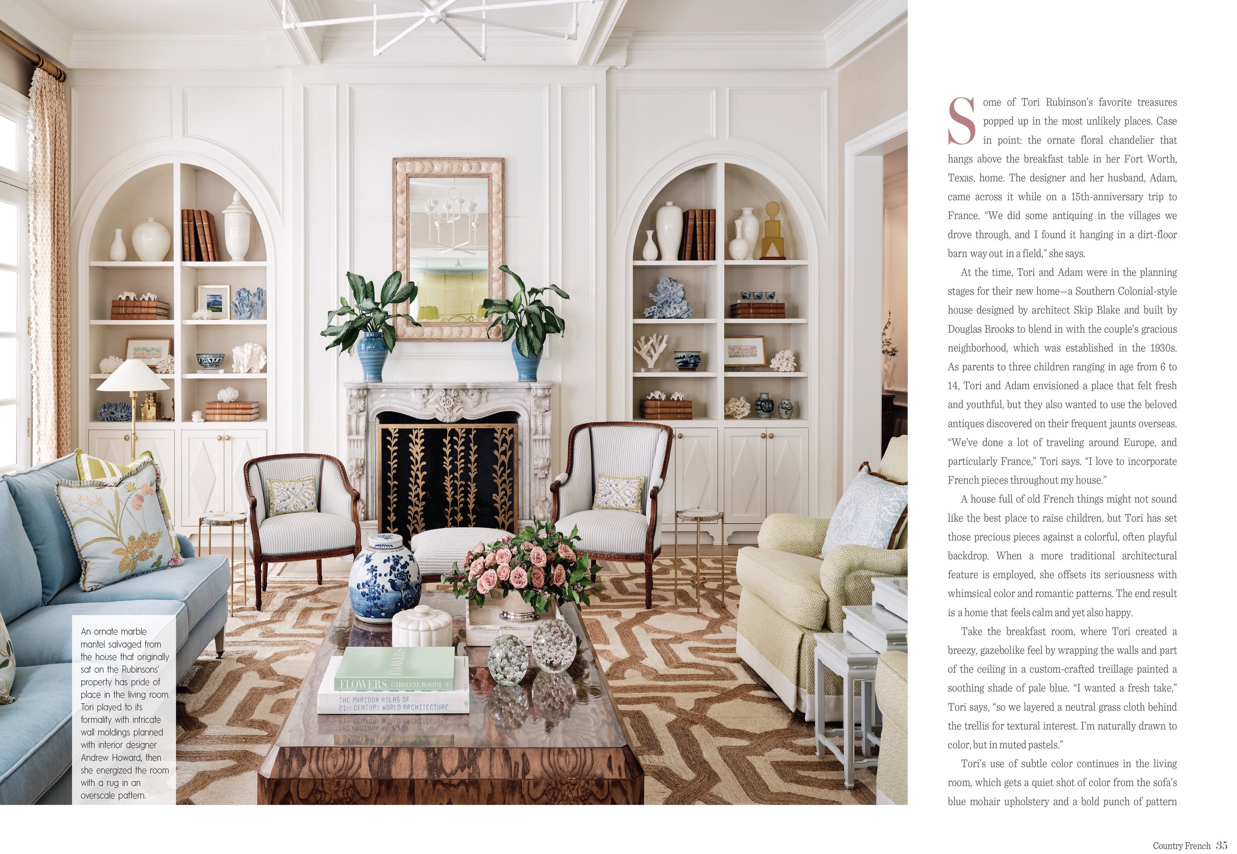
Tori Rubinson contacted me a few years ago to take some new photos of her home in Ft. Worth, Texas.  From that early photoshoot we have been working together on several large projects in Texas, including her new home and also a showhouse in Ft. Worth.  

The evolution of Tori as a designer and leading interior design firm in Texas and beyond has been a fun one to witness and I have been fortunate to document. Her style is timeless, she is loved by so many, and working alongside her is about as great as it gets from a photographer's perspective. I can only imagine how much growth she will have in the next few years, the word is out and her team is growing.  See the full feature from Country French and on Tori in a recent Creative Focus blog post.

To learn and see more of Tori Rubinson Interior talents please visit Tori Rubinson Interiors website and be sure to follow her instagram.

Stephen Karlisch's photographs from the September-October Issue of Southern Home Magazine

Southern Home September-October 2022 | Check out our REEL featuring the images.

Houston Heights – Architect George Tracy’s design for a new Houston home evokes the grand cathedrals of Europe. For designer Ben Johnston, the task was to make a home within the lofty spaces. 

Written by Lydia Somerville
Photography: Stephen Karlisch @stephen_karlisch_photo
Stylist: @jennyoconnorstudio
Floral Design: Haile Wossen
Interior Design: @benjaminjohnstondesign
Architect: @tracydesignstudio
Builder: @irajtaghicustomhomes
Landscape: @gregoryhenrylandscapeanddesign

I recently photographed this amazing home designed by Houston’s own Benjamin Johnston, currently featured in the September - October issue of Southern Home Magazine. Working on this shoot with Benjamin Johnson in Houston was a highlight of early 2021. Teaming up with my old friends Jenny O'Connor (Stylist) and Haile Wossen (Floral Design) made this shoot a success. Benjamin is turning Houston into his playground, knocking out more residential projects than anyone I know. And they are all on a scale fit for special client. The main living room really shows off what is possible when deciding to live in a home that is a statement piece on its own. The primary bath could fit 20 people comfortably at once, reminiscent of an old roman bath or communal spa. 
See more of Johnston’s work at Benjamin Johnston Design


Image of Luxe Interiors+Design photography by Stephen Karlisch

Luxe Interiors+Design – Austin + San Antonio, September 2022

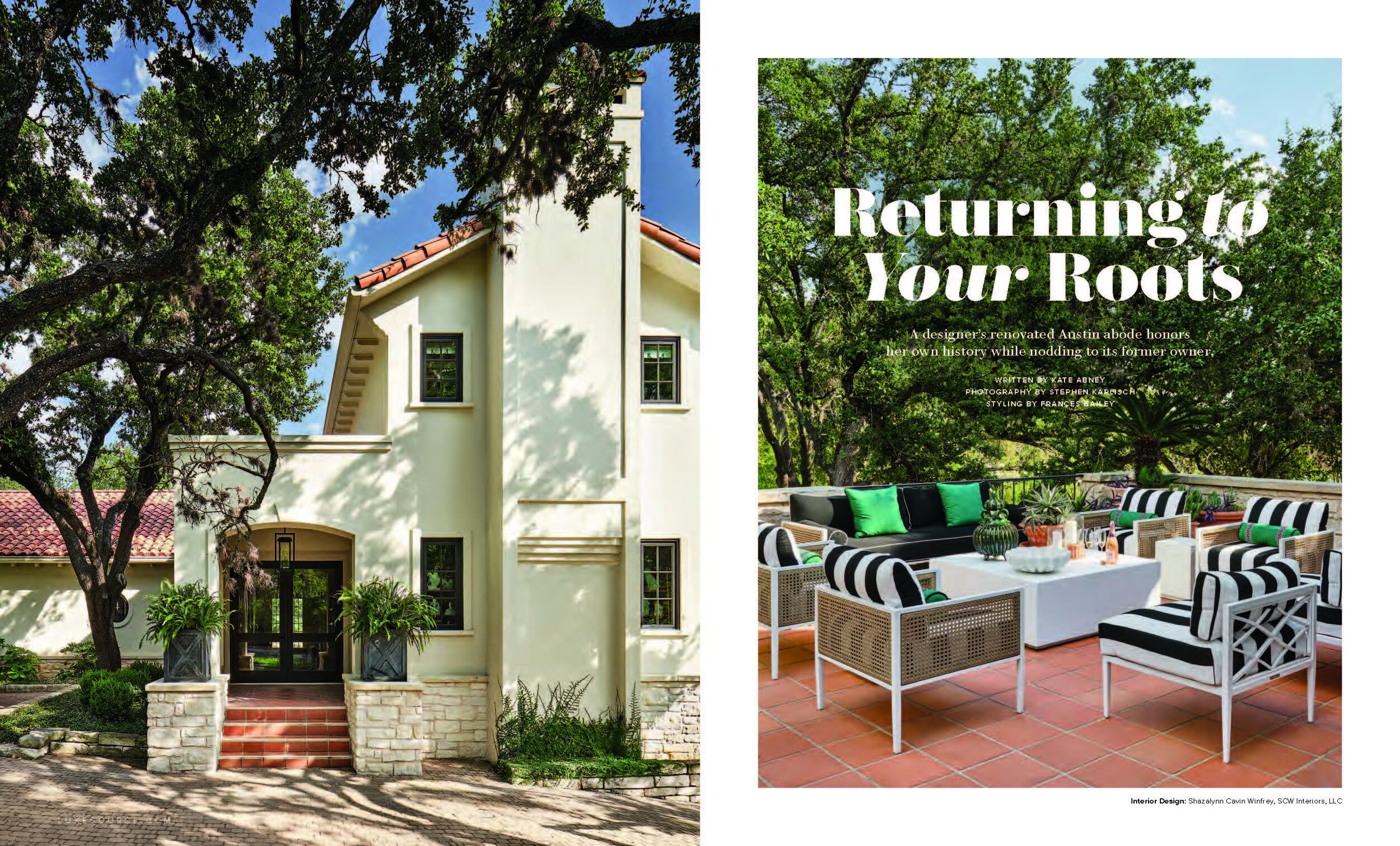
Returning to your Roots – A designer’s renovated Austin abode honors her own history while nodding to its former owner.

Written by Kate Abney
Photography by @Stephen_Karlisch_photo
Interior Design by Shazlynn Cavin Winfrey @scw_interiors
Styling by @FrancesBailey

Shazalynn Cavin Winfrey updated this beautiful, historic home by making it more functional without losing its connection to the past. This was the first time shooting and working with Shazalynn and we started with a very personal assignment, her own home. Needless to say, no pressure here! Ha! Working with the talented Frances Bailey (Stylist) on this, we had a wonderful time during this two day shoot in Austin. The backstory of this house is worth checking out from the article. Seeing how she has transformed this into a comfortable, sprawling home, with surprises around every corner, showcases her style and skill as a top designer. 

Excited to feature this spread and interview we did on Shazlynn in our series, Creative Focus.

See more of Cavin Winfrey’s beautiful design work | SCW Interiors


Frederic Design Feature - August 2022 

Josh Pickering Creates a Verdant Aerie in Downtown Dallas – The designer drew on lush greens to harmonize a couple's mix of brand-new pieces, treasured heirlooms, and personal artworks.

Photography by Stephen Karlisch
Designed by Josh Pickering
Written by Kate Bolick
Produced by Tori Mellott

Joshua Pickering's style is in full effect in this Turtle Creek, Dallas, high rise condo. Situated in a classic building with rooms on a smaller scale, Joshua brings a sense of calm to each area, building on a theme repeated throughout the residence. 

See Pickering’s recent projects | Pickering House Interiors