Posts tagged Published interiors
New year new published featured shoots!

Excited to start 2023 with a national feature in the annual House Beautiful Small Spaces and a local feature in D Home! Congratulations and thank you to interior designers Tanner Morgan of Morgan Madison and Teddie Garrigan of Coco & Dash.


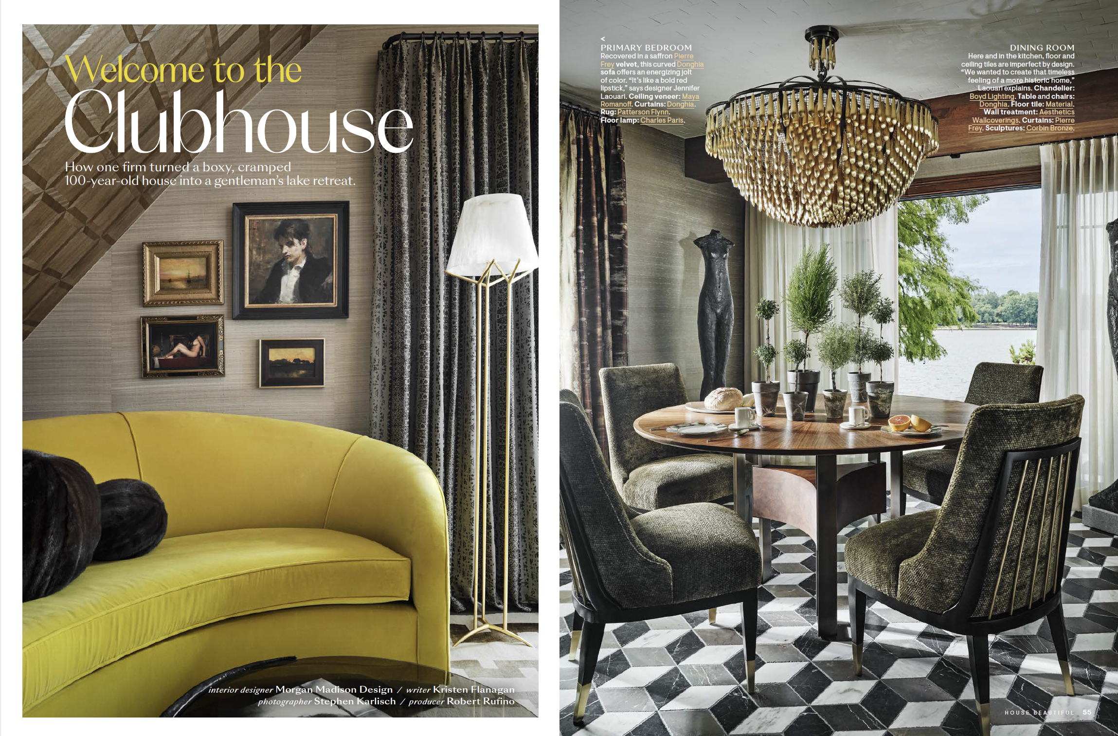
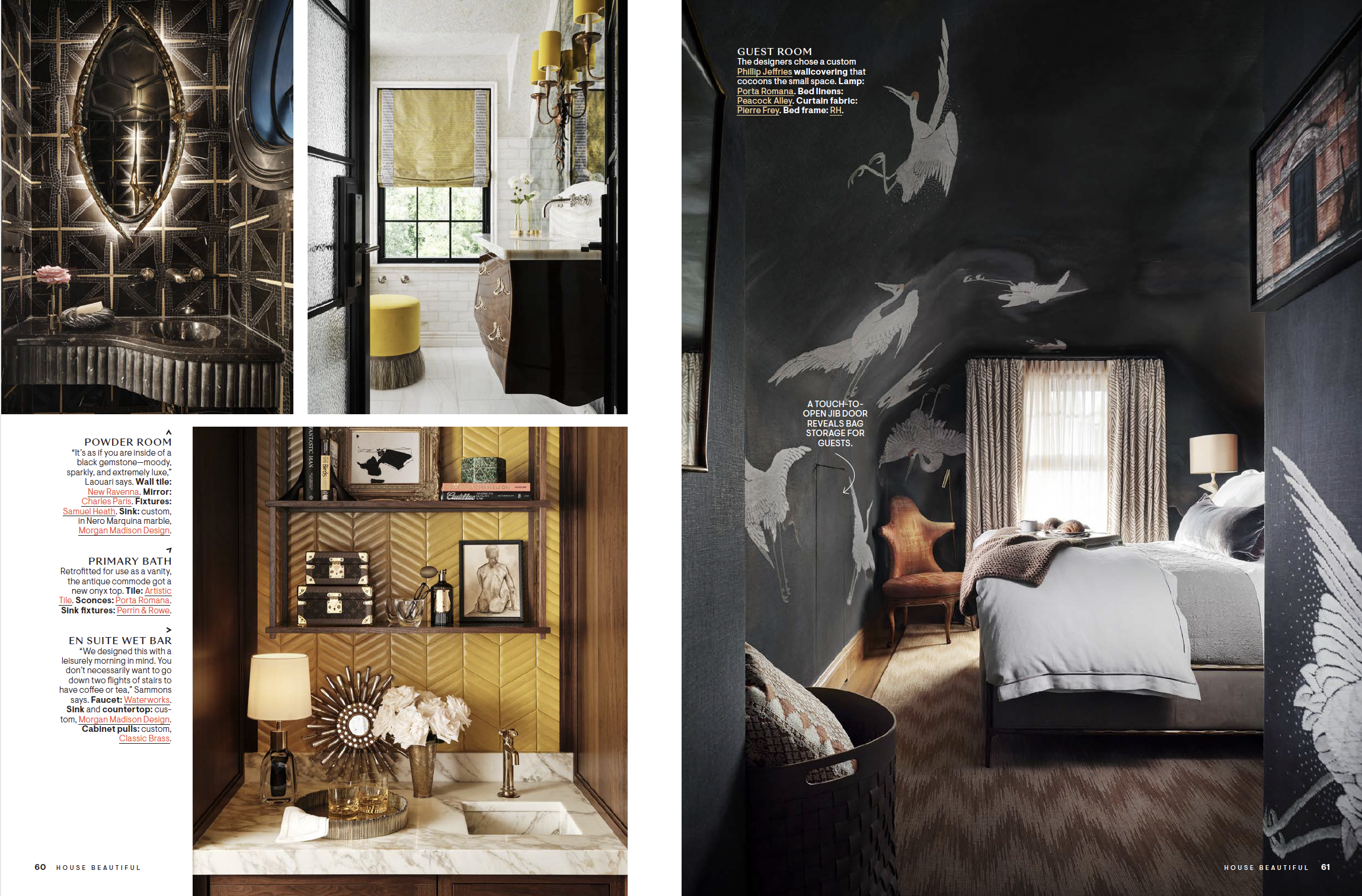
Magazine spread in House Beautiful featuring photos by Stephen Karlisch

A couple of years ago I got a message from a young designer (Tanner Morgan) in Cleveland, wanting to discuss photographing a project he was working on. It was very early in the process for him, in fact none of the actual construction had even started at this point, but Tanner really wanted to make a connection with me and get me on board for this journey. I was a bit skeptical at first, not knowing anything about Tanner at that time and his online presence as a designer was limited, but he also was very young and excited to get going. His passion for this project quickly became evident and I was ready to go along on this ride. Through many calls, emails, facetimes and updates to the progress on this home, we brought in Frances Bailey, one of the world's top interior stylists, to soften the edges of this project and get it to a national editorial level. 

The three days we spent shooting this project was a highlight in my photography career. Being a part of the process from the beginning engaged my curiosity and brought out my best. We stayed out on this lake property in a charming guest house and enjoyed sunsets and sunrises together, bringing us all pretty close during that week. 

Tanner transformed this simple lake house into a showpiece, each room better than the last, and not one square inch left untouched. The details in every surface are remarkable, a testament to Tanner's own personal style, a character himself you will never forget. 

Writer: Kristen Flanagan
Photographer: Stephen Karlisch @stephen_karlisch_photo
Interior Designer: Morgan Madison Design @morganmadison__
Producer: Robert Rufino
Stylist and floral: Frances Bailey @francesfinds


Photo of living room interior by Stephen Karlisch in D Magazine
Photo of sitting room interior by Stephen Karlisch in D Magazine
Photo of bedroom interior by Stephen Karlisch in D Magazine
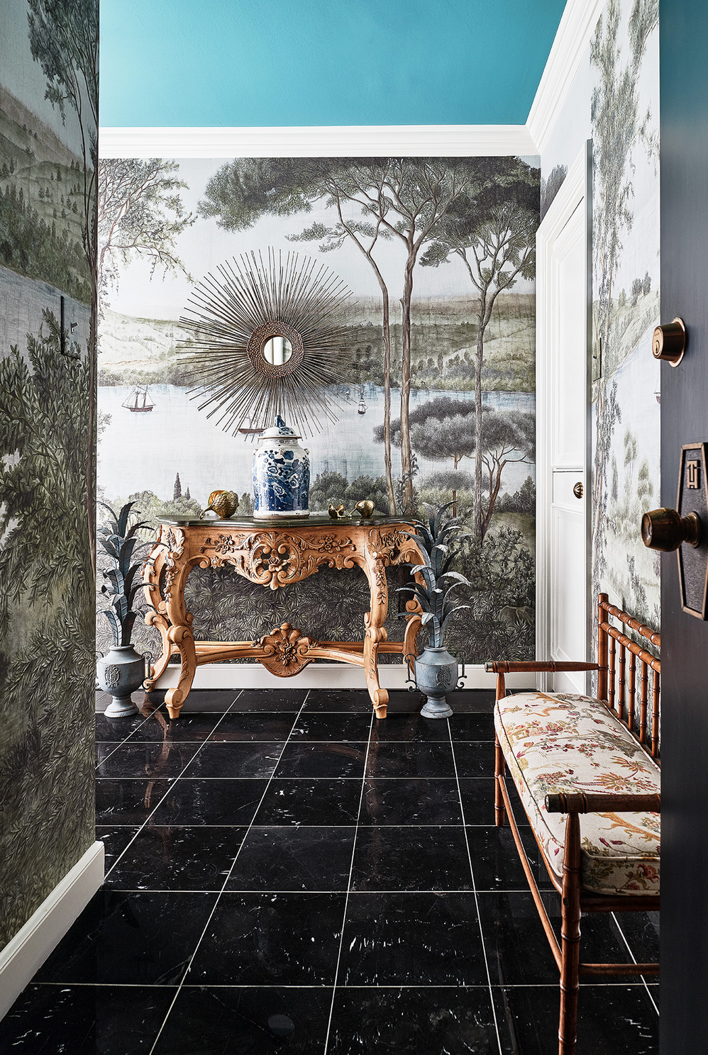
Photo of hallway interior by Stephen Karlisch in D Magazine

Teddie Garrigan, owner of a unique retail furniture/design shop in Dallas called Coco and Dash, reached out to me to photograph her apartment in Dallas recently. She lives in a high rise in Uptown, near the Katy Trail, that has been a favorite for many in the design world for years. They could do an HBO series about this place, seriously, full of character(s). 

Teddie and her daughter Courtney run the shop together and their interior design business, and I was thrilled to get the opportunity to document her home. From a life of travel and living in many foreign countries (she has a great story to tell!), she lives a collected life. Layers of color and texture rule her world, and I've rarely photographed a space that I've felt more at home in. Working with stylist Jenny O'Connor on this was the perfect mix. She was able to blend in some simple floral to accent the shots, but not overwhelm, and help move some items around to create perfect compositions from the cameras point of view. The apartment was glowing from so much natural light, being in a high rise with nothing around to block the sun, the rooms just come alive as the day moves on. It's always hard to pack up and leave a shoot like this one, so many more stories in there to be told, maybe I'll get a chance to get back in there someday soon.  

Writer: Kendall Morgan
Photographer: Stephen Karlisch @stephen_karlisch_photo
Interior Designer: Teddie Garrigan, Coco and Dash @cocoanddash
Stylist and floral: Jenny O'Connor @jennyoconnorstudio

Thoughts about the future of Veranda from Steele Marcoux on BOH
 

I just finished listening to the latest Business of Home Podcast featuring Steele Marcoux of Veranda magazine, discussing their new issue and commitment to print publishing. It’s an exciting time for fans of Veranda, and fans of printed magazines (not to knock the digital realm, but seriously, aren’t we all a bit tired of scrolling through images on our phones?). Veranda is not just changing the physical size of the magazine, but also doubling the page count, which is going to make this next issue feel more like a Sept issue from years past of one of the major fashion magazines.

All of this means more content, better laid out content, and just overall prettier and more engaging content. This is huge for anyone in our industry, from designers to craftsmen to photographers and stylists.  I feel this will be a defining moment in print, we will all remember the day we laid our hands and eyes on this issue.  

For me personally, I am really happy to hear that one of my favorite magazines is doubling down on print. Steele discusses the push for Veranda to assign and direct (what every magazine used to do…) their shoots for total editorial control. This establishes a narrative and trend base that will be followed for years to come. Whoever is a part of this creative re-birth will become our new guides directing our own shoots and content creation moving forward. Mood boards flooded with thick glossy pages from Veranda, shining brighter than anything else. To be included in any Veranda issue is a major feather in your cap, but now this may become someone’s defining moment in design. 

Cheers to Steele and everyone who fought for this in the halls of Hearst and cocktail parties/dinners/trade shows. Thank you for pushing this through, I cannot wait to get my hands wrapped around it all!

Steele Marcoux courtesy of Veranda

 
Creating the Hero Shot
 

There is a lot of effort that goes into getting that perfect shot – the one with the WOW factor that really showcases your designs in the best way. Some people think those shots are kismet or that they just happen, but I can tell you that the level of energy that it takes to get even just one hero shot is enormous. 

Designer: Emily SummersPhotographer: Stephen Karlisch

Designer: Emily Summers

Photographer: Stephen Karlisch

But all that effort is so worth it. A shot like that can change your career. It can get your project published in the magazine you’ve always dreamed about. It can get you into a top-shelf design book. It can uplevel you to the client work you’ve always wanted. It can change everything. 

So what goes into creating a hero shot? Let’s take a look.

Designer: Chad DorseyStylist: Jenny O’Connor         Floral: Haile WossonPhotographer: Stephen Karlisch

Designer: Chad Dorsey

Stylist: Jenny O’Connor Floral: Haile Wosson

Photographer: Stephen Karlisch

Hire a Stylist

Yes, you are a fabulous designer and your project is probably amazing. But there is a very big difference between what your eye takes in when you are in a room and how that room translates onto a screen or a printed page. A great stylist can see things with a fresh eye and help you make the most of how your room looks digitally. He or she can also offer suggestions for styling for a specific publication you may be targeting. A good stylist will still stay within your aesthetic boundaries, but also knows how to take it up a notch. 

Designer: Michelle NussbaumerPhotographer: Stephen Karlisch

Designer: Michelle Nussbaumer

Photographer: Stephen Karlisch

Be Honest

You know that not every single room in your project is spectacular. That’s really rare and it has nothing to do with your talent. Often there are just some rooms that your client may not have wanted to invest in. Or maybe the budget only allowed for an incredible 2-3 rooms and 4 or so other rooms that are good, but not spectacular. Be very honest with yourself about which rooms are so well-designed that they will make a big impact once they’re photographed. Shooting every single room like it’s a hero shot isn’t often worth the time we’ll put into it. 

Designer: Lucas EilersPhotographer: Stephen Karlisch

Designer: Lucas Eilers

Photographer: Stephen Karlisch

Invest in Experience

There are a lot of very good photographers out there. But just because they know their way around a camera doesn’t mean they know how to properly light and shoot your project. So invest in a photographer who really understands how to get the best interior photos. Go through their portfolio to see who they’ve worked with and what their photos look like. Have they been published in top magazines and in design books? Do their photos showcase an understanding of light and space and style? Invest in a photographer who can give you those incredible shots that you’re looking for.

Patience Is a Virtue

Understand that those hero shots take time. Sometimes a lot of time. We could spend a whole day on 5 shots – but each one of those shots is going to be incredible. Remember that getting a great photo isn’t just a click of the camera. We move lighting and furniture,  we’ll work with the styling, we’ll tweak, we’ll study the shot, and we’ll tweak again. It takes time. I’m a fast photographer, so on a normal day, I can do about 30 minutes per shot, or maybe 15+ shots per day. But remember that I said “shots,” not rooms. So if we do several angles of the same room, that means we might do 4-6 rooms in a day. And not all of those shots will be hero shots. Understand that if you ask the photographer to move faster, then you might get good shots, but maybe not great shots. Taking the time during the photo session means that you’ll have more photos to work with later.

Designer: Celerie KemblePhotographer: Stephen Karlisch

Designer: Celerie Kemble

Photographer: Stephen Karlisch

Make a List

And to be as efficient as possible, once you’ve decided which rooms are the most important, start creating an in-depth shot list. Do you need detail shots? How many? Which angles? What rooms can go to the bottom of the list if we run out of time? Even think about how we’ll move through the house – a quick path that doesn’t move us up and down stairs or across a house will save you a lot of time. You may want to try to do some styling ahead of time so we’ll be able to move quickly once we’re shooting, and always consider the sun (utilize as much natural beautiful light as possible).

Use these tips to help you and your photographer snap those perfect hero shots. They will definitely help get your work noticed by editors and your target clients.

Have you planned out your next shoot for your marketing this year? We want to hear from you.